twitter’s got a brand new bird, created from overlapping circles. they talk about rolling it out here. i think it looks cute and friendly, right in line with their brand.
Author: heather parlato
porcini & parmesan cauliflower crust pizza
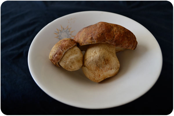
it’s an exciting time of year when fresh porcini mushrooms come into season. this year, they’re a bit pricey, so while i’m not exactly buying them as the main ingredient for anything, i am enjoying giving them the spotlight on this new pizza crust i’ve been playing with.
in an effort to skew my diet more in the paleo direction without completely giving up on pizza, i went searching for alternative crusts, and found this one that completely busts out of the common gluten-free pitfall of substituting a million different flours for a dough that just isn’t all that great.
aside from being healthy, i think the thing i like best about this pizza is that it tastes pretty darn good, and can be made in minutes. if you rice an entire cauliflower head, it keeps well in the fridge whenever you want to whip up a pizza. no dough kneading or rising, the only thing you’ll be waiting for is your oven to preheat.
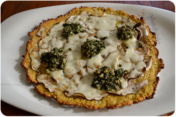
porcini & parmesan cauliflower crust pizza
2 cups riced cauliflower [first chop it, then rice it in a food processor]
3 eggs
1/4 cup almond meal
1/4 cup coconut flour
2 garlic cloves, minced
1/4 tsp salt
olive oil, for drizzling
2 small porcini mushrooms, sliced thin
1/2 cup grated parmesan cheese
1/2 cup mozzarella [optional]
pesto [or your preferred condiment, optional]
preheat oven to 450º. place riced cauliflower in a mixing bowl with eggs, garlic and salt, and mix with a fork to break egg yolks and incorporate to a fairly uniform mixture. add almond meal, mix to incorporate, then coconut flour, mix to incorporate completely. you’ll have a fairly wet “dough” compared to any typical pizza crust, but this is normal for this type of crust. you will have enough dough to make 2 pizzas of about 8″ diameter.
place a piece of parchment over a cookie sheet or pizza pan at least 10″ wide. you may be tempted to use foil if you don’t have parchment, but don’t do this—this crust will lift effortlessly off parchment, but cook down and stick to foil. place half your cauliflower dough in the middle of the parchment and push and mold it with your hands into a pancake about 1/4″ thick and 8″ diameter. the dough moves and shapes easily, just keep pressing it out and shaping it until you like it. drizzle olive oil [or flavored oil] over the top, and spread with a brush or your fingertips. bake at 450º for 10 minutes to set the egg.
unlike traditional pizzas, this pizza has 2 baking phases: one to set the crust, above, and one to melt any cheeses or heat toppings through. once your first 15 minutes is done, remove the crust from the oven and spread half the parmesan cheese over the surface in a thin, even layer. this acts as a nice barrier for any wet ingredients, but you may add more for the love of cheese, if you like. then, layer half of the sliced porcini over the surface. finally, sprinkle half the mozzarella, if using, over the top. return the pizza to the oven for 10 more minutes, to melt and lightly cook the toppings.
once your cheeses are melted, finish the pizza any way you like. if you’re using condiments that don’t need oven baking, like pesto, soffrito or the like, add them at this phase. add any finishing salts or pepper here too.
repeat this process with the remaining half of your ingredients, or adjust the recipe so you can try 2 different toppings on each pizza. enjoy!
creative inspiration
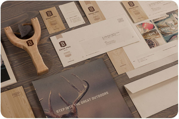
looking at outdoorsy design today, i’m loving all the natural, full-frame surfaces of this branding for bass pro. the complete set on fred carriedo‘s site.
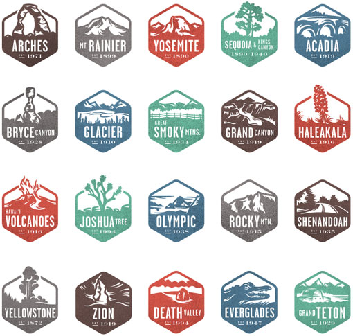
this beautiful set of national park stamps were commissioned by national geographic for their interactive guide to the national parks. thanks to designworklife.com for profiling the set.
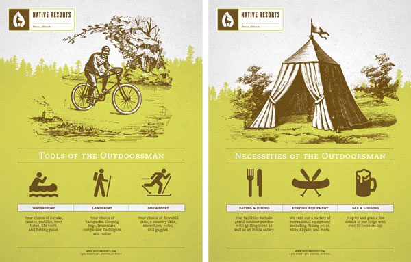
awesome work for this denver resort that specializes in outdoorsy experiences in the neighboring national parks. great poster series to compliment the branding. see the whole set on brian rau‘s site.
case study: re-imagining natural curiosities
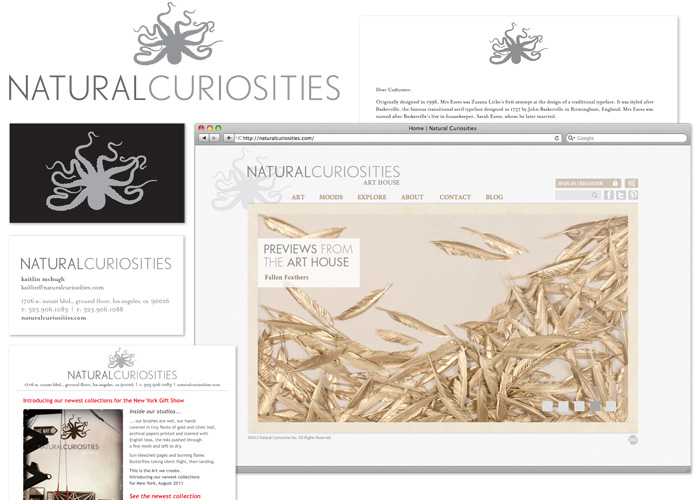
For the past 7 months, I’ve been hard at work with Natural Curiosities, a collective of artists and artisans working under the creative direction of Christopher Wilcox in a beautiful studio in the Jensen Recreation Center, here in Echo Park. They have evolved from roots in archival giclée printing and silk screen to application and specimen art, gold & silver leafing, aging and paper treating, and hand watercoloring. They have a specific aesthetic celebrating a time when both scientists and artists were constantly observing and cataloging nature, and they’ve brought this around from archives of illustrations to three-dimensional recreations and objet d’art. With all these new developments afoot, it was time to do a little identity refresh, and refocus the web site on communicating all the exciting news in more of a real-time way.
brand exploration
Starting with research, we did a full company-wide brand exploration. You never know what you might find when you interview everyone in a company, but it was exciting to see how passionate everyone was about their work and the family environment in the art house. They all offered great ideas and perspectives that we incorporated into a report, and further refined into a brand brief to guide the project. Natural Curiosities had already developed a lovely logo and wordmark, so the job of standardizing its ratio, lockup, and uses was easy.
identifying the challenges
The main goals boiled down to 2 things: create a marketing strategy that would communicate the brand philosophy, and design a web site that would serve both the marketing strategy and the clients. as a wholesaler, the clients of natural curiosities are partners and external sales rather than consumers, though the site is used as a catalog to consumers as well, and has to serve both markets seamlessly. The previous site was very strong on products, but needed more of a bridge to the promotional engine and client relations. Research told us that people really love interfacing with the staff and studio, so another goal was to bring more of that experience to the surface of all communications. On the technical side, this site was built in Drupal and would stay in Drupal, but had to become far easier to update by employees.
a dynamic, art-focused home page
One of the first challenges we faced was how to pull specific pieces out of the archive and showcase them. With a catalog as big as that which Natural Curiosities sells, even after a streamlining, we’re still faced with many collections and sub-collections, relying on the user to find them either by browsing or searching. In reworking the home page, we decided on a 5-image slide show, showing a full-screen close-up of any one piece of art that Natural Curiosities would like to feature, with each linking to the appropriate product or collection. Previews from the art house is their way of visually showcasing breaking news or exciting products, which is very easy to update on the fly.
the art catalog
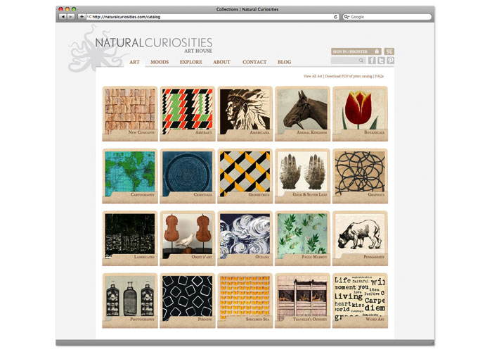
Our first task was to map out the art catalog, which was no small feat. Flow charts, graphics and full wall murals were involved! The general feeling was that the categories and collections were not intuitive enough, so we reworked the names, resorted the art, refreshed the overall collection [adding new pieces, retiring others] and stacked it into a grid of highly-colorful art folios to reiterate the sense of archive. This is a main landing page for regular site users, so it has become more inviting, and easier to use.
enhanced search and products pages
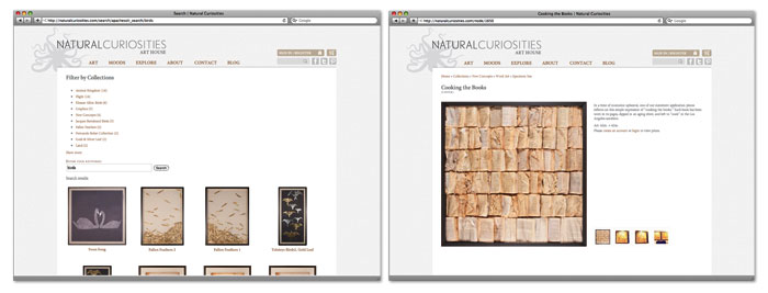
Another section ripe for opportunity was the search function, which wasn’t returning as many results as it could, and showed the results more like data records than art. We installed a module that would perform a wider search, give the user options to narrow the search by category, and suggest alternatives, with results coming in as large thumbnails for quick preview and selection. The product pages have been rearranged to be image first, support information second for visually-driven clients. When authorized users are logged in, pricing and buying options appear here as well.
setting the mood
With clients in mind, we decided to add a design & interior-focused section to put art in context into the spotlight. This is a more extensive slide show which offers Natural Curiosities another way to showcase products, overlay editorial and cross-link styles from inspiration shots to related collections or blog posts. It’s also the first of a few more client-partnership aspects we’re building into the site.
a look inside
Giving outsiders a look inside the studio, we created a section called explore which is starting out as a video gallery of art processes used at Natural Curiosities. The about section has given more weight to the story behind the formation of the collective, how they operate now, and the influence of the place as inspiration. Also featured in the about section is a retail location search, for retail customers looking to buy, and all the FAQ, shipping, privacy policy and terms & conditions information buyers may be looking for. These sections have been given the flexibility to grow as the art house has new things to share.
a new & improved blog!
As another, more dynamic opportunity for communication, we’ve introduced a new blog with a unique layout from the rest of the site, and an editorial calendar to fill it with sources of beautiful design inspiration, product showcases, video posts and news missives. The blog is going to be a pivotal point of the communication strategy, as another place to bring clients into the natural curiosities experience.
+ Read more case studies here.
+ See more of our work for Natural Curiosities.
friday fun
The Forty Story from Pentagram on Vimeo.
pentagram tells the story of their 40 years in design in this fantastic animated video!
lemon verbena oil

it’s the time of year for lemon verbena again. i have my own potted plant, but it’s nothing compared to my mom’s perennial, which has come back in fuller force every year. this year, i’ve trimmed off a goodly amount, merely sculpting the shrub into a small tree, but hardly making a dent.
since my diet is decidedly off added sugar, the typical simple syrup is out of the question, but perhaps an oil to add a twist to my vinaigrette dressings is in order. i tried it two ways, by heating and steeping, and then by blending and straining. the fresher of the two is definitely blending and straining. since this preparation macerates much of the leaf, you’ll want to store it in the fridge if you don’t use it immediately.
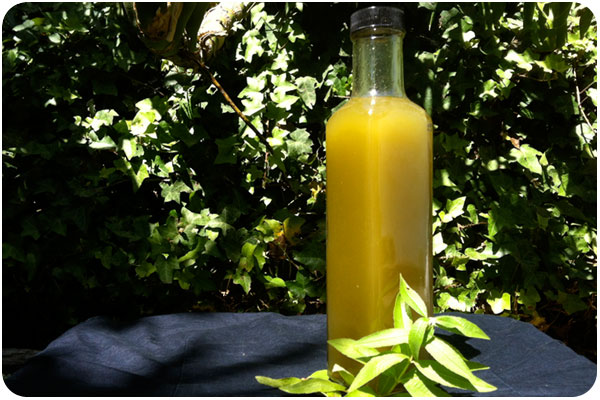
lemon verbena oil
1 cup lemon verbena leaves
1/2 cup canola oil
blend leaves and oil in the blender, stopping periodically to scrape down sides and incorporate into a pulp. pour out and let the mixture sit in a jar for up to 3 hours. strain out the oil into a storage jar and store in the refrigerator.
creative inspiration
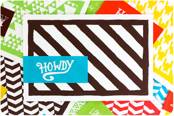
looking at hand-illustrated design today, these thank you cards by hub design are all brightly-colored patterns with hand-lettered type. they’re also letter-pressed, which makes them extra special. see the whole set on underconsideration.com.
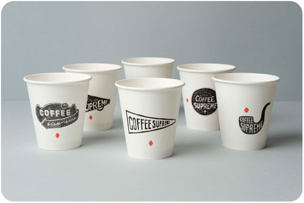
a rebrand of new zealand’s coffee supreme gave them 16 unique take-out cups in hand-illustrated style. this is the white set, but there are black and orange sets as well, all of them are super cool. see the whole set on thedieline.com.
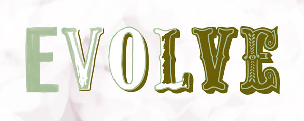
i’ve been watching my friend emily mcdowell move into more illustration and hand-lettering and it’s all so fun to look at. she does fantastic work, sells prints, and has even created a printed scarf. see it all at emilymcdowell.com
solar eclipse 2012
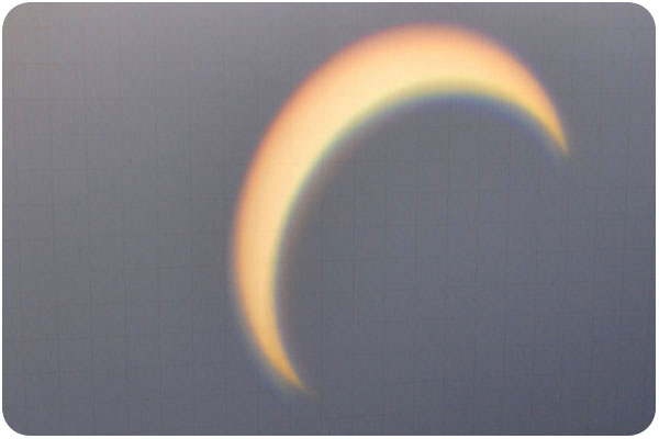
here’s my contribution from the eclipse on sunday. i don’t have any fancy equipment, but we did rig up some reversed binoculars and poster board to watch the transition. i like the color shift that’s happening here.
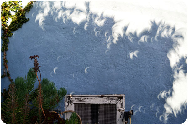
i knew we were supposed to use pinhole technology to refract the eclipse into viewable form but what i hadn’t expected was that any abstract pinholes of light would create the same shape on shady walls everywhere!
happy monday
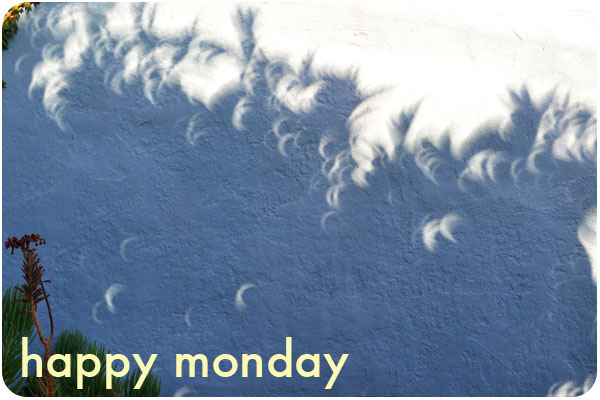
we had a lovely time watching the eclipse yesterday. LAist posted a nice gallery from photographers around LA as well as this

