AIGA Studio Tour at Metro Design Studio

Last week, I attended the AIGA National Design Conference to get a 2019 recharge on my creative outlook. It was a packed schedule of talks, symposia and meeting designers from around the country, but my favorite part was the kickoff event: a studio tour at Metro Design Studio, the creative team behind the LA transit system!

As a second generation Angeleno, my extended family has been excited to experience LA’s transition to transit with the addition of a train system since we first heard it was coming. This is not to belittle the already-great bus system, but trains really made it possible to envision a life integrating transit for everyone. The Metro LA look has been simple, accessible and colorful to help expand ridership beyond only those who depend on it. We’re in an interesting time in LA now that the basic lines are operational and the new roll-outs are extensions and connections. What a great time to take a look behind the scenes and see how Metro LA will communicate to all possible riders in our huge city and get them to think about tapping in!

There is a really cool showcase room for environmental graphics and way finding where all kinds of signs are displayed together. Putting everything together like this is a great way to envision how it will be interpreted by users, make sure everything makes sense and communicates clearly. Most of the current signage in stations explains line extensions and local surroundings, but as they manage growth, information about the transition from color to letter naming systems will rotate in along with a standardization of way finding at some stations. The breadth of Metro branding is so huge, it truly does not fit in one room, but looking at everything together is how you manage the message across so many channels of communication.

When you work on a campaign with so many layers, you want to have a wall like this where samples of everything reside and walk by it a lot and let it sink in, think about how it’s working, let that one little thing annoy you about it and address it before it’s permanent. The sheer list of work to keep track of all of this is epic. This is brand design on the largest scale I have ever considered, mainly because the target market keeps the scope of it so big.

The most impressive thing about visiting this studio was how process-oriented they remain even in the face of such a huge scope and scale of work. The designers who spoke about breakout projects talked about research and had us participate in telling them what was most important to us as potential riders. There are so many back-discussions to every public decision here. I’ve worked with far smaller operations that want to put aside process with the misguided perception that they’ll be able to churn out work faster, but once process is no longer the foundation, rules break, standards deteriorate, messages are garbled and brands fall apart. And if Metro can stay on track, anyone with a target audience smaller than all of Los Angeles can do it.

This was a truly inspiring way to kick off our conference, and I’m excited to start using my Metro/AIGA tap card!

Case Study: Rebranding Descanso Gardens

Main Identity Set

It started innocently enough, with a simple request to create a set of rules around using their wordmark and design a style guide around it. Just a guiding document for internal departments and external contractors to follow for a consistent presentation of all Descanso Gardens print matter. As with many things, though, that which appears simple has many unanticipated questions and discussions ahead, so we started as we always do, with discovery!

In this case, we did a full identity audit of the past few years of print matter, sorted by type [main stationery set, organization communications, membership campaigns, fundraising efforts, field guides, event collateral, signage], mounted to boards and affixed to the walls for all decision-makers to review and discuss. There’s nothing like seeing everything you’ve put out into the world all in one place to really see what works and what doesn’t. My approach is to collect everything and prepare the boards, along with best recommendations ahead of time, then present to the group and see where the discussion goes. Separately, we did a brand audit interview worksheet for stakeholders to fill out separately, to make sure the forward look of the organization was in line with the mission and the values of their membership. This is often where the best insider advice comes out, when people have the chance to speak anonymously.

Much of their core identity was very strong, it just needed a bit of refinement and standardization. Descanso Gardens’ main mission is to steward the land left by the Boddy estate, which includes in greatest number an impressive collection of camellias and native oak trees. We revised the leaf cluster used previously to reflect those of coast live oaks, and gave them a simple boxed wordmark in their signature green that keeps visual continuity with their previous setup. For social media, everything is further simplified, but the 3 elements are all there.

DG_ID_logos

Expanding to the full identity set, we have a standard logo setup, address lockup, leaf cluster placements for bleeds and non-bleeds alike. Descanso previously used an extended color palette reflective of the 4 seasons, which we modestly updated and applied to the business cards, specialty communications and membership campaigns.

Finally, the set was complete, and guidelines could be compiled into a style guide. We’ve covered everything from the basics of logo usage and type styles to organizational messaging and positioning. For the in-house departments, we have the basics of 1-sheet and flyer layouts, and for off-site contractors we have lock-ups and callouts and color specs for all color spaces.

Style Guide

We’re really pleased with how everything turned out, and looking forward to seeing how they use it in the coming years.
+ See more of our work for Descanso Gardens here.
+ Read more case studies here.

Is it time to whip your identity into shape? A brand & identity audit can get everything on track and moving in the right direction, and it also happens to be what we do. Say hello anytime and let us know how we can help.

Article of the Week

When to Wordmark? from Print Magazine

Here’s a situation every brand designer comes up against time and again: sometimes the research and vision of a client’s future brand points to a wordmark rather than an icon, or icon & wordmark lockup as a logo. Such was the case in our most recent brand exploration for Descanso Gardens, but that doesn’t mean the question of an icon or other image didn’t come up.

This piece, by Sagi Haviv, is a great rundown of several strong brands that rest on a word rather than an image. I’m of the very same mind and have found myself saying these same words: Creating a symbol can be a great design exercise, but we try to be very disciplined about only developing a symbol when there is a compelling strategic reason to do so. Indeed!

Enjoy.

Case Study: Chevalier’s Books Brand & Identity

CB_header_764
I’m excited to be a part of revitalizing a neighborhood bookstore in their 75th year of operation! Chevalier’s Books is a mainstay of Larchmont Village and beloved by the locals, though they’ve been struggling in the age of Amazon and changing times. Enter new owners and dedicated bibliophiles Darryl Holter and Bert Deixler with great plans, energy and funds, to give Chevalier’s just what it needs to come back in a big way.

CB_print-matter

Our main goals with redesigning this store brand was to appeal to everyone who loves books, bookstores, and keeping LA history alive, and give them a comfortable space to shop, meet, and convene for readings and events. The space is inviting and comfortable, with a great selection and an expert staff. We gave them a very literary wordmark, with a sign-off that reiterates their founding year, which is easily versatile enough to adapt for their 75th anniversary. To follow it out, we have matching business cards, gift bookmarks, merchandise bags, and an economically friendly canvas bag.

CB_canvas-bag

For the web site, we wanted to give them all the blogging and writing capabilities they’d need to promote readings, signings, intimate concerts, book club meetings, and membership, bringing some of the store experience online. The wordpress platform is simple enough for employees to update and integrate with social media, and the look packs all the information they need into a very clean, streamlined layout.

cb-site-about

In the first few months after re-opening, Chevalier’s was reporting record sales numbers in the holiday season. I’m excited to see where they take things in the coming years. In the meantime, check them out online!

+ See the full project here.
+ Read more case studies here.

You don’t need to be a new business to need a new brand & identity. Most of our clients are looking for a refresh & recharge approach, integrating previous efforts seamlessly into an elevated look going forward. If this sounds like just what you need, let’s talk!

creative inspiration: expand your brand touchpoints

i’ve been looking at some beautiful brand systems lately and i’m really itching to create one with all kinds of tools, gifts and clever industry aids. we fetishize these lovely spreads, but they don’t have to be designed from the ground up. if it’s time for a brand refresh, revising a list of touchpoints and applying a theme in-line with your mission is a great next project. we’ve written about how to brainstorm and build a list of brand touchpoints before, but i thought i’d post some selections that i think really carry a strong theme, and have potential for great add-ons.


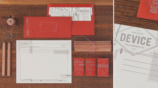
device stationery

image: designworklife.com

a simple example to start with, device creative collaborative’s stationery set. aside from a really bold design, this set is also rather interactive, with some nice surprises like a printed envelope liner for recipients of mailed items. they also have a designed worksheet with a custom punch, which looks like it might use some nice industrial binder. some of these items are clearly props, but it’s a starter set for so much more! we see everything together here, but in the client experience, they might get a business card upon first meeting, a nice mailer follow-up, project notes on the custom worksheets, and custom invoices in these awesome envelopes. see the full set at designworklife.com.


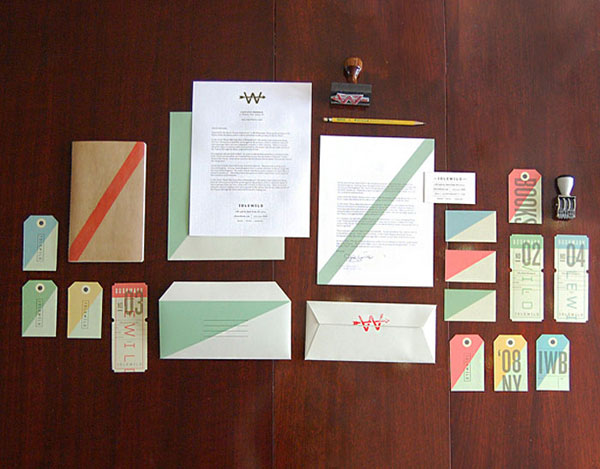
idlewild books

image: thedieline.com

this spread for idlewild books is a great rendition of library and vintage office ephemera with a travel twist. the stationery is full of surprises with color blocks on the back of the first sheet, a stripe down the 2nd sheet, and a converted envelope which allows for a topographic texture inside. little add-ons of date and logo stamps give the materials a handled and worn look. custom bookmarks and tickets with inspirational quotes about travel are a great connection point. see more at thedieline.com.


litchy guitars

image: designworklife.com

a classy collection for litchy guitars in cream with brown, craft paper and wood themes is a great example of style and simplicity. they have a few working logos that are used sparsely, and they’ve created all paperwork associated with sales in the same style. there are many tools in the music trade where these materials could expand into gifts or utility sets. similarly, they could create ink or emboss stamps for customizing secondary subsequent materials.


so, how do you get started? think about the tools of your own trade. can you make something useful that tells the story of what you do? think about the people in your target markets, can you make something that bridges what you do to what they do?

if you’ve been thinking about expanding your brand and you’re ready to take the plunge, let’s talk about the possibilities!

AIGA blueprint: freelance

aiga blueprint: freelance
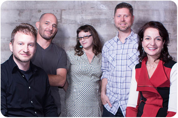
jason adam, mark leroy, heather parlato, spencer cross & petrula vrontikis. photo by paul dimalanta for aiga

last week, i had a blast participating on the aiga los angeles discussion panel blueprint: freelance! i was in excellent company, in concert with mark leroy of silver echo, spencer cross of tokyofarm, and petrula vrontikis of vrontikis design office, moderated by jason adam of hexanine.

i considered the many freelance debates and debacles i’ve been through in preparation, but it seemed once we got going, we really could have talked for hours. one great thing about running your own business is that you can always learn from 3 other people if you sit down and talk about it. everyone has a different experience or has learned some specific twist that can help ratchet the industry ever closer to best & ideal practices. jason kept us from picking apart the details of every point by moving the discussion along.

we talked about a great many things, and all kinds of questions rolled in. aside from saving your money, increasing your moonlighting till you can’t stand it and attempting to take your employer as a client, i think the most general statement about the great unknown can be summed up by these 3 steps of transitioning to freelance:

1. know yourself first. you will have to search yourself for your personal philosophy about how you want to run your business. you’ll draw on past experiences, books and articles you’ve read, inspiration from mentors, and you’ll have a pretty good idea of how you want things to go. you’ll decide on your market positioning and your mission statement, and you’ll brand accordingly.

2. get prepared. knowing yourself is a good start, but you’ll want to check with industry references and standards. find out the main styles of business and see where you fall. learn about book keeping, accounting, tax qualifications, project management, legal specifics that pertain to design and intellectual property. learn all this stuff you don’t know!

3. learn on the job. the first two steps only describe the situations you can imagine—but the business world is all ready to throw you a bunch of curve balls you haven’t considered. there will be intricacies you haven’t prepared for, questionable situations that don’t point to a clear answer [or maybe they do and you’re just mired in it enough you can’t see it yet], interactions that make you question a policy or contract line. and so be it. you will learn what you didn’t know, you’ll consult your network, you’ll make a valuable mistake that informs your future, you will grow, and you will keep on truckin!

blueprint-4panelists
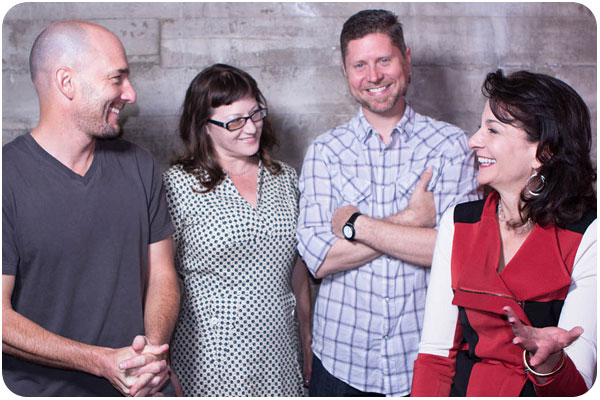
if we look happy, it’s because none of us have bosses! thanks so much to paul dimalanta for the great photos.

with that said, if you have a specific question about something, email me!. in the meantime, here’s a recap of the resources we all talked about:

jason’s recap:
on the hexanine blog!

mark’s resources:
win without pitching manifesto
the brand gap by marty neumeier

petrula’s resources:
lynda.com class running a design business: freelancing

spencer’s resources:
AIGA professional practices in graphic design by tad crawford
design is a job by mike montiero
the education of a design entrepreneur by steven heller
graphic artists guild handbook: pricing and ethical guildelines
talent is not enough: business secrets for designers by shel perkins
california lawyers for the arts
join the spencer-founded kernspiracy list: kernspiracy.com

my additions:
creative freelancer conference, blog & events!
the designer’s guide to marketing & pricing by ilise benun & peleg top [check their blog too]
freelanceswitch.com blog
smashing magazine’s legal guide for designers, check their blog too!
jessica hische’s thoughts on getting freelance work and the dark art of pricing once you have it.

and a couple of my own interviews:
freelancing 101, 102 and 103
creative freelancer blog’s interview with heather parlato on freelancing

how to choose the right designer for your business

in an effort help more people understand how to get the most out of design services, i offer these helpful primers to demystify the process of hiring a graphic designer and getting prepared for your next project. if you find yourself here with a head full of questions, 2 other pieces to read are how to prepare a for a design project which will give you the tools to narrow your design objectives into a creative brief, and process & design project timeline which is a rough outline of all the phases of production i use with my clients.

follow these steps to find the right designer for your business

it’s a bit of a toss-up between whether style or industry is the more important place to start. obviously, some businesses will be more concerned with insider sensitivity, while others will want a designer whose style clicks with their creative direction. in my opinion, both of these factors should be weighted equally, and let some of the subsequent factors help tip the scales in your top choices:

industry focus

if you’re in a niche that has a lot of specifics attached to it, or want someone who understands the history of your industry so they can help consult on key ways to differentiate you from your competition, look into creative professionals that specialize in your slice of the market. i am a strong proponent of getting referrals, either from colleagues or trade organizations, where you can search on specifics and see linked portfolios of work samples. you can also do research on who your competitors are hiring by looking at their web sites for a design credit and following that link to the firm’s portfolio. to get a feel for the breadth of options, add “design” to any of the keywords for your industry and see who’s doing what all around the world. once you get a sense of who is doing it well, you’ll be ready to look for…

individual style

every designer worth his or her salt will have an individual style that is evident in their work. whether you search online, get referrals from colleagues, or go to a trade association, go straight to the portfolio and look at all their work. do the pieces in their portfolios show clever design solutions that work well in your opinion? if their work resonates with you, can you also see your clients & target market receiving it positively as well? the key here is that you are hiring a visual translator. every designer sees a unique “best avenue” for translating your message, so the major consideration in individual style is to see what this particular designer has done with the information in each piece to appeal effectively to the viewer.

customer service & transparency

once you’ve narrowed it down to excellent talent and experience, take some time to notice how each firm’s site introduces themselves, how much information do they put forward about how they work and what they value? how much of a sense do you get about what they’d be like to work with? it’s smart to be a bit wary of any firm that seems vague about what you’ll be getting. the best of us realize that you have your own businesses to run and perhaps aren’t familiar with the design process or don’t know what to expect or how to get started, and we do our best to anticipate your questions and answer them. it’s the beginning of a relationship and we’re all looking for compatibility. if you’re feeling good about a designer’s approach, take the next step and…

ask questions!

we are service providers, and the best we can do is educate people whenever they are curious. designers that follow best practices will be able to provide you with a clear explanation of what you can expect from working with them. if you have the parameters of your project outlined, [use this system to prepare a creative brief] you can ask for a project proposal, which will give you a good idea of the costs involved as well as the production timeline.

plan ahead

or rather, plan ahead to plan ahead. we do understand that sometimes you’re looking for a designer because of a looming rush deadline, but in ideal circumstances, you won’t want to make these decisions in a day. you’ll also run the risk of not getting a slot with your designer of choice, because they’ll already be booked out. the best marketing efforts take careful planning and projection far before they are put into action. if you’re in business, you’ll eventually need marketing materials, so look for someone you want to work with early on—long before you’re ready to start a project. this will give you a chance to meet them, see their work, have lunch, meet up at a mixer, read their blog, and google their online presence so you get to know them and how they work for the most critical ingredient in the mix: peace of mind that you’re working with someone who is right for you.

if you think that person might be me, let’s talk!

how to prepare for your next design project

when you’re not in the business of graphic design, it can be hard to know the best order of operations in getting a project started. what i often end up doing for clients who need a little strategy clarification is summed up in this article so anyone can follow it, consider all the preliminary factors, and end up with a great starting point to bring to any project initiation. while it’s not a final blueprint, having these questions answered before you start makes it easy for both parties to deliver on the same goal.

use these guidelines to prepare your next project and write a general creative brief

define the goal of communication for the project

before you decide on the format of the communication, it’s good to think about the general messaging going into it. what are you trying to tell your market? in the best-case scenario, what do you want them to do in reaction to this piece? a good place to start is to write out a company description and include any mission statement or boilerplate for reference, then indicate what the immediate goal is and how this project will work toward it.

define the audience

this is where you define all the types of people the project should speak to, and describe for your designer their typical lifestyle choices, interests, and availability to similar services. the purpose of this information is to inform your designer on how to communicate with your audience while differentiating you from your competition. if you can, provide sample profiles of typical individuals who would use your products or services. some questions to answer here are: what should the target market think, feel or do in reaction to this piece?

keep consistent with your brand objectives

if you have a brand brief or style guide in place, you will want to use it as a guideline for every project so as to stay on message. if not, the first step is to collect as much of your previous collateral as possible and bring it to your designer for reference. whether you are sticking with an ongoing messaging plan or trying to break from the past, the over-arching narrative of your business should inform all your marketing efforts. submitting these materials to your designer will allow them to work within the context you’ve created, or create context for you if need be.

define your budget

budgeting for a project can be tricky when you’re working with an industry with as wide a fee range as graphic design. there are all levels of firms out there, and as with anything, you generally get what you pay for if price point is your first concern. be realistic about what the value of the project is to you, and what you expect it to do for you. do research with the design firms you’re interested in and ask for a range of what similar projects have cost in the past. be honest about what you can afford, and be open to advice on what can be done within your budget, or perhaps what can be done if you put the project off for now and save a bit more for a bigger impact down the road. an experienced designer will be able to scale a project to fit your budget, so you may not get all the bells and whistles you originally dreamed of, but you can get the materials you need from the designer you want to work with, at a price you can afford.

define your deliverables

some clients have logos, taglines, photography, illustrations, charts & graphs or copy that will be used in creating the final piece, and some will be looking to have any applicable elements created specifically for the project. if you have a set of non-negotiables, make your designer aware of them from the beginning. bring any style guide you have in place that specifies how these materials are to be used, if applicable.

define success

similar to defining your goals, you’ll want to put together some measurable success markers so you can track what your marketing efforts are doing for you. be realistic here, every piece is not going to convert to new business, but if you have a percentage return of new interest in mind, desire noticeable positive feedback from existing clients, or if you would like to break ground in a specific way with a new market, these are things to list from the outset and track as your efforts are put into action.

the designer you choose to work with will ask many more detailed questions to draft a creative brief that will address the your project-specific goal. in the meantime, clarifying these thoughts will allow you to communicate your needs more clearly, and will take a lot of the guesswork out of the discovery interview. if you’re not currently working with a designer and need some help in choosing one, some good starting advice can be found in how to choose the right designer.

if you’ve got everything ready to go, let’s get started!

friday fun: branding links

a round-up of branding links

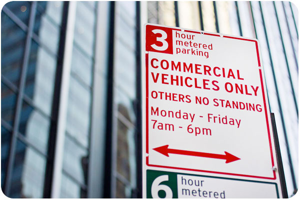
if you’re looking at that parking sign and thinking it looks a lot friendlier than any you’ve seen recently, it’s probably because it’s a typographic breath of fresh air. pentagram has been asked to help redesign new york city department of transportation signage, and i like the samples that have been released. see more of the collection here.

as a tea drinker, i noticed the new tazo packaging in my market’s tea section as soon as it was stocked. i always thought the designers who did tazo did a nice job with it, even though the type styles ended up looking dated [mostly due to overuse of typefaces like émigré’s mason in the 90s]. thedieline.com gets the whole scoop here. i think it’s a refreshing look with just enough historic reference.

two different blogs take a look at what happens to some global american brands when they go overseas. one gets nicer while another gets a lot cooler:
mcdonald’s new global packaging
7-11 goes to sweden

more in-depths on brand strategy

“farm-to-fork” drives consumer packaging
5 classic strategies for growing your brand equity
boost your freelance brand 100 percent with your expert status
helicopter branding: why it’s bad and how to avoid it