Case Study: Character Projects

CP_cards_mess

I recently had the pleasure of working with my very talented friend, Jonathan Silberman, in helping him launch his latest venture, Character Projects, a vintage lighting and hardware store, period home design services, and real estate specializing in historic homes around northeast LA. This project was very close to my heart, as it took place during our very own search for an arts & crafts-era fixer under Jonathan’s excellent advice and guidance. Talk about getting to know a client’s business! Having first-hand experience allows me to say, without reservation, Jonathan is my top recommendation in all aspects of home restoration with a sensitivity to period accuracy.

Branding for a service business can be tricky, especially one where the customer stewardship will become the most memorable experience for clients. Lucky for the visuals here, Jonathan pairs service with meticulously restored pieces that speak for themselves. At first we created a wordmark that was much more demonstrative of vintage style, but ultimately we decided to back off and go clean and timeless, allowing the products to do the talking.

Cards & Tags
Cards & Tags

Since Jonathan has such rich imagery to show, we went with moo cards, so he could have as many alternate photos as he wants, adding new sets as needed. This business started as an online store, but grew into a physical studio within a few months. Jonathan picked out some nice tags for pricing and product info, and we worked up some stamps he could use in marking these and other materials, such as tissue, stickers and shipping packages.

We gave him a site that allows for changing content on the home page, while putting a spotlight on each of his services on separate pages. His store links directly to Etsy, where he enjoys the overlap of social shopping with targeted demographics there, so all he has to maintain is changing content, which is easy and intuitive on the WordPress platform. Once his site was up, he was all ready to start promoting the opening of his store in Highland Park.

Character Projects is off to a great start, with a small but effective package of identity materials to help Jonathan grow his business. Visit Character Projects online and dare yourself not to consider remodeling your home.

+ See the full project here.
+ Read more case studies here.

If you’re just starting a new business, you’ve got a clean slate to take it in any direction. A starter branding package can get any new venture off the ground, targeting the right materials for promotion without anything you don’t need. Say hello anytime and let us know how we can help.

Article of the Week

The Danger of Assuming What Your Client Wants, by Allison Stadd for Behance

The title of this article seems so simplistic I almost didn’t read it, but I’m so glad I did, because it’s all about the importance of the discovery process. As a longtime snowboarder, I appreciated the case study of Burton [a snowboard equipment company] refocusing as the go-to brand for women, and the follies along the way to success. The difference between brand appeal from men to women was particularly interesting.

Starting projects and engagements with discovery is how we get to the heart of these issues and the people we’re communicating with. This article provides a great look at how discovery plays a role in a successful connection with a new market. Take a look!

Case Study: Rebranding Descanso Gardens

Main Identity Set

It started innocently enough, with a simple request to create a set of rules around using their wordmark and design a style guide around it. Just a guiding document for internal departments and external contractors to follow for a consistent presentation of all Descanso Gardens print matter. As with many things, though, that which appears simple has many unanticipated questions and discussions ahead, so we started as we always do, with discovery!

In this case, we did a full identity audit of the past few years of print matter, sorted by type [main stationery set, organization communications, membership campaigns, fundraising efforts, field guides, event collateral, signage], mounted to boards and affixed to the walls for all decision-makers to review and discuss. There’s nothing like seeing everything you’ve put out into the world all in one place to really see what works and what doesn’t. My approach is to collect everything and prepare the boards, along with best recommendations ahead of time, then present to the group and see where the discussion goes. Separately, we did a brand audit interview worksheet for stakeholders to fill out separately, to make sure the forward look of the organization was in line with the mission and the values of their membership. This is often where the best insider advice comes out, when people have the chance to speak anonymously.

Much of their core identity was very strong, it just needed a bit of refinement and standardization. Descanso Gardens’ main mission is to steward the land left by the Boddy estate, which includes in greatest number an impressive collection of camellias and native oak trees. We revised the leaf cluster used previously to reflect those of coast live oaks, and gave them a simple boxed wordmark in their signature green that keeps visual continuity with their previous setup. For social media, everything is further simplified, but the 3 elements are all there.

DG_ID_logos

Expanding to the full identity set, we have a standard logo setup, address lockup, leaf cluster placements for bleeds and non-bleeds alike. Descanso previously used an extended color palette reflective of the 4 seasons, which we modestly updated and applied to the business cards, specialty communications and membership campaigns.

Finally, the set was complete, and guidelines could be compiled into a style guide. We’ve covered everything from the basics of logo usage and type styles to organizational messaging and positioning. For the in-house departments, we have the basics of 1-sheet and flyer layouts, and for off-site contractors we have lock-ups and callouts and color specs for all color spaces.

Style Guide

We’re really pleased with how everything turned out, and looking forward to seeing how they use it in the coming years.
+ See more of our work for Descanso Gardens here.
+ Read more case studies here.

Is it time to whip your identity into shape? A brand & identity audit can get everything on track and moving in the right direction, and it also happens to be what we do. Say hello anytime and let us know how we can help.

how to choose the right designer for your business

in an effort help more people understand how to get the most out of design services, i offer these helpful primers to demystify the process of hiring a graphic designer and getting prepared for your next project. if you find yourself here with a head full of questions, 2 other pieces to read are how to prepare a for a design project which will give you the tools to narrow your design objectives into a creative brief, and process & design project timeline which is a rough outline of all the phases of production i use with my clients.

follow these steps to find the right designer for your business

it’s a bit of a toss-up between whether style or industry is the more important place to start. obviously, some businesses will be more concerned with insider sensitivity, while others will want a designer whose style clicks with their creative direction. in my opinion, both of these factors should be weighted equally, and let some of the subsequent factors help tip the scales in your top choices:

industry focus

if you’re in a niche that has a lot of specifics attached to it, or want someone who understands the history of your industry so they can help consult on key ways to differentiate you from your competition, look into creative professionals that specialize in your slice of the market. i am a strong proponent of getting referrals, either from colleagues or trade organizations, where you can search on specifics and see linked portfolios of work samples. you can also do research on who your competitors are hiring by looking at their web sites for a design credit and following that link to the firm’s portfolio. to get a feel for the breadth of options, add “design” to any of the keywords for your industry and see who’s doing what all around the world. once you get a sense of who is doing it well, you’ll be ready to look for…

individual style

every designer worth his or her salt will have an individual style that is evident in their work. whether you search online, get referrals from colleagues, or go to a trade association, go straight to the portfolio and look at all their work. do the pieces in their portfolios show clever design solutions that work well in your opinion? if their work resonates with you, can you also see your clients & target market receiving it positively as well? the key here is that you are hiring a visual translator. every designer sees a unique “best avenue” for translating your message, so the major consideration in individual style is to see what this particular designer has done with the information in each piece to appeal effectively to the viewer.

customer service & transparency

once you’ve narrowed it down to excellent talent and experience, take some time to notice how each firm’s site introduces themselves, how much information do they put forward about how they work and what they value? how much of a sense do you get about what they’d be like to work with? it’s smart to be a bit wary of any firm that seems vague about what you’ll be getting. the best of us realize that you have your own businesses to run and perhaps aren’t familiar with the design process or don’t know what to expect or how to get started, and we do our best to anticipate your questions and answer them. it’s the beginning of a relationship and we’re all looking for compatibility. if you’re feeling good about a designer’s approach, take the next step and…

ask questions!

we are service providers, and the best we can do is educate people whenever they are curious. designers that follow best practices will be able to provide you with a clear explanation of what you can expect from working with them. if you have the parameters of your project outlined, [use this system to prepare a creative brief] you can ask for a project proposal, which will give you a good idea of the costs involved as well as the production timeline.

plan ahead

or rather, plan ahead to plan ahead. we do understand that sometimes you’re looking for a designer because of a looming rush deadline, but in ideal circumstances, you won’t want to make these decisions in a day. you’ll also run the risk of not getting a slot with your designer of choice, because they’ll already be booked out. the best marketing efforts take careful planning and projection far before they are put into action. if you’re in business, you’ll eventually need marketing materials, so look for someone you want to work with early on—long before you’re ready to start a project. this will give you a chance to meet them, see their work, have lunch, meet up at a mixer, read their blog, and google their online presence so you get to know them and how they work for the most critical ingredient in the mix: peace of mind that you’re working with someone who is right for you.

if you think that person might be me, let’s talk!

how to prepare for your next design project

when you’re not in the business of graphic design, it can be hard to know the best order of operations in getting a project started. what i often end up doing for clients who need a little strategy clarification is summed up in this article so anyone can follow it, consider all the preliminary factors, and end up with a great starting point to bring to any project initiation. while it’s not a final blueprint, having these questions answered before you start makes it easy for both parties to deliver on the same goal.

use these guidelines to prepare your next project and write a general creative brief

define the goal of communication for the project

before you decide on the format of the communication, it’s good to think about the general messaging going into it. what are you trying to tell your market? in the best-case scenario, what do you want them to do in reaction to this piece? a good place to start is to write out a company description and include any mission statement or boilerplate for reference, then indicate what the immediate goal is and how this project will work toward it.

define the audience

this is where you define all the types of people the project should speak to, and describe for your designer their typical lifestyle choices, interests, and availability to similar services. the purpose of this information is to inform your designer on how to communicate with your audience while differentiating you from your competition. if you can, provide sample profiles of typical individuals who would use your products or services. some questions to answer here are: what should the target market think, feel or do in reaction to this piece?

keep consistent with your brand objectives

if you have a brand brief or style guide in place, you will want to use it as a guideline for every project so as to stay on message. if not, the first step is to collect as much of your previous collateral as possible and bring it to your designer for reference. whether you are sticking with an ongoing messaging plan or trying to break from the past, the over-arching narrative of your business should inform all your marketing efforts. submitting these materials to your designer will allow them to work within the context you’ve created, or create context for you if need be.

define your budget

budgeting for a project can be tricky when you’re working with an industry with as wide a fee range as graphic design. there are all levels of firms out there, and as with anything, you generally get what you pay for if price point is your first concern. be realistic about what the value of the project is to you, and what you expect it to do for you. do research with the design firms you’re interested in and ask for a range of what similar projects have cost in the past. be honest about what you can afford, and be open to advice on what can be done within your budget, or perhaps what can be done if you put the project off for now and save a bit more for a bigger impact down the road. an experienced designer will be able to scale a project to fit your budget, so you may not get all the bells and whistles you originally dreamed of, but you can get the materials you need from the designer you want to work with, at a price you can afford.

define your deliverables

some clients have logos, taglines, photography, illustrations, charts & graphs or copy that will be used in creating the final piece, and some will be looking to have any applicable elements created specifically for the project. if you have a set of non-negotiables, make your designer aware of them from the beginning. bring any style guide you have in place that specifies how these materials are to be used, if applicable.

define success

similar to defining your goals, you’ll want to put together some measurable success markers so you can track what your marketing efforts are doing for you. be realistic here, every piece is not going to convert to new business, but if you have a percentage return of new interest in mind, desire noticeable positive feedback from existing clients, or if you would like to break ground in a specific way with a new market, these are things to list from the outset and track as your efforts are put into action.

the designer you choose to work with will ask many more detailed questions to draft a creative brief that will address the your project-specific goal. in the meantime, clarifying these thoughts will allow you to communicate your needs more clearly, and will take a lot of the guesswork out of the discovery interview. if you’re not currently working with a designer and need some help in choosing one, some good starting advice can be found in how to choose the right designer.

if you’ve got everything ready to go, let’s get started!

recent work: skift

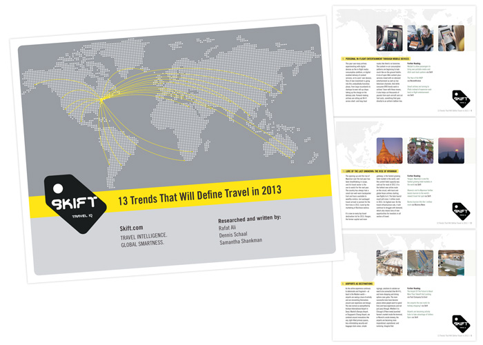
skift.com 13 trends that will define travel in 2013

It’s been exciting to watch Rafat Ali launch his latest startup, skift.com, a news source on the business of the travel industry, reporting on everything from airline mergers to niche travel apps. For their 1-year anniversary, we created this interactive trend report for distribution at the outset of 2013, a collection of articles with full click-throughs to citations and resources. They reported very positive feedback, and I’m very happy with how it turned out. Interested in what these 13 trends might be? download a copy here.

Interactive pdfs are a great alternate tactic to direct traffic or email marketing, since you get the chance to reorganize information in a different way than you might have it online, creating new value for the reader. Also, there are those who prefer to read a 15-page report over sorting relevant items in a blog, though now with the information arranged as a trend report, these same readers are far more likely to visit your site through the relevant links provided. With InDesign, these documents offer total design flexibility and look far better than something whipped up in word, or [gasp] a presentation deck standing in for its presenter.

see more of our recent work here.

case study: re-imagining natural curiosities

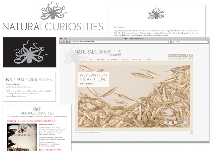
natural curiosities identity package

For the past 7 months, I’ve been hard at work with Natural Curiosities, a collective of artists and artisans working under the creative direction of Christopher Wilcox in a beautiful studio in the Jensen Recreation Center, here in Echo Park. They have evolved from roots in archival giclée printing and silk screen to application and specimen art, gold & silver leafing, aging and paper treating, and hand watercoloring. They have a specific aesthetic celebrating a time when both scientists and artists were constantly observing and cataloging nature, and they’ve brought this around from archives of illustrations to three-dimensional recreations and objet d’art. With all these new developments afoot, it was time to do a little identity refresh, and refocus the web site on communicating all the exciting news in more of a real-time way.

brand exploration

Starting with research, we did a full company-wide brand exploration. You never know what you might find when you interview everyone in a company, but it was exciting to see how passionate everyone was about their work and the family environment in the art house. They all offered great ideas and perspectives that we incorporated into a report, and further refined into a brand brief to guide the project. Natural Curiosities had already developed a lovely logo and wordmark, so the job of standardizing its ratio, lockup, and uses was easy.

identifying the challenges

The main goals boiled down to 2 things: create a marketing strategy that would communicate the brand philosophy, and design a web site that would serve both the marketing strategy and the clients. as a wholesaler, the clients of natural curiosities are partners and external sales rather than consumers, though the site is used as a catalog to consumers as well, and has to serve both markets seamlessly. The previous site was very strong on products, but needed more of a bridge to the promotional engine and client relations. Research told us that people really love interfacing with the staff and studio, so another goal was to bring more of that experience to the surface of all communications. On the technical side, this site was built in Drupal and would stay in Drupal, but had to become far easier to update by employees.


natural curiosities home page

a dynamic, art-focused home page

One of the first challenges we faced was how to pull specific pieces out of the archive and showcase them. With a catalog as big as that which Natural Curiosities sells, even after a streamlining, we’re still faced with many collections and sub-collections, relying on the user to find them either by browsing or searching. In reworking the home page, we decided on a 5-image slide show, showing a full-screen close-up of any one piece of art that Natural Curiosities would like to feature, with each linking to the appropriate product or collection. Previews from the art house is their way of visually showcasing breaking news or exciting products, which is very easy to update on the fly.

natural curiosities art catalog

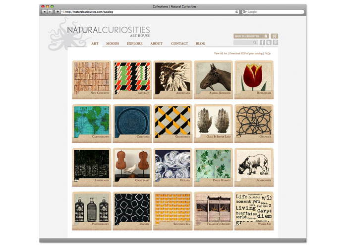
the art catalog

Our first task was to map out the art catalog, which was no small feat. Flow charts, graphics and full wall murals were involved! The general feeling was that the categories and collections were not intuitive enough, so we reworked the names, resorted the art, refreshed the overall collection [adding new pieces, retiring others] and stacked it into a grid of highly-colorful art folios to reiterate the sense of archive. This is a main landing page for regular site users, so it has become more inviting, and easier to use.

natural curiosities search & products

enhanced search and products pages

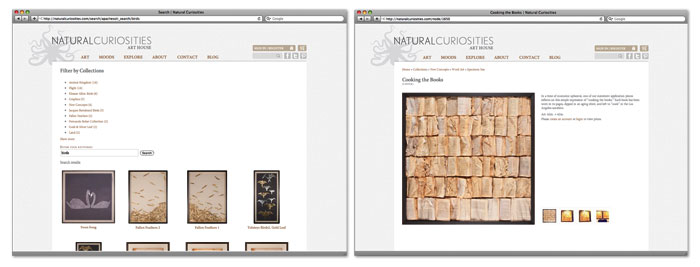
Another section ripe for opportunity was the search function, which wasn’t returning as many results as it could, and showed the results more like data records than art. We installed a module that would perform a wider search, give the user options to narrow the search by category, and suggest alternatives, with results coming in as large thumbnails for quick preview and selection. The product pages have been rearranged to be image first, support information second for visually-driven clients. When authorized users are logged in, pricing and buying options appear here as well.


setting the mood

setting the mood

With clients in mind, we decided to add a design & interior-focused section to put art in context into the spotlight. This is a more extensive slide show which offers Natural Curiosities another way to showcase products, overlay editorial and cross-link styles from inspiration shots to related collections or blog posts. It’s also the first of a few more client-partnership aspects we’re building into the site.


explore & about sections

a look inside

Giving outsiders a look inside the studio, we created a section called explore which is starting out as a video gallery of art processes used at Natural Curiosities. The about section has given more weight to the story behind the formation of the collective, how they operate now, and the influence of the place as inspiration. Also featured in the about section is a retail location search, for retail customers looking to buy, and all the FAQ, shipping, privacy policy and terms & conditions information buyers may be looking for. These sections have been given the flexibility to grow as the art house has new things to share.


notes from the art house: the blog

a new & improved blog!

As another, more dynamic opportunity for communication, we’ve introduced a new blog with a unique layout from the rest of the site, and an editorial calendar to fill it with sources of beautiful design inspiration, product showcases, video posts and news missives. The blog is going to be a pivotal point of the communication strategy, as another place to bring clients into the natural curiosities experience.

+ Read more case studies here.
+ See more of our work for Natural Curiosities.

Case Study: A Modest Makeover for Tony’s Darts Away

tony's darts away web site

We recently gave Tony’s Darts Away a little makeover online and wanted to share it with you. If you’re familiar with the All Craft, All Draught, All California bar in Burbank, you know they’ve been making a name for themselves as celebrationists of some of the finest California craft beer. Before we even got involved, LA weekly cited their site in a top 5 of LA restaurants others could learn from, so we wanted to keep it as accessible and informative as it’s always been, with more muscle on the back end and make it more easily expandable as their web presence grows. Their contact info & hours are built into every page, their site pages have been sorted into simple main categories, and we’re porting tweets into a sidebar so they can announce events and late keg tappings after opening.

tony's darts away, interactive beer list

Similar to what we did for Mohawk Bend, we gave Tony’s Darts Away an interactive beer list to make browsing, searching and sorting easy. On the back end, this list is easy for employees to manage and update, so the menu stays updated all the time.

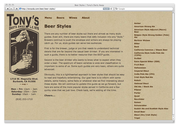
tony's darts away, beer styles library

Something unique that has garnered this site some attention is the beer styles library where visitors can research and read tasting notes and anecdotes on all kinds of craft beer styles they might encounter at Tony’s and beyond. Click a style in the sidebar and the text loads in the center. We also set up the brewers list the same way, so if you’re curious who’s who and what’s what, take a look!

Finally, we did some streamlining to their menu workflow, to integrate menu layouts that allow for styled updates they can print as needed and then paste right into wordpress. The main idea here is, we want to make it easy for them to get done with setup and serve us all some beer, which is exactly what will happen if you drop into Tony’s. Visit the full site: tonys.la

+ Read more case studies here.
+ See more of our work for tony’s pubs.