creative inspiration


i love these videos that animate the text being sung or spoken, but this one takes it to another level by including all the typos and having the narrator read every one of them.

sustainability

design museum young designers kit
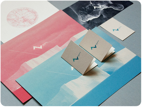
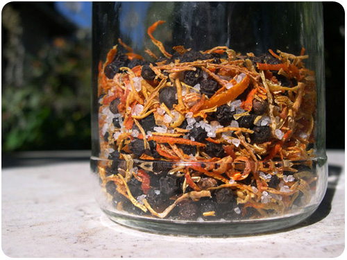
[image: thedieline.com]
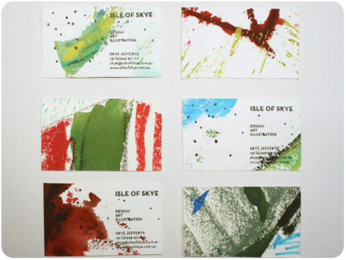
the design museum made this awesome young designers kit—but they took it further than simply inspiring young people to get into design, arming them with tools—they did it sustainably with recycled and low-impact materials. bravo! see the whole profile on the dieline.

got a minute to take the first in a multi-part series of steps in learning to go sustainable beyond ink and paper? i’m writing a piece on revisiting all the milestones in a print production process and encouraging we make more sustainable choices over on neenah’s against the grain blog. Eco-Friendly 2011: Think Forward…Then Backwards.

i’m loving this LemonAid project on good.is: a german company mixed up the perfect batch of lemon aid [to their taste, anyway], then figured out how to produce it using all fair trade resources, and then they donate a portion of their profits to fund grass-roots organizations in the countries where they source the ingredients. now that’s cooking with lemons!

one of the unexpected turnouts of the katrina disaster is that some areas are being rebuilt using much more sustainable materials, read up on utne.com: thanks katrina for greener building materials.

design industry

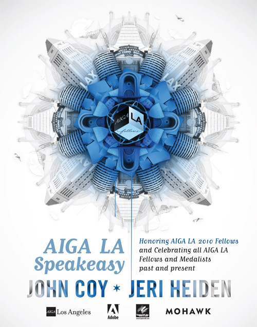
the first of the reviews are in from AIGA LA: Speakeasy, our fellows celebration for the 2010 AIGA fellows. check out michael dooley’s 2-part follow up interviewing john coy: influence and inspiration, part 1: john coy.

smashing magazine has a great round-up: time-saving tips and educational resources for web designers.

with all the talk of annual planning, i think it’s important to remember not to plan so hard you miss unexpected opportunities. justin ahrens shares his perspective on the parse blog: rain or shine: embrace the unplanned.

food

mixed citrus salt & pepper
i’m on a bender about using more of the food we buy, and this week i get on everyone’s case about wasting orange peels [among other things] over at LAist. because i’m a curmudgeon who thinks you should dry them and eat them. but look—this other girl at serious eats is also nutty for citrus seasoning with her deliciously italian lemon salt with fennel and chili!

and speaking of going grassroots on the food industry, what about an old-fashioned food swap!? i joined my friend emily’s LAX swappers group here in LA, you should too!

if you’re spending time in the garden and want to attract monarch butterflies [while helping restore their dwindling populations of late], re-nest shows you how to get your milkweed going to attract butterflies to your garden!

3 ways to kick-start 2011

3 ways to kick-start 2011 parlato design studio

so here we are, a new year is just beginning and everyone is energized to start fresh. it’s a great feeling, but before it fades and settles behind a daily grind, harness and focus your energy so you can let it help you make progress on your most important goals and stay motivated throughout they year.

take stock of where you’re at
if you did any year-end planning or creative retreating, you probably already have a road map for the year ahead. if not, it’s a great time to take a day and look back at the biggest progress you made last year, the most effective efforts, the best projects, and find ways to build on them or continue rolling them out. how did your marketing plans play out for you? were you surprised by the results of any actions you took? better yet, did you learn what worked well and what isn’t worth the effort? do you have lingering projects that stayed on the back burner, that now need attention? does your brand, messaging or site content need a little refresh to match some new directions you’re taking? it’s time to strip down to a mix of what works best for you, toss the rest in a box [you can revisit it later if you want] and refine what you’re keeping so it keeps working for you in the new year.

assess the landscape ahead
knowing yourself, your internal strengths and where to put your energy is one thing, but what’s the terrain you’re going to travel? are you continuing to work with familiar industries and clients, or are you going to develop a new niche? are you in a plateau phase of familiar territory, or in a growth phase where you’ll be learning and trying all kinds of new things? take stock of the things you can depend on, and the areas you’re less familiar with. make sure to keep investing good energy in the familiar places, grow with it and don’t take it for granted. but, what are the biggest things you want to learn about the new places you’re going? can you read up on them, can you research some good starter events to get your feet wet, can you get some initial meetings with friendly informers who are happy to help you get to where you want to be?

pick a strategic blend and plan your moves
once you have a more clear sense of what you do best, how you do it, and the lay of the land ahead, take what you know and apply it—to the calendar! start with what you know: your best and most long-standing clients. plan a mix that works for you, attend the events where you know you’ll see them, think about your own brand touchpoints and which communicate the best with your home-base. you know these people really well at this point, maybe even research how you might better serve them, or find some aspect of their businesses that is largely overlooked. if you’ve attended mixers to see them in the past, consider hosting your own and inviting them for a regular check-in outside the office. in short, make your best relationships even better.

if you’re breaking ground in a new industry or niche, start a regular schedule of research, read the industry blogs, look for events to attend, make contacts and ask questions so you can learn from the personal experience of others. research the archetypes in the industry and get to know how they communicate, what’s important to them, go where they go. eventually, with regular research and exposure, you’ll have a great idea of who might be a good fit for you as a client or what might be a best first project to get your foot in the door.

and, of course, the best way to communicate with them when you’re not actually in the same room is to make information readily available about your own services and show that you’re aligned with this new industry. if you’ve been meaning to refresh your print collateral or web site content in this way, chart it out and put it on the calendar. if you can’t afford the dream overhaul, do the realistic refresh now. as seth godin often says, plan what you can, don’t let fear of failure hold you back from shipping, and put yourself out there!

creative inspiration


not that you’ve forgotten how the economy got into a mess, but information is beautiful made a really clean animated infographic that drives the point home.

branding

antarctic voice
[image: astronautdesign.com]
truly stunning branding system created by astronaut design [the whole portfolio is well-worth a spin], described simply: Antarctic Voice is a project that aims to express the voice, the silence and the magic of the unattainable continent, Antarctica. view the complete project profile at identitydesigned.com.

check out honey & mackie’s ice cream shop packaging on thedieline.com, a great pairing of typography and silhouette!

calendars

2011 calendars
[image: re-nest.com]
i don’t use traditional calendars for date tracking so much anymore [because i’m so dependent on ical], but i still think they’re a thing of beauty and can be some great rotational art for your home. re-nest.com has a great round-up of cute 2011 calendars.

design industry

wpa posters
[image: inspiredology.com]
i love looking at these old posters that came out of WPA arts projects. inspiredology takes a look at how design and typography have helped communicate civic messages in years past.

need a job? béhance is now hosting how design’s job list!

it’s a new year, and everyone’s talking about how to start it off right. let me put down my breakfast pizza to suggest maybe we learn to give better design feedback. thanks, mule design, for bringing humorous honesty to this admittedly difficult process. here’s an excerpt in case you haven’t clicked yet: First rule of design feedback: what you’re looking at is not art. It’s not even close. It’s a business tool in the making and should be looked at objectively like any other business tool you work with. The right question is not, “Do I like it?” but “Does this meet our goals?” If it’s blue, don’t ask yourself whether you like blue. Ask yourself if blue is going to help you sell sprockets. Better yet: ask your design team. You just wrote your first feedback question. bam!

AIGA

fellows 2010 speakeasy
[image: AIGA LA]
the time has come to celebrate designers who have made outstanding contributions to the legacy of los angeles. this year, AIGA LA honors 2010 fellows john coy and jeri heiden, and invites you to meet, mix & mingle with past AIGA fellows and AIGA medalists in a truly wonderful evening january 20 at the palihouse in west hollywood. i should know, i’m producing it, and we’re planning a fantastic speakeasy event. the tickets are a steal, register today before they go up the day of the event!

los angeles

so what’s new in my hood? i’ve been wondering what to do with the preponderance of elderly towels i’ve accumulated. like, they’re not falling apart, but they’re not pretty and they don’t match. i got a nice set of matching towels, but since i’m not into wasting things, i kept the old towels too. maybe for cat baths or spills or making into rags? thanks blue collar dog supplies for solving this for me! i can give them to dogs in need! so can you!

kelly over at echoparknow.com has a great list of echo parky things to do in 2011. come to think of it, i should probably read the madonnas of echo park, and i love climbing stairs, and i am sure going to miss the lake on its 2-year hiatus.

this week for LAist: seasonal eats: bringin’ mad beets! oh yeah, i went there. it’s okay to hit the “like” button if you like it.

creative inspiration

branding

michelle obama garden branding
[image: fastcodesign.com]
lovely packaging for specialty items from michelle obama’s vegetable garden, designed by cronan give home grown handmade items a classy look.

typography

hanging wall letters for home decor
[image: iron accents]
if you’ve been looking for more ways to bring the signage you see on the street into your home, re-nest.com has a great profile on a company that can bring them to you: hanging wall letters from iron accents. cute!

packaging

the tentacle wine packaging
[image: thedielinewine.com]
here’s my favorite for wine packaging this week from thedielinewine.com, the tentacle designed by john schall.

design industry

check out part 2 of my creative co-working adventures on the creative freelancer blog!

a really informative piece from rochelle fainstein of sterling brands on how wine packaging can become more sustainable in both materials and manufacturing: message in the bottle: repackaging wine, from thedielinewine.com

beyond design

you’ve probably noticed i write about food and diy projects, and i put up a fair amount of preservation projects. an interesting piece on this growing movement is home canners wield pickles against food giants, from utne reader. my interest is first to buy fresh food with as little interference in the farmer’s profit margin as possible, and second to replace commodified convenience foods with my own preservations from scratch. i find the assertion by rachel lauden that preservation projects are “…making too many women slaves to their stovepots and canning jars…” completely absurd and sexist. it’s a lifestyle choice and an activity that is hugely rewarding. i love my stovepots and canning jars!

speaking of food, i got myself 2 bunches of dandelion greens from the market this week and went looking some delicious things you can do with them at epicurious.com. i typically stay away from salads with added sugar or bacon [though there are some good ones out there], so here are my picks: dandelion greens with hot olive oil dressing which is a way to wilt the greens without cooking them, greek country salad which you can do with any combination of the listed greens in the recipe, and the standout for me, wilted greens with garlic and anchovies. i love anchovies, this is just what i’m looking for!

creative inspiration

branding


one of a few commercials in the effort to rebrand baby carrots.

while carrots try to appeal to kids by looking more unhealthy, high fructose corn syrup attempts to win its way back onto the table with a simplified name change and ad campaign: the sticky, tricky rebranding of corn syrup as corn sugar, from good.

found objects

B&B diaries
[image: brian mcmullen, imprint]
i knew i wasn’t the only one who reads B&B diaries and museum exhibit & nature center guest books! loving this post i love bed and breakfast diaries, from imprint

design industry


is there even a category for this curiosity? a drawing machine that parses the language of stories into a string of words, cross references them with the archive of patent illustrations as provided by the US patent & trademark office, and draws them into a string of visual narrative. you might call it a perpetual storytelling apparatus: drawing machine tells the story of innovation via patent drawings, from good

another point against the print is dead battle cry: a new design publication anthology magazine.

what’s a dream come true for a designer who loves wine & wine packaging? this new blog from the dieline: the dieline wine, a blog dedicated to wine packaging design. thanks how design for the link.

beyond design

spaghetti carbonara
[image: lacucinaitlaianamagazine.com]

spaghetti carbonara is the perfect comfort food for any season. if you want to learn to make it “the right way,” look no further than my favorite italian food resource spaghetti carbonara, from la cucina italiana.

delicious, simple, healthy, and another seasonally-independent dish white bean salad (salatet fassoulia), from saveur.

i’m a fan of rick bayless’ recipes, so i was happy to see this nice round up: authentic mexican: five recipes from rick bayless, from thekitchn, all of which are seasonal for the summer-fall changeover.

looking for some natural, preventative allergy treatments? design sponge has these answers for you: small measures: diy seasonal allergy treatments.

a humorous look at language: when is it okay to use the F word, from penelope trunk, another person who often-says but seldom-writes this glorious expletive.

article of the week

what design can't do, by mine design, san francisco
[image: mine design, san francisco]

what design can’t do by christopher simmons for aiga.org

if the above graphic doesn’t drive the point home, simmons’ stance is that design can only express what comes from the top down, through a staff working toward a goal through shared vision and strategy. design isn’t going to change your product, your approach to customer service, or turn your average idea into a great one. the attempt to slap a smashing design on an average service will only temporarily distract people, if that, and when their opinions recalibrate to match reality, you’ll be out valuable time and money that could have been spent reworking your system so it’s in line with the brand you want to be. excellent read!

creative inspiration

http://vimeo.com/moogaloop.swf?clip_id=4249739&server=vimeo.com&show_title=1&show_byline=1&show_portrait=1&color=&fullscreen=1&autoplay=0&loop=0

Hi-Fi from bante on Vimeo.

branding

secca animated logo
[image: pentagram]
this brand & identity for secca by pentagram is not only stunning, it moves! read up on it here: pentagram’s luke hayman on how multimedia is transforming branding, from fastcodesign.com.

print design

lan su visitor guide
[image: sockeye creative]
this lovely print specimen by sockeye creative for the lan su chinese garden in portland is rich in details that make the experience of interacting with it really rewarding. a custom die-cut window over a stylized illustration invites you in, then the unique binding of a gate fold over stepped pages detailing the vistas makes you want to flip through and study each one. fantastic work! see more here: lan su visitor guide, from underconsideration.com.

web design

a series i found on uxbooth.com included some useful articles i wanted to share for web designers. a complete beginner’s guide to design research, overcoming the obstacles of usability testing and the complete beginner’s guide to web analytics and measurement.

creativity

bottle rainbows by johnny miller
[image: johnny miller]
amazing rainbows and color gradients created with colored glass and light, by johnny miller. thanks, oh joy for the link!

since creativity is about how you think, here are 2 articles i found interesting from around the tubes this week. seth godin talks about how we analyze our inner monologue to help define intuitive marketing: monitoring your internal monologue, and succcess.org explores the einstein quote “imagination is more important than knowledge” here: be smart, know smarts ain’t the answer.

design industry

ravi sawhney talks about his new book predictable magic here:forget praying to the muse, create design magic on demand, from fastcodesign.com

tim lapetino of hexanine talks about how to get the most out of your kickoff meeting: the art of interviewing your client, from logodesignlove.com.

a post chock-full of inspiring resources: 25 useful videos and presentations for designers, from smashingmagazine.com.

small business owners & sole-proprietors, take note: biz ladies: free online resources for business owners, from designsponge.com

creative inspiration


meg mateo ilasco and joy deangdeelert cho promote their new book, creative, inc.: the ultimate guide to running a successful freelance business, with this cute stop-motion video. thanks design sponge for the link.

branding

abu dhabi logo
[image: brand.abudhabi.ae]
the capital of the united arab emirates has decided to brand itself, with the help of m&c saatchi. i think this logo is really lovely, and i like how they’re using the mark alone to sign-off on all kinds of beautiful photos of the area. check out the full post for applications and the custom typeface they created: the abu dhabi brand rich, from underconsideration.com

identity

isle of skye business cards
[image: isle of skye]
a stunning alternative to commercially printing your business cards, illustrator skye jeffries has cut hers from illustrations and overprint her black plate with a hand stamp, for an original creation in each one. thanks to designworklife.com for the link.

photography

barker at the state fair
[image: library of congress]
this collection of color photographs from the 30s and 40s has been circulating around the internet, so if you haven’t seen them yet, take a look: captured: america in color from 1939-1943. from denverpost.com: These images, by photographers of the Farm Security Administration/Office of War Information, are some of the only color photographs taken of the effects of the Depression on America’s rural and small town populations. The photographs are the property of the Library of Congress and were included in a 2006 exhibit Bound for Glory: America in Color.

design industry

excellent advice for clients new to hiring designers: tips on buying design, from muledesign.com

here are some great thoughts on how we limit ourselves from being creative as we age further from our childhood sensibilities & wonders: the problem with creativity, from logodesignlove.com

LAUSD linked learning summer institute

LAUSD linked learnig summer institute

i’ve been working with the LA area chamber’s pillar program to link up with LA area high schools with graphic design programs, providing the perspective of a working designer for curriculum enhancement. most recently this took the form of the LAUSD linked learning summer institute with canoga park high school. several schools from LAUSD were present, and after a morning presentation, we split off into groups by school and worked on curriculum development.

the group of teachers included instructors in digital art & yearbook, drawing, printing, photography and english. they were a really great group of educators who have been working hard to improve school programs within tight budgets. i was really impressed with the curriculum they already offer. it’s so much more developed than anything my high school offered to potential designers, and while some of this is the natural evolution of education multiplied by the accessibility of the internet, some of it is old-fashioned care and attention being paid to our profession.

LAUSD linked learning summer institute

the focus of the consult was supposed to be about how i could help advise on real-world scenarios and help direct curriculum to address these things in the classroom before the students become employed. interestingly, though, we got into a discussion about the current perception of the school and how it’s not where they’d like it to be in order to attract students who want to participate in the design program. it had all the makings of a branding conversation, so i said it sounds like canoga park high needs a brand makeover! and they agreed.

we decided to start talking about it as a possible project for the design program to tackle. what i love about these teachers is that they were full of questions and had great ideas about implementation. one of them asked “if we were to conduct a rebrand project, how would you suggest we do it?” we went through having the students brainstorm on all their perceptions about the school, good, bad & ugly, and refining their thoughts to core ideas.

we talked about conducting an informal market research campaign where they could interview their parents, neighbors & local business owners on perception of the school and analyze it. we talked about developing a brief going forward and having students propose projects they’d like to do to support it [photo essays, psa poster campaigns, identity exploration, mood boards, poetry in a typography-only layout, etc.]. we talked about having kids in 3 different classes group up [a designer, an illustrator and a copywriter] to work to produce projects as creative teams. we talked about environmental and experience design—what’s it like to walk into the attendance office to get an absence slip, what about that experience is a reflection of the school? whether these things actually get redesigned or just remain projects isn’t important, but the process of identifying parts of a system and how to improve them is.

what i love about it the most, is that it serves multiple purposes. the students will be building amazing portfolios, the school will have attention to its image paid from the inside out, and the educators will have no shortage of artifact to send along with grand proposals to show the level of work they’re doing.

LAUSD linked learning summer institute

of course, it doesn’t stop there. one of the biggest challenges with a diverse group of students is relative levels of exposure to design. i’m sending over resources the educators can use to present all different types of design to the students, as well as offering to come in and talk about portfolio development and help give the students a good idea of what they’re in for with a career in design. i really hope they find a way to work up to the school rebrand project, it’s a big thing to organize, but it would turn out some really exciting work.