retro styles
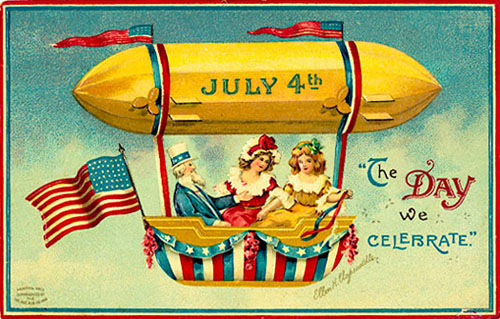
[image: from the collection of richard sheaff]
this fantastic collection of fourth of july postcards from designobserver.com includes illustrations of doll-faced children, hand-drawn type, and loads of fireworks!
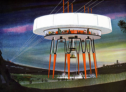
[image: US steel, grainedit.com]
i have to say, i liked the look of the future as imagined in the mid-60s. thanks to dave from grainedit.com for sharing spreads from power styling, which seems to be a collection of illustrations proposing re-imagined looks for the infrastructure of electric utility. be sure to look through all the pieces he scanned, they suggest a majesty that is glaringly absent in the power lines i see outside my window today.
logo evolution

[image: smashingmagazine.com]
we’ve come to know logos as modern signifiers in the marketplace, but the concept of a brand mark has existed a long time through history. smashing magazine offers the evolution of the logo that traces how graphic marks have been used to denote ownership, authorship and associations with different groups, only leading them to corporate identity as a result of evolution.
identity
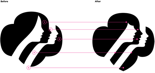
[image: fastcodesign.com]
subtle, yet classic & modernized, check out the identity makeover on fastcodesign.com: a fresh identity for the girl scouts of america. i think these new profiles look more contemporary and youthful without losing any recognition of the brand and tradition. great work!
design industry
check out redesigning propublica by mule design. We love good journalism and hate unchecked abuses of power, so we were excited and honored to collaborate with ProPublica on their website redesign. hear, hear!
another from smashing magazine: add music to your workflow to improve results. i’ve always known i liked listening to music while i work, but i didn’t realize why it was helping me work better.

Although I see the badge silouette, the GSoA logo reminds me of a hair shampoo or conditioner. The “hair” and profile looks like a women in their late 20’s or early 30’s.
How come our present never looks as cool as the way illustrators from the 1930’s or 40’s portray us?
LikeLike