Recent Work: The Rise, Only at Descanso

DG_TheRise_digital

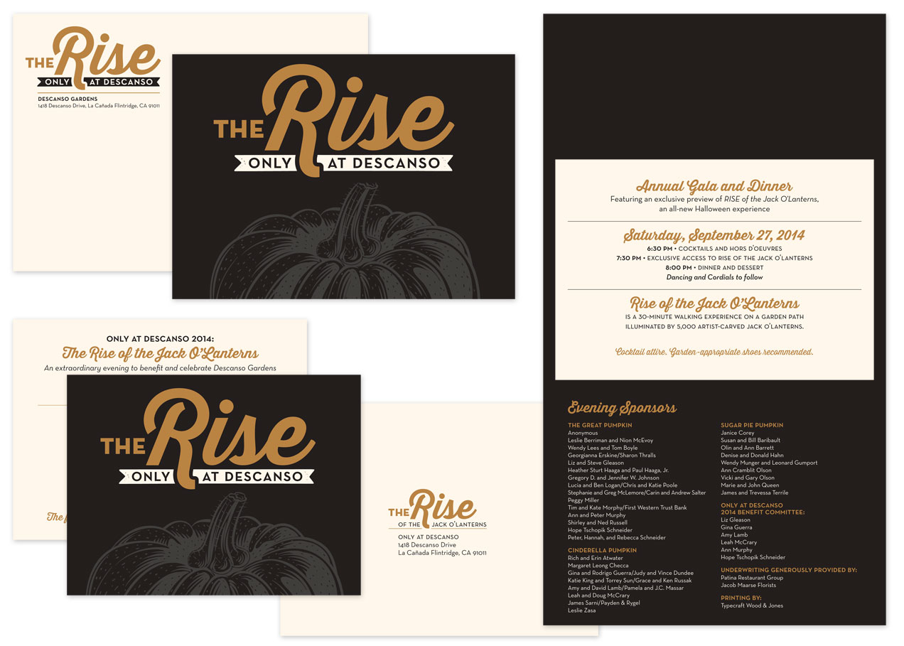
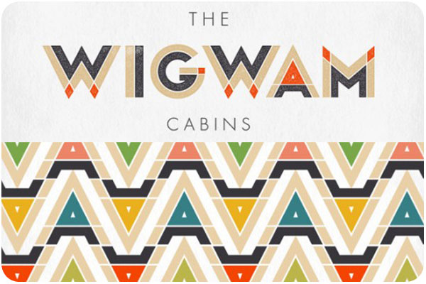
It’s been really hard not to shout about this project all year long, but now that it’s complete: these gala materials have been one of our most fun projects to date! As the only west coast host to The Rise of the Jack O’Lanterns, Descanso set their fundraising gala ahead of the public event as an evening garden wonderland among the carved pumpkin sculptures. We decided to glam it up by printing metallic copper on cream paper, adding an elegant twist to fall festivities.

CG_TheRise_ID_rev_2014

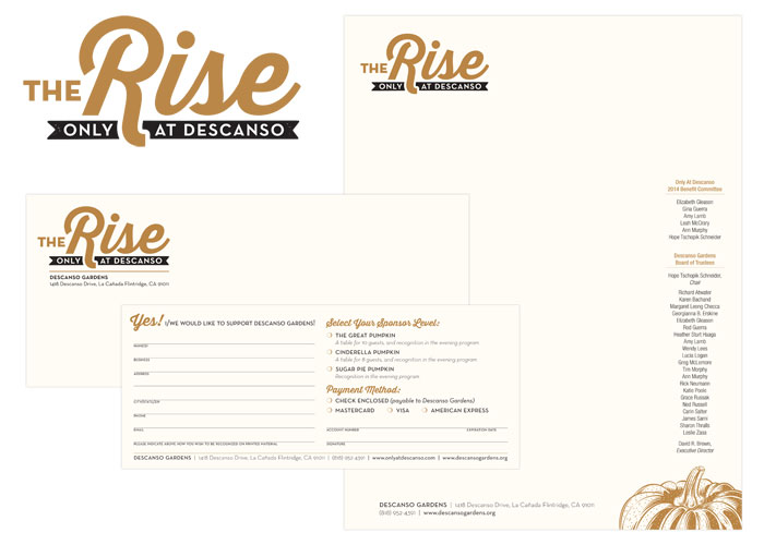
The calendar leading up to this exclusive event is a long one, so we got started more than 6 months out with an overall look & feel, and initial commitment materials in the form of an extended letterhead set. Next came a save-the date invite, and eventually the event invitation, finishing up with on-site collateral. We definitely had a budget to keep in mind, and managed to create really beautiful pieces by going 2-color and running together on similar stocks, and layering specialty papers together.

I’m really pleased with how these pieces work together, and Descanso Gardens reported that this gala garnered increased commitments and donations from the previous year.

+ See the complete project here.
+ See more of our work for Descanso Gardens here.

creative inspiration: type-driven beer labels

there’s nothing like a strong typographic treatment over a simple color palette. this week we’re looking at 3 label series that make bold statements with type and color front and center.


great divide: yeti

great divide: yeti
image: thedieline.com

great divide’s yeti series uses a standardized-yet-versatile type treatment that allows them to include the minimal graphic elements that indicates the yeti line while making room for longer titles or alternate treatments for barrel aged brews. see the whole collection at thedieline.com


private brewery: bob

private brewery: bob
image: lovelypackage.com

the bob [best of british] line from private brewery uses unconventional colors and unique brew names to draw interest and curiosity. each bottle is easily identifiable, with a nice 3-word descriptor. see more at lovelypackage.com


turkey mountain brewhaus

turkey mountain brewhaus
image: ohbeautifulbeer.com

this collection from turkey mountain brewhaus uses a series of 2-color stamp-finish designs that allow for clear and prominent logo placement and brew name, relegating the brewery name to the neck label. nice, strong presentation. see more at ohbeautifulbeer.com

creative inspiration: wine wraps

it seems like wine wraps are popping up everywhere—whether as packaging for a product, decorative wrap for personal gift-giving, or branded overlays for client gifts, wine is getting wrapped up everywhere!


waddeson wine wraps

waddeson wine wraps
image: designworklife.com

just one component of the rothschild’s wine distribution company, waddeson wine, these wraps manage to show a modern take on the map of the estate, blending historic and contemporary influences. see the whole brand package at designworklife.com.


truett-hurst wine wraps

truett-hurst wine wraps
image: psfk.com

truett-hurst takes a different approach with these buyer-themed wraps, studying reasons and seasons when buyers buy, and designing wraps in the strongest themes. the wraps add an engaging and image-heavy narrative that allows the brand to communicate in a new way with potential shoppers. see more at psfk.com.


filirea gi wine wraps

filirea gi wraps
image: thedieline.com

great for home brewers giving client gifts or short production runs, this 1-color wrap is budget-conscious while still adding a layer of interest. this piece illustrates the home winemaking process. see more at thedieline.com


design am chiemsee wine wraps

design am chiemsee wraps
image: underconsideration.com

a very nice collection of wine wrapping papers from design am chiemsee, these wraps are reversible and offer decorative surprises for the recipient. see the collection at underconsideration.com.

creative inspiration: thai-inspired branding

in my never-ending design research, i saw a few pieces of thai-inspired design that caught my attention. i say thai-inspired because these 3 products and places are far from thailand, but each are borrowing their own elements from the design landscape and making them their own with great results.


my thai

my thai cordials
image: thedieline.com

this series of brightly flavored and colored cordials are just one aspect of the branding for brazillian restaurant, my thai. the color palettes are outstanding, and a lovely contrast from the cordials inside. see more at thedieline.com.


pak pao

pak pao branding
image: underconsideration.com

dallas-based pak pao has a lovely logo & wordmark with shapes that echo each other in a uniquely satisfying way. they have done a great job of mounting clean & simple menus to painted boards with lots of orange-over-orange reverberations. see more at underconsideration.com


sway

sway branding
image: identitydesigned.com

austin-based sway is a very extensive environment brand experience right down to the last detail. starting with the wordmark, the voice of sway is bilingual from the wayfinding to the menu. the stark and clean design of both print and environment is accented with bright color in coasters, placemats and matchbooks. see the whole profile at identitydesigned.com

creative inspiration: colorful branding

angela & evan photography

image: designworklife.com

i love a vibrant brand that uses multiple color iterations, patterns and setups around one clear logo. this identity for angela & evan wedding photography centers around a striking hand-drawn logo, pairing it with fresh spring greens and yellows for wedding season, playing out into traditional photographic equipment in brand touchpoints. see the full post at designworklife.com.


wigwam cabins

image: the-design-ark.com

i’ve talked about this identity before, but how can you NOT when wigwams are involved? focusing heavily on the angular relationships of the W, A and M letterforms, they have created a thematic logo that references the shape of the cabins themselves, and then uses the extended color palette to carry the identity through, looking much like an indian woven blanket. fantastic & fun work! see more at the-design-ark.com


kröller müller

image: identitydesigned.com

the kröller müller museum offers this colorful, inviting and interactive brand, where the logo appears to be revealed through an open door in still applications, it is very literally opening in motion and environmental graphics. another identity with every color application in the rainbow, it is not only versatile in pairing several colors into every layout, but the theme of invitation and discovery of art and environment is very strong in this brand. explore further at identitydesigned.com.

redesign: inspire 2013

Inspire2013_banner

i’m hugely excited to announce that i’ll be speaking at the redesign: inspire conference this fall, october 21 – 22, 2013, at the smog shoppe in culver city!

described as equal parts conference, salon and retreat, redesign: inspire is shaping up to be a fantastic creative getaway [or staycation, if you’re local]. i’m already overwhelmed at the company i’m in honor of keeping at this event. as you’ll see the speaker lineup unfold through june and july, it’s a group of truly outstanding design thinkers and industry leaders. this year’s event symposiarch is lawrence azerrad, a fantastic designer i met at aiga’s blueprint: freelance panel discussion.

parlato_2013_150
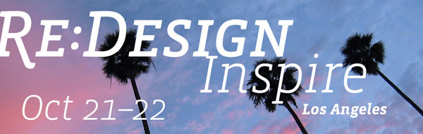
this year’s theme is cross-pollination, “drawing from sources beyond traditional design to enhance, strengthen and inspire our work.” i’ll be talking about my long and winding road in design, moving ever outward from the day-to-day bubble in order to give my work balance and clarity. i love the idea that this is a forum format, because while i have plenty to share from my own experience, i’m equally excited to hear from attendees as well. every speaker will be tackling this topic from a different angle. join us and get in on the conversation!

this conference has an early-bird registration deadline of june 30, 2013, for the best possible rate! register this week, and keep your eyes on the redesign: inspire site for new announcements.

creative inspiration: beer branding

summit brewing

image: thedieline.com

i love the simplicity and straightforward branding of summit brewing. the logo remains colorful, while it still translates easily to the 3-color packaging, using the natural paper texture really well. see more at the dieline.


lake superior

image: thedieline.com

when dealing with the constraints of beer labels, the wrap on the bottle is a given, but a straight or die cut can be your variable. so many times, the preferred choice is symmetry, but i love these angular labels, giving each brew its own color palette and type style. see more at the dieline


citizen beer

image: ohbeautifulbeer.com

a very interesting logo and use of pattern & texture by citizen beer. this branding is refreshing, clean and simple, often in 1 color. see more at oh beautiful beer.

starbucks global creative

image: thedieline.com

if you’ve ever wondered how the big brands do it, the dieline blog creator, andrew gibbs, visited starbucks global creative and got to ask them all about the daily experience of creating the starbucks brand. fascinating stuff!

read the whole story at thedieline.com.

open season on the parlato design patio

patiotime

i was escaping the early-season heat on the patio last night with a friend, when i realized that maybe it’s time i combine my love for making snacks and drinks and my love of patio sitting with friends into one thing: patio season!

here’s how it works. choose a morning coffee [10:30am] or evening happy hour [5:30pm] appointment, tuesday, wednesday or thursday. tell me when you’d like to meet and what you’d like to talk about. if it’s open, i’ll make the drinks & snacks, you come over and we chat. about design, about business, about ideas, about food stuff–whatever, up to 2 hours.

i’m interested in connecting with old friends, colleagues i don’t see often enough and meeting new people. we’ve got the shade of the loquat tree and a nice breeze. pick a slot and let’s hang!