summit brewing
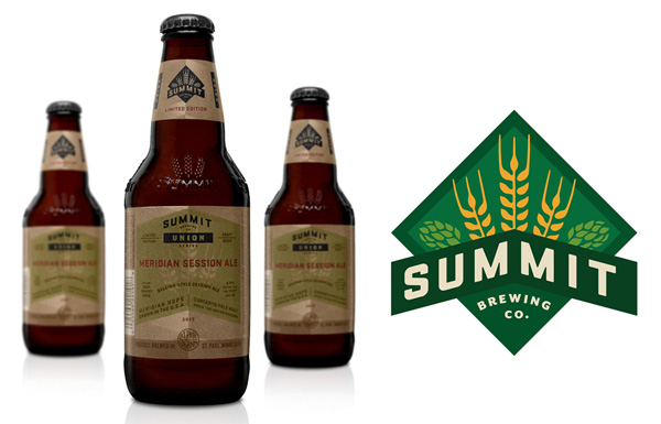
i love the simplicity and straightforward branding of summit brewing. the logo remains colorful, while it still translates easily to the 3-color packaging, using the natural paper texture really well. see more at the dieline.
lake superior
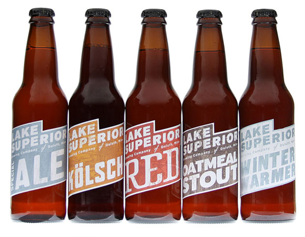
when dealing with the constraints of beer labels, the wrap on the bottle is a given, but a straight or die cut can be your variable. so many times, the preferred choice is symmetry, but i love these angular labels, giving each brew its own color palette and type style. see more at the dieline
citizen beer
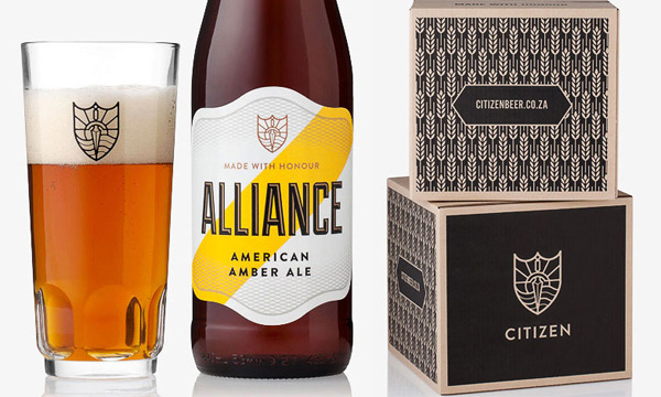
a very interesting logo and use of pattern & texture by citizen beer. this branding is refreshing, clean and simple, often in 1 color. see more at oh beautiful beer.
