Article of the Week

The Danger of Assuming What Your Client Wants, by Allison Stadd for Behance

The title of this article seems so simplistic I almost didn’t read it, but I’m so glad I did, because it’s all about the importance of the discovery process. As a longtime snowboarder, I appreciated the case study of Burton [a snowboard equipment company] refocusing as the go-to brand for women, and the follies along the way to success. The difference between brand appeal from men to women was particularly interesting.

Starting projects and engagements with discovery is how we get to the heart of these issues and the people we’re communicating with. This article provides a great look at how discovery plays a role in a successful connection with a new market. Take a look!

Case Study: Rebranding Descanso Gardens

Main Identity Set

It started innocently enough, with a simple request to create a set of rules around using their wordmark and design a style guide around it. Just a guiding document for internal departments and external contractors to follow for a consistent presentation of all Descanso Gardens print matter. As with many things, though, that which appears simple has many unanticipated questions and discussions ahead, so we started as we always do, with discovery!

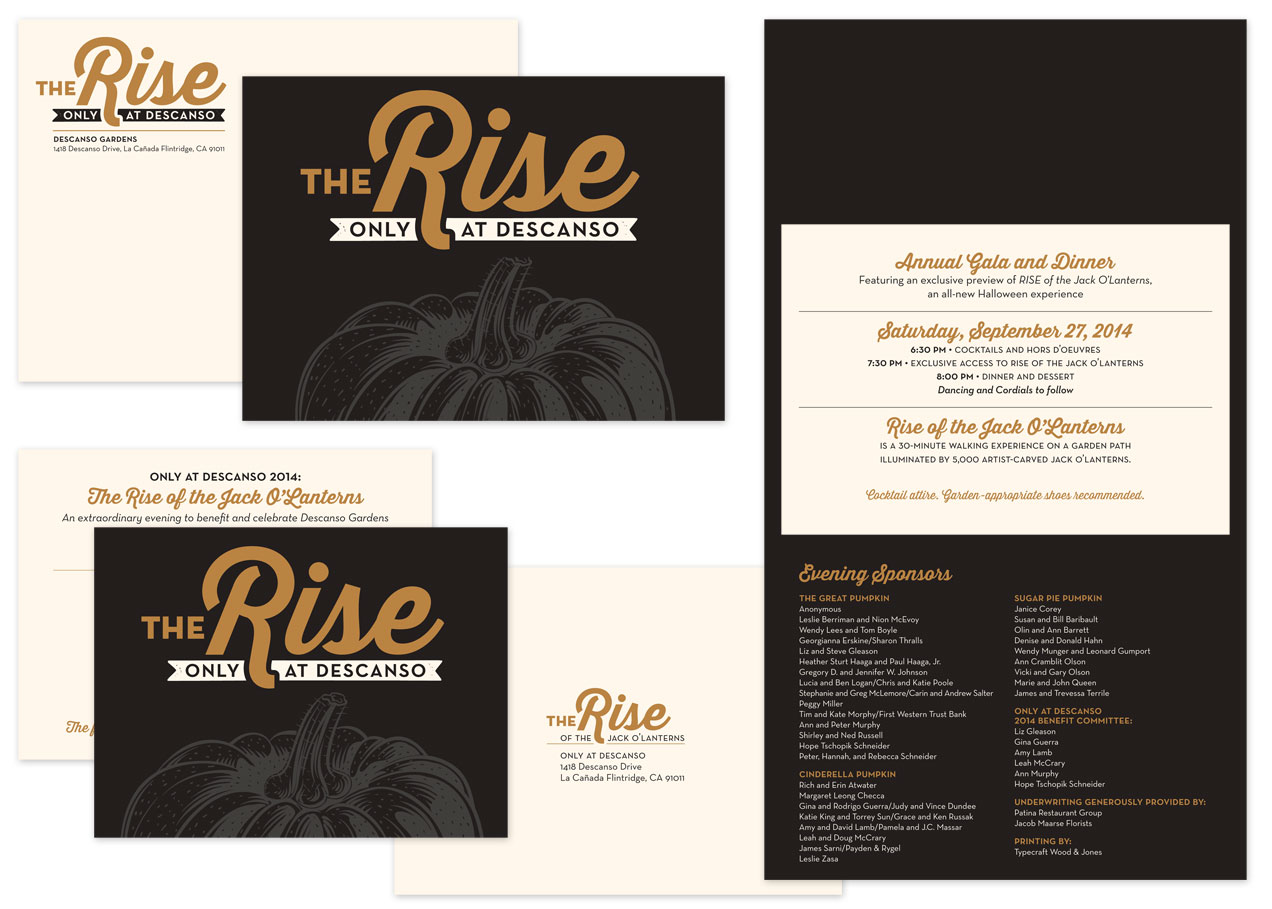
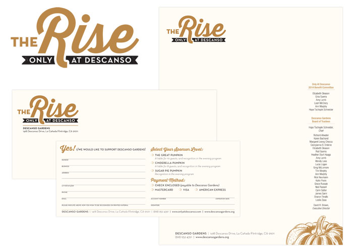
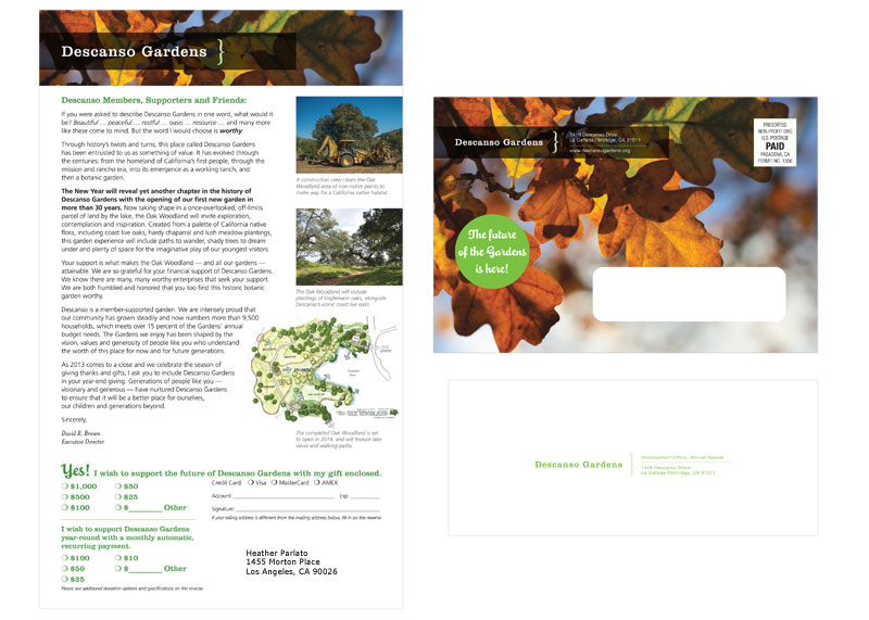
In this case, we did a full identity audit of the past few years of print matter, sorted by type [main stationery set, organization communications, membership campaigns, fundraising efforts, field guides, event collateral, signage], mounted to boards and affixed to the walls for all decision-makers to review and discuss. There’s nothing like seeing everything you’ve put out into the world all in one place to really see what works and what doesn’t. My approach is to collect everything and prepare the boards, along with best recommendations ahead of time, then present to the group and see where the discussion goes. Separately, we did a brand audit interview worksheet for stakeholders to fill out separately, to make sure the forward look of the organization was in line with the mission and the values of their membership. This is often where the best insider advice comes out, when people have the chance to speak anonymously.

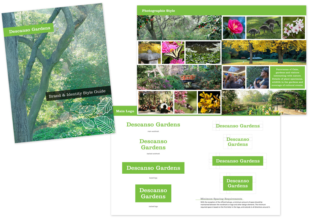
Much of their core identity was very strong, it just needed a bit of refinement and standardization. Descanso Gardens’ main mission is to steward the land left by the Boddy estate, which includes in greatest number an impressive collection of camellias and native oak trees. We revised the leaf cluster used previously to reflect those of coast live oaks, and gave them a simple boxed wordmark in their signature green that keeps visual continuity with their previous setup. For social media, everything is further simplified, but the 3 elements are all there.

DG_ID_logos

Expanding to the full identity set, we have a standard logo setup, address lockup, leaf cluster placements for bleeds and non-bleeds alike. Descanso previously used an extended color palette reflective of the 4 seasons, which we modestly updated and applied to the business cards, specialty communications and membership campaigns.

Finally, the set was complete, and guidelines could be compiled into a style guide. We’ve covered everything from the basics of logo usage and type styles to organizational messaging and positioning. For the in-house departments, we have the basics of 1-sheet and flyer layouts, and for off-site contractors we have lock-ups and callouts and color specs for all color spaces.

Style Guide

We’re really pleased with how everything turned out, and looking forward to seeing how they use it in the coming years.
+ See more of our work for Descanso Gardens here.
+ Read more case studies here.

Is it time to whip your identity into shape? A brand & identity audit can get everything on track and moving in the right direction, and it also happens to be what we do. Say hello anytime and let us know how we can help.

Recent Work: The Rise, Only at Descanso

DG_TheRise_digital

It’s been really hard not to shout about this project all year long, but now that it’s complete: these gala materials have been one of our most fun projects to date! As the only west coast host to The Rise of the Jack O’Lanterns, Descanso set their fundraising gala ahead of the public event as an evening garden wonderland among the carved pumpkin sculptures. We decided to glam it up by printing metallic copper on cream paper, adding an elegant twist to fall festivities.

CG_TheRise_ID_rev_2014

The calendar leading up to this exclusive event is a long one, so we got started more than 6 months out with an overall look & feel, and initial commitment materials in the form of an extended letterhead set. Next came a save-the date invite, and eventually the event invitation, finishing up with on-site collateral. We definitely had a budget to keep in mind, and managed to create really beautiful pieces by going 2-color and running together on similar stocks, and layering specialty papers together.

I’m really pleased with how these pieces work together, and Descanso Gardens reported that this gala garnered increased commitments and donations from the previous year.

+ See the complete project here.
+ See more of our work for Descanso Gardens here.

Recent Work: Center Circle Identity

DG_center_circle_ID_digital

The Center Circle members at Descanso Gardens are a special sector of supporters who donate at a premium and highly value the grounds they help protect. In turn, Descanso has a selection of events, a personalized welcome kit and focused communications that require a unique identity reflective of this group.

We built an identity for Center Circle collateral around one of the main colors in their extended palette and tied it into one of Descanso’s specialties: cherry blossoms. In addition to a stationery set, the welcome kit includes tips on all the ways to maximize the membership experiences, delivers membership cards, and contains a personal note from the director.

See more of our work for Descanso Gardens.

Recent Work: Descanso Gardens, Appeal 2013

DG_AA_2013

I’m pleased to be working with one of our fantastic oases in the city, Descanso Gardens! True to their tagline, Descanso is a member-supported garden, sending a fundraising appeal annually to continue their work in stewardship of the grounds and education to the public.

We created this showcase letter with a run-down of innovative projects completed with a forecast of what’s to come next year, all delivered in a very colorful mailing envelope themed by the oaks Descanso is known for. This piece got a lot done in a small space, and they reported an increase in returns from previous years.

See more of our work for Descanso Gardens.

creative inspiration: type-driven beer labels

there’s nothing like a strong typographic treatment over a simple color palette. this week we’re looking at 3 label series that make bold statements with type and color front and center.


great divide: yeti

great divide: yeti
image: thedieline.com

great divide’s yeti series uses a standardized-yet-versatile type treatment that allows them to include the minimal graphic elements that indicates the yeti line while making room for longer titles or alternate treatments for barrel aged brews. see the whole collection at thedieline.com


private brewery: bob

private brewery: bob
image: lovelypackage.com

the bob [best of british] line from private brewery uses unconventional colors and unique brew names to draw interest and curiosity. each bottle is easily identifiable, with a nice 3-word descriptor. see more at lovelypackage.com


turkey mountain brewhaus

turkey mountain brewhaus
image: ohbeautifulbeer.com

this collection from turkey mountain brewhaus uses a series of 2-color stamp-finish designs that allow for clear and prominent logo placement and brew name, relegating the brewery name to the neck label. nice, strong presentation. see more at ohbeautifulbeer.com

creative inspiration: colorful branding

angela & evan photography

image: designworklife.com

i love a vibrant brand that uses multiple color iterations, patterns and setups around one clear logo. this identity for angela & evan wedding photography centers around a striking hand-drawn logo, pairing it with fresh spring greens and yellows for wedding season, playing out into traditional photographic equipment in brand touchpoints. see the full post at designworklife.com.


wigwam cabins

image: the-design-ark.com

i’ve talked about this identity before, but how can you NOT when wigwams are involved? focusing heavily on the angular relationships of the W, A and M letterforms, they have created a thematic logo that references the shape of the cabins themselves, and then uses the extended color palette to carry the identity through, looking much like an indian woven blanket. fantastic & fun work! see more at the-design-ark.com


kröller müller

image: identitydesigned.com

the kröller müller museum offers this colorful, inviting and interactive brand, where the logo appears to be revealed through an open door in still applications, it is very literally opening in motion and environmental graphics. another identity with every color application in the rainbow, it is not only versatile in pairing several colors into every layout, but the theme of invitation and discovery of art and environment is very strong in this brand. explore further at identitydesigned.com.

creative inspiration: summer-ready colorful wine packaging

la belle famille

image: ali-labelle.com

kickin around pinterest one day, i found these cute conversation-starters pinned to someone else’s packaging board. i love how ali labelle has used the wine as a background color for both rosé and white. see more at ali-labelle.com.


vin de mesies

image: thedieline.com

very clean execution of moon phases as mandalas in color palettes that compliment the flavors, each with a sparing use of gold. very nice! see more at the dieline


small talk vineyard

image: thedieline.com

another hat tip to hand-drawn type, evoking conversational style, giving voice to the background clamor you might hear at your next party. over wine, of course. see more at the dieline.

creative inspiration: beer branding

summit brewing

image: thedieline.com

i love the simplicity and straightforward branding of summit brewing. the logo remains colorful, while it still translates easily to the 3-color packaging, using the natural paper texture really well. see more at the dieline.


lake superior

image: thedieline.com

when dealing with the constraints of beer labels, the wrap on the bottle is a given, but a straight or die cut can be your variable. so many times, the preferred choice is symmetry, but i love these angular labels, giving each brew its own color palette and type style. see more at the dieline


citizen beer

image: ohbeautifulbeer.com

a very interesting logo and use of pattern & texture by citizen beer. this branding is refreshing, clean and simple, often in 1 color. see more at oh beautiful beer.