there’s nothing like a strong typographic treatment over a simple color palette. this week we’re looking at 3 label series that make bold statements with type and color front and center.
great divide: yeti
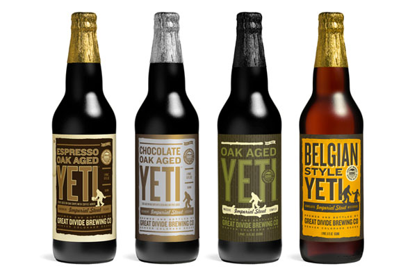
great divide’s yeti series uses a standardized-yet-versatile type treatment that allows them to include the minimal graphic elements that indicates the yeti line while making room for longer titles or alternate treatments for barrel aged brews. see the whole collection at thedieline.com
private brewery: bob
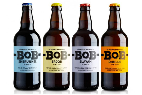
the bob [best of british] line from private brewery uses unconventional colors and unique brew names to draw interest and curiosity. each bottle is easily identifiable, with a nice 3-word descriptor. see more at lovelypackage.com
turkey mountain brewhaus
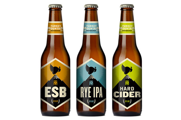
this collection from turkey mountain brewhaus uses a series of 2-color stamp-finish designs that allow for clear and prominent logo placement and brew name, relegating the brewery name to the neck label. nice, strong presentation. see more at ohbeautifulbeer.com
