Movers & Cocktail Shakers at Descanso Gardens

DG_Movers_Shakers_invite

If there’s one thing I love, it’s a good cocktail party! Descanso Gardens has been coming up with some really innovative and intimate events, and their latest, Movers & Cocktail Shakers was the kind that puts the fun back in fundraiser.

Held at the historic Boddy House, we celebrated the era of the home through cocktails of the times, headed up by bar director Sean Naughton of LACMA’s Ray’s & Stark Bar. Three handcrafted cocktails told the formative story of the martini and old fashioned through their common ancestor, the martinez, the construction of prohibition-era sours, and the original recipe of the mai thai with hand-pressed almond syrup. Sean told the story of each drink, including interesting info about the ingredients, and gave great mixing advice. After each demo, he taught one volunteer how to make the drink again, so we’d really learn them.

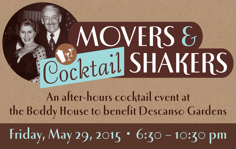
To give some real retro flair to this event, we designed a lockup using period typefaces and used photos of the Boddys as a nod to their home. It’s always fun when you get to depart from current branding to develop a themed look for an event, and this one just happens to be an era I love!

See more of our work for Descanso Gardens here.
+ See more recent work here.

creative inspiration: type-driven beer labels

there’s nothing like a strong typographic treatment over a simple color palette. this week we’re looking at 3 label series that make bold statements with type and color front and center.


great divide: yeti

great divide: yeti
image: thedieline.com

great divide’s yeti series uses a standardized-yet-versatile type treatment that allows them to include the minimal graphic elements that indicates the yeti line while making room for longer titles or alternate treatments for barrel aged brews. see the whole collection at thedieline.com


private brewery: bob

private brewery: bob
image: lovelypackage.com

the bob [best of british] line from private brewery uses unconventional colors and unique brew names to draw interest and curiosity. each bottle is easily identifiable, with a nice 3-word descriptor. see more at lovelypackage.com


turkey mountain brewhaus

turkey mountain brewhaus
image: ohbeautifulbeer.com

this collection from turkey mountain brewhaus uses a series of 2-color stamp-finish designs that allow for clear and prominent logo placement and brew name, relegating the brewery name to the neck label. nice, strong presentation. see more at ohbeautifulbeer.com

creative inspiration: wine wraps

it seems like wine wraps are popping up everywhere—whether as packaging for a product, decorative wrap for personal gift-giving, or branded overlays for client gifts, wine is getting wrapped up everywhere!


waddeson wine wraps

waddeson wine wraps
image: designworklife.com

just one component of the rothschild’s wine distribution company, waddeson wine, these wraps manage to show a modern take on the map of the estate, blending historic and contemporary influences. see the whole brand package at designworklife.com.


truett-hurst wine wraps

truett-hurst wine wraps
image: psfk.com

truett-hurst takes a different approach with these buyer-themed wraps, studying reasons and seasons when buyers buy, and designing wraps in the strongest themes. the wraps add an engaging and image-heavy narrative that allows the brand to communicate in a new way with potential shoppers. see more at psfk.com.


filirea gi wine wraps

filirea gi wraps
image: thedieline.com

great for home brewers giving client gifts or short production runs, this 1-color wrap is budget-conscious while still adding a layer of interest. this piece illustrates the home winemaking process. see more at thedieline.com


design am chiemsee wine wraps

design am chiemsee wraps
image: underconsideration.com

a very nice collection of wine wrapping papers from design am chiemsee, these wraps are reversible and offer decorative surprises for the recipient. see the collection at underconsideration.com.

get in on patio season

patioseason-june

in case you haven’t heard, i’m hosting a little something called patio season, which is an open invitation to sit & chat, network, or mutually brain-pick during either morning coffee or afternoon happy hour. take me up on it, and all this [snacks above] and more can be yours. ha.

recently, someone i’d never met before answered the call and came for a visit! she’s a lovely person, a writer, and a neighbor, ana ottman. we chatted about running our freelance practices, managing clients, how and where we might hire each other if the opportunity comes up, and life in los angeles. i’m so glad she took a chance on coming to meet a new person for a patio chat! turns out, we have a lot of friends in common and have just missed meeting somehow within the same circles, but no more—we just ran into each other at LA creative mornings last week, and she has given me the low-down on where to get earl grey pie downtown.

ottman-card

so, conquer your fears, people! there’s no better way to get some in-depth networking done than a one-on-one conversation over snacks & drinks. let’s hang!

here’s how it works. choose a morning coffee [10:30am] or evening happy hour [5:30pm] appointment, tuesday, wednesday or thursday. tell me when you’d like to meet and what you’d like to talk about. if it’s open, i’ll make the drinks & snacks, you come over and we chat. about design, about business, about ideas, about food stuff–whatever, up to 2 hours.

creative inspiration: summer-ready colorful wine packaging

la belle famille

image: ali-labelle.com

kickin around pinterest one day, i found these cute conversation-starters pinned to someone else’s packaging board. i love how ali labelle has used the wine as a background color for both rosé and white. see more at ali-labelle.com.


vin de mesies

image: thedieline.com

very clean execution of moon phases as mandalas in color palettes that compliment the flavors, each with a sparing use of gold. very nice! see more at the dieline


small talk vineyard

image: thedieline.com

another hat tip to hand-drawn type, evoking conversational style, giving voice to the background clamor you might hear at your next party. over wine, of course. see more at the dieline.

creative inspiration: beer branding

summit brewing

image: thedieline.com

i love the simplicity and straightforward branding of summit brewing. the logo remains colorful, while it still translates easily to the 3-color packaging, using the natural paper texture really well. see more at the dieline.


lake superior

image: thedieline.com

when dealing with the constraints of beer labels, the wrap on the bottle is a given, but a straight or die cut can be your variable. so many times, the preferred choice is symmetry, but i love these angular labels, giving each brew its own color palette and type style. see more at the dieline


citizen beer

image: ohbeautifulbeer.com

a very interesting logo and use of pattern & texture by citizen beer. this branding is refreshing, clean and simple, often in 1 color. see more at oh beautiful beer.

creative inspiration: wine wraps

wine wraps

something i’ve been seeing here & there in wine packaging are bottle wraps. it seems like such a nice opportunity to create interest, but probably doesn’t stand up so well to shipping enough to become a standard. however, during the season of gift giving, you can add something special to your own bottles, or add a layer of your own branding over purchased bottles or homemade concoctions.

image: thedieline.com

the 2 samples from the dieline, above, show commercial use by csetvei winery, and a branded gift from brnd wgn. below, pre-sized wraps are for sale for gift-giving from bottlestockshop.com.

image: bottlestockshop.com

open season on the parlato design patio

patiotime

i was escaping the early-season heat on the patio last night with a friend, when i realized that maybe it’s time i combine my love for making snacks and drinks and my love of patio sitting with friends into one thing: patio season!

here’s how it works. choose a morning coffee [10:30am] or evening happy hour [5:30pm] appointment, tuesday, wednesday or thursday. tell me when you’d like to meet and what you’d like to talk about. if it’s open, i’ll make the drinks & snacks, you come over and we chat. about design, about business, about ideas, about food stuff–whatever, up to 2 hours.

i’m interested in connecting with old friends, colleagues i don’t see often enough and meeting new people. we’ve got the shade of the loquat tree and a nice breeze. pick a slot and let’s hang!

creative inspiration: liquor design

image: designworklife.com
image: thedieline.com

this kind of student work is what i really think we need more of, especially in beverage packaging. so many liquors try to evoke something sultry and end up looking like cheap dates. this series of infused akvavit associates the flavors with swedish folktales while showcasing a very strong brand. great work! see more at designworklife.com.

image: thedieline.com

so, moonshine has been a thing for awhile, and it’s very appropriately in a jar. i love this simple packaging, with a logo looking like a streamlined version of a hand-carved stamp. see more at thedieline.com

image: thedieline.com

i think this packaging for pavan is something you either love or you don’t. to me, this color palette is a perfect representation of southern france, and very clearly evokes the flavor of this liqueur, which is described as muscat & orange blossom. this is the kind of bottle i’d keep as a vase after finishing the liqueur. the pavan web site is beautiful, too! see more at thedieline.com.