creative inspiration: big design for small markets

this week we’re looking at 3 small specialty shops that have big brand ideas, leaving no touchpoint unturned. these suites bring taste and flavor to the forefront with striking packaging and multi-use labels and stickers, leaving no question as to where you picked up these fine food finds.


the dirty apron

the dirty apron
image: lovelypackage.com

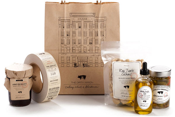
the dirty apron delicatessen uses a clever system of branded bags, hang tags and package closure tape with various versatile fill-in labels for an identity system that appears much bigger than it is. the branded items allow for multiple placements, and the labels allow for one collection of shapes to serve as fill-ins for every item in the store. see the whole collection at lovelypackage.com.


grazia

grazia
image: thedieline.com

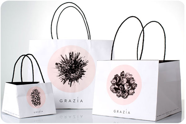
grazia, specializing in sweet and savory delicacies, uses a wonderful system of branded boxes, bags and stickers, all in their signature 2-color palette, featuring cross-sections of raw ingredients. i find this system to be stunning in versatility and simplicity. see more at thedieline.com.


f. ménard

f. menard
image: lovelypackage.com

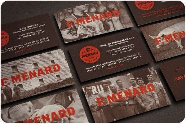
this family-owned butcher specializing in ethically-raised pork products has an identity system that pays special respect to the art of the craft. soft duotone photography is paired with a strong color palette and bold type, mostly using a label system for products in the store, and branded bags for your groceries. see more at lovelypackage.com.

creative inspiration: type-driven beer labels

there’s nothing like a strong typographic treatment over a simple color palette. this week we’re looking at 3 label series that make bold statements with type and color front and center.


great divide: yeti

great divide: yeti
image: thedieline.com

great divide’s yeti series uses a standardized-yet-versatile type treatment that allows them to include the minimal graphic elements that indicates the yeti line while making room for longer titles or alternate treatments for barrel aged brews. see the whole collection at thedieline.com


private brewery: bob

private brewery: bob
image: lovelypackage.com

the bob [best of british] line from private brewery uses unconventional colors and unique brew names to draw interest and curiosity. each bottle is easily identifiable, with a nice 3-word descriptor. see more at lovelypackage.com


turkey mountain brewhaus

turkey mountain brewhaus
image: ohbeautifulbeer.com

this collection from turkey mountain brewhaus uses a series of 2-color stamp-finish designs that allow for clear and prominent logo placement and brew name, relegating the brewery name to the neck label. nice, strong presentation. see more at ohbeautifulbeer.com

creative inspiration: wine wraps

it seems like wine wraps are popping up everywhere—whether as packaging for a product, decorative wrap for personal gift-giving, or branded overlays for client gifts, wine is getting wrapped up everywhere!


waddeson wine wraps

waddeson wine wraps
image: designworklife.com

just one component of the rothschild’s wine distribution company, waddeson wine, these wraps manage to show a modern take on the map of the estate, blending historic and contemporary influences. see the whole brand package at designworklife.com.


truett-hurst wine wraps

truett-hurst wine wraps
image: psfk.com

truett-hurst takes a different approach with these buyer-themed wraps, studying reasons and seasons when buyers buy, and designing wraps in the strongest themes. the wraps add an engaging and image-heavy narrative that allows the brand to communicate in a new way with potential shoppers. see more at psfk.com.


filirea gi wine wraps

filirea gi wraps
image: thedieline.com

great for home brewers giving client gifts or short production runs, this 1-color wrap is budget-conscious while still adding a layer of interest. this piece illustrates the home winemaking process. see more at thedieline.com


design am chiemsee wine wraps

design am chiemsee wraps
image: underconsideration.com

a very nice collection of wine wrapping papers from design am chiemsee, these wraps are reversible and offer decorative surprises for the recipient. see the collection at underconsideration.com.

creative inspiration: summer-ready colorful wine packaging

la belle famille

image: ali-labelle.com

kickin around pinterest one day, i found these cute conversation-starters pinned to someone else’s packaging board. i love how ali labelle has used the wine as a background color for both rosé and white. see more at ali-labelle.com.


vin de mesies

image: thedieline.com

very clean execution of moon phases as mandalas in color palettes that compliment the flavors, each with a sparing use of gold. very nice! see more at the dieline


small talk vineyard

image: thedieline.com

another hat tip to hand-drawn type, evoking conversational style, giving voice to the background clamor you might hear at your next party. over wine, of course. see more at the dieline.

creative inspiration: beer branding

summit brewing

image: thedieline.com

i love the simplicity and straightforward branding of summit brewing. the logo remains colorful, while it still translates easily to the 3-color packaging, using the natural paper texture really well. see more at the dieline.


lake superior

image: thedieline.com

when dealing with the constraints of beer labels, the wrap on the bottle is a given, but a straight or die cut can be your variable. so many times, the preferred choice is symmetry, but i love these angular labels, giving each brew its own color palette and type style. see more at the dieline


citizen beer

image: ohbeautifulbeer.com

a very interesting logo and use of pattern & texture by citizen beer. this branding is refreshing, clean and simple, often in 1 color. see more at oh beautiful beer.

creative inspiration: design for food

image: thedieline.com

some beautiful examples of food-related design lately include this really nice packaging for earl’s best, using typography based on hand-lettered signs. see the collection at thedieline.com


image: underconsideration.com

i’m really liking this simple & traditional seal for fred’s market, paired with the clip board menu system. nice hardware and easy to switch out. see more at art of the menu.


image: underconsideration.com

this menu has more going on than appears in this photo. i really like the typography for each section. the pages are stacked above, but the final presentation has them hand-stitched together, and marked with a wax seal. very nice handmade work! see more at art of the menu

creative inspiration: wine wraps

wine wraps

something i’ve been seeing here & there in wine packaging are bottle wraps. it seems like such a nice opportunity to create interest, but probably doesn’t stand up so well to shipping enough to become a standard. however, during the season of gift giving, you can add something special to your own bottles, or add a layer of your own branding over purchased bottles or homemade concoctions.

image: thedieline.com

the 2 samples from the dieline, above, show commercial use by csetvei winery, and a branded gift from brnd wgn. below, pre-sized wraps are for sale for gift-giving from bottlestockshop.com.

image: bottlestockshop.com

creative inspiration: liquor design

image: designworklife.com
image: thedieline.com

this kind of student work is what i really think we need more of, especially in beverage packaging. so many liquors try to evoke something sultry and end up looking like cheap dates. this series of infused akvavit associates the flavors with swedish folktales while showcasing a very strong brand. great work! see more at designworklife.com.

image: thedieline.com

so, moonshine has been a thing for awhile, and it’s very appropriately in a jar. i love this simple packaging, with a logo looking like a streamlined version of a hand-carved stamp. see more at thedieline.com

image: thedieline.com

i think this packaging for pavan is something you either love or you don’t. to me, this color palette is a perfect representation of southern france, and very clearly evokes the flavor of this liqueur, which is described as muscat & orange blossom. this is the kind of bottle i’d keep as a vase after finishing the liqueur. the pavan web site is beautiful, too! see more at thedieline.com.

creative inspiration: beer design

image: ohbeautifulbeer.com
3 selections

this week, i’ve collected 3 examples of awesome illustration styles in beer design. the first one, above is for wahoo brewing in texas. their blog is a nice tribute to craft beer.

image: ohbeautifulbeer.com

these labels for aspen brewing company in colorado are a fun tribute to vintage national park posters. the highlights of their collateral is featured here.

image: ohbeautifulbeer.com

finally, the illustration-forward packaging for R&B brewing in vancouver has been making the rounds, each brew with a themed container full of hand-drawn type. these pieces are new and not entirely integrated on their site as of this posting, but see the collection here.

thanks to ohbeautifulbeer.com for these great design profiles!