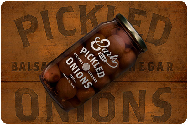
some beautiful examples of food-related design lately include this really nice packaging for earl’s best, using typography based on hand-lettered signs. see the collection at thedieline.com
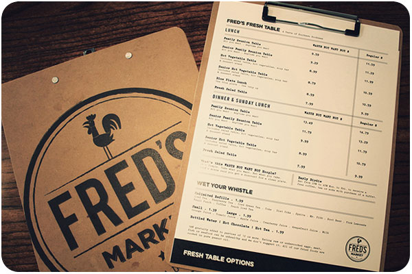
i’m really liking this simple & traditional seal for fred’s market, paired with the clip board menu system. nice hardware and easy to switch out. see more at art of the menu.
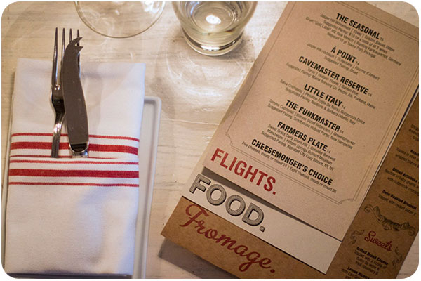
this menu has more going on than appears in this photo. i really like the typography for each section. the pages are stacked above, but the final presentation has them hand-stitched together, and marked with a wax seal. very nice handmade work! see more at art of the menu
