Case Study: Character Projects

CP_cards_mess

I recently had the pleasure of working with my very talented friend, Jonathan Silberman, in helping him launch his latest venture, Character Projects, a vintage lighting and hardware store, period home design services, and real estate specializing in historic homes around northeast LA. This project was very close to my heart, as it took place during our very own search for an arts & crafts-era fixer under Jonathan’s excellent advice and guidance. Talk about getting to know a client’s business! Having first-hand experience allows me to say, without reservation, Jonathan is my top recommendation in all aspects of home restoration with a sensitivity to period accuracy.

Branding for a service business can be tricky, especially one where the customer stewardship will become the most memorable experience for clients. Lucky for the visuals here, Jonathan pairs service with meticulously restored pieces that speak for themselves. At first we created a wordmark that was much more demonstrative of vintage style, but ultimately we decided to back off and go clean and timeless, allowing the products to do the talking.

Cards & Tags
Cards & Tags

Since Jonathan has such rich imagery to show, we went with moo cards, so he could have as many alternate photos as he wants, adding new sets as needed. This business started as an online store, but grew into a physical studio within a few months. Jonathan picked out some nice tags for pricing and product info, and we worked up some stamps he could use in marking these and other materials, such as tissue, stickers and shipping packages.

We gave him a site that allows for changing content on the home page, while putting a spotlight on each of his services on separate pages. His store links directly to Etsy, where he enjoys the overlap of social shopping with targeted demographics there, so all he has to maintain is changing content, which is easy and intuitive on the WordPress platform. Once his site was up, he was all ready to start promoting the opening of his store in Highland Park.

Character Projects is off to a great start, with a small but effective package of identity materials to help Jonathan grow his business. Visit Character Projects online and dare yourself not to consider remodeling your home.

+ See the full project here.
+ Read more case studies here.

If you’re just starting a new business, you’ve got a clean slate to take it in any direction. A starter branding package can get any new venture off the ground, targeting the right materials for promotion without anything you don’t need. Say hello anytime and let us know how we can help.

Article of the Week

The Danger of Assuming What Your Client Wants, by Allison Stadd for Behance

The title of this article seems so simplistic I almost didn’t read it, but I’m so glad I did, because it’s all about the importance of the discovery process. As a longtime snowboarder, I appreciated the case study of Burton [a snowboard equipment company] refocusing as the go-to brand for women, and the follies along the way to success. The difference between brand appeal from men to women was particularly interesting.

Starting projects and engagements with discovery is how we get to the heart of these issues and the people we’re communicating with. This article provides a great look at how discovery plays a role in a successful connection with a new market. Take a look!

Case Study: Rebranding Descanso Gardens

Main Identity Set

It started innocently enough, with a simple request to create a set of rules around using their wordmark and design a style guide around it. Just a guiding document for internal departments and external contractors to follow for a consistent presentation of all Descanso Gardens print matter. As with many things, though, that which appears simple has many unanticipated questions and discussions ahead, so we started as we always do, with discovery!

In this case, we did a full identity audit of the past few years of print matter, sorted by type [main stationery set, organization communications, membership campaigns, fundraising efforts, field guides, event collateral, signage], mounted to boards and affixed to the walls for all decision-makers to review and discuss. There’s nothing like seeing everything you’ve put out into the world all in one place to really see what works and what doesn’t. My approach is to collect everything and prepare the boards, along with best recommendations ahead of time, then present to the group and see where the discussion goes. Separately, we did a brand audit interview worksheet for stakeholders to fill out separately, to make sure the forward look of the organization was in line with the mission and the values of their membership. This is often where the best insider advice comes out, when people have the chance to speak anonymously.

Much of their core identity was very strong, it just needed a bit of refinement and standardization. Descanso Gardens’ main mission is to steward the land left by the Boddy estate, which includes in greatest number an impressive collection of camellias and native oak trees. We revised the leaf cluster used previously to reflect those of coast live oaks, and gave them a simple boxed wordmark in their signature green that keeps visual continuity with their previous setup. For social media, everything is further simplified, but the 3 elements are all there.

DG_ID_logos

Expanding to the full identity set, we have a standard logo setup, address lockup, leaf cluster placements for bleeds and non-bleeds alike. Descanso previously used an extended color palette reflective of the 4 seasons, which we modestly updated and applied to the business cards, specialty communications and membership campaigns.

Finally, the set was complete, and guidelines could be compiled into a style guide. We’ve covered everything from the basics of logo usage and type styles to organizational messaging and positioning. For the in-house departments, we have the basics of 1-sheet and flyer layouts, and for off-site contractors we have lock-ups and callouts and color specs for all color spaces.

Style Guide

We’re really pleased with how everything turned out, and looking forward to seeing how they use it in the coming years.
+ See more of our work for Descanso Gardens here.
+ Read more case studies here.

Is it time to whip your identity into shape? A brand & identity audit can get everything on track and moving in the right direction, and it also happens to be what we do. Say hello anytime and let us know how we can help.

Article of the Week

When to Wordmark? from Print Magazine

Here’s a situation every brand designer comes up against time and again: sometimes the research and vision of a client’s future brand points to a wordmark rather than an icon, or icon & wordmark lockup as a logo. Such was the case in our most recent brand exploration for Descanso Gardens, but that doesn’t mean the question of an icon or other image didn’t come up.

This piece, by Sagi Haviv, is a great rundown of several strong brands that rest on a word rather than an image. I’m of the very same mind and have found myself saying these same words: Creating a symbol can be a great design exercise, but we try to be very disciplined about only developing a symbol when there is a compelling strategic reason to do so. Indeed!

Enjoy.

Case Study: Chevalier’s Books Brand & Identity

CB_header_764
I’m excited to be a part of revitalizing a neighborhood bookstore in their 75th year of operation! Chevalier’s Books is a mainstay of Larchmont Village and beloved by the locals, though they’ve been struggling in the age of Amazon and changing times. Enter new owners and dedicated bibliophiles Darryl Holter and Bert Deixler with great plans, energy and funds, to give Chevalier’s just what it needs to come back in a big way.

CB_print-matter

Our main goals with redesigning this store brand was to appeal to everyone who loves books, bookstores, and keeping LA history alive, and give them a comfortable space to shop, meet, and convene for readings and events. The space is inviting and comfortable, with a great selection and an expert staff. We gave them a very literary wordmark, with a sign-off that reiterates their founding year, which is easily versatile enough to adapt for their 75th anniversary. To follow it out, we have matching business cards, gift bookmarks, merchandise bags, and an economically friendly canvas bag.

CB_canvas-bag

For the web site, we wanted to give them all the blogging and writing capabilities they’d need to promote readings, signings, intimate concerts, book club meetings, and membership, bringing some of the store experience online. The wordpress platform is simple enough for employees to update and integrate with social media, and the look packs all the information they need into a very clean, streamlined layout.

cb-site-about

In the first few months after re-opening, Chevalier’s was reporting record sales numbers in the holiday season. I’m excited to see where they take things in the coming years. In the meantime, check them out online!

+ See the full project here.
+ Read more case studies here.

You don’t need to be a new business to need a new brand & identity. Most of our clients are looking for a refresh & recharge approach, integrating previous efforts seamlessly into an elevated look going forward. If this sounds like just what you need, let’s talk!

Recent Work: The Rise, Only at Descanso

DG_TheRise_digital

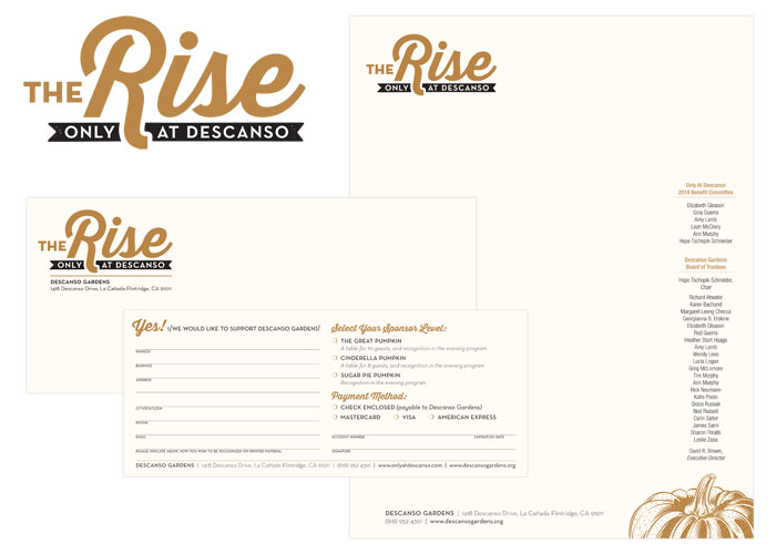
It’s been really hard not to shout about this project all year long, but now that it’s complete: these gala materials have been one of our most fun projects to date! As the only west coast host to The Rise of the Jack O’Lanterns, Descanso set their fundraising gala ahead of the public event as an evening garden wonderland among the carved pumpkin sculptures. We decided to glam it up by printing metallic copper on cream paper, adding an elegant twist to fall festivities.

CG_TheRise_ID_rev_2014

The calendar leading up to this exclusive event is a long one, so we got started more than 6 months out with an overall look & feel, and initial commitment materials in the form of an extended letterhead set. Next came a save-the date invite, and eventually the event invitation, finishing up with on-site collateral. We definitely had a budget to keep in mind, and managed to create really beautiful pieces by going 2-color and running together on similar stocks, and layering specialty papers together.

I’m really pleased with how these pieces work together, and Descanso Gardens reported that this gala garnered increased commitments and donations from the previous year.

+ See the complete project here.
+ See more of our work for Descanso Gardens here.

Recent Work: Center Circle Identity

DG_center_circle_ID_digital

The Center Circle members at Descanso Gardens are a special sector of supporters who donate at a premium and highly value the grounds they help protect. In turn, Descanso has a selection of events, a personalized welcome kit and focused communications that require a unique identity reflective of this group.

We built an identity for Center Circle collateral around one of the main colors in their extended palette and tied it into one of Descanso’s specialties: cherry blossoms. In addition to a stationery set, the welcome kit includes tips on all the ways to maximize the membership experiences, delivers membership cards, and contains a personal note from the director.

See more of our work for Descanso Gardens.

creative inspiration: big design for small markets

this week we’re looking at 3 small specialty shops that have big brand ideas, leaving no touchpoint unturned. these suites bring taste and flavor to the forefront with striking packaging and multi-use labels and stickers, leaving no question as to where you picked up these fine food finds.


the dirty apron

the dirty apron
image: lovelypackage.com

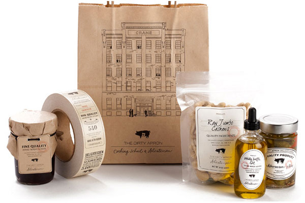
the dirty apron delicatessen uses a clever system of branded bags, hang tags and package closure tape with various versatile fill-in labels for an identity system that appears much bigger than it is. the branded items allow for multiple placements, and the labels allow for one collection of shapes to serve as fill-ins for every item in the store. see the whole collection at lovelypackage.com.


grazia

grazia
image: thedieline.com

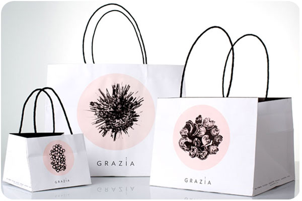
grazia, specializing in sweet and savory delicacies, uses a wonderful system of branded boxes, bags and stickers, all in their signature 2-color palette, featuring cross-sections of raw ingredients. i find this system to be stunning in versatility and simplicity. see more at thedieline.com.


f. ménard

f. menard
image: lovelypackage.com

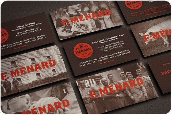
this family-owned butcher specializing in ethically-raised pork products has an identity system that pays special respect to the art of the craft. soft duotone photography is paired with a strong color palette and bold type, mostly using a label system for products in the store, and branded bags for your groceries. see more at lovelypackage.com.

creative inspiration: wine wraps

it seems like wine wraps are popping up everywhere—whether as packaging for a product, decorative wrap for personal gift-giving, or branded overlays for client gifts, wine is getting wrapped up everywhere!


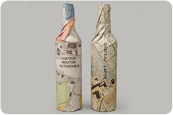
waddeson wine wraps

waddeson wine wraps
image: designworklife.com

just one component of the rothschild’s wine distribution company, waddeson wine, these wraps manage to show a modern take on the map of the estate, blending historic and contemporary influences. see the whole brand package at designworklife.com.


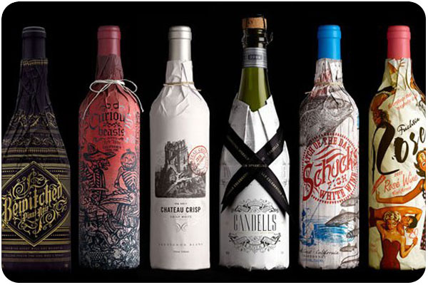
truett-hurst wine wraps

truett-hurst wine wraps
image: psfk.com

truett-hurst takes a different approach with these buyer-themed wraps, studying reasons and seasons when buyers buy, and designing wraps in the strongest themes. the wraps add an engaging and image-heavy narrative that allows the brand to communicate in a new way with potential shoppers. see more at psfk.com.


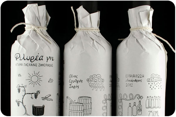
filirea gi wine wraps

filirea gi wraps
image: thedieline.com

great for home brewers giving client gifts or short production runs, this 1-color wrap is budget-conscious while still adding a layer of interest. this piece illustrates the home winemaking process. see more at thedieline.com


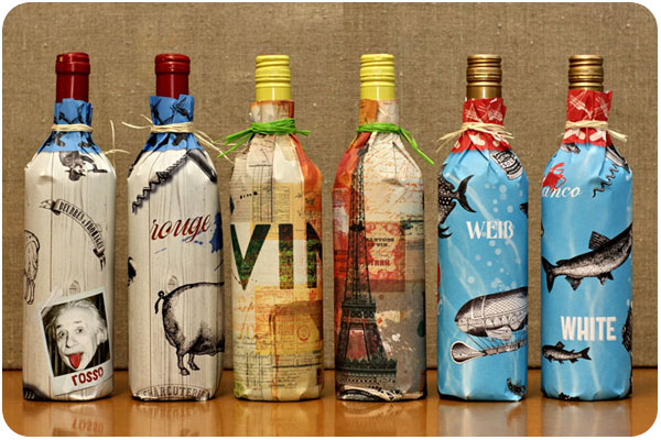
design am chiemsee wine wraps

design am chiemsee wraps
image: underconsideration.com

a very nice collection of wine wrapping papers from design am chiemsee, these wraps are reversible and offer decorative surprises for the recipient. see the collection at underconsideration.com.