creative inspiration: thai-inspired branding

in my never-ending design research, i saw a few pieces of thai-inspired design that caught my attention. i say thai-inspired because these 3 products and places are far from thailand, but each are borrowing their own elements from the design landscape and making them their own with great results.


my thai

my thai cordials
image: thedieline.com

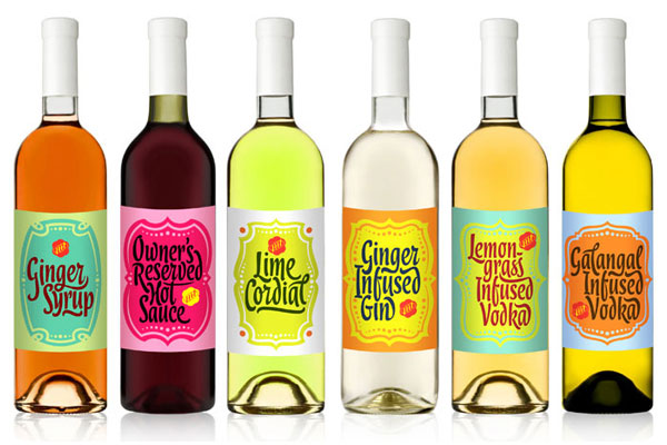
this series of brightly flavored and colored cordials are just one aspect of the branding for brazillian restaurant, my thai. the color palettes are outstanding, and a lovely contrast from the cordials inside. see more at thedieline.com.


pak pao

pak pao branding
image: underconsideration.com

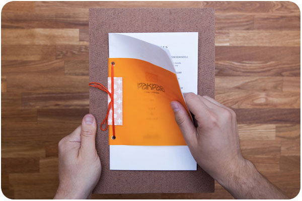
dallas-based pak pao has a lovely logo & wordmark with shapes that echo each other in a uniquely satisfying way. they have done a great job of mounting clean & simple menus to painted boards with lots of orange-over-orange reverberations. see more at underconsideration.com


sway

sway branding
image: identitydesigned.com

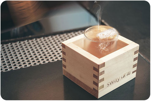
austin-based sway is a very extensive environment brand experience right down to the last detail. starting with the wordmark, the voice of sway is bilingual from the wayfinding to the menu. the stark and clean design of both print and environment is accented with bright color in coasters, placemats and matchbooks. see the whole profile at identitydesigned.com

creative inspiration: colorful branding

angela & evan photography

image: designworklife.com

i love a vibrant brand that uses multiple color iterations, patterns and setups around one clear logo. this identity for angela & evan wedding photography centers around a striking hand-drawn logo, pairing it with fresh spring greens and yellows for wedding season, playing out into traditional photographic equipment in brand touchpoints. see the full post at designworklife.com.


wigwam cabins

image: the-design-ark.com

i’ve talked about this identity before, but how can you NOT when wigwams are involved? focusing heavily on the angular relationships of the W, A and M letterforms, they have created a thematic logo that references the shape of the cabins themselves, and then uses the extended color palette to carry the identity through, looking much like an indian woven blanket. fantastic & fun work! see more at the-design-ark.com


kröller müller

image: identitydesigned.com

the kröller müller museum offers this colorful, inviting and interactive brand, where the logo appears to be revealed through an open door in still applications, it is very literally opening in motion and environmental graphics. another identity with every color application in the rainbow, it is not only versatile in pairing several colors into every layout, but the theme of invitation and discovery of art and environment is very strong in this brand. explore further at identitydesigned.com.

creative inspiration: summer-ready colorful wine packaging

la belle famille

image: ali-labelle.com

kickin around pinterest one day, i found these cute conversation-starters pinned to someone else’s packaging board. i love how ali labelle has used the wine as a background color for both rosé and white. see more at ali-labelle.com.


vin de mesies

image: thedieline.com

very clean execution of moon phases as mandalas in color palettes that compliment the flavors, each with a sparing use of gold. very nice! see more at the dieline


small talk vineyard

image: thedieline.com

another hat tip to hand-drawn type, evoking conversational style, giving voice to the background clamor you might hear at your next party. over wine, of course. see more at the dieline.

creative inspiration: beer branding

summit brewing

image: thedieline.com

i love the simplicity and straightforward branding of summit brewing. the logo remains colorful, while it still translates easily to the 3-color packaging, using the natural paper texture really well. see more at the dieline.


lake superior

image: thedieline.com

when dealing with the constraints of beer labels, the wrap on the bottle is a given, but a straight or die cut can be your variable. so many times, the preferred choice is symmetry, but i love these angular labels, giving each brew its own color palette and type style. see more at the dieline


citizen beer

image: ohbeautifulbeer.com

a very interesting logo and use of pattern & texture by citizen beer. this branding is refreshing, clean and simple, often in 1 color. see more at oh beautiful beer.

creative inspiration: design for food

image: thedieline.com

some beautiful examples of food-related design lately include this really nice packaging for earl’s best, using typography based on hand-lettered signs. see the collection at thedieline.com


image: underconsideration.com

i’m really liking this simple & traditional seal for fred’s market, paired with the clip board menu system. nice hardware and easy to switch out. see more at art of the menu.


image: underconsideration.com

this menu has more going on than appears in this photo. i really like the typography for each section. the pages are stacked above, but the final presentation has them hand-stitched together, and marked with a wax seal. very nice handmade work! see more at art of the menu

creative inspiration: wine wraps

wine wraps

something i’ve been seeing here & there in wine packaging are bottle wraps. it seems like such a nice opportunity to create interest, but probably doesn’t stand up so well to shipping enough to become a standard. however, during the season of gift giving, you can add something special to your own bottles, or add a layer of your own branding over purchased bottles or homemade concoctions.

image: thedieline.com

the 2 samples from the dieline, above, show commercial use by csetvei winery, and a branded gift from brnd wgn. below, pre-sized wraps are for sale for gift-giving from bottlestockshop.com.

image: bottlestockshop.com

starbucks global creative

image: thedieline.com

if you’ve ever wondered how the big brands do it, the dieline blog creator, andrew gibbs, visited starbucks global creative and got to ask them all about the daily experience of creating the starbucks brand. fascinating stuff!

read the whole story at thedieline.com.

recent work: beer & food

B&F_ID

From the owners of Golden Road, Mohawk Bend and Tony’s Darts Away, comes expert hospitality team, Beer & Food Management, providing California-fresh artisanal catering and craft beer services for special events. In keeping with the local, hands-on theme, we’re using Neenah Environment 100% PCW recycled paper, and recalling the beautiful wood finishes found in your favorite public houses.

See more for the Mohawk Bend family of pubs here.

recent work: small farm fresh

I recently started working with a project I deeply believe in! Small Farm Fresh is the startup of a good friend, who created a site where local farmers could sign on to list all their seasonal produce, and chefs from local restaurants could shop for ingredients they need and have it delivered quickly through any of the local daily farmer’s markets. When i say local, this is currently an LA-area project, and for now it’s in beta. Similarly, for the moment, the identity is just a logo, but it’s taking off quickly and we’re planning to grow the brand as the business expands. There are a lot of great plans in the works, i’m so proud to be a part of it!

See more of our work here.