angela & evan photography
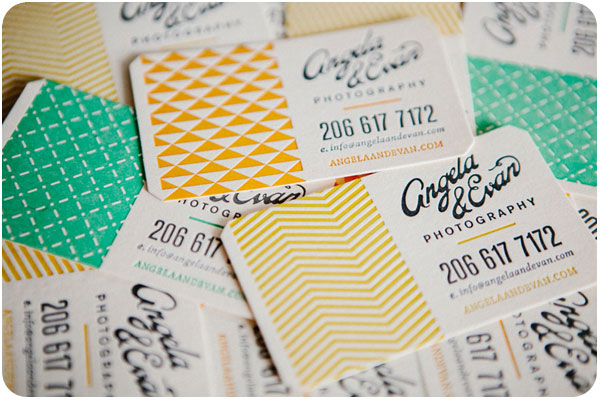
i love a vibrant brand that uses multiple color iterations, patterns and setups around one clear logo. this identity for angela & evan wedding photography centers around a striking hand-drawn logo, pairing it with fresh spring greens and yellows for wedding season, playing out into traditional photographic equipment in brand touchpoints. see the full post at designworklife.com.
wigwam cabins
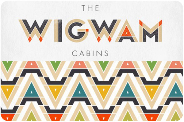
i’ve talked about this identity before, but how can you NOT when wigwams are involved? focusing heavily on the angular relationships of the W, A and M letterforms, they have created a thematic logo that references the shape of the cabins themselves, and then uses the extended color palette to carry the identity through, looking much like an indian woven blanket. fantastic & fun work! see more at the-design-ark.com
kröller müller

the kröller müller museum offers this colorful, inviting and interactive brand, where the logo appears to be revealed through an open door in still applications, it is very literally opening in motion and environmental graphics. another identity with every color application in the rainbow, it is not only versatile in pairing several colors into every layout, but the theme of invitation and discovery of art and environment is very strong in this brand. explore further at identitydesigned.com.
