1 tank per month challenge

tocoop

with the month of april wrapping up tomorrow, i’m able to review how my first 1 tank / 300 miles per month challenge went. i’m happy to report i came in at 240 miles this month, and while i thought it would be lower, i did take some luxuries, and had some emergencies that reminded me every month is going to have ups & downs and not to worry about them. i’m already driving a lot less, and even doing errands far less frequently.

the two main things i’ve learned are these:

+ i subconsciously allow myself to run a bit late, and only when it’s too late for other options do i confront driving. when i didn’t have a car, i didn’t really do this, so this is the fine line i have to watch.

+ i don’t mind the act of driving, but negotiating with bad drivers is infuriating, and happens a lot more often than i realized before i scaled back. the main times i was irritated this month revolved around driving.

the main thing now is to keep it going, and find new and exciting excursions to take. i still used my guidelines for making errands walkable and my on-the-go lessons of carless travel to get by. i’ve learned to run for busses [you catch them more often than not] and check ahead on my metro app for which options are arriving when. currently, i’m working on utilizing the amtrak surfliner, which allows bike walk-ons, for trips to bike-friendly beach cities. we’ll see how it goes!

friday fun: the signs of santa monica

The Signs of Santa Monica Blvd from chris rubino on Vimeo.

i have seen and photographed so many of these over the years. great collection!

creative inspiration: beer design

image: ohbeautifulbeer.com
3 selections

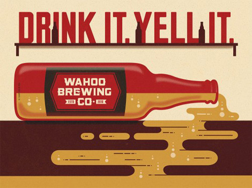
this week, i’ve collected 3 examples of awesome illustration styles in beer design. the first one, above is for wahoo brewing in texas. their blog is a nice tribute to craft beer.

image: ohbeautifulbeer.com

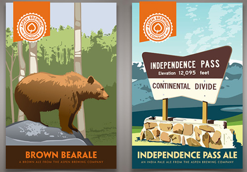
these labels for aspen brewing company in colorado are a fun tribute to vintage national park posters. the highlights of their collateral is featured here.

image: ohbeautifulbeer.com

finally, the illustration-forward packaging for R&B brewing in vancouver has been making the rounds, each brew with a themed container full of hand-drawn type. these pieces are new and not entirely integrated on their site as of this posting, but see the collection here.

thanks to ohbeautifulbeer.com for these great design profiles!

condiment class

image: poketo.com
image: poketo.com

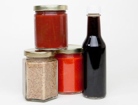
one of my recent monday mornings at the back door coffee club introduced me to zach negin, co-owner of sono trading company, and the instructor of poketo’s upcoming condiment class. i tasted their mustards at my first visit to artisanal LA and really enjoyed them. of my experiments with condiments, these 4 are not ones i’ve tried yet, so i figured why not learn from a pro?

spaces are limited and nearly sold out, but sign up if you’re interested: condiment workshop with zach negin.

friday fun: scarf tying

this is a resource i always need, so rather than bury it somewhere in an archive, i’m just going to put it here. i have a feeling i’m not the only one. get ready for a workout, dormant scarf collection!

creative inspiration

goa healthy yogurt

image: thedieline.com

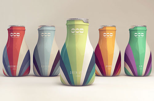
today i’m sharing some really cool food packaging / brand systems. these flavors of goa yogurt are poppy, fun color palettes. any surprise they’re from brazil? see the spread at thedieline.com


brown’s court bakery

image: designworklife.com

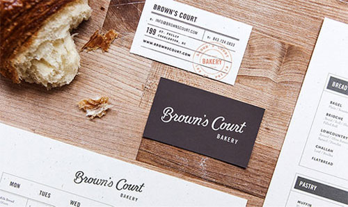
this beautiful identity system for brown’s bakery is multifaceted, covering every touchpoint imaginable, using preprinted matter and post-press applications. see the collection at designworklife.com


coffee & kitchen

image: moodley.at
image: moodley.at

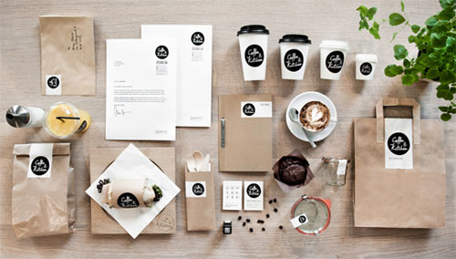
this identity for coffee and kitchen is a nice combination of bright whites, black ink and craft paper, and strategic use of stickers! see the full set at moodley.at

happy monday

it’s tax day, but i finished my taxes early, so i decided to share funny stuff instead. don’t use this funny stuff to procrastinate on your taxes!

if you’re like me, you regret almost every errant glance into comment threads or yelp reviews for their self-important tone. whether they’re true satire or just a collection of the most preciously ill-formed opinions, these parody reviews crack me up. when you’re done checking the yelp reviews read by real actors above, read onto some of these:

this film goes wrong in the wrong places. Sure, the acting is bad, the plot confounded, the editing nonexistent. But if i wanted to see a film this bad, I’d go watch all the stupid videos I recorded with my friends in elementary school. Eight and a half is about 2 hours and 18 minutes of just that.
sight & sound’s 10 greatest films of all time and their 1-star imdv reviews

Jar of uranium ore: I purchased this product 4.47 Billion Years ago and when I opened it today, it was half empty.
funniest amazon product reviews

And from their number arose a cry ancient and of another world entire and the raiders spurred their mounts through the paneglass of the American Apparel and the souls within perished under the blade and the cudgel and their cotton hides were taken from them.
yelping with cormac

friday fun: sign painters

SIGN PAINTERS (OFFICIAL TRAILER) from samuel j macon on Vimeo.

i guess i’ve got drawing and hand-lettering on the brain this week. above is the trailer for sign painters, a documentary, and also a book, by faythe levine and sam macon. the original post on thefontfeed.com is so full of good links, i’ll just send you there. enjoy!

beautifully illustrated wine labels

image: thedieline.com

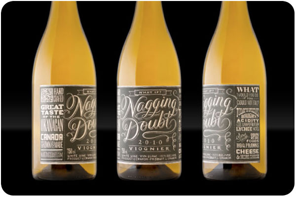
in my travels of design research, i’m always collecting inspiring work on pinterest. these 3 wine label design projects stood out to me as beautifully simplistic with the personal touch of illustration. on the heels of yesterday’s book about drawing your own type, how about that fantastic label for nagging doubt?! full post here.

image: thedieline.com

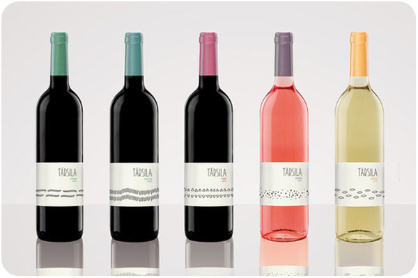
this collection for társila is such a breath of fresh air. i love the patterns for each wine, and the colors are a nice accent. i love this type of clean organization, it’s a very confident presentation. full post here.

image: thedieline.com

this “magic machine” that wraps the length of torello’s label is both funny and charming, a cluster of gears here, a bugle that funnels into a barrel there. a very nice touch of gold foil to match the color of the wine, too. full post here.