creative inspiration: beer design

image: ohbeautifulbeer.com
3 selections

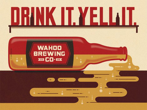
this week, i’ve collected 3 examples of awesome illustration styles in beer design. the first one, above is for wahoo brewing in texas. their blog is a nice tribute to craft beer.

image: ohbeautifulbeer.com

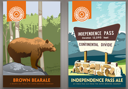
these labels for aspen brewing company in colorado are a fun tribute to vintage national park posters. the highlights of their collateral is featured here.

image: ohbeautifulbeer.com

finally, the illustration-forward packaging for R&B brewing in vancouver has been making the rounds, each brew with a themed container full of hand-drawn type. these pieces are new and not entirely integrated on their site as of this posting, but see the collection here.

thanks to ohbeautifulbeer.com for these great design profiles!

condiment class

image: poketo.com
image: poketo.com

one of my recent monday mornings at the back door coffee club introduced me to zach negin, co-owner of sono trading company, and the instructor of poketo’s upcoming condiment class. i tasted their mustards at my first visit to artisanal LA and really enjoyed them. of my experiments with condiments, these 4 are not ones i’ve tried yet, so i figured why not learn from a pro?

spaces are limited and nearly sold out, but sign up if you’re interested: condiment workshop with zach negin.

friday fun: scarf tying

this is a resource i always need, so rather than bury it somewhere in an archive, i’m just going to put it here. i have a feeling i’m not the only one. get ready for a workout, dormant scarf collection!

creative inspiration

goa healthy yogurt

image: thedieline.com

today i’m sharing some really cool food packaging / brand systems. these flavors of goa yogurt are poppy, fun color palettes. any surprise they’re from brazil? see the spread at thedieline.com


brown’s court bakery

image: designworklife.com

this beautiful identity system for brown’s bakery is multifaceted, covering every touchpoint imaginable, using preprinted matter and post-press applications. see the collection at designworklife.com


coffee & kitchen

image: moodley.at
image: moodley.at

this identity for coffee and kitchen is a nice combination of bright whites, black ink and craft paper, and strategic use of stickers! see the full set at moodley.at

friday fun: sign painters

SIGN PAINTERS (OFFICIAL TRAILER) from samuel j macon on Vimeo.

i guess i’ve got drawing and hand-lettering on the brain this week. above is the trailer for sign painters, a documentary, and also a book, by faythe levine and sam macon. the original post on thefontfeed.com is so full of good links, i’ll just send you there. enjoy!

beautifully illustrated wine labels

image: thedieline.com

in my travels of design research, i’m always collecting inspiring work on pinterest. these 3 wine label design projects stood out to me as beautifully simplistic with the personal touch of illustration. on the heels of yesterday’s book about drawing your own type, how about that fantastic label for nagging doubt?! full post here.

image: thedieline.com

this collection for társila is such a breath of fresh air. i love the patterns for each wine, and the colors are a nice accent. i love this type of clean organization, it’s a very confident presentation. full post here.

image: thedieline.com

this “magic machine” that wraps the length of torello’s label is both funny and charming, a cluster of gears here, a bugle that funnels into a barrel there. a very nice touch of gold foil to match the color of the wine, too. full post here.

creative mornings

image: sara mick
image: sarah mick

look at that captive audience [myself and the gorgeous ladies of the natural curiosities design department], up bright & early on a friday!

creative mornings, started by tina roth eisenberg in new york, has had a los angeles chapter that’s been active for about 3 years, and since then has grown so many chapters worldwide, i’ve lost count. i’ve been going off an on to the ones on the east side, and find they always have a new angle on some aspect of running a creative business that is inspiring. the person we are listening to in the photo above is stephen kenn talking about designing fashion and furniture inspired by reused fabrics he discovered in a downtown warehouse he found simply by wandering around. he and his wife also host the backdoor coffee club, which i dropped in on yesterday, and where i met some very interesting & creatively active people. i love all the avenues you can follow through the people you meet even in just the design industry.

image: sarah mick
image: sarah mick

regular photographer, sarah mick captures all aspects of the events. she took a picture of me doing this.

this year, each monthly talk is on a theme. here are the first 2 of 2013, on money and happiness. watch & enjoy, and follow their twitter to find out when to rsvp.

LosAngeles/CreativeMornings – Joel Arquillos from CreativeMornings/LosAngeles on Vimeo.

LosAngeles/CreativeMornings – Joe Stewart from CreativeMornings/LosAngeles on Vimeo.

completing the cutting boards

hp-tablesaw

last month, i talked about community woodshop and the first half of our cutting board class. last week i completed the class and came away with 2 nice cutting boards. the first step in finishing up is to trim the uneven edges, which i am doing with a squaring template on the table saw above.

trimmingedges

once i got my trimmed pieces, it was time to decide if i would do any cross cuts and flips. the wood grain itself will always look pretty on its own, but i used the trimmed edges to see where they flipped cuts would match up. i decided to cut the board into 5 pieces and flip symmetrically.

gluingcuts

after these final design edits, when the glue is dry, we plane both surfaces and decide on any edge finishes. i decided on simple rounded edges for one, and only one round for the other. then it’s off to the sander to get all surfaces perfectly smooth.

sandedboards

once they’re ready to go, we got out the beeswax. it’s more of a heavy grease that smells like fine bath products and soaks into both wood and your hands, giving both a nice finish. the color of the wood really came alive with this application. i think they look great, but now i’m a little hesitant to take a knife to them. next up, i’ve signed up for basic cabinetry. i can’t wait to see what manner of trouble i can get into there!

finishedboards