Squash Season: Freestyle Crunchy Chopped Salads

mandolined-veggies

We’re still eating our way through squash season in the studio. My very serious research into squash recipes tells me that people are looking for any way to modify squash to do things other than be squash. Lots of people make chips. Others took a cue from the cauliflower pizza crusts of late and make a similar squash crust. While, on their own, they are interesting ideas, I can’t really get behind the concept that I’ve watered my garden during a drought only to desiccate its bounty. There are a few where you salt & drain off some liquid, but that’s as far as I’m willing to go.

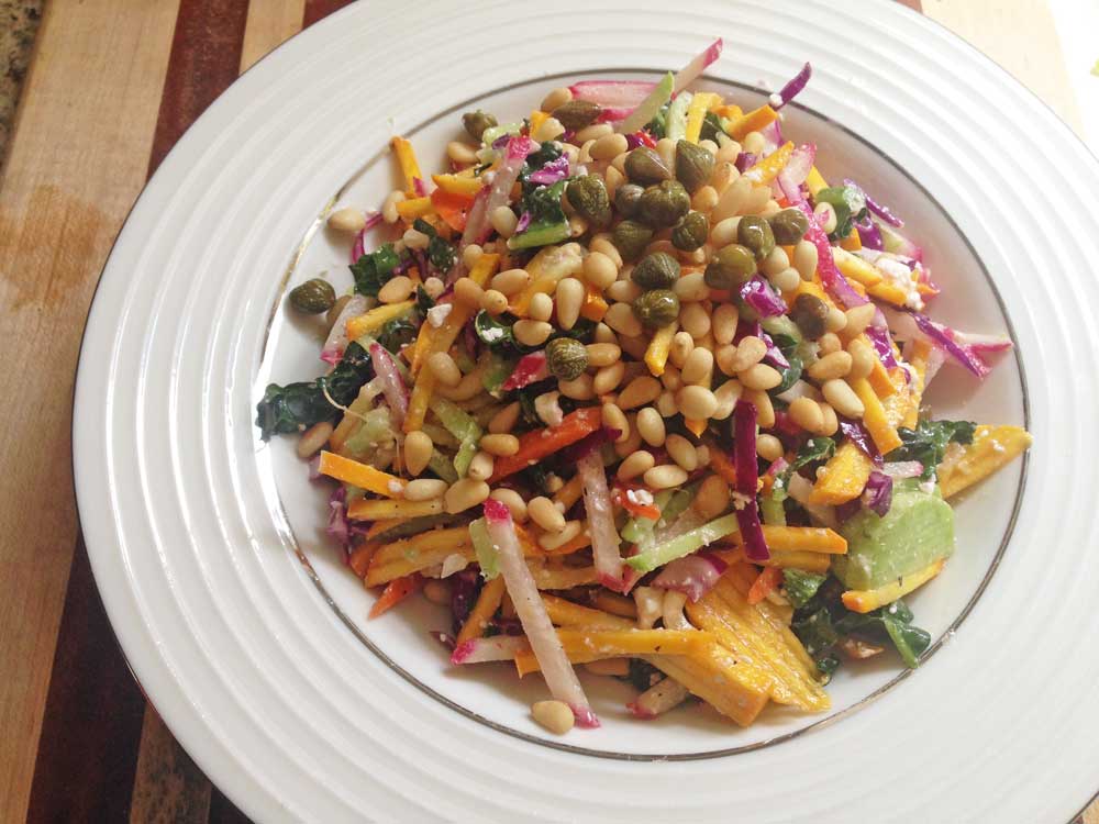
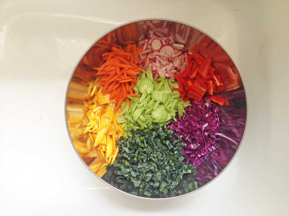
Turning to a kitchen tool that opens up a lot of possibilities, the mandoline can really put a new spin on your squash experience. Unlike squash that’s been sitting for a week, fresh picked squash has a good tooth to it, and does well with other crunchy veggies in a crunch salad. When every ingredient is reduced to basically the same shape & size, you can mix any ratio of any selection of veggies, dress them and enjoy the freshness. These salads are off the charts for Vitamins A & C as well.

I used generally similar amounts of mandolined yellow squash, red daikon radish, cucumber and carrot. Then I chopped purple cabbage, kale and red pepper in a similar fashion. This left me with roughly 10 cups of chopped veggies, to which I added 4oz feta cheese, olive oil and lemon juice to toss together and store. For each serving, I add some capers and nuts.

The great thing about these freestyle salads is that you can use what you have. I like a variety of flavor and color, but you could do only a few ingredients if you want. They’re also filling and so so healthy!

chopped-salad

Article of the Week

Crafting a Design Persona by Meg Dickey-Kurdziolek for A List Apart

Another look at brand design, this time through voice and persona. Many times when crafting or refreshing an identity, we touch on the voice and personality of the copy, but the project is largely visual. Dickey-Kurdziolek outlines a great case study of developing persona and voice for Weather Underground, deciding exactly when to be straightforward, scientific, funny and even apologetic. A great look at developing the communication style of an organization, and launching internally to get everyone on board from the inside out.

Squash Season: Roasted Yellow Squash Soup

yellow-squash-2015

For the first time in my life, I have room for a full-sun garden at my own home. Though we didn’t get this one started until mid-spring, due to moving in and finishing up our livability projects, the luck of a long season in LA means we still have a pretty happy garden on a later start. I’ve been documenting the changes at our house on our house blog, and specifically took a bunch of garden progress pics here. However, our yellow squash wasted no time in growing and maturing, and we’re currently in the full onslaught of about 2 large, ripe squash per day.

When you look up things to do with zucchini or yellow squash, many recipes go straight to breads, which aren’t breads at all, but sweet cakes. I just can’t do it, I tell you! Though I am keeping a particularly good selection of breads and converting them to grain-free coconut flour recipes, I’m setting out on a challenge to make as many fresh, healthy things with squash as I can! I wrote about pattypan squash for LAist back in 2011, and I’d like to thank me of the past for all those good ideas, along with this hilariously Dr. Seuss-inspired line on using squash blossoms: My favorite way is to stuff them with ricotta, but they also go well in any tortilla or frittata. Ha!

One way you can really enjoy the flavor of summer is to roast a mix of summer veggies as a precursor to soup. I’ve started with a base that can be blended and then seasoned in virtually any direction. To prevent from having to have vegetable stock around, we’re roasting onions, garlic and carrots along with celery seeds in the same pan, so your mirepoix is already in the mix.

roasted-squash-soup

Roasted Yellow Squash Soup

1 medium onion, sliced
3.5 cups thinly-sliced summer squash
3.5 cups thinly-sliced carrots
1/4 tsp celery seeds
4 garlic cloves, minced
4 tbs oil of your choice [olive, coconut, butter all work fine]
1 cup water or vegetable stock
salt & pepper

Coat a roasting pan with 1tb of your oil and layer in the sliced onion. Add a layer of carrots over the onion, and sprinkle the garlic and celery seed on top, along with 1tb of oil and a pinch of salt. With the mirepoix set, add alternate layers of squash and carrots, each with a drizzle of oil and pinch of salt until each is complete.

I like to alternate fats on each layer, so i go between olive oil, coconut oil and butter. I also add veggies that go with the flavor profile I’m going for, so on this batch, I added yellow peppers.

Roast at 350 for 1 hour. Toss to mix, turn off oven, leave pan in to cool with oven, or roast until you have a bit of caramelization happening on some edges. The veggies will reduce in size and When cool enough to mix, blend to desired consistency, adding water or vegetable stock as needed to blend it up, then pour into a pot. Bring to simmer and season as desired. Simmer as long as you need to for the seasonings or additional veggies you’re using.

I decided to go for a curry flavor, adding 7oz coconut milk and curry spices, so I only simmered 5 minutes. Last time I simmered 30min with parmesan rinds, adding 1/4c parmesan cheese. Top however you like: green onions, chives, cheese, oil, hot sauce …

This soup is very flavorful, and is equally delicious hot or chilled. You can also blend it into gazpacho when your tomatoes are ripe.

Movers & Cocktail Shakers at Descanso Gardens

DG_Movers_Shakers_invite

If there’s one thing I love, it’s a good cocktail party! Descanso Gardens has been coming up with some really innovative and intimate events, and their latest, Movers & Cocktail Shakers was the kind that puts the fun back in fundraiser.

Held at the historic Boddy House, we celebrated the era of the home through cocktails of the times, headed up by bar director Sean Naughton of LACMA’s Ray’s & Stark Bar. Three handcrafted cocktails told the formative story of the martini and old fashioned through their common ancestor, the martinez, the construction of prohibition-era sours, and the original recipe of the mai thai with hand-pressed almond syrup. Sean told the story of each drink, including interesting info about the ingredients, and gave great mixing advice. After each demo, he taught one volunteer how to make the drink again, so we’d really learn them.

To give some real retro flair to this event, we designed a lockup using period typefaces and used photos of the Boddys as a nod to their home. It’s always fun when you get to depart from current branding to develop a themed look for an event, and this one just happens to be an era I love!

See more of our work for Descanso Gardens here.
+ See more recent work here.

Case Study: Character Projects

CP_cards_mess

I recently had the pleasure of working with my very talented friend, Jonathan Silberman, in helping him launch his latest venture, Character Projects, a vintage lighting and hardware store, period home design services, and real estate specializing in historic homes around northeast LA. This project was very close to my heart, as it took place during our very own search for an arts & crafts-era fixer under Jonathan’s excellent advice and guidance. Talk about getting to know a client’s business! Having first-hand experience allows me to say, without reservation, Jonathan is my top recommendation in all aspects of home restoration with a sensitivity to period accuracy.

Branding for a service business can be tricky, especially one where the customer stewardship will become the most memorable experience for clients. Lucky for the visuals here, Jonathan pairs service with meticulously restored pieces that speak for themselves. At first we created a wordmark that was much more demonstrative of vintage style, but ultimately we decided to back off and go clean and timeless, allowing the products to do the talking.

Cards & Tags
Cards & Tags

Since Jonathan has such rich imagery to show, we went with moo cards, so he could have as many alternate photos as he wants, adding new sets as needed. This business started as an online store, but grew into a physical studio within a few months. Jonathan picked out some nice tags for pricing and product info, and we worked up some stamps he could use in marking these and other materials, such as tissue, stickers and shipping packages.

We gave him a site that allows for changing content on the home page, while putting a spotlight on each of his services on separate pages. His store links directly to Etsy, where he enjoys the overlap of social shopping with targeted demographics there, so all he has to maintain is changing content, which is easy and intuitive on the WordPress platform. Once his site was up, he was all ready to start promoting the opening of his store in Highland Park.

Character Projects is off to a great start, with a small but effective package of identity materials to help Jonathan grow his business. Visit Character Projects online and dare yourself not to consider remodeling your home.

+ See the full project here.
+ Read more case studies here.

If you’re just starting a new business, you’ve got a clean slate to take it in any direction. A starter branding package can get any new venture off the ground, targeting the right materials for promotion without anything you don’t need. Say hello anytime and let us know how we can help.

Article of the Week

The Danger of Assuming What Your Client Wants, by Allison Stadd for Behance

The title of this article seems so simplistic I almost didn’t read it, but I’m so glad I did, because it’s all about the importance of the discovery process. As a longtime snowboarder, I appreciated the case study of Burton [a snowboard equipment company] refocusing as the go-to brand for women, and the follies along the way to success. The difference between brand appeal from men to women was particularly interesting.

Starting projects and engagements with discovery is how we get to the heart of these issues and the people we’re communicating with. This article provides a great look at how discovery plays a role in a successful connection with a new market. Take a look!

Case Study: Rebranding Descanso Gardens

Main Identity Set

It started innocently enough, with a simple request to create a set of rules around using their wordmark and design a style guide around it. Just a guiding document for internal departments and external contractors to follow for a consistent presentation of all Descanso Gardens print matter. As with many things, though, that which appears simple has many unanticipated questions and discussions ahead, so we started as we always do, with discovery!

In this case, we did a full identity audit of the past few years of print matter, sorted by type [main stationery set, organization communications, membership campaigns, fundraising efforts, field guides, event collateral, signage], mounted to boards and affixed to the walls for all decision-makers to review and discuss. There’s nothing like seeing everything you’ve put out into the world all in one place to really see what works and what doesn’t. My approach is to collect everything and prepare the boards, along with best recommendations ahead of time, then present to the group and see where the discussion goes. Separately, we did a brand audit interview worksheet for stakeholders to fill out separately, to make sure the forward look of the organization was in line with the mission and the values of their membership. This is often where the best insider advice comes out, when people have the chance to speak anonymously.

Much of their core identity was very strong, it just needed a bit of refinement and standardization. Descanso Gardens’ main mission is to steward the land left by the Boddy estate, which includes in greatest number an impressive collection of camellias and native oak trees. We revised the leaf cluster used previously to reflect those of coast live oaks, and gave them a simple boxed wordmark in their signature green that keeps visual continuity with their previous setup. For social media, everything is further simplified, but the 3 elements are all there.

DG_ID_logos

Expanding to the full identity set, we have a standard logo setup, address lockup, leaf cluster placements for bleeds and non-bleeds alike. Descanso previously used an extended color palette reflective of the 4 seasons, which we modestly updated and applied to the business cards, specialty communications and membership campaigns.

Finally, the set was complete, and guidelines could be compiled into a style guide. We’ve covered everything from the basics of logo usage and type styles to organizational messaging and positioning. For the in-house departments, we have the basics of 1-sheet and flyer layouts, and for off-site contractors we have lock-ups and callouts and color specs for all color spaces.

Style Guide

We’re really pleased with how everything turned out, and looking forward to seeing how they use it in the coming years.
+ See more of our work for Descanso Gardens here.
+ Read more case studies here.

Is it time to whip your identity into shape? A brand & identity audit can get everything on track and moving in the right direction, and it also happens to be what we do. Say hello anytime and let us know how we can help.

Article of the Week

When to Wordmark? from Print Magazine

Here’s a situation every brand designer comes up against time and again: sometimes the research and vision of a client’s future brand points to a wordmark rather than an icon, or icon & wordmark lockup as a logo. Such was the case in our most recent brand exploration for Descanso Gardens, but that doesn’t mean the question of an icon or other image didn’t come up.

This piece, by Sagi Haviv, is a great rundown of several strong brands that rest on a word rather than an image. I’m of the very same mind and have found myself saying these same words: Creating a symbol can be a great design exercise, but we try to be very disciplined about only developing a symbol when there is a compelling strategic reason to do so. Indeed!

Enjoy.

Case Study: Chevalier’s Books Brand & Identity

CB_header_764
I’m excited to be a part of revitalizing a neighborhood bookstore in their 75th year of operation! Chevalier’s Books is a mainstay of Larchmont Village and beloved by the locals, though they’ve been struggling in the age of Amazon and changing times. Enter new owners and dedicated bibliophiles Darryl Holter and Bert Deixler with great plans, energy and funds, to give Chevalier’s just what it needs to come back in a big way.

CB_print-matter

Our main goals with redesigning this store brand was to appeal to everyone who loves books, bookstores, and keeping LA history alive, and give them a comfortable space to shop, meet, and convene for readings and events. The space is inviting and comfortable, with a great selection and an expert staff. We gave them a very literary wordmark, with a sign-off that reiterates their founding year, which is easily versatile enough to adapt for their 75th anniversary. To follow it out, we have matching business cards, gift bookmarks, merchandise bags, and an economically friendly canvas bag.

CB_canvas-bag

For the web site, we wanted to give them all the blogging and writing capabilities they’d need to promote readings, signings, intimate concerts, book club meetings, and membership, bringing some of the store experience online. The wordpress platform is simple enough for employees to update and integrate with social media, and the look packs all the information they need into a very clean, streamlined layout.

cb-site-about

In the first few months after re-opening, Chevalier’s was reporting record sales numbers in the holiday season. I’m excited to see where they take things in the coming years. In the meantime, check them out online!

+ See the full project here.
+ Read more case studies here.

You don’t need to be a new business to need a new brand & identity. Most of our clients are looking for a refresh & recharge approach, integrating previous efforts seamlessly into an elevated look going forward. If this sounds like just what you need, let’s talk!