creative inspiration


meg mateo ilasco and joy deangdeelert cho promote their new book, creative, inc.: the ultimate guide to running a successful freelance business, with this cute stop-motion video. thanks design sponge for the link.

branding

abu dhabi logo
[image: brand.abudhabi.ae]
the capital of the united arab emirates has decided to brand itself, with the help of m&c saatchi. i think this logo is really lovely, and i like how they’re using the mark alone to sign-off on all kinds of beautiful photos of the area. check out the full post for applications and the custom typeface they created: the abu dhabi brand rich, from underconsideration.com

identity

isle of skye business cards
[image: isle of skye]
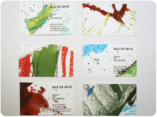
a stunning alternative to commercially printing your business cards, illustrator skye jeffries has cut hers from illustrations and overprint her black plate with a hand stamp, for an original creation in each one. thanks to designworklife.com for the link.

photography

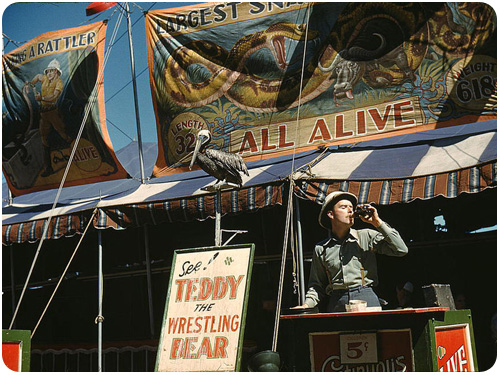
barker at the state fair
[image: library of congress]
this collection of color photographs from the 30s and 40s has been circulating around the internet, so if you haven’t seen them yet, take a look: captured: america in color from 1939-1943. from denverpost.com: These images, by photographers of the Farm Security Administration/Office of War Information, are some of the only color photographs taken of the effects of the Depression on America’s rural and small town populations. The photographs are the property of the Library of Congress and were included in a 2006 exhibit Bound for Glory: America in Color.

design industry

excellent advice for clients new to hiring designers: tips on buying design, from muledesign.com

here are some great thoughts on how we limit ourselves from being creative as we age further from our childhood sensibilities & wonders: the problem with creativity, from logodesignlove.com

event calendar, august 16 – 22, 2010

here’s what i’ll be doing

wednesday, august 18, 7-10pm type that moves (you) FREE with rsvp. put on by AIGA los angeles at typecon, we’ll be talking about the design of motion graphics and creating a typeface on the spot!

friday, august 21, 7-11pm house industries at reserve gallery opening FREE! Join us in West Hollywood for a House Industries show at Reserve Gallery featuring new wood serigraphs, custom Reserve/House products and plenty of House gear.

creative inspiration

color

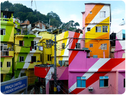
rainbow project in rio de janiero by favela
[image: favela]
they weren’t so bad to begin with, but this rainbow project in rio de janiero by favela makes these apartments downright tasty! thanks ohjoy for the link!

i missed the first post of print magazine’s series on color wheels, but now that the second one is out, i can share both here. look at these amazing retrospectives on color exploration through the ages!
the wonderous color wheel, part 1
the wonderful color wheel, part 2
hopefully we’re staying tuned for more…

if those made you want to put down your stylus and get your hands dirty, take a look at creative activities, from freelance switch and see how alternative forms of creative activities can keep your ideas fresh.

if you need a more conceptual way to do this, consider creative block’s design ideas for when you’re out of ideas for process strategies on the fly.

typography

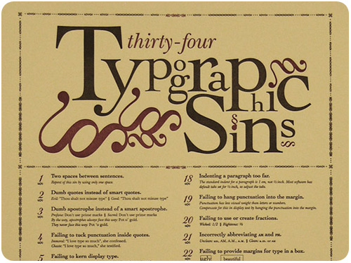
34 typographic sins
[image: jim godfrey design]
a poster designed around a compiled list of ways not to set type, by jim godfrey. take a look at the full piece at the showcase post on underconsideration.com

we’ve all seen uses of typography that could have been chosen better, especially when it comes to era-specific visual references. typecasting: the use (and misuse) of period typography in movies, from michael simonson runs through some classic stylistic mismatches with entertaining commentary.

want to make fonts on your ipad by drawing with your fingers? these people are willing enablers in this effort!

design industry

sharpie pencil
[image: sharpie]
permit me an office supply love minute here, but sharpie is releasing a liquid graphite pencil that goes permanent after a few days. i have a soft spot for pencils [espcially soft lead mechanicals], and while i realize this is not necessarily what the world needs, i am curious to try it. also, how cute is the sharpie blog header graphic?! thanks to how magazine for the link.

in our ongoing adventure to create great things, i think it’s important to remember that design is for everyone. ravi sawhney asserts designers continue to dedicate an overwhelming portion of their attention and energy toward designing for the top 10% in most developed nations. and he’s got a point. read more of what he has to say in designers are still blind to main street, from fastcodesign.com

consider the factors of a design team, and if you’re working alone, perhaps consider which ones are fulfilled by you and which are done by your client: 4 essential members of a great design team, from michael roller

an interesting look at 4 “ugly” web sites that make millions (and what we can learn from them), from kissmetrics. clue: figure out function first and tell your users how to do it.

LAUSD linked learning summer institute

LAUSD linked learnig summer institute

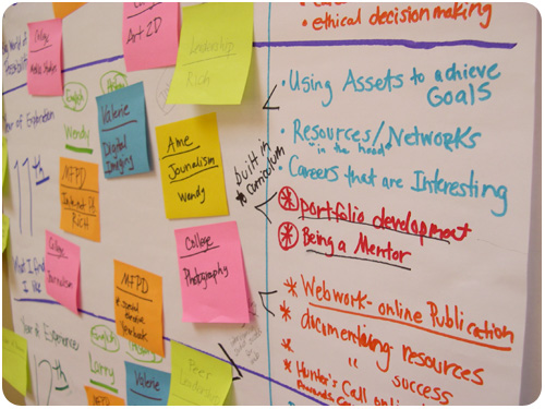
i’ve been working with the LA area chamber’s pillar program to link up with LA area high schools with graphic design programs, providing the perspective of a working designer for curriculum enhancement. most recently this took the form of the LAUSD linked learning summer institute with canoga park high school. several schools from LAUSD were present, and after a morning presentation, we split off into groups by school and worked on curriculum development.

the group of teachers included instructors in digital art & yearbook, drawing, printing, photography and english. they were a really great group of educators who have been working hard to improve school programs within tight budgets. i was really impressed with the curriculum they already offer. it’s so much more developed than anything my high school offered to potential designers, and while some of this is the natural evolution of education multiplied by the accessibility of the internet, some of it is old-fashioned care and attention being paid to our profession.
LAUSD linked learning summer institute

the focus of the consult was supposed to be about how i could help advise on real-world scenarios and help direct curriculum to address these things in the classroom before the students become employed. interestingly, though, we got into a discussion about the current perception of the school and how it’s not where they’d like it to be in order to attract students who want to participate in the design program. it had all the makings of a branding conversation, so i said it sounds like canoga park high needs a brand makeover! and they agreed.

we decided to start talking about it as a possible project for the design program to tackle. what i love about these teachers is that they were full of questions and had great ideas about implementation. one of them asked “if we were to conduct a rebrand project, how would you suggest we do it?” we went through having the students brainstorm on all their perceptions about the school, good, bad & ugly, and refining their thoughts to core ideas.

we talked about conducting an informal market research campaign where they could interview their parents, neighbors & local business owners on perception of the school and analyze it. we talked about developing a brief going forward and having students propose projects they’d like to do to support it [photo essays, psa poster campaigns, identity exploration, mood boards, poetry in a typography-only layout, etc.]. we talked about having kids in 3 different classes group up [a designer, an illustrator and a copywriter] to work to produce projects as creative teams. we talked about environmental and experience design—what’s it like to walk into the attendance office to get an absence slip, what about that experience is a reflection of the school? whether these things actually get redesigned or just remain projects isn’t important, but the process of identifying parts of a system and how to improve them is.

what i love about it the most, is that it serves multiple purposes. the students will be building amazing portfolios, the school will have attention to its image paid from the inside out, and the educators will have no shortage of artifact to send along with grand proposals to show the level of work they’re doing.
LAUSD linked learning summer institute

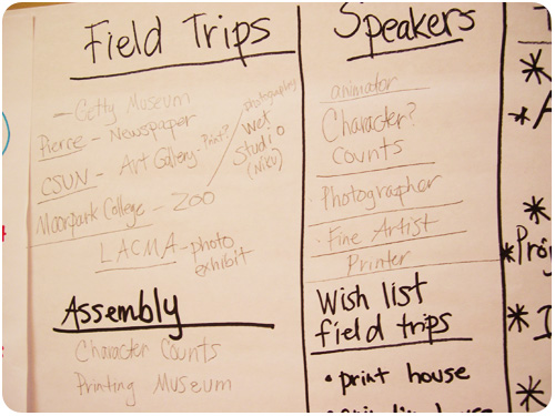
of course, it doesn’t stop there. one of the biggest challenges with a diverse group of students is relative levels of exposure to design. i’m sending over resources the educators can use to present all different types of design to the students, as well as offering to come in and talk about portfolio development and help give the students a good idea of what they’re in for with a career in design. i really hope they find a way to work up to the school rebrand project, it’s a big thing to organize, but it would turn out some really exciting work.

creative inspiration

identity

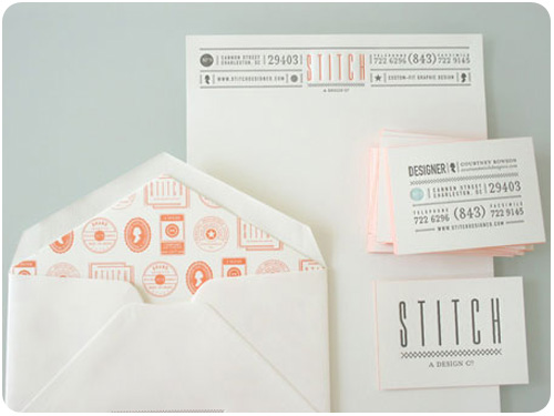
stitch identity
[image: stitch design co.]
stitch design co. worked up a lovely identity system for themselves in 3-colors and letterpress printing. i am really loving the orange edge printing on the cards!

history

propaganda & graphic design
[image: fastcodesign.com]
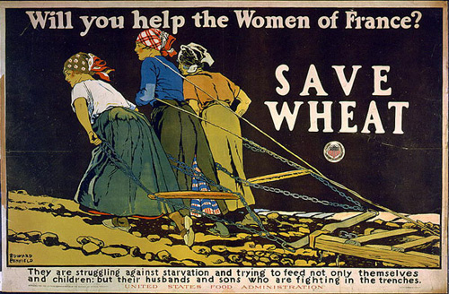
how america waged war with food and graphic design, from fastcodesign.com is a great first look at cory bernat’s collection of posters from 1900 to 1950 from the national agricultural library, showing how government urged citizens to modify their behavior for the greater good using graphic design.

design industry

publishing in the age of the internet, from design observer is a fascinating article about how the perception of design has changed due to the abundant archive on the web, and the reaction of the author to launch a unit editions dedicated to producing books on design and visual culture, as well as a series of low-cost research papers covering a range of topics in graphic design. sounds fantastic!

how i get positive feedback from my clients, from marketing mentor is a nice piece by guest blogger, kara smith, on her follow up strategy for rounding out projects, giving thanks and asking for feedback. good ideas!

top 10 web sites for designers, from HOW. another great round-up for august of resources for design professionals.

want to win an eco-trip for 2? neenah paper is celebrating it’s environment line with a contest! enter for a chance to win an eco-trip to costa rica for 2!

photographs of signs

signs of san francisco
[image: print magazine]
kicking off a new series, print magazine’s blog imprint showed a selection of photos of signs of san francisco. these are all so beautiful, i’m glad to read they want to make it a series, asking readers to submit photos of their local area sign relics that they’ll post up and feature. excellent!

creative inspiration

branding

miller high-life brand refresh
[image: underconsideration.com]
admittedly, i don’t drink miller high life, so i’m not sure how long before i noticed their packaging redesign. luckily, we have miller high life overhaul from underconsideration.com with copious photos and reviews. i love the cleaner look that doesn’t deviate from the original, and more prominent use of their poster-girl, lucy, which is a lovely illustration featured on the sides of the 6-packs above. nice work!

packaging

cigarette packaging
[image: fastcodesign.com]
a hilarious look at what might happen if packaging could deter smoking merely by being totally annoying! can annoying cigarette packs make smokers quit? from fastcodesign.com. brilliant!

design industry

design never 2010 winner
[image: howdesign.com]
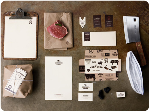
i love the concept of project never, an awards show to showcase great work that never made it to final. thanks to the how design blog for showcasing the 2010 winner, an identity system for chop shop, by ptarmak, inc.. i’m loving this typography they did.

michael beirut takes a look at advertising personalities after the season premiere of mad men for design observer jerry della femina, mad men, and the cult of advertising personality.

i thought this photography post was worth sharing: the showcase of beautiful pinhole photography from smashing magazine. i haven’t taken pinhole photos since my high school photography class!

need some help talking money with clients? don’t let “you” get in the way of price negotiations, from creative freelancer blog has some possibly-familiar suggestions you might see in your own experience on how to improve.

linkswitch 28: choose a domain name, hire a designer, from freelance switch is a pretty awesome list of all kinds of things you might want to do but just don’t know how. take a spin, maybe tackle some if they’re on your list!

event calendar: july 26 – august 1, 2010

here’s what i’ll be doing

tuesday, july 27, 7:30-9am the LA area chamber referral network. my bimonthly breakfast to connect with my fellow chamber members is FREE to chamber members, but you can drop in as my guest if you’d like to check it out.

thursday, july 29, 7-9:30pm stimulatte [one drink minimum]. Come out and join us for a cup of coffee and some stimulating conversation at the Zephyr Cafe! This Month’s StimuLatte is being hosted by CSULA’s AIGA Student Group GAUGE. Thanks to Aileen Garrido! StimuLatte is a monthly networking event for held during the school year for Los Angeles area Design Students. come out, design students!

other events for this week

tuesday, july 27 – friday, july 30, 7-11pm each day Information Design: Transforming data into information, information into knowledge, and knowledge into stories, a week-long class at machine project.

biznik article of the week

how saving money on branding can cost you by Maria Ross

another great piece on branding and why it’s so important to put together a strategy from the beginning. ross summarizes it best herself here:

Hiring unqualified people or designers who don’t ask you anything about your value proposition, differentiators, or target audience is not the way to save money. I talk to many people that threw away money because their brand strategy was not baked yet. Good design is a skill: it’s a skill that involves taking a message and communicating it visually, not just creating a pretty picture. You will lose more in lost sales by getting this part wrong than you will save on cutting corners.

And guess what? That brand strategy will do more than just inform your visual identity. It will serve as a compass for other marketing investments: partners, advertising, events. Basically any decision your company makes will be a smarter one if you start with the brand strategy first and use it as a compass. This helps you avoid throwing away money on what I call “random acts of marketing” and ensures that you only invest in activities that move your business forward.

creative inspiration

brand development

brand building
[image: fastcodesign.com]
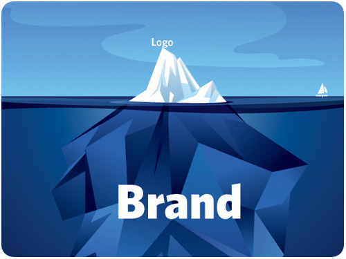
apparently, the idea that when a client asks for a logo, what they probably really need is a brand strategy is gaining ground. if this is you or someone you know, get familiar with what goes into brand development with six tips for designing a memorable brand from fastcodesign.com.

once you work out the brand strategy, you’ll want to create a style guide so you can keep everyone developing artifacts for your business on point. to get a good idea of what goes into a style guide, check out designing style guidelines for brands and web sites from smashingmagazine.com

logos

indian rupee symbol selected
[image: logodesignlove.com]
more than a logo, a currency denotation is an international symbol that comes to be synonymous with a country and its people’s well being. the indian rupee underwent a redesign [via, of all things, a design contest] and a final has been chosen. i like the shape of it, almost futura-istic. read more here: indian rupee symbol selected, from logodesignlove.com.

typography

interview with rudy vanderlans
[image: fastcodesign.com]
i have been an emigre fan for my entire design career. it was just yesterday that one of many awesome creations of rudy vanderlans [brothers typeface] rescued yet another in a line of countless layouts for me. join alissa walker in her interview with this amazing type design icon and his new showcase for his typefaces, historia: type master: an interview with emigre’s rudy vanderlans, from fastcodesign.com

design industry

recycled vintage couture by koi suwannagate
[image: greenlagirl.com]
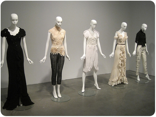
i wasn’t able to make it to the pasadena museum of california arts biennial this past saturday, but you can take a spin through the greenest features here: discover green design at pasadena museum of california arts biennial, from greenlagirl.com.

we talked about it last week, we’ll talk about it this week: print cant be dead if people are still starting up new magazines, especially in these new niche markets for printed rag fetishists. steven heller profiles vintage magazine for print here: print ain’t dead yet, continued.

three for the marketing department. first of all, drop the “us vs. them” mentality, marketing and design do their best when they work together: the creative vs. the marketing team: yin and yang, oil and water, from smashingmagazine.com. then, take 2 marketing-smart tips from ilise benun: does your email say “open me?” and keywords made simple, both from marketingmixblog.com.