[photo: ©larsonmirek on flickr]
[recap day 1 and day 2 of the HOW conference]
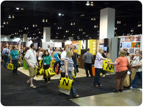
we’re in the home stretch! at this point i was really exhausted—but it’s back to the convention center for the final wrap up on HOW 2010!
designing the future, dodging the vectors
i’m always interested in what the aiga is up to, and wanted to hear what richard grefé would talk about as their new direction. i have to admit, this presentation went by too quickly for me to keep up with the notes, but grefé talked about how design has changed from simply executing on creative direction, to strategic thinking. his idea of dodging the vectors is about the fact that traditions in design practices have become the vectors we most often follow, and it’s time to divert from those in order to evolve the industry, both in practicing differently and teaching it differently. we start as makers of artifacts, and evolve into designers of higher concepts and more interdisciplinary hybrid intangibles. similarly, the global landscape has changed, and since american culture is received less openly, we have to change how we appeal to the rest of the world. aiga will adapt to these changes by investing in the new generation of designers, meeting people where they are, recognizing that social responsibility counts and that institutional authority is no longer valid. interesting points, i’m going to have to download his presentation to recreate the full picture. i couldn’t write fast enough!
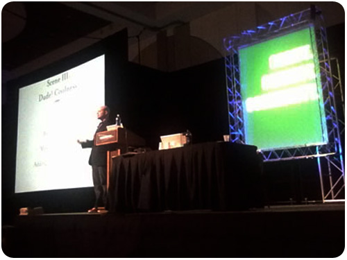
rediscovering play: bringing fun and passion to your work…and life
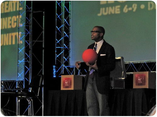
[photo: ©larsonmirek on flickr]
kevin carroll was a very inspiring closing keynote for the conference. while he talked about play as a universally important aspect of human culture, my takeaway was that he connected with something he felt passionately about and made it his life’s work, working with ann willoughby to make his ideas accessible in a few forms of media. but above all, his message was to find play and connect with our need to play as an uplifting social exercise. i really enjoyed his style.
wrap-up
overall i really enjoyed my first HOW conference. there were so many amazing people here with so much to share, even advice that may have seemed obvious was re-framed in new contexts as food for thought. there was so much good programming that it was hard to narrow the choices down for concurrent sessions.
that said, i do have a few critiques
first, a lot of the sessions were named something a bit misleading. the session titled killer copy was not about crafting killer copy, it was about creating clear content. three word taglines was not about branding practices so much as changing process and approach. i started to wonder how many other sessions i passed over due to the title [and description] that would have been interesting to me. second, a lot of these presentations are too portfolio showcase-heavy. i remember a time when i might have been more curious what artifacts these designers were producing, but currently i’m a lot more interested in their process and style than having half [or sometimes all] of a presentation be a portfolio show. this is probably due to how online portfolios have become so available remotely, but what i want to see & hear these days is more about how you think rather than what you made. third, the exhibition floor should be open a little more often. it seemed like it was only open during the breaks, and i get that, but a conference like this is so back-to-back that we need lunch breaks outside. the only time the floor was open was when it was flooded with people, and as such, i never got a chance to walk & talk with vendors. they paid for those booths, give them some quality time with attendees, not just a swag-fest.
getting respect is a 2-way street
another thing i noticed in a big way due to the nature of CFC and HOW happening back to back is the difference of the attitude toward design between business owners & independent professionals like myself and in-house designers. in both arenas there is a lot of talk about how to communicate the value of design, how to convince our clients and bosses that design is a priority not to be overlooked. at CFC we talk about strategic thinking v. simple execution on directives. we talk about knowing the value of what we produce, creating a fantastic experience for our clients, and charging accordingly. and we talk to each other about how we plan to do this, things we have done that work, evidence that we have converted clients to believers because they see the return on their investments. this was also discussed at HOW, but when i’d talk to attendees, i also heard in-house designers talking about working on the side for rates that could never support an independent practice, doing branding work on an hourly rate with no value add commensurate to the service, or working to justify the value of design to the higher-ups and then turning around to pressure their contract designer to do extra work for free. when david berman challenged designers to do 5 hours of work per week for a cause, i heard grumbling along the lines of …but how do you pay the bills? when i related some of brian dougherty’s sustainable best practices to someone i met, the response was but how do you get clients to pay for it? this was disheartening, but it’s no surprise to me that getting respect in this industry is so hard when so many people are willing to sell it out in one way or another, or come to the most simple, somewhat-cop-out answer. there’s an inherent flaw in trying to sell your clients and bosses on the value of ideas if you’re selling logos on the side at production rates. to be valued in the way we say we’d like to be at these conferences, we all have to bring professionalism and respect to everything we do, in all areas of our practice. we all have to live this message more so we can talk about it less.


