article of the week

7 steps for creating disruptive new retail experiences by jump associates for fastcodesign.com

one of the most fun aspects of branding is when the main work of identity and brief are finished and you get to start applying the brand to in-person experiences. jump associates put together a great list of time-tested points with examples of how to build a unique, engaging experience out of your brand strategy.

creative inspiration

Baroque.me: J.S. Bach – Cello Suite No. 1 – Prelude from Alexander Chen on Vimeo.

sculpture

ugmonk woodcut ampersand
ugmonk woodcut ampersand, image: ugmonk.com

i really wish i could buy every large, sculptural ampersand i see. this premium woodcut & from ugmonk is pretty sweet.

typography

averia font type sample
averia font type sample, image: fastcodesign.com

so, i don’t know if this would happen to you, but it happened to dan sayers when he averaged the shapes of 725 fonts on his computer. i think it’s refreshingly friendly with a little throwback to faces like cooper old style. read up on it and get a download link on fastcodesign.com

poster

stuart thursby ampersand poster
stuart thursby ampersand poster, image: underconsideration.com

look at that, i tricked you with all these categories since everything i’m posting today is about type. this lovely ampersand is made up of all different styles of tiny ampersands in a lovely shade of blue! check out underconsideration.com for a closer look.

food

parlato design studio seasonal eats recipe guide, thanksgiving 2011

if you weren’t able to snag a free copy, the parlato design studio seasonal eats recipe guide is $5 per copy in the store!

Case Study: A Modest Makeover for Tony’s Darts Away

tony's darts away web site

We recently gave Tony’s Darts Away a little makeover online and wanted to share it with you. If you’re familiar with the All Craft, All Draught, All California bar in Burbank, you know they’ve been making a name for themselves as celebrationists of some of the finest California craft beer. Before we even got involved, LA weekly cited their site in a top 5 of LA restaurants others could learn from, so we wanted to keep it as accessible and informative as it’s always been, with more muscle on the back end and make it more easily expandable as their web presence grows. Their contact info & hours are built into every page, their site pages have been sorted into simple main categories, and we’re porting tweets into a sidebar so they can announce events and late keg tappings after opening.

tony's darts away, interactive beer list

Similar to what we did for Mohawk Bend, we gave Tony’s Darts Away an interactive beer list to make browsing, searching and sorting easy. On the back end, this list is easy for employees to manage and update, so the menu stays updated all the time.

tony's darts away, beer styles library

Something unique that has garnered this site some attention is the beer styles library where visitors can research and read tasting notes and anecdotes on all kinds of craft beer styles they might encounter at Tony’s and beyond. Click a style in the sidebar and the text loads in the center. We also set up the brewers list the same way, so if you’re curious who’s who and what’s what, take a look!

Finally, we did some streamlining to their menu workflow, to integrate menu layouts that allow for styled updates they can print as needed and then paste right into wordpress. The main idea here is, we want to make it easy for them to get done with setup and serve us all some beer, which is exactly what will happen if you drop into Tony’s. Visit the full site: tonys.la

+ Read more case studies here.
+ See more of our work for tony’s pubs.

get design on a budget without a crowdsourcing contest

crowdsourcing & design contest vs. partnerships and volunteer opportunities

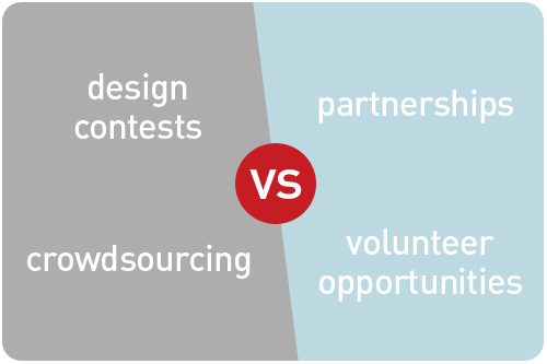
so, you find yourself in the position of needing design services, with the little problem of not having a budget for the designers you want to hire. and maybe you’re thinking “hey, let’s have one of those contests where people will design stuff for us as part of a competition, and we’ll award some kind of prize for the winner!” why not, we’re seeing all kinds of larger brands hold crowdsourced design contests, and it seems like a good deal for everyone, right? well, i can understand the eagerness to want to jump to this conclusion, but there are a few problems here, not least of which is that there’s actually no real benefit to your winning designer. big brands don’t hold design contests for the purpose of supplementing what their creative teams can provide, and this is where smaller businesses stand to make mistakes when they emulate big companies. we’re all in this together, and we all have valuable services that can add to each other’s businesses greatly if we trade them strategically. there are smarter ways to get the things we can’t yet afford by searching ourselves for equitable trades and creating volunteer opportunities, and i’m here to set you on the path that’s better for everyone.

so, what are crowdsourced design contests?

by definintion, crowdsourcing is the act of sourcing tasks traditionally performed by specific individuals to an undefined large group of people or community (crowd) through an open call. When applied to a design project, the contest seeks to replace paid work with spec work, which is essentially work that is only paid for conditionally after completion if accepted, leaving the designer to put out effort on good faith of payment. [clue: professional designers usually work on a payment system, where a deposit and payments are made at project milestones along the way, not after.] the general feeling of the design industry is that spec work, including crowdsourced contests, are frowned upon. when a company decides to replace paid work with a contest, we talk about it and tend to agree it’s not worth our participation. believe me, designers are asked to work for free all the time, and unless you’re saving kittens for the greater good, or you’re my mom, we’d prefer it if you factor the cost of business into your budgets.

so, what’s the problem with them?

here’s what they look like: a company announces a contest to design them a poster or a logo or an ad, and after reviewing all entries, the company will select a winner who will get a prize of somewhere around 500 bucks. [clue: this prize is usually far below market value for the design work solicited] on the surface of it, it seems harmless, maybe even fun to the amateur on a lark, but let’s take a closer look. statistically speaking, the likelihood of winning is extremely slim. contests like these usually have legal provisions allowing them to take exclusive rights to ALL work submitted. if you were thinking of showing it in a portfolio as the winner or even as a contributor, think again—the company can demand you make no public reference to the work you did. so let’s get this straight: hundreds of people do the same job, one person gets paid below market value, and all of them get stripped of the ability to promote what they did. is this how we want to treat people who do free work for us?

so, why do big brands have design contests?

i’m of the firm belief that big brands have crowdsourced design contests for entirely different reasons than smaller companies, and that they’re not at all used for actually sourcing design. big brands all have budgets for the design they need done, and they know the value of having it done professionally. if they don’t already have a big in-house team, they have an agency they trust implicitly and use regularly. i promise you there are no creative meetings that result in the design team running in a panic to marketing, saying “we’re fresh out of ideas! quick—call in the public to help!!”

so, if they don’t need design, what are the contests for?

here’s where i’ll tell you a branding secret. creating a strong brand is about creating a lot of positive thinking around your company or product. designers start this by designing your brand for you, and you continue it by delivering good service and growing the brand in line with your core commitments. the reason good branding works is because allows the customer to project their strongest personal narratives when they interact with it. when i think about buying the running shoes i’ve been coveting, i think of myself a healthy person who likes running more than i do while promising myself i will go running more than i will. when a big brand launches a design contest, they get hundreds of thousands of people to think about advertising for them. even if they only get 5000 submissions, they may have gotten 50,000 people or more to imagine creating something for them—thinking positively about their brand—which is infinitely more valuable than getting free design. [clue: when they cast you in the role of their designer, they’re getting you to make positive statements to yourself about them—sneaky!] moreover, they can test the reach of their advertising and brand loyalty by seeing how many people participate. it’s actually a way to take the market’s temperature, get people rallied around them, appeal to our sense of narcissism [maybe i could win!], and get participants to take action in the name of brand loyalty. that’s the power of positive thinking, only they’re using your brains to do it!

the thing is, while we may write these contests off as publicity stunts, most people see them as legitimate, and they do a lot to create the perception that design is a simple thing that can be done equally well by anyone for about 500 bucks. with obama’s recent art works campaign [design of a poster in exchange for 1 signed copy of the limited edition print], common reactions to designer criticisms said “but this is volunteer work—just like the folks going door-to-door!” i’m sorry to say, but just because entry is voluntary doesn’t make it volunteer work. volunteers should have a connection to the effects of the work they do—that’s the rewarding feeling they’re working for. contests like this ask thousands of people to do work that no one will ever see, rewarding only 3 finalists—and not by using their art in the campaign, but merely selling prints in their store. they’re missing a bigger opportunity to show more of the work and celebrate being inclusive rather that just getting people thinking and talking. i could go on, but instead i’ll leave it at this: the design community respectfully asks bigger businesses to find more creative ways to increase brand loyalty than contests that cheapen the value of the design profession.

so, where does that leave smaller businesses?

here’s the big disconnect i see. while i’ve almost never seen the winning work from a big brand’s design contest [clue: big brands don’t break brand continuity for contest winners], there are lots of smaller companies and non-profits running similar contests for major parts of their branding. sometimes their logo, sometimes a major promotion poster—money-making promotional items they should budget in as the cost of doing business, but for whatever reason, they don’t. it might seem like a great benefit to the contest-holders to have hundreds of samples to choose from for the price of a prize, but you’re asking hundreds of people to all go through the same effort, rewarding only one. considering most professional designers abstain from participating, ask yourself who is even doing this work? unlike a big brand contest designed to excite people about a familiar brand, the participants of a smaller, lesser-known contest don’t have much to connect to. and anyway, do you really have time to review hundreds of mediocre samples, retrofitting a final choice into an appropriate brand for you? when small businesses do it, it looks a lot more like what it is: someone asking for something for nothing. there’s a much better way to get what you want without wasting the time and effort of everyone involved.

scrap the contest idea and get real

as i said before, we’re all in this together. we could be building lasting partnerships instead of trying to get stuff from each other for free while slapping the word “contest” on it. treat this work like what it is: a job. prepare a full creative brief and advertise for it with honest compensation. if you don’t have the budget to pay for it and you’re looking for an outright volunteer, say so, or start asking yourself what you can offer in trade and quantify these things in an offering. not empty promises of future work, unqualified referrals or portfolio building, because we’ve all heard that before, and they sound just like the lies they are. consider things you might normally charge for that have little overhead for you, that would be as valuable to your designer as their design work is to you.

dig deep and mine the value you can offer

for starters, you will want to take ownership of the work, but always allow your designer a credit in print on the piece, a link online [preferably in a “thanks to our sponsors” or similar credit], the right to display the work in a portfolio, and to enter contests for the purpose of garnering awards. [clue: this is what paid designers ask for, so it should be a given for in-kind trade work.] taking it further, write them a testimonial they can use on their site and on social media networks. if your site has a page of trusted partners or online advertising, link them up. if you’re in the business of putting on events where there is some form of collateral, offer them sponsorship placement on signage, an ad in the program book, and let them leave print matter for attendees to take. if you’re in a particularly related industry an there are speaking opportunities [say you put on a conference and have a panel your designer would be a good fit for, or if you run a trade show and can offer them a booth] see how you can work them in. if you deal in products or services the designer might be interested in, be open to offering an equitable amount of products or services in trade. make sure the things you’re listing have real value, and if you can ballpark what their monetary equivalent is, you can come up with a suite of offerings, perhaps a combination of promotion, service and product that comes in right around where the project fee would be. if you find a designer who is interested in these things, and whom you feel is a good fit for your design project, you’re in business! draw up a trade agreement of exactly what each party will do for each other, with a timeline for milestones and deliveries. lo and behold, we have reinvented the barter system!

what if i don’t think i have anything of value to trade?

hang in there kitty! if you’re in business in any capacity, you will have something to offer and probably just have to think harder, but if you’re not finding a designer who wants to take you up on your trade, start smaller. many new businesses think they have to come roaring out the gate with all the fancy collateral that larger, more established businesses already have in order to compete. here’s another secret: you don’t, because you’re not competing those businesses yet. start with what’s free and work your way up. can’t afford a web site? get all your social networks set up, add business pages and start communicating with people there. can’t afford a logo and identity? set your company name in a nice, clean, appropriate typeface, and make yourself a simple business card [clue: ask me for referrals on affordable printers]. look into networking events for small businesses, and for your industry, and get out there and talk to everyone you meet about what you do. tell them you’re just getting started, and you’re really excited about it. you can get much farther on good service and a good attitude with a simple identity than flashy design that attempts to cover unfocused service and untimely delivery.

…and save your money as you grow, because if you’re doing it right, you’ll have the beginnings of a brand promise people are eager to associate with visually, and for that you’ll need the budget for an awesome designer.

design week LA 2011

design week LA 2011

design week is actually here! after scouring the list, i think i’m going to head over to mid-wilshire and check out A+D’s eames designs exhibit, CAFAM’s the golden state of craft and LACMA’s california design: living in a modern way. then some other time this week, up to pasadena to the norton simon museum for proof: the rise of printmaking in southern california and the original print: an introduction to printmaking in the postwar period. sounds like a super week of design history & celebration!

creative inspiration

branding

mohawk bend brand & identity

this week we’re looking at branding from the home team: the whole story behind building a brand & identity for mohawk bend!

typography

FF tundra characteristics
FF tundra characteristics, image: ilovetypography.com

take a look into one type designer’s process on the making of a new serif face from i love typography: FF tundra

letterpress printing

iron beasts make great beauty cover
iron beasts make great beauty cover, image: beastpieces.com

some sneak peaks on the new book from studio on fire, the cover printing of their new book iron beasts make great beauty. how cool to be able to print the cover of a book on your work!

los angeles

dosa truck sketch, shiho nakaza
the dosa truck, image: shiho nakaza

my friend, illustrator shiho nakaza, is doing a cool sketch series on LA food trucks. check out her food trucks blog tag to see the series.

thanks to echo park now for culling all the echo park listings from LA weekly’s best of LA issue. echo park rocks!

Case Study: Mohawk Bend Brand & Identity Development

mohawk bend brand & identity

As the saying goes, I love it when a plan comes together. When I first talked to Tony Yanow about his newest venture, Mohawk Bend, it was nearly a year ago, midway through the Ramona Theater’s renovation process. While we’d be working from scratch design-wise, Tony had a very clear idea of who he was serving and what the attitude and voice of Mohawk Bend would be, which made the preliminary research and brand brief development really easy. He also had an interior design team working with the raw materials of the space and adding beautiful custom furniture in light wood and warm, orange tones. From the outset, we knew the setting of where the identity would live and how we could make it stand out appropriately within that environment.


mohawk bend logo

logo development

Mohawk Bend has a few different areas of focus, but it’s first and foremost a celebration of craft beer from all over California. The most exciting and innovative of these is the hops-forward west coast IPA, and in that vein, the hop flower became a main feature of the logo.


mohawk bend icon system

mohawk bend business cards

building an identity

Beyond beer, though, their plans included California-sourced spirits, a bottle-free selection of California wine, local / organic food that spans the vegan-omnivore spectrum, and a low-waste operation in the kitchen. Tony really wanted an icon system that could represent each of these aspects and work interchangeably with the main identity, play out on the web site, and associate with core staff’s areas of expertise. We developed a color palette and selection of icons that swap out with the hop flower in the logo for specialized uses, and become indicators for each area of the web site. For future signage and events, they’ll have the versatility of growing this icon system with new developments.


mohawk bend web site home page

keeping it simple & highly useful online

Creating the web site was a fun exercise in brainstorming all the things we hate about restaurant web sites and putting them at the top of the list of what not to do. No flash, No pdf menus, No hard-to-find location information. Tony was always very clear about the voice of Mohawk Bend, that it’s craft first in a simple and honest way. We were still excited to talk about all the great things Mohawk Bend does, however, so we built all of it into the about section, so the information is there without being an obstacle on the home page. Instead, a styled twitter widget announces daily specials and events, with clear postings of hours, location, directions and a list of menus: get the info you need and come on over!


mohawk bend web site interactive beer list

the interactive beer list

One particularly fun feature is the interactive beer list. During our preliminary talks on functionality of the site, Tony said “What I’d really like to have is a beer list you can sort by any category—brewery, style, alcohol volume…” And so we thought about it, and worked out a solution that integrates directly with WordPress, allowing all the searching & sorting a curious beerophile would want. Click any column header to sort by that column, or use the search field to isolate beers containing your search terms. We also translated everything to a nice mobile site, so anyone can find just what they’re looking for [even search the beer list] on the go.


mohawk bend menus

beyond design: a workflow that works

Behind the scenes was the real challenge: developing a workflow system that would allow daily menu updates in print and online to be done easily and quickly by employees. A system that still uses nice typefaces and formatting in print, but doesn’t require any coding online—and all simple enough to execute well without a design education. Once we settled on a menu format, we built in-house layout templates using paragraph styles that would transfer heading tags and basic bold and italic formatting to WordPress. The WordPress interface is extremely user-friendly, with a visual editor, so everyone has taken to it quickly. To keep the carbon footprint low, the menus are printed on Neenah Environment 100% post-consumer waste recycled paper.


mohawk bend extended identity

and they’re off…!

As I’ve watched this roll out in action and seen the Mohawk Bend staff make it their own, I’m proud of the system we created together. They’ve been able to switch around the menu formats easily using feedback from customers, and we’ve been able to build more of the identity into ads, stickers, signage and support collateral. Best of all, they are all super-nice people to work with, so we’re always happy to walk down, have a beer, find out how everything is going, and help them work out their next adventure. Bottoms-up to Mohawk Bend!

+ Read more case studies here.
+ See more of our work for Mohawk Bend here.

3rd annual LA printer’s fair

modern-themed card sets

this past weekend, i headed down to the LA printer’s fair at the international print museum in carson to get my annual dose of awesome letterpress projects and enjoy the demos of the old linotype machine. i feel like i’m inching my way ever-closer to doing more printing after attending last year and then doing a workshop with the night shift [a group that meets at the museum and makes prints using the wood and metal type in the archives].

fugu fugu press booth

this year was another great selection of design and print, hand-bound books, and specialty printing tools. one of my favorites, fugu fugu press, was back again this year with a really cute selection of cards and prints.

make ready scraps
make-ready scraps

another printer had this really cute idea of giving away make-ready scraps in little bags. some of the shapes make great book marks, but mostly i chose some nice, deeply-impressed pieces to stave off my letterpress lust until i can make my own.

making paper
making paper

what’s this? it’s a paper pulper! what i couldn’t capture all in one frame is that this pulp mechanism was hooked up to a stationary bike [maybe we can finally call it a ‘stationery bike’] where riders could power the whole contraption by simply pedaling their feet.

paper made from fatigues

…but this paper isn’t made from wood. this demo showed how to make paper from army fatigues! it looked pretty cool, and takes the pounding from a typewriter like a pro.

wooden books
wooden books

these books were some of the more unique hand-made crafts i saw, with beautifully sanded wood and intricate bindings. in addition to the sales tables, there were printing demos where attendees could run off their own pre-set posters, and typesetting, where guests could typeset their names, hand it to a printer who would lock it into a frame, and print you a personalized souvenir as a visitor to the museum. fantastic!

to help keep hot metal type alive, the museum has started the ludlow project, with the goal of rescuing a collection of typefaces and antique ludlow typecasting equipment to share with letterpress printers, museum visitors and use in teaching classes. watch the video below, and give what you can to this awesome project!

robert boardman promotional dvd

robert boardman dvd packaging

how do you grab attention in a competitive job market? if you’re in one of the performing arts, compiling your best clips into a promotional reel as part of a mailing makes it easy for any prospects to see exactly what you do as soon as they receive it. as an addendum to his web site and youtube channel, conductor robert boardman contacted me to create a dvd in the same style as part of his intro kit mailing, for maximum exposure to music department decision makers. i was happy to help showcase his energy and personality to get him one step closer to connecting with his dream jobs.