Case Study: Rebranding Descanso Gardens

Main Identity Set

It started innocently enough, with a simple request to create a set of rules around using their wordmark and design a style guide around it. Just a guiding document for internal departments and external contractors to follow for a consistent presentation of all Descanso Gardens print matter. As with many things, though, that which appears simple has many unanticipated questions and discussions ahead, so we started as we always do, with discovery!

In this case, we did a full identity audit of the past few years of print matter, sorted by type [main stationery set, organization communications, membership campaigns, fundraising efforts, field guides, event collateral, signage], mounted to boards and affixed to the walls for all decision-makers to review and discuss. There’s nothing like seeing everything you’ve put out into the world all in one place to really see what works and what doesn’t. My approach is to collect everything and prepare the boards, along with best recommendations ahead of time, then present to the group and see where the discussion goes. Separately, we did a brand audit interview worksheet for stakeholders to fill out separately, to make sure the forward look of the organization was in line with the mission and the values of their membership. This is often where the best insider advice comes out, when people have the chance to speak anonymously.

Much of their core identity was very strong, it just needed a bit of refinement and standardization. Descanso Gardens’ main mission is to steward the land left by the Boddy estate, which includes in greatest number an impressive collection of camellias and native oak trees. We revised the leaf cluster used previously to reflect those of coast live oaks, and gave them a simple boxed wordmark in their signature green that keeps visual continuity with their previous setup. For social media, everything is further simplified, but the 3 elements are all there.

DG_ID_logos

Expanding to the full identity set, we have a standard logo setup, address lockup, leaf cluster placements for bleeds and non-bleeds alike. Descanso previously used an extended color palette reflective of the 4 seasons, which we modestly updated and applied to the business cards, specialty communications and membership campaigns.

Finally, the set was complete, and guidelines could be compiled into a style guide. We’ve covered everything from the basics of logo usage and type styles to organizational messaging and positioning. For the in-house departments, we have the basics of 1-sheet and flyer layouts, and for off-site contractors we have lock-ups and callouts and color specs for all color spaces.

Style Guide

We’re really pleased with how everything turned out, and looking forward to seeing how they use it in the coming years.
+ See more of our work for Descanso Gardens here.
+ Read more case studies here.

Is it time to whip your identity into shape? A brand & identity audit can get everything on track and moving in the right direction, and it also happens to be what we do. Say hello anytime and let us know how we can help.

Recent Work: Descanso Gardens, Appeal 2014

DG_AA2014_digital

As we come around to the close of the year, it’s time for one more push for support for Descanso Gardens. This year’s appeal mailing package was printed on French Madero Beach paper, a natural tone with delicate, unobtrusive particulate that puts source materials right in your hands.

This simple-yet-effective mailer includes a letter, a general run-down of what members helped accomplish and what they can look forward to, with a tear-off section that allows for various types of contributions. I’m pleased to hear that Descanso is reporting yet higher commitments than last year. Bravo! See more photos of this project here.

+ See more of our work for Descanso Gardens here.
+ See more recent work here.

Recent Work: The Oak Woodland Opening

entry-sign

Last week, Descanso Gardens hosted private openings for their newest garden, The Oak Woodland, dedicated to native flora and fauna, on a part of their grounds never before open to the public. This garden is very much in line with the top-of-mind concerns about water conservation, with a contemplative focus on the plants that have co-evolved with our southern California landscape. Following a path that encircles a lake and connects to two other gardens, this space offers closeup views of colorful salvias and coast live oaks, as well as meditative vistas of the san gabriels.

To announce this great unveiling, we created a versatile invite enclosure with a variable insert, showcasing the oaks, and all on natural-tone paper. On site, we created garden entry signs that explain the history of the land up to this point.

DG_OW_digital_1272

This garden also has a printed field guide, as well as a full-page pdf of all the plants that can be found here. Download a copy and go explore!

+ See more of our work for Descanso Gardens here.
+ See more recent work here.

Recent Work: Descanso Gardens, Appeal 2013

DG_AA_2013

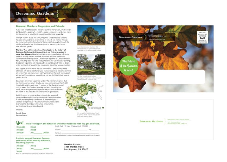
I’m pleased to be working with one of our fantastic oases in the city, Descanso Gardens! True to their tagline, Descanso is a member-supported garden, sending a fundraising appeal annually to continue their work in stewardship of the grounds and education to the public.

We created this showcase letter with a run-down of innovative projects completed with a forecast of what’s to come next year, all delivered in a very colorful mailing envelope themed by the oaks Descanso is known for. This piece got a lot done in a small space, and they reported an increase in returns from previous years.

See more of our work for Descanso Gardens.

recent work: natural curiosities exhibition tri-fold

NC_trifold_2013

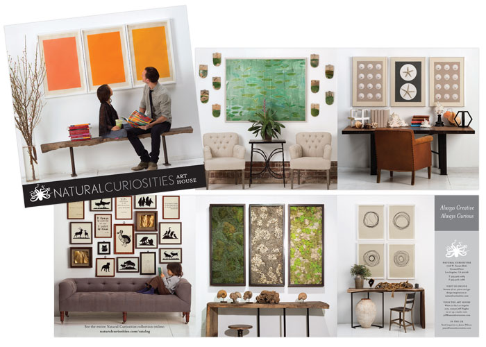
Lately, we’ve been hard at work in development for a full product catalog with Natural Curiosities. Since they exhibit regularly throughout the year, we were bound have to create a work-around for one of the shows while in production. To give them a colorful showcase piece in the interim, we worked with their ever-growing photography assets to produce this exhibition piece as a takeaway for attendees. The fun aspect of this z-fold piece is that it works as a back-to-front flyer when closed, but still works as a beautiful, long-format piece with call to action & contact info on both sides when fully-open.

See more of our work for natural curiosities.

If you have questions about exhibition collateral or different ways to make your products stand out, say hello!

recent work: beer & food

B&F_ID

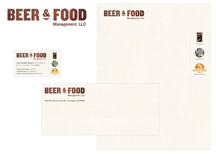
From the owners of Golden Road, Mohawk Bend and Tony’s Darts Away, comes expert hospitality team, Beer & Food Management, providing California-fresh artisanal catering and craft beer services for special events. In keeping with the local, hands-on theme, we’re using Neenah Environment 100% PCW recycled paper, and recalling the beautiful wood finishes found in your favorite public houses.

See more for the Mohawk Bend family of pubs here.

recent work: small farm fresh

I recently started working with a project I deeply believe in! Small Farm Fresh is the startup of a good friend, who created a site where local farmers could sign on to list all their seasonal produce, and chefs from local restaurants could shop for ingredients they need and have it delivered quickly through any of the local daily farmer’s markets. When i say local, this is currently an LA-area project, and for now it’s in beta. Similarly, for the moment, the identity is just a logo, but it’s taking off quickly and we’re planning to grow the brand as the business expands. There are a lot of great plans in the works, i’m so proud to be a part of it!

See more of our work here.

recent work: wilcox look book

wilcox look book 2013

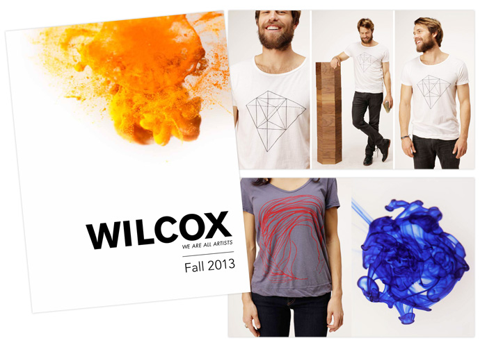
the latest project to emerge from natural curiosities founder, christopher wilcox, is simply: wilcox, a clean and modern look at art, design, fashion and music all made by hand in their echo park studio. we played with different aspects of telling this story, and settled on these dye explosions as a unique take on process that also keeps the bright color pops of this brand alive.

after a late-2012 soft launch with a blog introducing the showroom space at HD Buttercup, a full e-commerce site is just around the corner.

see more recent work here.

recent work: skift

skift.com 13 trends that will define travel in 2013

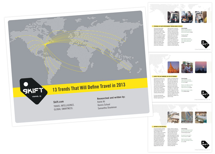
It’s been exciting to watch Rafat Ali launch his latest startup, skift.com, a news source on the business of the travel industry, reporting on everything from airline mergers to niche travel apps. For their 1-year anniversary, we created this interactive trend report for distribution at the outset of 2013, a collection of articles with full click-throughs to citations and resources. They reported very positive feedback, and I’m very happy with how it turned out. Interested in what these 13 trends might be? download a copy here.

Interactive pdfs are a great alternate tactic to direct traffic or email marketing, since you get the chance to reorganize information in a different way than you might have it online, creating new value for the reader. Also, there are those who prefer to read a 15-page report over sorting relevant items in a blog, though now with the information arranged as a trend report, these same readers are far more likely to visit your site through the relevant links provided. With InDesign, these documents offer total design flexibility and look far better than something whipped up in word, or [gasp] a presentation deck standing in for its presenter.

see more of our recent work here.