community woodshop

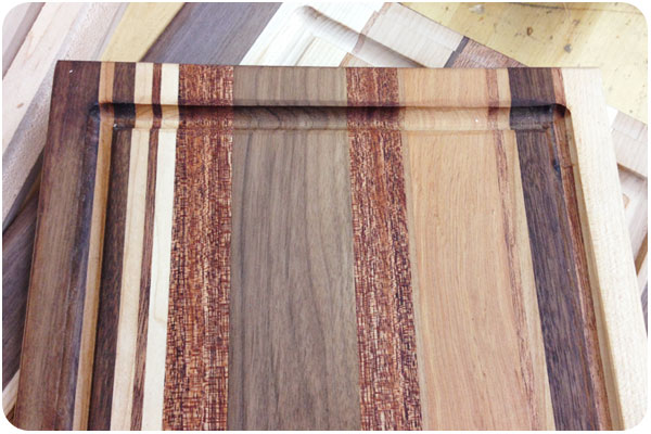
samples1

thanks to my fantastic design network, i found out about community woodshop in the keystone arts spaces in glassell park just a few months after they opened. community woodshop is both a workspace and a learning space for people who want to learn about and work on various techniques in wood working, but maybe don’t own or have space for all the equipment. after taking the required safety class, you can join various levels of membership to work in the shop, or take classes. since i’m a beginner, i opted to start with the cutting board class.

samples2

we were given all the samples in the above photos for inspiration of what we could create, though we were discouraged from cutting too many angles, since it would complicate the gluing process for those of us with less experience. we could do straight cuts, cross & flip, round corners, cut handles, or route a trench. cool!

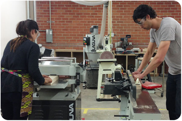
planer-joiner

we were provided with maple, alder, walnut and mahogany pieces, squared on 2 sides. to get a feel for the process, we were told to smooth the other sides. here are 2 students using the planer and joiner to get perfectly-smooth starting pieces.

tablesaw

our teacher, bob, reminds us of all the safety precautions of the table saw. there are many. when cutting with wood grain, the wood goes through the blade effortlessly, but going against grain can be a much more tricky cut. we cut all our on-grain 1″ pieces, and bob cut all our against-grain requests for us. then we went to worktables to arrange our pieces and design our boards.

glue

gluing is the fun part. you get big clamps and glue paper and turn all your pieces on their sides, run the glue down the center, and stick them one by one to their neighbor. then tighten the clamps and watch the glue squeeze out the seams.

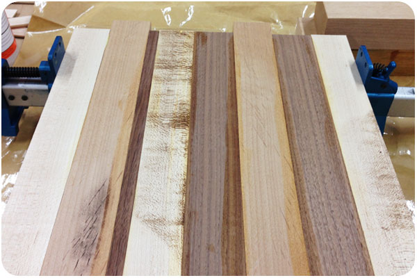
clamping

finally, we let the glue set and cleaned it from the surface. my board looks oddly plain here. the table saw burned the maple wood as it cut, which is normal since it is a very hard wood, but leaves it looking dirty. all of that will be sanded away though, it will oil up nicely and all the grain details will show through. i’ve heard we use some sort of beeswax to do this. we’ll find out in next week’s class when the beauty of our projects are revealed!

friday fun

Husbands – “Dream” from Cauboyz on Vimeo.

this is a great type-only video, and i love the reveal at the end that it’s not just some digital animation. very cute.

how to choose the right designer for your business

in an effort help more people understand how to get the most out of design services, i offer these helpful primers to demystify the process of hiring a graphic designer and getting prepared for your next project. if you find yourself here with a head full of questions, 2 other pieces to read are how to prepare a for a design project which will give you the tools to narrow your design objectives into a creative brief, and process & design project timeline which is a rough outline of all the phases of production i use with my clients.

follow these steps to find the right designer for your business

it’s a bit of a toss-up between whether style or industry is the more important place to start. obviously, some businesses will be more concerned with insider sensitivity, while others will want a designer whose style clicks with their creative direction. in my opinion, both of these factors should be weighted equally, and let some of the subsequent factors help tip the scales in your top choices:

industry focus

if you’re in a niche that has a lot of specifics attached to it, or want someone who understands the history of your industry so they can help consult on key ways to differentiate you from your competition, look into creative professionals that specialize in your slice of the market. i am a strong proponent of getting referrals, either from colleagues or trade organizations, where you can search on specifics and see linked portfolios of work samples. you can also do research on who your competitors are hiring by looking at their web sites for a design credit and following that link to the firm’s portfolio. to get a feel for the breadth of options, add “design” to any of the keywords for your industry and see who’s doing what all around the world. once you get a sense of who is doing it well, you’ll be ready to look for…

individual style

every designer worth his or her salt will have an individual style that is evident in their work. whether you search online, get referrals from colleagues, or go to a trade association, go straight to the portfolio and look at all their work. do the pieces in their portfolios show clever design solutions that work well in your opinion? if their work resonates with you, can you also see your clients & target market receiving it positively as well? the key here is that you are hiring a visual translator. every designer sees a unique “best avenue” for translating your message, so the major consideration in individual style is to see what this particular designer has done with the information in each piece to appeal effectively to the viewer.

customer service & transparency

once you’ve narrowed it down to excellent talent and experience, take some time to notice how each firm’s site introduces themselves, how much information do they put forward about how they work and what they value? how much of a sense do you get about what they’d be like to work with? it’s smart to be a bit wary of any firm that seems vague about what you’ll be getting. the best of us realize that you have your own businesses to run and perhaps aren’t familiar with the design process or don’t know what to expect or how to get started, and we do our best to anticipate your questions and answer them. it’s the beginning of a relationship and we’re all looking for compatibility. if you’re feeling good about a designer’s approach, take the next step and…

ask questions!

we are service providers, and the best we can do is educate people whenever they are curious. designers that follow best practices will be able to provide you with a clear explanation of what you can expect from working with them. if you have the parameters of your project outlined, [use this system to prepare a creative brief] you can ask for a project proposal, which will give you a good idea of the costs involved as well as the production timeline.

plan ahead

or rather, plan ahead to plan ahead. we do understand that sometimes you’re looking for a designer because of a looming rush deadline, but in ideal circumstances, you won’t want to make these decisions in a day. you’ll also run the risk of not getting a slot with your designer of choice, because they’ll already be booked out. the best marketing efforts take careful planning and projection far before they are put into action. if you’re in business, you’ll eventually need marketing materials, so look for someone you want to work with early on—long before you’re ready to start a project. this will give you a chance to meet them, see their work, have lunch, meet up at a mixer, read their blog, and google their online presence so you get to know them and how they work for the most critical ingredient in the mix: peace of mind that you’re working with someone who is right for you.

if you think that person might be me, let’s talk!

how to prepare for your next design project

when you’re not in the business of graphic design, it can be hard to know the best order of operations in getting a project started. what i often end up doing for clients who need a little strategy clarification is summed up in this article so anyone can follow it, consider all the preliminary factors, and end up with a great starting point to bring to any project initiation. while it’s not a final blueprint, having these questions answered before you start makes it easy for both parties to deliver on the same goal.

use these guidelines to prepare your next project and write a general creative brief

define the goal of communication for the project

before you decide on the format of the communication, it’s good to think about the general messaging going into it. what are you trying to tell your market? in the best-case scenario, what do you want them to do in reaction to this piece? a good place to start is to write out a company description and include any mission statement or boilerplate for reference, then indicate what the immediate goal is and how this project will work toward it.

define the audience

this is where you define all the types of people the project should speak to, and describe for your designer their typical lifestyle choices, interests, and availability to similar services. the purpose of this information is to inform your designer on how to communicate with your audience while differentiating you from your competition. if you can, provide sample profiles of typical individuals who would use your products or services. some questions to answer here are: what should the target market think, feel or do in reaction to this piece?

keep consistent with your brand objectives

if you have a brand brief or style guide in place, you will want to use it as a guideline for every project so as to stay on message. if not, the first step is to collect as much of your previous collateral as possible and bring it to your designer for reference. whether you are sticking with an ongoing messaging plan or trying to break from the past, the over-arching narrative of your business should inform all your marketing efforts. submitting these materials to your designer will allow them to work within the context you’ve created, or create context for you if need be.

define your budget

budgeting for a project can be tricky when you’re working with an industry with as wide a fee range as graphic design. there are all levels of firms out there, and as with anything, you generally get what you pay for if price point is your first concern. be realistic about what the value of the project is to you, and what you expect it to do for you. do research with the design firms you’re interested in and ask for a range of what similar projects have cost in the past. be honest about what you can afford, and be open to advice on what can be done within your budget, or perhaps what can be done if you put the project off for now and save a bit more for a bigger impact down the road. an experienced designer will be able to scale a project to fit your budget, so you may not get all the bells and whistles you originally dreamed of, but you can get the materials you need from the designer you want to work with, at a price you can afford.

define your deliverables

some clients have logos, taglines, photography, illustrations, charts & graphs or copy that will be used in creating the final piece, and some will be looking to have any applicable elements created specifically for the project. if you have a set of non-negotiables, make your designer aware of them from the beginning. bring any style guide you have in place that specifies how these materials are to be used, if applicable.

define success

similar to defining your goals, you’ll want to put together some measurable success markers so you can track what your marketing efforts are doing for you. be realistic here, every piece is not going to convert to new business, but if you have a percentage return of new interest in mind, desire noticeable positive feedback from existing clients, or if you would like to break ground in a specific way with a new market, these are things to list from the outset and track as your efforts are put into action.

the designer you choose to work with will ask many more detailed questions to draft a creative brief that will address the your project-specific goal. in the meantime, clarifying these thoughts will allow you to communicate your needs more clearly, and will take a lot of the guesswork out of the discovery interview. if you’re not currently working with a designer and need some help in choosing one, some good starting advice can be found in how to choose the right designer.

if you’ve got everything ready to go, let’s get started!
sewing projects

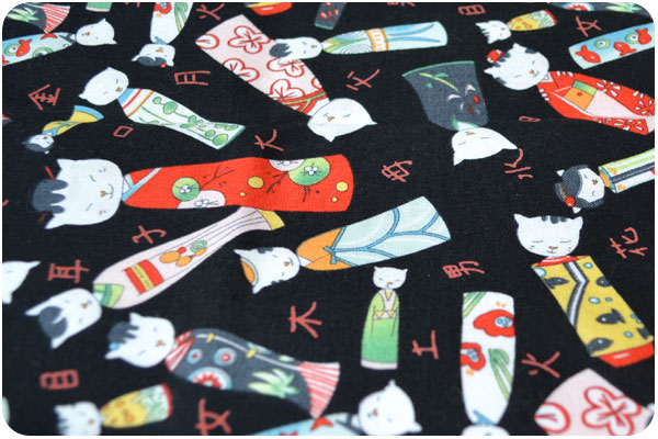
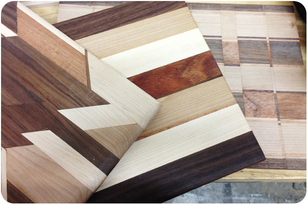
i’ve been doing a lot of sewing lately and wanted to post a few things. not because the sewing is particularly great, but because fabric and pattern design has become so inspiring now that i’m looking at it all the time. recently i made a few sets of pillowcases, because so many fabrics remind me of the crazy sheets we had as kids in the 70s. that, and we don’t have even one complete set of sheets, everything is mismatched in our house, so i thought i’d compound that problem by adding to it. but i mean, look at these cute little geisha cats! and they’re all sleeping!

sewing pillowcases is really easy, and you get to buy fabrics that are way more crazy than you’d wear. wearing a print like this definitely makes me feel like a crazy cat lady. it’s the absolute furthest i’m willing to go in terms of wearing cat things. so all i did was make a kimono-style top out of it and solid black. that’s it! i’m making more clothes too, but i have to figure out how & where to photograph them.

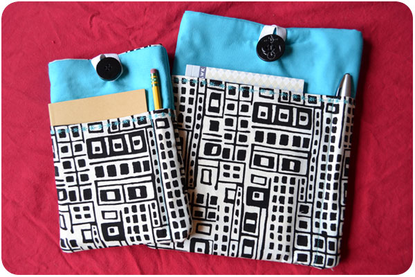
i found this pattern for a kindle slipcase online and thought it was so nice with the contrasting fabric and divided pocket. turns out it’s really easy to make and requires very little fabric. i made my parents slipcases for each of their devices for the holidays, an ipad case and a nook case. my machine has a ton of embroidery stitches, so i tried out a contrasting thread and made a star pattern to close the hems. making things like this is really fun & rewarding. and with all the extra fabric from garment sewing, it’s starting to look like i’ll have to take up quilting. hmmmm!

creative inspiration

i found some really nice, affordable typefaces in my research this week, and thought i’d share my favorites.

vulpa

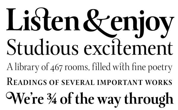
this typeface is certainly named accurately, a rounded & voluptuous take on a classic serif that remains highly readable. buy it here.


levato

as the name would suggest, this is more of a renaissance serif, full of details and flourish. the letterforms manage to remain spacious at smaller sizes and thinner weights. check it out in more detail here.


moonshiner

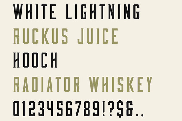
this is a free font in 2 styles of caps: one with more angular crossbars and slants, the other a bit more straightened out. with all the vintage goodness popular in design today, this typeface could certainly add nice detail. download it here.


st. agnes

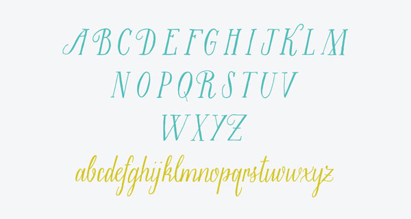
i like this, because i can’t quite do it. and because most handwritten fonts mimic a more conventional, casual hand, while this one is more illustrative and cursive. available here.

recent work: small farm fresh

I recently started working with a project I deeply believe in! Small Farm Fresh is the startup of a good friend, who created a site where local farmers could sign on to list all their seasonal produce, and chefs from local restaurants could shop for ingredients they need and have it delivered quickly through any of the local daily farmer’s markets. When i say local, this is currently an LA-area project, and for now it’s in beta. Similarly, for the moment, the identity is just a logo, but it’s taking off quickly and we’re planning to grow the brand as the business expands. There are a lot of great plans in the works, i’m so proud to be a part of it!

See more of our work here.

notes from caveland, part 2

breakfast salad

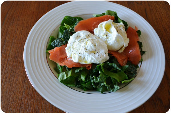
so, i’m back on more of a paleo diet lately, and while some of my favorite snacks from my first round with it are still mainstays, i’ve been adding new regulars to the mix and thought i’d share them. by far my favorite is breakfast salad, above! i discovered breakfast salad on a trip with my sister, but all i had to do was eliminate the cheese to make it paleo [though, i don’t have a huge beef with cheese, and i will still eat it sometimes]. i’ve added smoked salmon and drizzled with olive oil and vinegar in this version, but i’ve also enjoyed a spicy tapenade over the eggs too. the basics are poached eggs over greens, but you can make it your own.

almond flour crackers

if breakfast salad has become my favorite meal, these almond flour crackers have become my favorite snack. i was just looking around one day and found elana’s pantry where you can find great cracker recipes using blanched almond flour: sesame, walnut, herb, mixed seed & nut, fig & rosemary…! the basis is often the same ratio of almond flour, egg and salt, and then use the ground nut or seed and oil of your choice. mine look just like hers because rolling between 2 parchments and pre-cutting really does make a uniform cracker. these are a great go-to when you need a little salty crunch, or if you need a substrate for your smoked oysters. unlike normal crackers, you can eat just 5, because they are far more filling.

paleo granola

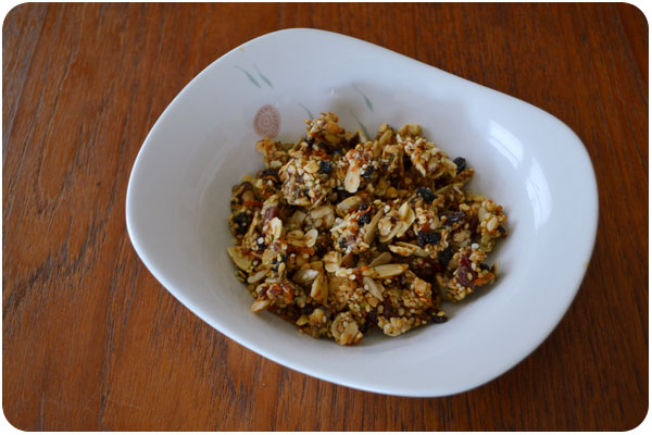
to be honest, i didn’t think i cared much about granola. certainly not enough to develop a recipe for it, but i was thinking about it one day, and then looked up paleomg’s granola, and tried it. it’s pretty good, and definitely got me to the point where i knew i could modify it to be just my style. i decided to try processing all the larger nuts into a uniform crumble to mix with soaked flax and chia seeds, and then incorporate the smaller nuts and seeds as their own texture. though it dehydrates for a long time, it totally worked, i got clusters that don’t fall apart in milk and a texture that feels like the granola i like. now i have to actually measure it so i can post it.

hemp-coconut milk

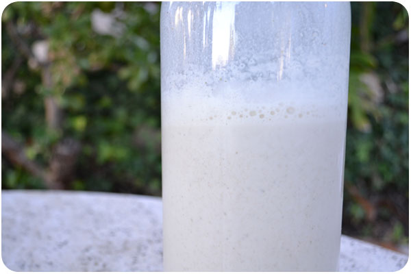
while i’m not exactly anti-dairy, i’m off it for the time being, so what kind of milk would i eat cereal with? for me, the easiest to make is hemp seed milk, because there is no pre-soaking necessary. unfortunately, i wasn’t wild about the taste, so i set out to improve it. my favorite blend so far is hemp and coconut milk sweetened with 2 dates and a splash of vanilla extract. if you’re trying to avoid sugars and emulsifiers in commercial alt-milks, this one is pretty easy to make. i’ll post the recipe with the granola once i sort all that measuring out.

it’s funny, once you get going on this stuff, it seems like there are endless food tricks to share, but these are the highlights for now. happy eating!

friday fun: branding links

a round-up of branding links

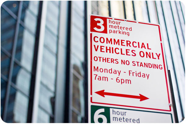
if you’re looking at that parking sign and thinking it looks a lot friendlier than any you’ve seen recently, it’s probably because it’s a typographic breath of fresh air. pentagram has been asked to help redesign new york city department of transportation signage, and i like the samples that have been released. see more of the collection here.

as a tea drinker, i noticed the new tazo packaging in my market’s tea section as soon as it was stocked. i always thought the designers who did tazo did a nice job with it, even though the type styles ended up looking dated [mostly due to overuse of typefaces like émigré’s mason in the 90s]. thedieline.com gets the whole scoop here. i think it’s a refreshing look with just enough historic reference.

two different blogs take a look at what happens to some global american brands when they go overseas. one gets nicer while another gets a lot cooler:
mcdonald’s new global packaging
7-11 goes to sweden

more in-depths on brand strategy

“farm-to-fork” drives consumer packaging
5 classic strategies for growing your brand equity
boost your freelance brand 100 percent with your expert status
helicopter branding: why it’s bad and how to avoid it