creative inspiration

design industry

http://video.ted.com/assets/player/swf/EmbedPlayer.swf
an inspiring ted talk by simon sinek centered around the premise that people don’t buy what you do, they buy why you do it, with examples.

how’s round-up of the top 10 web sites for designers, june 2010

if you’ve written an ebook or you have a client who has, and they want to get in on the ipad audience, inc magazine has outlined how to self-publish books for ipad to make it easy for you.

branding

transportation alternatives rebrand
[image: underconsideration.com]
i am loving this rebrand of transportation alternatives, as profiled on <a href="underconsideration’s brand new: walk this way. while the previous logo was classy, it was a bit too reserved and removed from the subject matter, and as armin says, too hard to read at smaller sizes. using road sign and subway memes, this new redesign speaks directly to transportation in an established visual language. they’ve rolled out the brand in an exciting way on their site as well.

mc craw's confections
[image: craig skinner]
big thanks to designworklife.com for showcasing this cool rebrand of mc craw’s confections by craig skinner. i love the retro-styled block letters & 2-color overprint techniques reminiscent of a snack stand at a carnival, circus or fair. great work!

america speaking out
[image: mule design / americaspeakingout.com]
<a href="taking the lol out of the gop is a fascinating and hilarious must-read by erika hall of mule design about the gop’s misguided attempt to create a hip social networking community to engage their base.

business cards

unusual business cards
[image: freelanceswitch.com]
if you’re looking for interesting die-cuts, folds, and non-paper substrates, 37 unusual examples of business card design from freelanceswitch.com has an interesting collection of recent work to peruse.

design life

design couples
[image: print magazine]
another item in the pros column for going to design school: all these successful design couples met in college. that and more, print magazine profiles 6 successful design couples, asks them how they work and how they balance working and living together.

creative inspiration

infographic mailer

travel & leisure food issue 2010
[photo: underconsideration.com]
this 2010 food issue mailer from travel & leisure, profiled on underconsideration.com combines a few areas of interests in an awesome piece! i love infographics, i love food, and i love knowing what regions specialize in different foods locally, so this map of the states by food really caught my eye. beyond that, 2-color printing is close to my heart, french paper is a drool-worthy paper source, and hand lettering gives a really fun personality to the piece. follow the link to read more!

snowboarding apparel

smith snow goggles by nubby twiglet
[photo: smith optics]
i’ve been snowboarding for 10 years now, and as much as i love it, i have to say that the fashion options for anyone over 17, especially women, are consistenly sorely lacking. this week, nubby twiglet posted examples of goggles and helmets she designed for smith optics which will be available next year. i have always wanted something classy and stylish to wear instead of opting for solid colors as the only alternative to a decidedly male adolescent fashion demographic. great work!

design industry

principles of minimalist web design with examples is a great showcase of sites that eliminate the clutter and allow visitors to focus on desired information. take a spin and let it help you re-imagine the possibilities for your own site.

ever wonder what goes on behind the scenes in type design? why did i start a type foundry is an interesting look at starting a foundry and getting fonts published and sold. cool!

something i’ve been writing about lately is what goes into a logo development, and it’s really outlined how you can’t really design a logo without a complete brand strategy in place. help your clients talk about their logo as part of a bigger plan with how to convince your clients they need a brand and not just a logo.

when applications crash and we get those report windows, sometimes we report bugs, sometimes we shut them in disgust. possibly, though, we’re missing some awesome opportunities for expressive prose!

creative inspiration

HOW and creative freelancer conference round-up

how cd experience
[photo: underconsideration.com]
if i haven’t mentioned it before, this year will be my first at the HOW conference, so i’m following as much preliminary info as i can. i wasn’t aware that there’s a tradition of a CD exchange, but thanks to underconsideration.com, i not only know about it, there’s a showcase of what kat feuerstein / gilah press + design did for last year: 2009 HOW design conference CD exchange sleeve. i’ve always liked silver ink on a dark stock, this one is chocolate brown!

the HOW conference closing party theme: white space. i have plenty of white to bring, now it’s just a matter of which white will it be?

if you’ve got questions about copyright or trademarks, jean s. perwin will be at this year’s CFC. thanks to the creative freelancer blog for this list of copyright resources: got copyright?

another great feature of CFC are the breakfast roundtables. here’s a list of some of the attendee-run tables you can join in on: what do you want to learn at breakfast?

event design

identity for brad radke
[image: charles ross]
thanks to designworklife.com for finding this great event suite by charles ross for the retirement party of minnesota twins player brad radke. he did a great job of capturing the best of baseball memorabilia.

logo design

frut logo sketches
[image: adam gf]
this logo development for smoothie company, frut, is an interesting look at how designers brainstorm on different shapes and ideas: logo design love: unsung heroes. i have a few pages like this myself, most of which never see the light of day. follow the link to see the final identity system, which is a super-fun burst of color.

35 smart logos with second thought to make you look twice is a nice collection of logos that work really well for the messages they convey.

typography

anatomy of type
[image: sigurdur armannsson ]
need help with your type anatomy? refer to each part of every letterform with accuracy, using this anatomy of type desktop graphic, free from font.is

silent dance
[image: camila drozd]
the work of this lovely hand-drawn type designer, camila drozd, has come up a few places in my weekly reading, and i think her work is really stunning.

creative inspiration

design industry

lentil vegetable stew print
[image: claudia g. pearson]
not only do i love this style of illustration, but you really can’t go wrong when food is the subject. thanks to design sponge, i now know about this outstanding artist, claudia g. pearson and her fantastic etsy shop where you can find prints and tea towels adorned with these lovely illustrations.

if you’re looking for green greeting cards, greenlagirl.com has a profile on 100% junk mail greeting cards, printed on 100% post-consumer recycled paper using vegetable-based biodegradable inks.

meetings! we’ve all been in them enough to know that some are well-organized, while most tend to stray off topic and waste time. todd henry’s accidental creative blog addresses meeting creep and how to avoid it, so if it’s happening to you, read the article.

color

colors in cultures
[image: informationisbeautiful.net]
in a global design culture, it’s important to choose colors that cross cultural lines in a friendly way. this infographic is an awesome color wheel cross-referencing world cultures with their emotional associations & meanings of colors. aside from being immensely useful, it’s quite a nice thing to look at. next time you have a project, or even dress for a meeting, consider some of the messages you can create and avoid with color.

logos

it’s that time again, logo lounge has released their 2010 logo trends article. i’ve heard a lot of buzz from my design community about getting their work into the annual book. congratulations to all those included! this annual trend report is a really interesting look at new trends in logo design.

typography

type soap
[image: how design blog]
thanks to the how design blog, i’m just happy to know this typography soap exists. i don’t think i could bring myself to use it if i bought it, though.

i’m a huge fan of hoefler & frere-jones knockout typeface, and i’m really enjoying the humor with which grip limited chose to use it, as shown on the h&fj blog.

help save the hamilton wood type museum! Dear friends of wood type: Hamilton has an unprecedented opportunity to qualify for a dollar-for-dollar matching grant from the “Save America’s Treasures” program which has a deadline of May 20th, 2010. This gives Hamilton 30 days to raise enough money to apply for a $25,000 matching grant from the National Endowment for the Humanities. We’re excited to have already raised over $5000 for this vital program that will help us archive, preserve and digitally document our collection of over 2000 vintage advertising plates and our 1.5 million-piece type collection. <a href="interested parties click here for 3 ways to help.

curiosities

clui: through the grapevine
[image: clui.org]
the center for land use interpretation is at it again with a new exhibit through the grapevine currently on display. i have driven this road many times, but the center has a great way of showing us things we’ve never seen in our travels. from clui.org: The mountainous passage that separates the great population of Southern California from the rest of the state is a zone of transit, from one epic region to another. Located at the collision of the San Gabriel and Tehachapi Mountain Ranges, this steep and convoluted terrain lies between Castaic, the northern edge of the Los Angeles megalopolis, and the depopulated place known as Grapevine, at the southern end of the Central Valley. Layers of traffic, water, and energy move like a braided stream through the mountainous terrain, connecting here to there.

make your own 100 year pinhole camera, from good.is. it will take a long time, and you may not get to see the end result yourself, but you can construct your own pinhole camera using inkjet ink as the emulsion, allowing it to expose a photo-quality image from 100 years of sun exposure. curious, indeed!

creative inspiration

design industry

health care reform t-shirt
[photo: barackobama.com]
the importance of health care reform and the genius of joe biden come together on a winning t-shirt design. whatever side you’re on, i think we can all agree, it IS a BFD!


[image: ketchup-mustard.com]
an inspiring set of identity design from designer-daily.com corporate identity design done right: 17 great examples there’s some great work in here! thanks to josh ross for the link.

design resources

thanks to the how design blog, i now have a list of15 excellent free online magazines for designers from technologysoftware.com.

if you like photoshop brushes, fudgegraphics.com is offering this cool set of plain fabric textures as a free download.

from the freelance files, nubby twiglet reviews her first year running her own design practice in one year of freelancing: what i’ve learned.

biznik article of the week

The Truth About Branding by Kevin Simcock

more information on all the ways your brand becomes touchpoints and opportunities to communicate with your target audience and potential clients. simcock gives a careful explanation about how prospective buyers interact with brands and divides these touchpoints into 4 categories: planned messaging, product messaging, service messaging, and unplanned messaging.

creative inspiration

design industry


[photo: department of graphic sciences]

my friends over at department of graphic sciences were featured in under consideration’s for print only blog for their outstanding packaging for original beans chocolate. they even utilized the long-coveted custom paper services over at french paper. truly lovely work!

another colleague of mine, velvette de laney of dew drop studios wrote a great piece for jeni herberger‘s blog: no designer is an island. and it’s true! when we work on our own we realize how much we need our network and support system. great piece, velvette!

who’s going to CFC this year? if you’re going to the creative freelancer conference and you’re on linkedin, come on over and join the discussion. let’s get to know each other a bit before the conference! or comment here!

neighborhoods


[image: jenny wang]

awhile back, good put out a call for submissions to design an infographic about a neighborhood, putting out a few parameters to follow. they’re reporting back on some of the submissions and they’re really cool to look at & analyze. check them out!

build your brand touchpoints

brand touchpoints

in brand design language, your brand touchpoints are a complete list of every opportunity the public at large has to interact with, or “touch,” your brand, from your identity, to your marketing & advertising, to the experience of working with you. it’s a much longer list than you could probably write off the top of your head, and for that reason, it’s a good idea to compile all the possible brand touchpoints your business might have so you can give attention to each one and plan how they will work together in the grand scheme of your brand strategy. this article gives a good overview of what a brand is and defines the major common touchpoints most businesses can use to communicate their brand message.

identity touchpoints
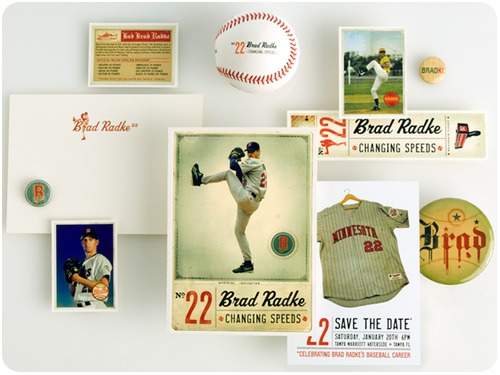
first off, all the pieces that make up your identity are also brand touchpoints [your identity is the nucleus of your brand]. building from the print matter area, add in every printed item your business produces: ads, newsletters & publications, business forms, proposals, signage & packaging, direct mail and special event collateral [if, say, you exhibit at trade shows]. these materials should all look like they’re saying what the business says it’s going to do in its mission statement to keep the message consistent each time a customer looks at your materials. what if clients look at your invoices and smile at the familiarity of someone they like working with? that’s the idea!

communications touchpoints
on the less-tangible side, starting with communication devices: emails, voice mails, public speaking, networking, public relations, presentations, phone etiquette and corporate voice. how you decide to use language to reinforce the type of company you are speaks volumes in very subtle ways, and when it’s consistent from your emails to the copy on your web site to the way you and your employees interact in person, that gives your target market reliable evidence that you are who you say you are and you deliver on what you say you will.

experiential touchpoints
all these printed words aside, experience plays a huge role in brand communications. every time a client or customer has a chance to experience working with you is also a touchpoint. sometimes we think of this as a closed sale and forget that the experience itself is what makes them keep coming back as well as give referrals and rave reviews. aside from the communication devices listed above, a company’s approach to process and service comes in to play here. what special approach can you take that sets your brand apart from others in your field? are your employees given an internal brand launch so they have brand confidence such that they are brand merchants in the field? if you have an office or store, how does the environment work toward your brand message [and more importantly, is there anything that detracts from it that can be improved]? what are your company’s affiliations? do you use green products, associate with a favorite non-profit, work with a preferred political party or initiative? your business associations say a lot about what you’re doing behind the scenes. what is your approach to customer service? how do you create confidence and trust between your business and your clients while you’re working with them? business philosophy can inform as many tangible touchpoints as experiential—think of as many opportunities you have to do things the best way possible and implement the ones you think will make the biggest difference with your target markets. the way we get clients to smile at our invoices is by giving them a great experience.

industry & lifestyle touchpoints
now that you have the main touchpoints in mind, the wild card category is anything that is specific to your business, your industry, or your target market. if you can create something helpful or useful as a gift to your clients, that is a great promotional touchpoint. think of your own experience in your industry: what is that one thing you’ve been doing yourself that would be so convenient if it were a form or a guide or information you could compile and share? you study your target market, you know them best, so what lifestyle choices are they making that might inform an item you could use as a promotional touchpoint? whether you create it yourself or partner with a gift company that simply puts your logo on something your clients will appreciate, the key is to make sure it’s useful and endearing to your target market so they use it, keep it and appreciate it. i can’t tell you how much swag i’ve tossed because it was a useless item that was simply an excuse to distribute a logo. think hard, choose wisely, get in the minds of your clients. better yet–ask your clients!

here’s my own example: i’m a designer with a long background in print design. one way i can showcase my work while being helpful to clients is in giving them complimentary communication devices they might otherwise buy. this month, i’ve created a set of valentines for clients, friends, and anyone who will get on my contact form and request a free set. that’s right A FREE SET, request yours today so i can mail it to you in time for valentine’s day!

what it comes down to is, your brand is in everything you do. leave no stone unturned, for there may be an overlooked opportunity to make a better impression. take none of them for granted, sometimes reworking the simple things to align with your brand strategy are details people notice and appreciate. if you haven’t in awhile, sit down with your mission statement and look at each touchpoint you’re currently using individually and ask yourself “how does this piece help communicate this statement?” brainstorm on it, sleep on it, think about how all of them might work together. compile a short list of sure shots and put them in action, adding any along the way that make sense. if you need ideas, advice or have questions, contact me, i’m always happy to answer!

plan your annual marketing calendar

2010 calendar

i’ll try not to add to the chorus of disbelief that the year is practically over and instead say: congratulations, we all made it another year! since the calendar allows us this time to regroup over the holidays and start fresh in the new year, i like to take a couple days sometime in december to do a year-end retreat. whether you get out of town to a new location to clear your head, or take a stay-cation right in your living room, it’s a good time to reflect on the past year, list out any new goals you’d like to incorporate, and chart out a marketing plan for the coming year. this not only allows you to take more control of your schedule, but you save money when you plan ahead, strategize on how best to attack these projects, and avoid rush charges.

if you’re not sure where to start in planning a marketing calendar, use these questions to get the basic framework going: does your business have any fixed dates for events or promotions you already know you’ll be working with? does your industry have any events your business participates in [or would like to]? are there holidays that you can use as a good excuse to reach out with a personalized communication? and alternately, where are the stretches where none of these things happen, and what can you do with them?

once you have these dates & events to work with, ask yourself what type of communication would work best in each case. a postcard? a promotional piece? email newsletter? a combination of a few of these? for promoting your own events, you’ll want to sketch out a specific promotion strategy, but for periodic points of contact, you can pick the best format for the occasion and try to switch it up so your market gets used to seeing the flexibility of your brand. for example, as a designer, sending my own cards on major card holidays is a given. i also commit to a monthly email newsletter, and i like celebrating seasons, so for me, that’s a good time to use a postcard. this means, aside from my monthly newsletter, my contacts are seeing something from me most months of the year.

for the stretches when you don’t really have anything planned is a good time to make something up! while my work is always accessible online & linked in my newsletter, i like to send out a little “what’s new” package of print samples every so often since most of my work is print matter. if you were thinking of offering a promotion, creating a unique piece that announces it and slating it for one of these months where you don’t have anything else going out is a good way to stay in touch. don’t be afraid to share something not related to business–share info on things you like, cool tools of the trade, or send a personal email inviting your colleagues to meet in person.

once you chart these out on a calendar, it should be pretty easy to balance your communications over a few media formats and evenly space them through the year. then the tough part comes: commitment! the surest way to get all these things out the door is to create production schedules at least 6 weeks out for each. but don’t fret–if you got to this point, you can plan certain pieces together and get them done early, consolidate projects and put a little more effort upfront and save time down the line. if you have questions about how to strategize your production schedule, drop me an email and i’ll show you where you can combine & conquer!