infographic mailer
[photo: underconsideration.com]
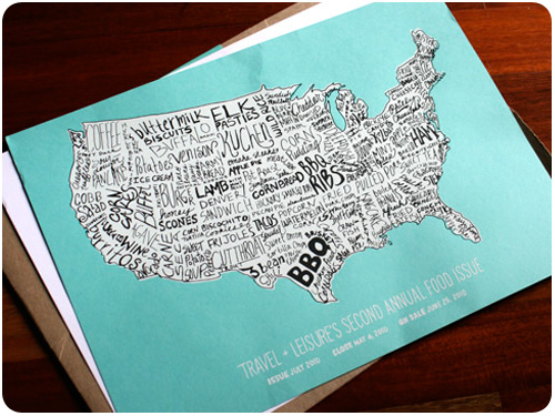
this 2010 food issue mailer from travel & leisure, profiled on underconsideration.com combines a few areas of interests in an awesome piece! i love infographics, i love food, and i love knowing what regions specialize in different foods locally, so this map of the states by food really caught my eye. beyond that, 2-color printing is close to my heart, french paper is a drool-worthy paper source, and hand lettering gives a really fun personality to the piece. follow the link to read more!
snowboarding apparel
[photo: smith optics]
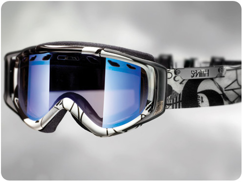
i’ve been snowboarding for 10 years now, and as much as i love it, i have to say that the fashion options for anyone over 17, especially women, are consistenly sorely lacking. this week, nubby twiglet posted examples of goggles and helmets she designed for smith optics which will be available next year. i have always wanted something classy and stylish to wear instead of opting for solid colors as the only alternative to a decidedly male adolescent fashion demographic. great work!
design industry
principles of minimalist web design with examples is a great showcase of sites that eliminate the clutter and allow visitors to focus on desired information. take a spin and let it help you re-imagine the possibilities for your own site.
ever wonder what goes on behind the scenes in type design? why did i start a type foundry is an interesting look at starting a foundry and getting fonts published and sold. cool!
something i’ve been writing about lately is what goes into a logo development, and it’s really outlined how you can’t really design a logo without a complete brand strategy in place. help your clients talk about their logo as part of a bigger plan with how to convince your clients they need a brand and not just a logo.
when applications crash and we get those report windows, sometimes we report bugs, sometimes we shut them in disgust. possibly, though, we’re missing some awesome opportunities for expressive prose!
