friday fun: branding links

a round-up of branding links

if you’re looking at that parking sign and thinking it looks a lot friendlier than any you’ve seen recently, it’s probably because it’s a typographic breath of fresh air. pentagram has been asked to help redesign new york city department of transportation signage, and i like the samples that have been released. see more of the collection here.

as a tea drinker, i noticed the new tazo packaging in my market’s tea section as soon as it was stocked. i always thought the designers who did tazo did a nice job with it, even though the type styles ended up looking dated [mostly due to overuse of typefaces like émigré’s mason in the 90s]. thedieline.com gets the whole scoop here. i think it’s a refreshing look with just enough historic reference.

two different blogs take a look at what happens to some global american brands when they go overseas. one gets nicer while another gets a lot cooler:
mcdonald’s new global packaging
7-11 goes to sweden

more in-depths on brand strategy

“farm-to-fork” drives consumer packaging
5 classic strategies for growing your brand equity
boost your freelance brand 100 percent with your expert status
helicopter branding: why it’s bad and how to avoid it

creative inspiration

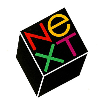
two stories about classic designers that came through the news this week caught my eye. one, the story of the NEXT logo by paul rand for steve jobs, including 2 interviews about the design, and a replication of what must be the most narrative logo presentation i’ve ever seen.

personal preferences, prejudices, and stereotypes often dictate what a logo looks like, but it is needs not wants, ideas, not type styles which determine what its form should be. to defamiliarize it, to make it look different, to let it evoke more than the mere adjective or adverb it happens to be is, it seems, the nub of the problem. —paul rand

read and view the full piece here: paul rand + steve jobs.

the other is a heartening tale of hiring one of the mad men-era illustrators to help capture the illustrative style of the time for the new season promotion posters. i love the show already, but thought it was a great pairing.

…they just looked up the person who had done all these drawings that I really loved, and they said: “Hey, we’ve got the guy who did them. And he’s still working. His name is Brian Sanders.” —matthew weiner

read the full story here: brian sanders creates made men poster for new season.

creative inspiration

sustainable food branding

i’m excited to see so many great examples of sustainable food storytelling for the preponderance of naturally-raised and hand-crafted foods available today. see the whole brand package here.

some other examples i’ve really enjoyed:
cat lady preserved food packaging
ruston farmer’s market identity & collateral
the sugar deli identity & product packaging
fix food identity and site design.

thoughts on branding, a round-up!

in place of the usual wednesday creative inspiration, i’ve collected a nice handful of articles on branding i thought i’d share, to bring others in on the experience, and get people thinking about what the next steps are with their own strategies. if you’re new to the idea of branding, i’ve got some great primers here and in my newsletter.

+ for the quick and easy: 3 hot design & branding ideas to boost summer sales from how magazine.

+ for the more in-depth how-to: great brands are about fusing product and service, how do you do it from fast company design.

+ for looking at new ways to tell your story: mining your brand for stories from my buddies at hexanine.

+ for fine-tuning your touchpoints: the personality layer from smashing magazine.

+ for thinking beyond brand: branding talk isn’t helping your company, here’s what should replace it and its follow-up, why branding is an artifact of the past from fast company design.

creative inspiration

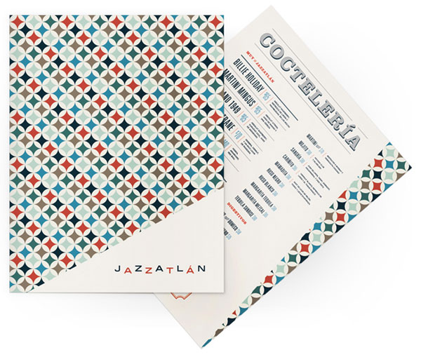
jazzatlan
jazzatlan

this week, we’re looking at jazz-themed design. doesn’t this menu for mexican nightclub, jazzatlán look like it’s straight out of great 60s album cover design? so swanky! see the spread at art of the menu.


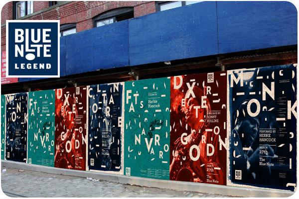
blue note legend
blue note legend

this is a beautiful piece for a proposed specialty sub-label of blue note: blue note legend, a modern twist on traditional blue note style. see the whole identity system here, i love how the letters break up, like notes in the air.


the jazz scene
the jazz scene

one of many great typographic covers from penguin books by alan fletcher. i love the big, bold, overprint type. thanks to book worship for this find!

friday fun

Austria Solar Annual Report, powered by the sun from mnoesel on Vimeo.

how’s this for a summer solstice idea: an annual report for a solar energy company using inks activated by ultra-violet rays, so it’s only visible in sunlight. thanks designenvy.com for the link. take a longer look here

creative inspiration

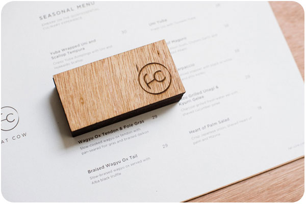
fat cow branding
fat cow branding, image: underconsideration.com

taking a look at the theme of connectivity i’ve collected lately, this bespoke, beef-focused restaurant uses a nice, straightforward ligature laser cut into wood. see the profile on underconsideration.com


mohawk logo
mohawk logo, image: mohawkpaper.com

mohawk paper recently rebranded, using references to print rollers and ink colors in their new branding. they have rolled out a lovely new brand, and they write all about it on their blog.


tu logo
tu logo, image: underconsideration.com

after seeing the mohawk rebrand, this logo caught my attention, an umbrella brand under spanish-based telefonica digital, using connectivity to illustrate conversation. see the full brand profile at underconsideration.com


marketwire rebrand
marketwire rebrand, image: underconsideration.com

another interesting piece for the connectivity files, the marketwire rebrand is simple while being elegant and effective at communicating integration. in their case, content and communication. see more at underconsideration.com.

friday fun

twitter’s got a brand new bird, created from overlapping circles. they talk about rolling it out here. i think it looks cute and friendly, right in line with their brand.