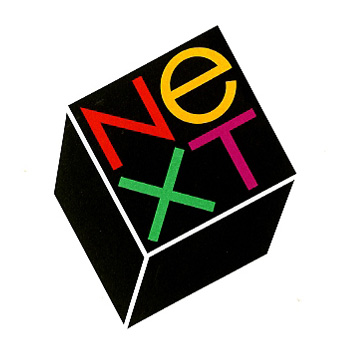
two stories about classic designers that came through the news this week caught my eye. one, the story of the NEXT logo by paul rand for steve jobs, including 2 interviews about the design, and a replication of what must be the most narrative logo presentation i’ve ever seen.
personal preferences, prejudices, and stereotypes often dictate what a logo looks like, but it is needs not wants, ideas, not type styles which determine what its form should be. to defamiliarize it, to make it look different, to let it evoke more than the mere adjective or adverb it happens to be is, it seems, the nub of the problem. —paul rand
read and view the full piece here: paul rand + steve jobs.
the other is a heartening tale of hiring one of the mad men-era illustrators to help capture the illustrative style of the time for the new season promotion posters. i love the show already, but thought it was a great pairing.
…they just looked up the person who had done all these drawings that I really loved, and they said: “Hey, we’ve got the guy who did them. And he’s still working. His name is Brian Sanders.” —matthew weiner
read the full story here: brian sanders creates made men poster for new season.

