snaps from portland

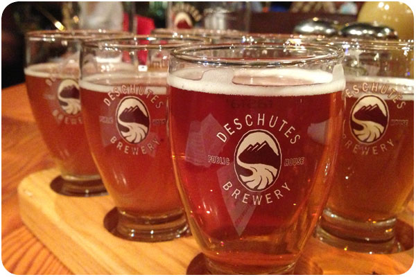
we recently went to portland for a wedding, and though i’ve only been there once before, i still couldn’t get over how cute it was. especially in the sunshine, which was the weather that graced our visit. we stayed downtown, so on our first night, we decided to finally have some deschutes from the source. our flight was outstanding, and look at their awesome logo!

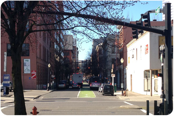
i won’t lie, i’m really jealous of a city that has highly-visible bike lanes that take up half the one-way street. one of these was right outside our hotel lobby, so we could watch all the happy people biking by. happy because it was beautiful sunshiny weather, which i know i mentioned before, but it seemed like every person we overheard was remarking on it all weekend, which made us enjoy it so much more.

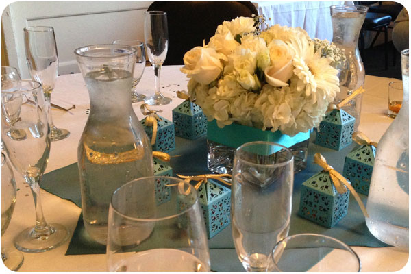
pretty wedding colors in creme and just-off tiffany blue. we joined the bride for champagne mani-pedis the night before, so i got to take this color home on my toes too. super cute!

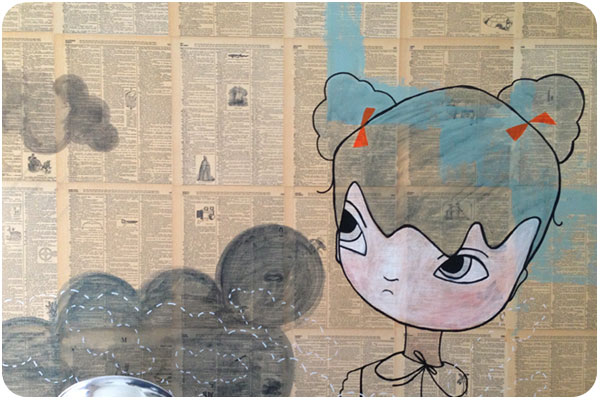
we chose the ace hotel since we’ve enjoyed the palm springs location, and selected a back room on the quiet side of the hotel. it was quiet, indeed, and quite comfy. i liked their idea of using an encyclopedia as wallpaper with these cute paintings.

creative inspiration

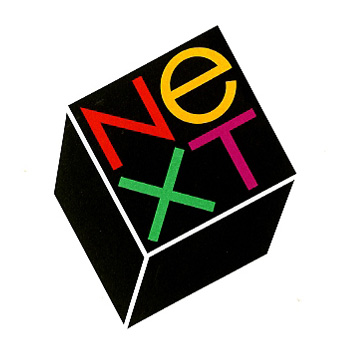
two stories about classic designers that came through the news this week caught my eye. one, the story of the NEXT logo by paul rand for steve jobs, including 2 interviews about the design, and a replication of what must be the most narrative logo presentation i’ve ever seen.

personal preferences, prejudices, and stereotypes often dictate what a logo looks like, but it is needs not wants, ideas, not type styles which determine what its form should be. to defamiliarize it, to make it look different, to let it evoke more than the mere adjective or adverb it happens to be is, it seems, the nub of the problem. —paul rand

read and view the full piece here: paul rand + steve jobs.

the other is a heartening tale of hiring one of the mad men-era illustrators to help capture the illustrative style of the time for the new season promotion posters. i love the show already, but thought it was a great pairing.

…they just looked up the person who had done all these drawings that I really loved, and they said: “Hey, we’ve got the guy who did them. And he’s still working. His name is Brian Sanders.” —matthew weiner

read the full story here: brian sanders creates made men poster for new season.

recent work: wilcox look book

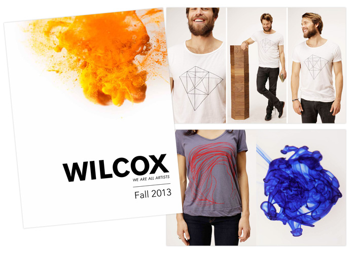
wilcox look book 2013

the latest project to emerge from natural curiosities founder, christopher wilcox, is simply: wilcox, a clean and modern look at art, design, fashion and music all made by hand in their echo park studio. we played with different aspects of telling this story, and settled on these dye explosions as a unique take on process that also keeps the bright color pops of this brand alive.

after a late-2012 soft launch with a blog introducing the showroom space at HD Buttercup, a full e-commerce site is just around the corner.

see more recent work here.

natural curiosities: designer’s lunch

a look inside the art house

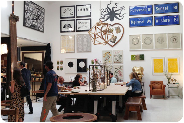
last week, natural curiosities hosted another of their design lunch series, where industry trade professionals are invited to take a spin through the studio, have lunch, get design inspiration, network and experience the creative space where the art pieces are developed.

fill your space with inspiration

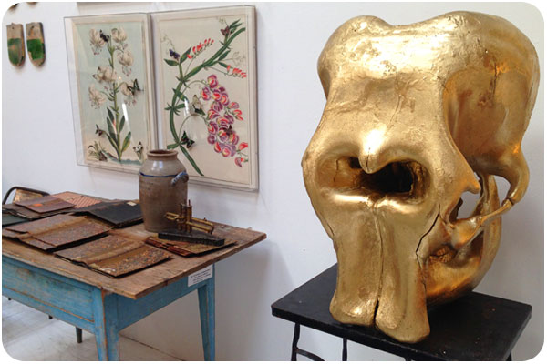
natural curiosities is known for working with all types of specimens and media. the art is the end product of ongoing explorations with collected artifacts that adorn the studio and experimental processes.

see our work for natural curiosities.

creative inspiration

sustainable food branding

i’m excited to see so many great examples of sustainable food storytelling for the preponderance of naturally-raised and hand-crafted foods available today. see the whole brand package here.

some other examples i’ve really enjoyed:
cat lady preserved food packaging
ruston farmer’s market identity & collateral
the sugar deli identity & product packaging
fix food identity and site design.

recent work: skift

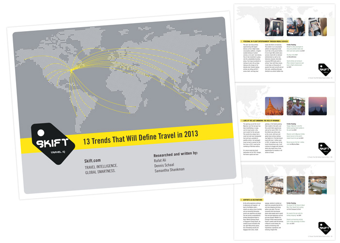
skift.com 13 trends that will define travel in 2013

It’s been exciting to watch Rafat Ali launch his latest startup, skift.com, a news source on the business of the travel industry, reporting on everything from airline mergers to niche travel apps. For their 1-year anniversary, we created this interactive trend report for distribution at the outset of 2013, a collection of articles with full click-throughs to citations and resources. They reported very positive feedback, and I’m very happy with how it turned out. Interested in what these 13 trends might be? download a copy here.

Interactive pdfs are a great alternate tactic to direct traffic or email marketing, since you get the chance to reorganize information in a different way than you might have it online, creating new value for the reader. Also, there are those who prefer to read a 15-page report over sorting relevant items in a blog, though now with the information arranged as a trend report, these same readers are far more likely to visit your site through the relevant links provided. With InDesign, these documents offer total design flexibility and look far better than something whipped up in word, or [gasp] a presentation deck standing in for its presenter.

see more of our recent work here.

hiatus over!

so yeah, i’ve been offline awhile. but i’m emerging from the media diet, undergoing a branding exercise and i’ll be back in many ways now that 2013 is underway, at places like creative mornings LA & stuff…!

thoughts on branding, a round-up!

in place of the usual wednesday creative inspiration, i’ve collected a nice handful of articles on branding i thought i’d share, to bring others in on the experience, and get people thinking about what the next steps are with their own strategies. if you’re new to the idea of branding, i’ve got some great primers here and in my newsletter.

+ for the quick and easy: 3 hot design & branding ideas to boost summer sales from how magazine.

+ for the more in-depth how-to: great brands are about fusing product and service, how do you do it from fast company design.

+ for looking at new ways to tell your story: mining your brand for stories from my buddies at hexanine.

+ for fine-tuning your touchpoints: the personality layer from smashing magazine.

+ for thinking beyond brand: branding talk isn’t helping your company, here’s what should replace it and its follow-up, why branding is an artifact of the past from fast company design.

creative inspiration

atlas of remote islands

atlas of remote islands
atlas of remote islands by trent edwards, image: designworklife.com

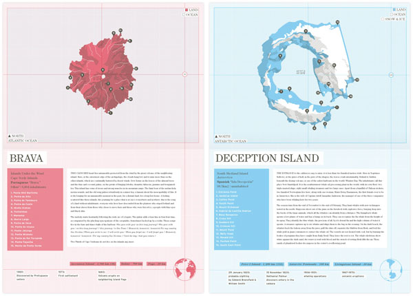
thanks to designworklife.com for featuring trent edward’s project to redesign and illustrate judith schalansky’s atlas of remote islands. these are beautifully technical, curios 2-color illustrations that lend an enjoyable flair to the map-as-art genre. see the collection here.


khuan+ktron

khuan+ktron
khuan+ktron, image: thefoxisblack.com

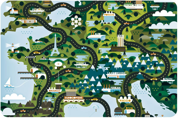
this is one of a series from khuan+ktron for the good life. from what i’ve seen so far, they bring a colorful, dimensional quality to the places they illustrate, whether mapped from above, or shown in depth scale. see the feature at thefoxisblack.com.


growing up: a landscape

growing up: a landscape
growing up: a landscape, image: emilymcdowell.com

this map adds a scale of hilarity to a sense of place, something you can only enjoy by going to the post and studying the close-ups. i love the idea of overlaying a map with life stories, and emily’s encapsulations say just enough, like “high school isn’t everything street” and “that used van was a bad idea gorge.” see more of her fantastic work at emilymcdowell.com