creative inspiration

A Letterpress Legacy with Lucky Duck Press from Etsy on Vimeo.

identity

botanical bakery identity design
[image: david brier]
i am loving this fun identity and packaging for botanical bakery by dbd international. so colorful with a homemade twist. see more at identity designed.

packaging

killibinbin wine packaging
[image: thedielinewine.com]
this wine packaging for killibinbin wines is an amazing combination of wine and noir horror flicks done in a nostalgically tasteful way. see more at thedielinewine.com

for more from the dieline in wine packaging, check out: the dieline wine’s latest top 10 wine designs, or for a great selection of packaging of all types: the dieline’s latest top 10 packaging designs.

design industry

oh, hey, look who’s writing for the creative freelancer blog these days. more on creative co-working from yours truly!

beyond design

LACMA The Linda and Stewart Resnick Exhibition Pavilion
[image: fastcodesign.com]
LA welcomes one of the world’s largest naturally-lit spaces, The Linda and Stewart Resnick Exhibition Pavilion, profiled on fastcodesign.com.

i just got my fall garden planted, but in other places, cool-weather items like swiss chard are already ripe for picking. serious eats profiles some great recipes here: in season: swiss chard, and cucina italiana offers some delicious stuffed pasta: swiss chard and ricotta tortelli.

there’s all kinds of exciting wine news. this winery isn’t exactly new, but it’s new to me, we have a local winery right here in echo park: d’augustine vinyard! serious eats brings us what are your wine discoveries which includes a list of 100 wines to drink now. and if you’ve ever wondered what the definition of meritage is, goosecross is happy to explain it for you: what is a meritage wine?

creative inspiration

http://vimeo.com/moogaloop.swf?clip_id=4249739&server=vimeo.com&show_title=1&show_byline=1&show_portrait=1&color=&fullscreen=1&autoplay=0&loop=0

Hi-Fi from bante on Vimeo.

branding

secca animated logo
[image: pentagram]
this brand & identity for secca by pentagram is not only stunning, it moves! read up on it here: pentagram’s luke hayman on how multimedia is transforming branding, from fastcodesign.com.

print design

lan su visitor guide
[image: sockeye creative]
this lovely print specimen by sockeye creative for the lan su chinese garden in portland is rich in details that make the experience of interacting with it really rewarding. a custom die-cut window over a stylized illustration invites you in, then the unique binding of a gate fold over stepped pages detailing the vistas makes you want to flip through and study each one. fantastic work! see more here: lan su visitor guide, from underconsideration.com.

web design

a series i found on uxbooth.com included some useful articles i wanted to share for web designers. a complete beginner’s guide to design research, overcoming the obstacles of usability testing and the complete beginner’s guide to web analytics and measurement.

creativity

bottle rainbows by johnny miller
[image: johnny miller]
amazing rainbows and color gradients created with colored glass and light, by johnny miller. thanks, oh joy for the link!

since creativity is about how you think, here are 2 articles i found interesting from around the tubes this week. seth godin talks about how we analyze our inner monologue to help define intuitive marketing: monitoring your internal monologue, and succcess.org explores the einstein quote “imagination is more important than knowledge” here: be smart, know smarts ain’t the answer.

design industry

ravi sawhney talks about his new book predictable magic here:forget praying to the muse, create design magic on demand, from fastcodesign.com

tim lapetino of hexanine talks about how to get the most out of your kickoff meeting: the art of interviewing your client, from logodesignlove.com.

a post chock-full of inspiring resources: 25 useful videos and presentations for designers, from smashingmagazine.com.

small business owners & sole-proprietors, take note: biz ladies: free online resources for business owners, from designsponge.com

creative inspiration


meg mateo ilasco and joy deangdeelert cho promote their new book, creative, inc.: the ultimate guide to running a successful freelance business, with this cute stop-motion video. thanks design sponge for the link.

branding

abu dhabi logo
[image: brand.abudhabi.ae]
the capital of the united arab emirates has decided to brand itself, with the help of m&c saatchi. i think this logo is really lovely, and i like how they’re using the mark alone to sign-off on all kinds of beautiful photos of the area. check out the full post for applications and the custom typeface they created: the abu dhabi brand rich, from underconsideration.com

identity

isle of skye business cards
[image: isle of skye]
a stunning alternative to commercially printing your business cards, illustrator skye jeffries has cut hers from illustrations and overprint her black plate with a hand stamp, for an original creation in each one. thanks to designworklife.com for the link.

photography

barker at the state fair
[image: library of congress]
this collection of color photographs from the 30s and 40s has been circulating around the internet, so if you haven’t seen them yet, take a look: captured: america in color from 1939-1943. from denverpost.com: These images, by photographers of the Farm Security Administration/Office of War Information, are some of the only color photographs taken of the effects of the Depression on America’s rural and small town populations. The photographs are the property of the Library of Congress and were included in a 2006 exhibit Bound for Glory: America in Color.

design industry

excellent advice for clients new to hiring designers: tips on buying design, from muledesign.com

here are some great thoughts on how we limit ourselves from being creative as we age further from our childhood sensibilities & wonders: the problem with creativity, from logodesignlove.com

LAUSD linked learning summer institute

LAUSD linked learnig summer institute

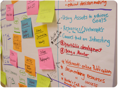
i’ve been working with the LA area chamber’s pillar program to link up with LA area high schools with graphic design programs, providing the perspective of a working designer for curriculum enhancement. most recently this took the form of the LAUSD linked learning summer institute with canoga park high school. several schools from LAUSD were present, and after a morning presentation, we split off into groups by school and worked on curriculum development.

the group of teachers included instructors in digital art & yearbook, drawing, printing, photography and english. they were a really great group of educators who have been working hard to improve school programs within tight budgets. i was really impressed with the curriculum they already offer. it’s so much more developed than anything my high school offered to potential designers, and while some of this is the natural evolution of education multiplied by the accessibility of the internet, some of it is old-fashioned care and attention being paid to our profession.

LAUSD linked learning summer institute

the focus of the consult was supposed to be about how i could help advise on real-world scenarios and help direct curriculum to address these things in the classroom before the students become employed. interestingly, though, we got into a discussion about the current perception of the school and how it’s not where they’d like it to be in order to attract students who want to participate in the design program. it had all the makings of a branding conversation, so i said it sounds like canoga park high needs a brand makeover! and they agreed.

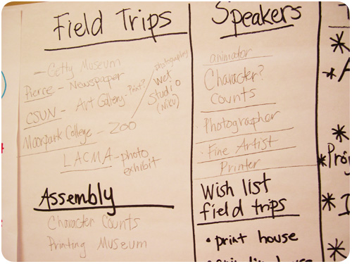
we decided to start talking about it as a possible project for the design program to tackle. what i love about these teachers is that they were full of questions and had great ideas about implementation. one of them asked “if we were to conduct a rebrand project, how would you suggest we do it?” we went through having the students brainstorm on all their perceptions about the school, good, bad & ugly, and refining their thoughts to core ideas.

we talked about conducting an informal market research campaign where they could interview their parents, neighbors & local business owners on perception of the school and analyze it. we talked about developing a brief going forward and having students propose projects they’d like to do to support it [photo essays, psa poster campaigns, identity exploration, mood boards, poetry in a typography-only layout, etc.]. we talked about having kids in 3 different classes group up [a designer, an illustrator and a copywriter] to work to produce projects as creative teams. we talked about environmental and experience design—what’s it like to walk into the attendance office to get an absence slip, what about that experience is a reflection of the school? whether these things actually get redesigned or just remain projects isn’t important, but the process of identifying parts of a system and how to improve them is.

what i love about it the most, is that it serves multiple purposes. the students will be building amazing portfolios, the school will have attention to its image paid from the inside out, and the educators will have no shortage of artifact to send along with grand proposals to show the level of work they’re doing.

LAUSD linked learning summer institute

of course, it doesn’t stop there. one of the biggest challenges with a diverse group of students is relative levels of exposure to design. i’m sending over resources the educators can use to present all different types of design to the students, as well as offering to come in and talk about portfolio development and help give the students a good idea of what they’re in for with a career in design. i really hope they find a way to work up to the school rebrand project, it’s a big thing to organize, but it would turn out some really exciting work.

creative inspiration

identity

stitch identity
[image: stitch design co.]
stitch design co. worked up a lovely identity system for themselves in 3-colors and letterpress printing. i am really loving the orange edge printing on the cards!

history

propaganda & graphic design
[image: fastcodesign.com]
how america waged war with food and graphic design, from fastcodesign.com is a great first look at cory bernat’s collection of posters from 1900 to 1950 from the national agricultural library, showing how government urged citizens to modify their behavior for the greater good using graphic design.

design industry

publishing in the age of the internet, from design observer is a fascinating article about how the perception of design has changed due to the abundant archive on the web, and the reaction of the author to launch a unit editions dedicated to producing books on design and visual culture, as well as a series of low-cost research papers covering a range of topics in graphic design. sounds fantastic!

how i get positive feedback from my clients, from marketing mentor is a nice piece by guest blogger, kara smith, on her follow up strategy for rounding out projects, giving thanks and asking for feedback. good ideas!

top 10 web sites for designers, from HOW. another great round-up for august of resources for design professionals.

want to win an eco-trip for 2? neenah paper is celebrating it’s environment line with a contest! enter for a chance to win an eco-trip to costa rica for 2!

photographs of signs

signs of san francisco
[image: print magazine]
kicking off a new series, print magazine’s blog imprint showed a selection of photos of signs of san francisco. these are all so beautiful, i’m glad to read they want to make it a series, asking readers to submit photos of their local area sign relics that they’ll post up and feature. excellent!

creative inspiration

branding

miller high-life brand refresh
[image: underconsideration.com]
admittedly, i don’t drink miller high life, so i’m not sure how long before i noticed their packaging redesign. luckily, we have miller high life overhaul from underconsideration.com with copious photos and reviews. i love the cleaner look that doesn’t deviate from the original, and more prominent use of their poster-girl, lucy, which is a lovely illustration featured on the sides of the 6-packs above. nice work!

packaging

cigarette packaging
[image: fastcodesign.com]
a hilarious look at what might happen if packaging could deter smoking merely by being totally annoying! can annoying cigarette packs make smokers quit? from fastcodesign.com. brilliant!

design industry

design never 2010 winner
[image: howdesign.com]
i love the concept of project never, an awards show to showcase great work that never made it to final. thanks to the how design blog for showcasing the 2010 winner, an identity system for chop shop, by ptarmak, inc.. i’m loving this typography they did.

michael beirut takes a look at advertising personalities after the season premiere of mad men for design observer jerry della femina, mad men, and the cult of advertising personality.

i thought this photography post was worth sharing: the showcase of beautiful pinhole photography from smashing magazine. i haven’t taken pinhole photos since my high school photography class!

need some help talking money with clients? don’t let “you” get in the way of price negotiations, from creative freelancer blog has some possibly-familiar suggestions you might see in your own experience on how to improve.

linkswitch 28: choose a domain name, hire a designer, from freelance switch is a pretty awesome list of all kinds of things you might want to do but just don’t know how. take a spin, maybe tackle some if they’re on your list!

creative inspiration


levi’s shares a video behind the scenes of letterpress, screen printing and block printing.

speaking of print design, how magazine reprinted part of a study by appleton coated on how print design is still a very valuable selling tool because clients and consumers love interacting with stunning print design pieces. but hey, you already knew that, right? the new ROI.

if you’ve done some of this outstanding print design, check out some upcoming design award deadlines: call for entries: HOW design awards

need one last print design fix? these central park wedding invites featured on design sponge are a great use of a 2-color palette. bonus points for creating a map—who doesn’t love a good, personalized map!?

branding

YMCA rebranding
[image: underconsideration.com / YMCA]
underconsideration.com reviews YMCA rebranding: my name is Y… the Y. the main mark in red & purple is nice, but i love that they are using multiple color iterations of the logo! i also like the sporty new look.

people for bikes
[image: fastcodesign.com
finally, bike branding moves beyond hipster-ghetto takes a look at the people for bikes campaign by colle+mcvoy. simply put, it’s an organization to improve the future of biking through various actions on local & national levels. the branding for these efforts is friendly, accessible and engaging. check out some of the print ads, i love the one of the woman with a gear print on her leg.

posters

know your rights
[image: fastcodesign.com]
if you’ve been looking for ways to use your design skills for positive propaganda, fastcodesign.com offers promoting social justice one poster at a time, showcasing the center for urban pedagogy. their mission statement has all kinds of inspiring language, and is worth reading in its entirety, but if you’re pressed for time, here’s a snip: Our work grows from a belief that the power of imagination is central to the practice of democracy, and that the work of governing must engage the dreams and visions of citizens. CUP believes in the legibility of the world around us.

design industry

brand new announces its first 1-day conference! if you’re a fan of underconsideration.com and you can swing by new york city at the beginning of november, they’ve got a jam-packed 11 hours for you. they’ve also got a bunch of different ways to attend, so if you’d rather watch a live webcast, you can!

what is the last thing you do before you launch a website? from smashing magazine is a really cute, informal quiz you can give yourself about your reactions to presenting final work and a brief analysis about what this says about your personality.

another from smashing magazine, renegotiating the final contract (and other tales of horror). here’s some great advice for how to handle things when you find yourself doing work that’s outgrown its governing agreement.

creative inspiration

retro styles

fourth of july postcards
[image: from the collection of richard sheaff]
this fantastic collection of fourth of july postcards from designobserver.com includes illustrations of doll-faced children, hand-drawn type, and loads of fireworks!

power styling
[image: US steel, grainedit.com]
i have to say, i liked the look of the future as imagined in the mid-60s. thanks to dave from grainedit.com for sharing spreads from power styling, which seems to be a collection of illustrations proposing re-imagined looks for the infrastructure of electric utility. be sure to look through all the pieces he scanned, they suggest a majesty that is glaringly absent in the power lines i see outside my window today.

logo evolution

evolution of the logo
[image: smashingmagazine.com]
we’ve come to know logos as modern signifiers in the marketplace, but the concept of a brand mark has existed a long time through history. smashing magazine offers the evolution of the logo that traces how graphic marks have been used to denote ownership, authorship and associations with different groups, only leading them to corporate identity as a result of evolution.

identity

girl scouts of america get an identity makeover
[image: fastcodesign.com]
subtle, yet classic & modernized, check out the identity makeover on fastcodesign.com: a fresh identity for the girl scouts of america. i think these new profiles look more contemporary and youthful without losing any recognition of the brand and tradition. great work!

design industry

check out redesigning propublica by mule design. We love good journalism and hate unchecked abuses of power, so we were excited and honored to collaborate with ProPublica on their website redesign. hear, hear!

another from smashing magazine: add music to your workflow to improve results. i’ve always known i liked listening to music while i work, but i didn’t realize why it was helping me work better.

creative inspiration

HOW and creative freelancer conference round-up

how cd experience
[photo: underconsideration.com]
if i haven’t mentioned it before, this year will be my first at the HOW conference, so i’m following as much preliminary info as i can. i wasn’t aware that there’s a tradition of a CD exchange, but thanks to underconsideration.com, i not only know about it, there’s a showcase of what kat feuerstein / gilah press + design did for last year: 2009 HOW design conference CD exchange sleeve. i’ve always liked silver ink on a dark stock, this one is chocolate brown!

the HOW conference closing party theme: white space. i have plenty of white to bring, now it’s just a matter of which white will it be?

if you’ve got questions about copyright or trademarks, jean s. perwin will be at this year’s CFC. thanks to the creative freelancer blog for this list of copyright resources: got copyright?

another great feature of CFC are the breakfast roundtables. here’s a list of some of the attendee-run tables you can join in on: what do you want to learn at breakfast?

event design

identity for brad radke
[image: charles ross]
thanks to designworklife.com for finding this great event suite by charles ross for the retirement party of minnesota twins player brad radke. he did a great job of capturing the best of baseball memorabilia.

logo design

frut logo sketches
[image: adam gf]
this logo development for smoothie company, frut, is an interesting look at how designers brainstorm on different shapes and ideas: logo design love: unsung heroes. i have a few pages like this myself, most of which never see the light of day. follow the link to see the final identity system, which is a super-fun burst of color.

35 smart logos with second thought to make you look twice is a nice collection of logos that work really well for the messages they convey.

typography

anatomy of type
[image: sigurdur armannsson ]
need help with your type anatomy? refer to each part of every letterform with accuracy, using this anatomy of type desktop graphic, free from font.is

silent dance
[image: camila drozd]
the work of this lovely hand-drawn type designer, camila drozd, has come up a few places in my weekly reading, and i think her work is really stunning.