levi’s shares a video behind the scenes of letterpress, screen printing and block printing.
speaking of print design, how magazine reprinted part of a study by appleton coated on how print design is still a very valuable selling tool because clients and consumers love interacting with stunning print design pieces. but hey, you already knew that, right? the new ROI.
if you’ve done some of this outstanding print design, check out some upcoming design award deadlines: call for entries: HOW design awards
need one last print design fix? these central park wedding invites featured on design sponge are a great use of a 2-color palette. bonus points for creating a map—who doesn’t love a good, personalized map!?
branding

[image: underconsideration.com / YMCA]
underconsideration.com reviews YMCA rebranding: my name is Y… the Y. the main mark in red & purple is nice, but i love that they are using multiple color iterations of the logo! i also like the sporty new look.
[image: fastcodesign.com
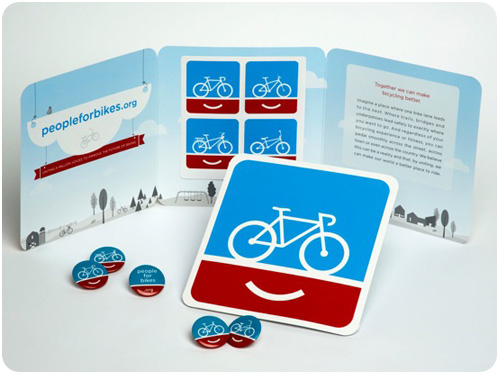
finally, bike branding moves beyond hipster-ghetto takes a look at the people for bikes campaign by colle+mcvoy. simply put, it’s an organization to improve the future of biking through various actions on local & national levels. the branding for these efforts is friendly, accessible and engaging. check out some of the print ads, i love the one of the woman with a gear print on her leg.
posters
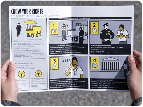
[image: fastcodesign.com]
if you’ve been looking for ways to use your design skills for positive propaganda, fastcodesign.com offers promoting social justice one poster at a time, showcasing the center for urban pedagogy. their mission statement has all kinds of inspiring language, and is worth reading in its entirety, but if you’re pressed for time, here’s a snip: Our work grows from a belief that the power of imagination is central to the practice of democracy, and that the work of governing must engage the dreams and visions of citizens. CUP believes in the legibility of the world around us.
design industry
brand new announces its first 1-day conference! if you’re a fan of underconsideration.com and you can swing by new york city at the beginning of november, they’ve got a jam-packed 11 hours for you. they’ve also got a bunch of different ways to attend, so if you’d rather watch a live webcast, you can!
what is the last thing you do before you launch a website? from smashing magazine is a really cute, informal quiz you can give yourself about your reactions to presenting final work and a brief analysis about what this says about your personality.
another from smashing magazine, renegotiating the final contract (and other tales of horror). here’s some great advice for how to handle things when you find yourself doing work that’s outgrown its governing agreement.