i’m loving this clean, simple, 2-color identity for social traders. the folded ribbon motif going through the main logotype, carrying through to the art is bold and elegant without being overstated. see the entire package on identitydesigned.com
packaging
image: thedieline.com
another from the dieline, outstanding student work on coffee packaging, with lovely custom type logo: coffee bag!
always a sucker for typographic design elements, this packaging for tilly devine nearly becomes illegible, though the desire to read it wins out as you spin the lable. see the more photos at thedieline.com
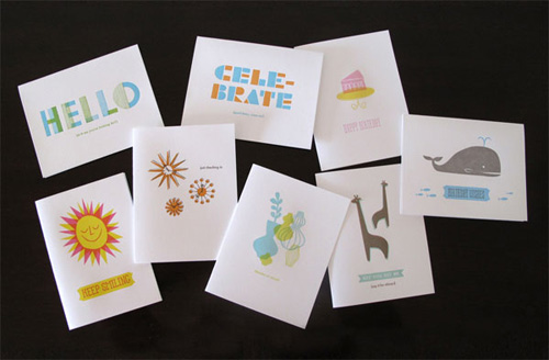
design industry
image: latimes.com
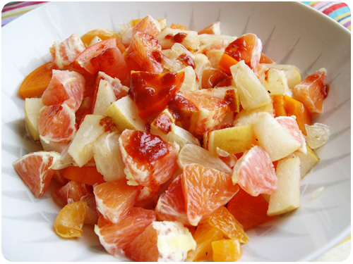
i could look at vintage citrus crates for hours. if you want to read more about this history of citrus branding and marketing in california, latimes.com has a great piece about how it all came to be.
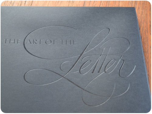
it’s been nearly a month since doyald young passed away. i’ve found myself thinking about him, about the amazing work he did, and what a nice guy he was. earlier this month, mohawk paper offered to ship a book they did with him awhile back, the art of the letter, for free, so for the cost of shipping i didn’t hesitate. you may still be able to order one following the link in this post.
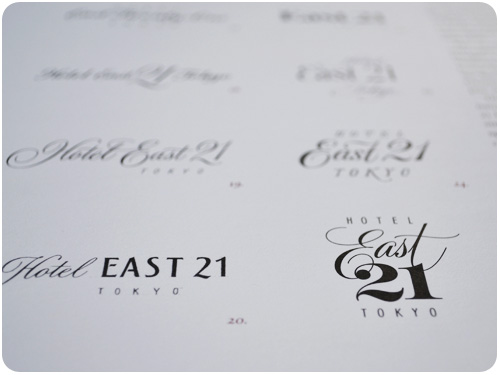
[hotel east 21 logo study]
i met doyald at my first design job, working in a service bureau on the studio city / hollywood border. i hadn’t started there with a design career in mind, but after a few years of seeing so much work from all over LA, i was compelled to make it my own. doyald was a regular customer, but i had no real concept of his legacy. he was just this really nice guy who always seemed to be tweaking the prudential stationery, ordering one sheet of paper or film with each visit, which seemed like a relatively small project compared to the 4-color ads and full book layouts that came through the shop. i remember thinking it was cool that he was still working past retirement age.
as i learned more and moved up, i landed a design position at a company with an employee education budget, so i joined AIGA and started going to events and conferences. at one of the early Y-design conferences with the san diego chapter, doyald gave a presentation of his hand-drawn logotypes and letterforms, and it utterly blew my mind. all those years i had known him as a nice, grandfatherly gentleman, but had no idea i was talking to one of the most amazing talents in graphic design. i bought all his books from the shop and asked him to sign them. i remember gushing somewhat apologetically that i hadn’t realized who he was. but this was bound to happen, after all, he was a modest guy and i was 19 & not formally educated in design just yet.
not that you’ve forgotten how the economy got into a mess, but information is beautiful made a really clean animated infographic that drives the point home.
branding
[image: astronautdesign.com]
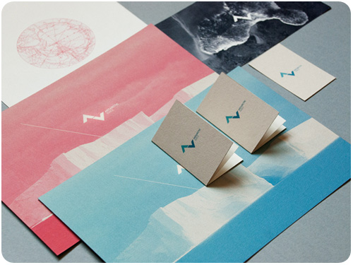
truly stunning branding system created by astronaut design [the whole portfolio is well-worth a spin], described simply: Antarctic Voice is a project that aims to express the voice, the silence and the magic of the unattainable continent, Antarctica. view the complete project profile at identitydesigned.com.
[image: re-nest.com]
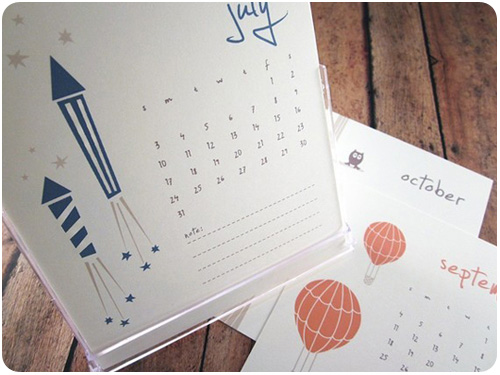
i don’t use traditional calendars for date tracking so much anymore [because i’m so dependent on ical], but i still think they’re a thing of beauty and can be some great rotational art for your home. re-nest.com has a great round-up of cute 2011 calendars.
it’s a new year, and everyone’s talking about how to start it off right. let me put down my breakfast pizza to suggest maybe we learn to give better design feedback. thanks, mule design, for bringing humorous honesty to this admittedly difficult process. here’s an excerpt in case you haven’t clicked yet: First rule of design feedback: what you’re looking at is not art. It’s not even close. It’s a business tool in the making and should be looked at objectively like any other business tool you work with. The right question is not, “Do I like it?” but “Does this meet our goals?” If it’s blue, don’t ask yourself whether you like blue. Ask yourself if blue is going to help you sell sprockets. Better yet: ask your design team. You just wrote your first feedback question. bam!
AIGA
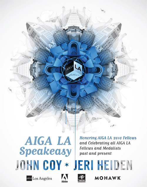
[image: AIGA LA]
the time has come to celebrate designers who have made outstanding contributions to the legacy of los angeles. this year, AIGA LA honors 2010 fellows john coy and jeri heiden, and invites you to meet, mix & mingle with past AIGA fellows and AIGA medalists in a truly wonderful evening january 20 at the palihouse in west hollywood. i should know, i’m producing it, and we’re planning a fantastic speakeasy event. the tickets are a steal, register today before they go up the day of the event!
los angeles
so what’s new in my hood? i’ve been wondering what to do with the preponderance of elderly towels i’ve accumulated. like, they’re not falling apart, but they’re not pretty and they don’t match. i got a nice set of matching towels, but since i’m not into wasting things, i kept the old towels too. maybe for cat baths or spills or making into rags? thanks blue collar dog supplies for solving this for me! i can give them to dogs in need! so can you!
kelly over at echoparknow.com has a great list of echo parky things to do in 2011. come to think of it, i should probably read the madonnas of echo park, and i love climbing stairs, and i am sure going to miss the lake on its 2-year hiatus.
something to get you rockin on the last week of the year.
packaging
[image: loyal luxe]
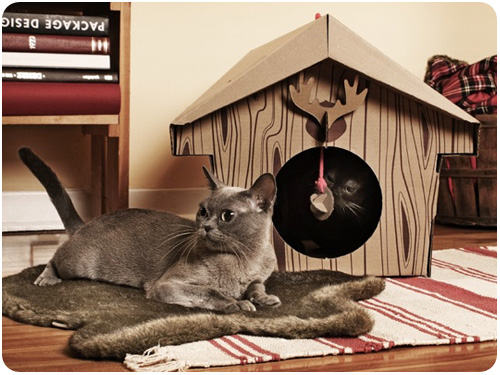
if you have cats, then you know that as soon as a box is around, they’re inside it. these little cat houses & cabins are so cute, i think mine would have a ball playing in them.
something we don’t talk about enough in packaging, however, is waste, and i think marian bantjes’ piece for design observer explains my wrap rage really well: plastics: an apoplexy.
wine
[image: thedieline.com]
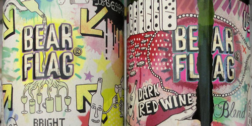
sometime in september, i was up in san francisco, walking home from dinner on my cell phone, when i dropped into a liquor store to buy a bottle of wine. distracted by my call and less familiar with napa wine than most points south, i scanned the shelf forever and then decided that this fascinating label for bear flag wine had to be a sign. i bought it, i drank it, i planned to photograph it, but i didn’t, and then i took home the empty bottle, and it sat on a shelf for 2 weeks, when i finally decided i would just let it go. but then—here it is on the dieline, and it reminded me, it was an awesome piece of illustration & package planning. the bear flag site is pretty awesome as well, and i give them a pass on using flash, because they’re using it well.
typography
[image: thedieline.com]
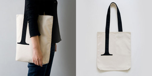
you probably think you don’t need this serif bag, but face it, you probably do. profiled on thedieline.com.
this week’s post for LAist doubly surprised me, for one because people seem to really like fennel more than i thought, and for another, i didn’t get ANY anchovy hate! seasonal eats: root-to-flower fun with fennel.
what a cool internet collaboration on a christmas song!
packaging
[image: the dieline]
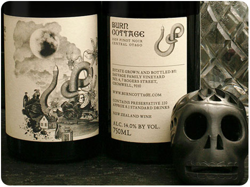
a really unique illustration on oncoated stock to showcase burn cottage, a biodynamic winery. by mash.
typography
[image: thedielinewine]
beautiful, simple type treatment and illustration for bathe wines by fuller. so clean and classic! check the complete profile on the dieline.
some outstanding tv quotes from mad men, the wire and battlestar galactica, in custom typeset.
loving LA got a lot easier with this awesome tumblr: 10>110>101, an eclectic collection of all kinds of LA ephemera. thanks to @theroyalacademy for sharing it!
food
i’m not going to add to your holiday overwhelm more than i already have, but consider these cookies. they’re made with salt and pepper. if you like salty cookies that really bring out the flavor, try these out: salt n pepper sandwich cookies. yum!
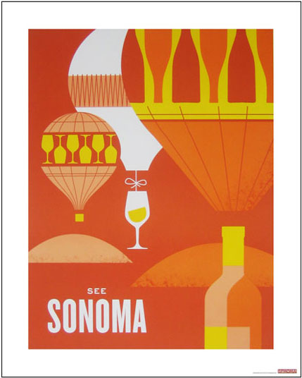
[image: designworklife]
i’m loving these wine country travel posters by hatch for the sf moma wine exhibit, available for sale in the museum store. thanks designworklife for the link.
if you’re not into holiday cards but don’t want to miss the opportunity to connect with your clients & vendors, consider a transition to new year’s cards, alisa tells you how: do you have your new year’s cards ready?
beyond design
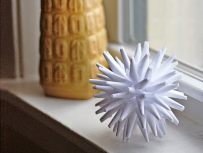
[image: craft magazine]
the holiday how-tos are rolling in these days, i thought this paper holiday star was particularly cute, and something we could all probably do with some of the paper we’d normally throw into the recycling bin. decorate with it for a few weeks!
if you like baking cookies for the holidays, saveur compiled their 20 best holiday cookie recipes, and boy are they cute!
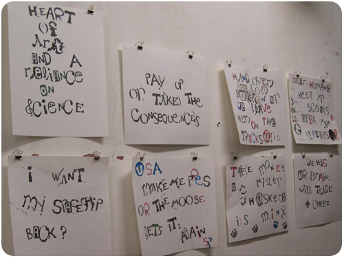
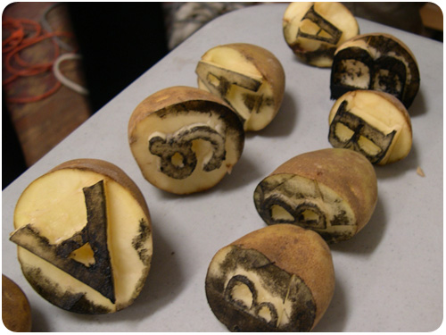
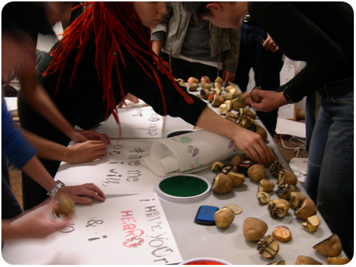
the evening consisted of a brief talk on type, instructions on how to carve potatoes [with supplemental backwards alphabets on the tables for inspiration], the actual carving, and then final printing in the form of ransom notes. concluding the workshop portion, we went next door to view a screening of typeface, a documentary about the history of wood type for letterpress and the hamilton wood type museum.
awhile back, my mom gave me some of her wood carving tools, so i brought those along for precision potato carving. we picked our letter assignments from a bowl and got started. some people like to jump in and carve right away, but our table all sat and sketched our letters ahead of time to make sure we liked them. designers!
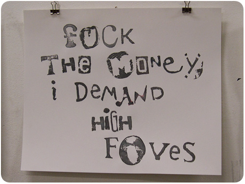
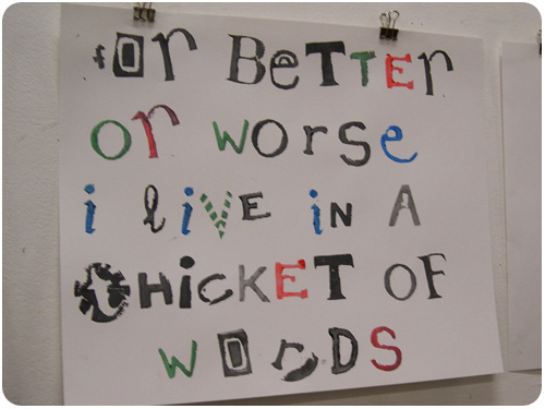
once we had a few of each letter, some ligatures, numbers, and such, people got to printing. since this typeface consists of unmatched characters, it’s technically a ransom note face, so we were encouraged to compose ransom notes of our own. this was super fun!
the documentary was very interesting, first & foremost to see so many gorgeous carved wood blocks of standard and intricate display faces. coming from a city like los angeles, it’s hard to wrap your head around the idea that this wood type factory pretty much made two rivers, wisconsin—though their other claim to fame is inventing the ice cream sundae. the visiting artists shown in the film were making amazing prints as well, it really made me want to figure out how to spend some kind of residency there.
typeface will screen in various cities for the next few months, and it’s available on limited edition dvd [with a wood type print jacket] or from itunes.
[image: will staehle]
this week, everyone is nuts about typography, so i’m going with it. first up, send your friends these cool b-movie typeset cards by will staehle for a tastefully retro spook during halloween week. thanks, how magazine for the link.
typography: in print!
[image: ligatureloopandstem.com]
this stunning typographic elements poster by ligature loop and stem was featured on the FPO blog this week. it’s already so clean and stylish, but then they even ran it as letterpress. bravo!
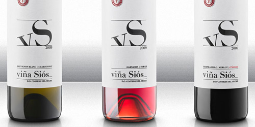
typography: wine packaging!
[image: thedielinewine.com]
this packaging for viña siós uses a simple type treatment, but it’s bold, unique and elegant in its simplicity. nice work!
speaking of pumpkins, you can use them like a terrine and bake soup right in them. neither i, nor saveur, would ever joke about something so delicious: pumpkin soup in a pumpkin.
and speaking of fall, and things like leaves, i hate leaf blowers. i guess i just thought everyone else loved them and invited them to my neighborhood every week, but i’m glad i’m wrong. the leaf blower wars, thanks utne reader.
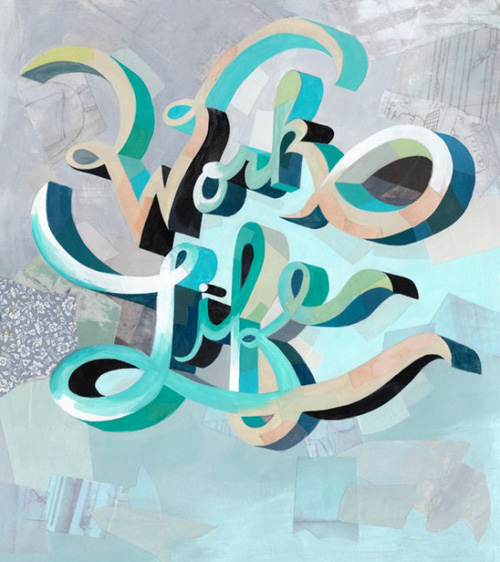
[image: darren booth]
this piece was a monday inspiration pic on fudgegraphics.com and it’s easy to see why. what a great combination of words, hand lettering and illustrative awesomeness!
i’m an undying fan of maira kalman, and as any undying fan should, i promise to post any article on her that crosses my rss reader. this week, she’s the focus of what’s in your toolbox, from designsponge. take a peek inside her studio!
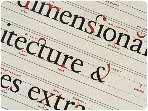
typography
[image: typography.com]
the people at hoefler & frere-jones have done it again with an outstanding post outlining the finishing touches of typeface design in which they show you how they mind your p’s & q’s.
[image: lulu dee]
one of the great letterpress artists i saw at the 2nd annual LA print fair recently was lulu dee, who’s work has just been featured on for print only. her work is so cute, pairing song lyrics with delicate illustrations.