branding

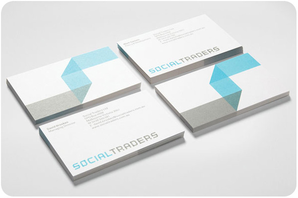
i’m loving this clean, simple, 2-color identity for social traders. the folded ribbon motif going through the main logotype, carrying through to the art is bold and elegant without being overstated. see the entire package on identitydesigned.com
packaging

another from the dieline, outstanding student work on coffee packaging, with lovely custom type logo: coffee bag!
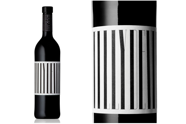
always a sucker for typographic design elements, this packaging for tilly devine nearly becomes illegible, though the desire to read it wins out as you spin the lable. see the more photos at thedieline.com
design industry

i could look at vintage citrus crates for hours. if you want to read more about this history of citrus branding and marketing in california, latimes.com has a great piece about how it all came to be.
continuing with sustainability, justin ahrens contributes to the parse blog, start somewhere: green is a must, while design sponge’s biz ladies outlines a how-to: simple ways to green your business.

We used to live in an 1898 Victorian cottage in San Jose, and I decorated the kitchen with vintage citrus crate labels. They were just gorgeous. I left them behind for the new owner, but I think I aspire to one day have another kitchen where crate labels can be prominently displayed.
LikeLike