As the saying goes, I love it when a plan comes together. When I first talked to Tony Yanow about his newest venture, Mohawk Bend, it was nearly a year ago, midway through the Ramona Theater’s renovation process. While we’d be working from scratch design-wise, Tony had a very clear idea of who he was serving and what the attitude and voice of Mohawk Bend would be, which made the preliminary research and brand brief development really easy. He also had an interior design team working with the raw materials of the space and adding beautiful custom furniture in light wood and warm, orange tones. From the outset, we knew the setting of where the identity would live and how we could make it stand out appropriately within that environment.
logo development
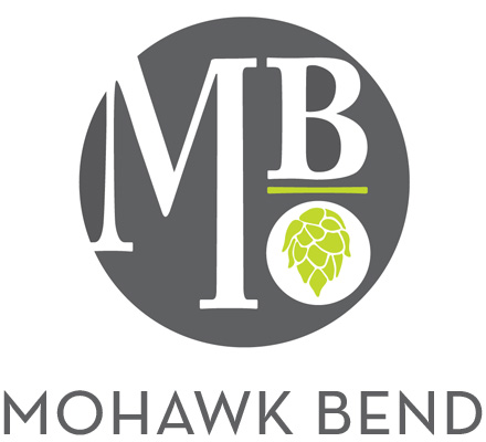
Mohawk Bend has a few different areas of focus, but it’s first and foremost a celebration of craft beer from all over California. The most exciting and innovative of these is the hops-forward west coast IPA, and in that vein, the hop flower became a main feature of the logo.


building an identity
Beyond beer, though, their plans included California-sourced spirits, a bottle-free selection of California wine, local / organic food that spans the vegan-omnivore spectrum, and a low-waste operation in the kitchen. Tony really wanted an icon system that could represent each of these aspects and work interchangeably with the main identity, play out on the web site, and associate with core staff’s areas of expertise. We developed a color palette and selection of icons that swap out with the hop flower in the logo for specialized uses, and become indicators for each area of the web site. For future signage and events, they’ll have the versatility of growing this icon system with new developments.

keeping it simple & highly useful online
Creating the web site was a fun exercise in brainstorming all the things we hate about restaurant web sites and putting them at the top of the list of what not to do. No flash, No pdf menus, No hard-to-find location information. Tony was always very clear about the voice of Mohawk Bend, that it’s craft first in a simple and honest way. We were still excited to talk about all the great things Mohawk Bend does, however, so we built all of it into the about section, so the information is there without being an obstacle on the home page. Instead, a styled twitter widget announces daily specials and events, with clear postings of hours, location, directions and a list of menus: get the info you need and come on over!
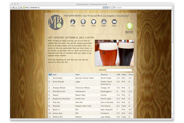
the interactive beer list
One particularly fun feature is the interactive beer list. During our preliminary talks on functionality of the site, Tony said “What I’d really like to have is a beer list you can sort by any category—brewery, style, alcohol volume…” And so we thought about it, and worked out a solution that integrates directly with WordPress, allowing all the searching & sorting a curious beerophile would want. Click any column header to sort by that column, or use the search field to isolate beers containing your search terms. We also translated everything to a nice mobile site, so anyone can find just what they’re looking for [even search the beer list] on the go.

beyond design: a workflow that works
Behind the scenes was the real challenge: developing a workflow system that would allow daily menu updates in print and online to be done easily and quickly by employees. A system that still uses nice typefaces and formatting in print, but doesn’t require any coding online—and all simple enough to execute well without a design education. Once we settled on a menu format, we built in-house layout templates using paragraph styles that would transfer heading tags and basic bold and italic formatting to WordPress. The WordPress interface is extremely user-friendly, with a visual editor, so everyone has taken to it quickly. To keep the carbon footprint low, the menus are printed on Neenah Environment 100% post-consumer waste recycled paper.

and they’re off…!
As I’ve watched this roll out in action and seen the Mohawk Bend staff make it their own, I’m proud of the system we created together. They’ve been able to switch around the menu formats easily using feedback from customers, and we’ve been able to build more of the identity into ads, stickers, signage and support collateral. Best of all, they are all super-nice people to work with, so we’re always happy to walk down, have a beer, find out how everything is going, and help them work out their next adventure. Bottoms-up to Mohawk Bend!
+ Read more case studies here.
+ See more of our work for Mohawk Bend here.