what-if wine packaging
today i’m taking the opportunity to share 3 wine packaging ideas that are all wonderful, but none of which exist in the commercial marketplace, either because they’re student work or personal projects. i’d love to see more of this on the shelves over the stayed embossed metallic serifs with only occasional illustrations of interest.
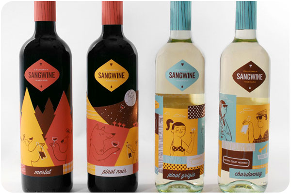
sangwine
sangwine by lydia nichols is a project based on a vineyard of her invention to showcase her lovely illustration work. why shouldn’t wine be set in a retro-fantastic national park or a polka-dotted california road trip? the colors and illustrative details are truly charming. read more on the dieline.com

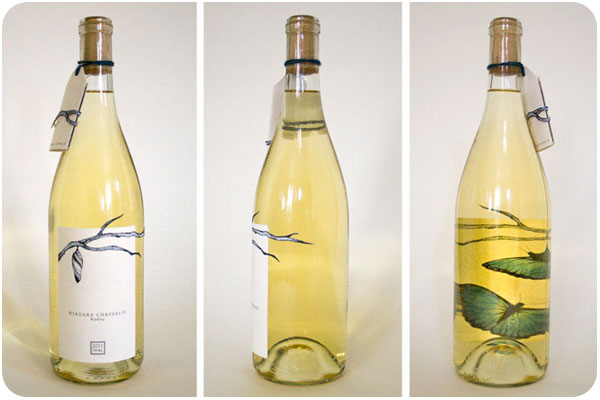
niagara chrysalis
niagara chrysalis by melissa deckert. i’ve seen a fair amount of diecut labels, but not many that use the distortion of the wine-filled bottle to add effects to back-side label printing. this is a great way to encourage interaction with the bottle, where a table wine can become a conversation piece.

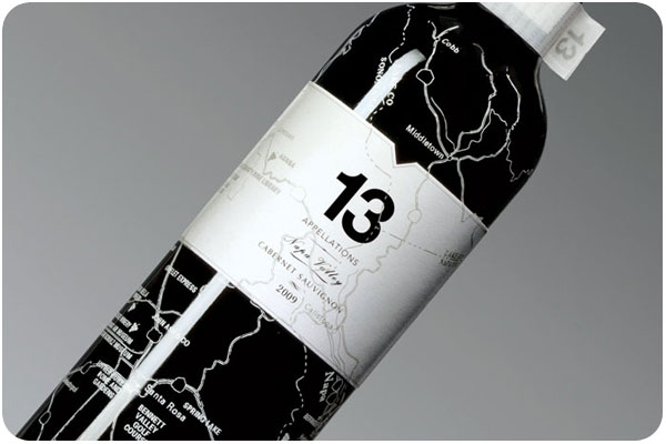
13 appelations
13 appelations by wei sun is a nice concept package on blend wines from multiple vineyards, tying together concepts of terroir into a patchwork of domaines and landscapes. beyond that, it’s covered in maps, another curiosity that gets people studying and enjoying the packaging. i don’t know a single person who doesn’t like maps.

