i’m a huge fan of the continuous line style of illustration, and this moving version that tells the story of mohawk paper’s legacy is a really beautiful way to evolve a narrative.

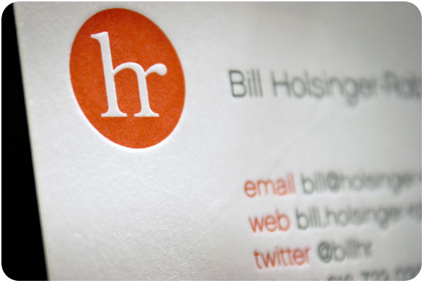
speaking of things connected, i’ve been looking at a lot of ligatures lately. or rather, i’m always looking at them, but i’m thinking about them even more, and i thought this logo for bill holisnger-robinson was pretty nice. see all the details on for print only.

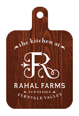
taking ligatures to the next level with illustration is this lovely identity for rahal kitchen, which has iterations for all types of vintage-style farm stand packaging. truly great work from anderson design group.
