creative inspiration

branding

miller high-life brand refresh
[image: underconsideration.com]
admittedly, i don’t drink miller high life, so i’m not sure how long before i noticed their packaging redesign. luckily, we have miller high life overhaul from underconsideration.com with copious photos and reviews. i love the cleaner look that doesn’t deviate from the original, and more prominent use of their poster-girl, lucy, which is a lovely illustration featured on the sides of the 6-packs above. nice work!

packaging

cigarette packaging
[image: fastcodesign.com]
a hilarious look at what might happen if packaging could deter smoking merely by being totally annoying! can annoying cigarette packs make smokers quit? from fastcodesign.com. brilliant!

design industry

design never 2010 winner
[image: howdesign.com]
i love the concept of project never, an awards show to showcase great work that never made it to final. thanks to the how design blog for showcasing the 2010 winner, an identity system for chop shop, by ptarmak, inc.. i’m loving this typography they did.

michael beirut takes a look at advertising personalities after the season premiere of mad men for design observer jerry della femina, mad men, and the cult of advertising personality.

i thought this photography post was worth sharing: the showcase of beautiful pinhole photography from smashing magazine. i haven’t taken pinhole photos since my high school photography class!

need some help talking money with clients? don’t let “you” get in the way of price negotiations, from creative freelancer blog has some possibly-familiar suggestions you might see in your own experience on how to improve.

linkswitch 28: choose a domain name, hire a designer, from freelance switch is a pretty awesome list of all kinds of things you might want to do but just don’t know how. take a spin, maybe tackle some if they’re on your list!

biznik article of the week

how saving money on branding can cost you by Maria Ross

another great piece on branding and why it’s so important to put together a strategy from the beginning. ross summarizes it best herself here:

Hiring unqualified people or designers who don’t ask you anything about your value proposition, differentiators, or target audience is not the way to save money. I talk to many people that threw away money because their brand strategy was not baked yet. Good design is a skill: it’s a skill that involves taking a message and communicating it visually, not just creating a pretty picture. You will lose more in lost sales by getting this part wrong than you will save on cutting corners.

And guess what? That brand strategy will do more than just inform your visual identity. It will serve as a compass for other marketing investments: partners, advertising, events. Basically any decision your company makes will be a smarter one if you start with the brand strategy first and use it as a compass. This helps you avoid throwing away money on what I call “random acts of marketing” and ensures that you only invest in activities that move your business forward.

creative inspiration

brand development

brand building
[image: fastcodesign.com]
apparently, the idea that when a client asks for a logo, what they probably really need is a brand strategy is gaining ground. if this is you or someone you know, get familiar with what goes into brand development with six tips for designing a memorable brand from fastcodesign.com.

once you work out the brand strategy, you’ll want to create a style guide so you can keep everyone developing artifacts for your business on point. to get a good idea of what goes into a style guide, check out designing style guidelines for brands and web sites from smashingmagazine.com

logos

indian rupee symbol selected
[image: logodesignlove.com]
more than a logo, a currency denotation is an international symbol that comes to be synonymous with a country and its people’s well being. the indian rupee underwent a redesign [via, of all things, a design contest] and a final has been chosen. i like the shape of it, almost futura-istic. read more here: indian rupee symbol selected, from logodesignlove.com.

typography

interview with rudy vanderlans
[image: fastcodesign.com]
i have been an emigre fan for my entire design career. it was just yesterday that one of many awesome creations of rudy vanderlans [brothers typeface] rescued yet another in a line of countless layouts for me. join alissa walker in her interview with this amazing type design icon and his new showcase for his typefaces, historia: type master: an interview with emigre’s rudy vanderlans, from fastcodesign.com

design industry

recycled vintage couture by koi suwannagate
[image: greenlagirl.com]
i wasn’t able to make it to the pasadena museum of california arts biennial this past saturday, but you can take a spin through the greenest features here: discover green design at pasadena museum of california arts biennial, from greenlagirl.com.

we talked about it last week, we’ll talk about it this week: print cant be dead if people are still starting up new magazines, especially in these new niche markets for printed rag fetishists. steven heller profiles vintage magazine for print here: print ain’t dead yet, continued.

three for the marketing department. first of all, drop the “us vs. them” mentality, marketing and design do their best when they work together: the creative vs. the marketing team: yin and yang, oil and water, from smashingmagazine.com. then, take 2 marketing-smart tips from ilise benun: does your email say “open me?” and keywords made simple, both from marketingmixblog.com.

creative inspiration


levi’s shares a video behind the scenes of letterpress, screen printing and block printing.

speaking of print design, how magazine reprinted part of a study by appleton coated on how print design is still a very valuable selling tool because clients and consumers love interacting with stunning print design pieces. but hey, you already knew that, right? the new ROI.

if you’ve done some of this outstanding print design, check out some upcoming design award deadlines: call for entries: HOW design awards

need one last print design fix? these central park wedding invites featured on design sponge are a great use of a 2-color palette. bonus points for creating a map—who doesn’t love a good, personalized map!?

branding

YMCA rebranding
[image: underconsideration.com / YMCA]
underconsideration.com reviews YMCA rebranding: my name is Y… the Y. the main mark in red & purple is nice, but i love that they are using multiple color iterations of the logo! i also like the sporty new look.

people for bikes
[image: fastcodesign.com
finally, bike branding moves beyond hipster-ghetto takes a look at the people for bikes campaign by colle+mcvoy. simply put, it’s an organization to improve the future of biking through various actions on local & national levels. the branding for these efforts is friendly, accessible and engaging. check out some of the print ads, i love the one of the woman with a gear print on her leg.

posters

know your rights
[image: fastcodesign.com]
if you’ve been looking for ways to use your design skills for positive propaganda, fastcodesign.com offers promoting social justice one poster at a time, showcasing the center for urban pedagogy. their mission statement has all kinds of inspiring language, and is worth reading in its entirety, but if you’re pressed for time, here’s a snip: Our work grows from a belief that the power of imagination is central to the practice of democracy, and that the work of governing must engage the dreams and visions of citizens. CUP believes in the legibility of the world around us.

design industry

brand new announces its first 1-day conference! if you’re a fan of underconsideration.com and you can swing by new york city at the beginning of november, they’ve got a jam-packed 11 hours for you. they’ve also got a bunch of different ways to attend, so if you’d rather watch a live webcast, you can!

what is the last thing you do before you launch a website? from smashing magazine is a really cute, informal quiz you can give yourself about your reactions to presenting final work and a brief analysis about what this says about your personality.

another from smashing magazine, renegotiating the final contract (and other tales of horror). here’s some great advice for how to handle things when you find yourself doing work that’s outgrown its governing agreement.

5 things you can do to build your business this summer

5 things you can do to build your business this summer

if you’re in an industry that experiences a slower summer season, it’s a great time to invest in your business so it’s extra-fresh for the next time you get busy. if you’re not sure where to start, here are 5 ideas to build on.

rethink your services
we all concentrate on our areas of specialty, but have you thought about related activities and services you could be offering that wouldn’t shift your focus too far? maybe you’ve been offering a couple services that would make sense to package and target a different sector of the market. perhaps you’re getting a lot of questions on similar subjects and an introductory consulting service makes sense. better yet, give your clients and prospects a little taste of your expertise and personality in a white paper or e-book. if you’re spending some of your extra time on education or professional development, maybe you’re able to branch out and offer a new product or service you hadn’t considered developing yet.

brainstorm: write out a list of all the services you currently offer. think about each one, and try to write one related service you’d like to add, or that could be included by someone who has the same expertise. google some of your favorites—what appears with these products and services that you hadn’t considered before? if you’re up to the task, consider adding the most viable to your repertoire. if you can’t incorporate it now, take a few days to see if one of your ideas appeals to you as a future goal to shoot for.

refresh your site content
building your web site is often the biggest project we work on in self-promotion, and once it’s done, it’s really easy to set it aside and let it do its work undisturbed. we may not be looking at it every day, but possible clients and customers are, and when they have new & interesting things to look at, they stay longer and engage more. additionally, search engines are regularly indexing sites on the web, but if it finds yours and you haven’t updated in awhile, they’ll pass you over for sites with more frequent content changes. you may want to consider an online editorial calendar, so you have a framework for adding new content regularly in different areas of your site [this can work in conjunction with social media, where you tell people about your new content and ask them to take a look].

brainstorm: chart out all the pages on your site and list what content is on each page. read through the content you have currently and see if it’s still 100% relevant or could use some improvement. decide on areas that just need a refresh once for the year, and other pages that could possibly have revolving content, such as announcements, new offers, or archived newsletters you’re sending monthly. if you can’t find current pages for revolving content, think of what you might add that is updated elsewhere, like a twitter stream or facebook business page. then chart out a rough calendar by month and see if you can commit to a schedule of regular updates, whether they’re quarterly or daily.

reconnect with your network
remember the last time someone caught you with a surprise phone call or a nice card just to say hi or catch up? it’s always a good feeling when friends and colleagues reach out, so why not be that person this time around? figure out your preferred method of contact and then do it up proper! if you like calling people, start with your favorite clients and vendors and call to say hello! if you’re more of an email person, write some thoughtful words personalized to the people in your network. as an alternative, you can use your newsletter service to send a graphic email to a larger list. if you prefer cards that arrive by post, pick up a set that appeals to the message you want to convey [or consider having some designed—just sayin!], get out your favorite pen, and author some nice notes. work your way out from your inner circle to those you speak to less frequently. get social media involved for the people you connect with online.

brainstorm: sometimes reaching out takes several forms of delivery. in fact, maybe it’s time to update your contact database with some of those cards you’ve picked up in your travels that are piled on your desk. you can use contact management software to note which mode of contact different friends prefer, and split them up by how you might contact them. then, get creative and make it happen!

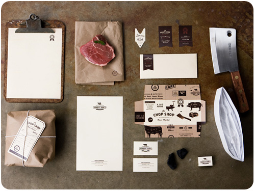
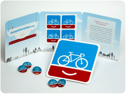
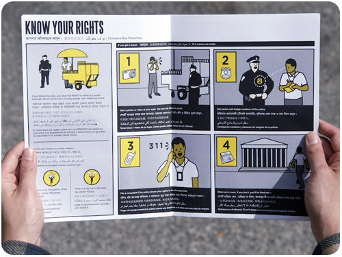
revisit your brand touchpoints
you can get some great help identifying and brainstorming on all the possibilities for brand touchpoints here. once you have a solid list, take some time with each one, ask yourself if they’re reaching your clients and prospects in the way you want them to. maybe you’ve been working with some new niches or personalities that interact with different items or information sources. evaluate which efforts you want to stick with and which are ready for hiatus. take notes when you’re out and about, what catches your eye, how have other businesses decided to interact with you in ways you thought was clever or well-placed? are you missing some cool twist in the lifestyles of the people you work with?

brainstorm: list out the brand touchpoints you’re currently using, then write as many possibilities for interaction you can think of next to each one. do these modes of interaction give you any ideas on similar items or resources you could use in the future? have you asked clients how they’ve found you or do they report on anything you’ve been doing that got their attention? is it time to start asking those questions to settle any doubts about your efforts?

reward yourself for a job well done
every time you spend time improving your business services and communications, you’re investing in yourself, so set some of this summer fun time aside to celebrate with a reward. we all work better and smarter when there is balance in our lives. give yourself that afternoon hike, take a night of overtime off, get yourself or your business a gift, or take yourself out for ice cream or soda.

brainstorm: aside from the pure rewards for a job well done, find ways to infuse fun into your business. can you go analog for the day and review paperwork or resource material at the park or the beach? do it! are there wifi hotspots or cafes with free wireless where you can go mobile for a change of scenery? try it out!

me? i take breaks for walks, bike rides, or a run on different days, but my new goal is to find a public pool i like and jump in a few times per week. and i’m a big believer in homemade fruit pops on hot days. nothing like an icy blended fruit pop!

article of the week

we are all brand anthropologists from hexanine.com.

a great perspective on how brand perception evolves through customer experience & feedback. mind your brand gaps!

creative inspiration

http://vimeo.com/moogaloop.swf?clip_id=11443824&server=vimeo.com&show_title=1&show_byline=1&show_portrait=0&color=&fullscreen=1

Oceans from Sol Linero on Vimeo [thanks to designworklife.com for the link].

sports

fifa world cup logos
[image: logoblog.org]
there are some great retrospectives on fifa world cup logos and posters online. fifa world cup logo evolution: 1934-2014, from logoblog.org has some great archives, as does an older post, fifa world cup logo designs, from logodesignlove.com. it’s so cool to see some of the early stuff from the 30s-50s!

typography

open type features
[image: martin plus for ilovetypography.com]
for the type designers out there, an introduction to opentype substitution features will show you how to make all those cool ligatures and custom-set type combos you might want to add to your typeface design.

if you’re in new york [or willing to travel] and want to learn typeface design, H&FJ’s sara soskolne will be teaching turning letters into type july 12-16: learning typeface design.

web design

applying interior design principles to the web from smashingmagazine.com talks about how the same principles of arranging physical objects relates to the placement and use of graphic objects, with a great breakdown of each.

creativity

jazz brain: functional magnetic resonance imaging is a quick report from utne.com about brain behavior during times of innovative creativity. Limb had jazz musicians play memorized music while being monitored by an fMRI machine. He then asked them to start improvising and noticed a shift in neurological activity. Their scans showed less activity in the areas that represent self-censoring and inhibition and more in the area that indicates self-expression. Limb interpreted this shift as a possible sign of “spontaneous creativity.”

article of the week

10 reasons why investing in branding makes you money in e-commerce by Stuart Silverstein

while this article is focused on building a brand to improve an e-commerce site, i silverstein is a friend and colleague who sees without a doubt that a smart brand strategy will improve sales for any business. he takes 10 solid points and explains how branding affects each in detail, in a way both partners and clients can understand. for me, this is a great article, because while i already love the power of branding, it’s really helpful to see how it applies to e-commerce.

HOW conference 2010, day 2

HOW conference 2010 exhibition floor
[photo: http://www.neenahpaperblog.com]

[recap day 1 of the HOW conference here]

how can we use design to influence positive change?

this breakfast with kit hinrichs was a late addition of interest to me. hinrichs started off by showing some of his work relevant to the topic, and then introduced his senior designer, maurice woods, to present on his labor of love the inneract project, where he offers free design classes to creative kids and teaches the concepts of creative problem solving. woods shared some pretty outstanding work from this program, which grew from a few interested students to a thriving classroom of engaged kids, bringing design to their personal passions. this program has a host of sponsors, including sappi paper, who handed out a cool booklet on creating positive change afterwards.

visual storytelling: resonate and activate audiences

i was interested this presentation by nancy duarte since i’m considering doing some speaking in the future. her talk was hands-down rockin’—and it should be, because she’s been in the business more than 20 years. too many presentations are about the presenter and not about helping the audience. duarte talked about deciding who your audience is when they walk in, and who you want them to be when they walk out. creating a presentation without an audience in mind is like writing a love letter that starts ‘to whom it may concern.’ duarte talked about contrasting between what is and what could be, take your audience back and forth between the two, using storytelling to talk about transformation. she had a fascinating way of telling her own story to illustrate this, starting out as a slide design company, moving through the transformation to powerpoint, and facing competition from abroad in a global marketplace, she had to transform her own business to remain competitive. she also talked about mapping out some of the most famous and poignant speeches in history, and formulating her own for presentations that have the most impact. using contrast as a structure, add a veil of emotional appeal in each transition to connect the audience to the story. use different media and try to illustrate points a few different ways. every presentation needs a star minute that everyone will remember. finally, deliver profound experiences, be the authentic you.

evolve: the future of sustainable design

this presentation by brian dougherty was just what i was looking for: something that goes beyond using recyclable paper. dougherty described that as the formative years of green design, and said he wanted to push it further: there must be better options than green & leaves or sustainability as a movement will hit a dead end. over time, green design has become about designing for outcomes. if you look at green design as a vehicle for changing behavior, design for change is your job. in order to do this, we need to make green design accessible, consider it part of a whole system that uses best practices, and give tools that enable the right actions. dougherty talked about his concept of designing backwards, considering the final resting place of the piece before creating it. if we don’t want it in the trash, we must design it to be used or recycled; if we want it recycled we must make it easy to de-ink; if we want to waste less, consider a package that uses as much of the sheet as possible to avoid throwing out unused materials. take these concepts up the chain, talk to vendors, find out about materials and processes and think about how best to use them.

three. word. taglines. [and other horrible branding practices]

tate linded at HOW 2010
[photo: http://www.neenahpaperblog.com]

as a branding specialist, i was curious about what tate linden had to say about branding practices. he ended up talking less about the practices themselves and more about developing a process that breaks out of “the written rules” of how traditional business has been done, and gave examples of how he wrote his own. the client is best qualified to open up insight into what they think their brand means. it’s up to you to add value. some of his practices include exploring all avenues before choosing one [rather than downplaying the alternatives to the client or allowing consensus to water-down concepts], always working directly with the decision-maker on every project, and knowing your target and going after their motives. some of the brand practices he cautioned us to avoid: company names that are acronyms, three word taglines that aren’t a call to action.

neenah white party

heather parlato & beth goldfarb at the neenah white party
[photo: neenah paper]

after all that action was over, we had a break for a couple hours before the white party. we took our time having dinner and then dressed up in our white outfits. i assembled a paper dress of tissue and outdated paper swatch books, because “it seemed like a good idea at the time” and “i am nuts.” beth made that awesome tissue flower for me, it really ties the whole ensemble together!

[continue with day 3 of the HOW conference here]