books

[image: from here to there on imprint.printmag.com]
i may have mentioned, even yesterday, that i love maps of all kinds. enter this gem maps, maps everywhere! from print magazine and now i not only know there’s a new book on hand-drawn maps, from here to there, i know there is a hand-drawn map association, which puts me over the moon! [don’t worry, i can map it for you.]
[image: how design blog]
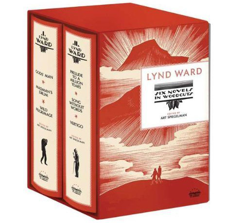
a 2-volume set of six novels told in woodcuts doesn’t need much more explanation, but the idea that lind ward chose to create this body of work is pretty unbelievable: wordless novel, from how design blog.
typography

[image: myfonts.com]
laura worthington creates beautiful original script fonts for myfonts.com, and this month she talks about design and hand-drawn type here: creative characters: laura worthington.
design industry
if there ever came a time to redesign american currency, there would be endless ideas abounding everywhere, it’s an interesting proposition. utne reader pointed me to this piece dowling duncan redesign: US bank notes in which a really cool set of US bills have been revised with a modern twist and more of a spin on our history of achievement rather than leaders.
following up from last week’s piece on buying design, mule is back with presenting design like you get paid for it outlines all the best points on how, why & when to present your work.
biz ladies: promoting your business tastefully online, another infinitely helpful how-to from designspongeonline.com.
little lies and small promises, from seth godin is a nice reminder about how your work ethic can be a slippery slope.
international freelancer’s day is coming up in september, with a free online conference especially for solopreneurs!
animation
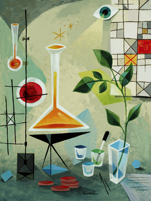
[image: don shank]
print magazine’s imprint blog got it right when they said i may not know don shank by name, but i know his work. i’ve actually been a longtime fan of his animation for samurai jack and the powerpuff girls, so it’s not surprising that a spin through his prints and original work have already set off an imaginary wish list. i love this stuff!