design industry
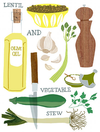
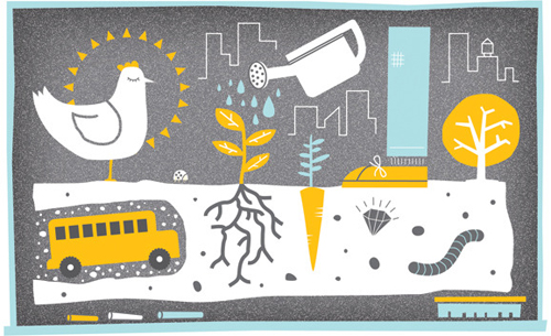
[image: claudia g. pearson]
not only do i love this style of illustration, but you really can’t go wrong when food is the subject. thanks to design sponge, i now know about this outstanding artist, claudia g. pearson and her fantastic etsy shop where you can find prints and tea towels adorned with these lovely illustrations.
if you’re looking for green greeting cards, greenlagirl.com has a profile on 100% junk mail greeting cards, printed on 100% post-consumer recycled paper using vegetable-based biodegradable inks.
meetings! we’ve all been in them enough to know that some are well-organized, while most tend to stray off topic and waste time. todd henry’s accidental creative blog addresses meeting creep and how to avoid it, so if it’s happening to you, read the article.
color
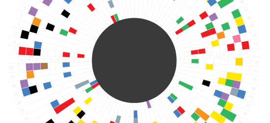
[image: informationisbeautiful.net]
in a global design culture, it’s important to choose colors that cross cultural lines in a friendly way. this infographic is an awesome color wheel cross-referencing world cultures with their emotional associations & meanings of colors. aside from being immensely useful, it’s quite a nice thing to look at. next time you have a project, or even dress for a meeting, consider some of the messages you can create and avoid with color.
logos
it’s that time again, logo lounge has released their 2010 logo trends article. i’ve heard a lot of buzz from my design community about getting their work into the annual book. congratulations to all those included! this annual trend report is a really interesting look at new trends in logo design.
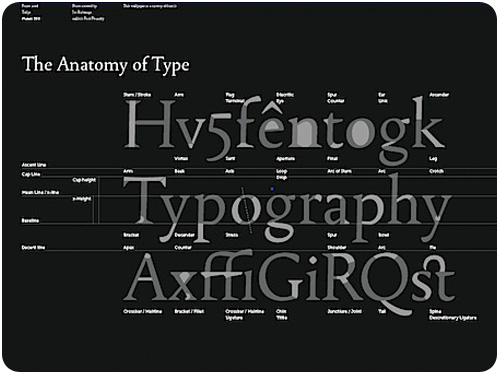
typography
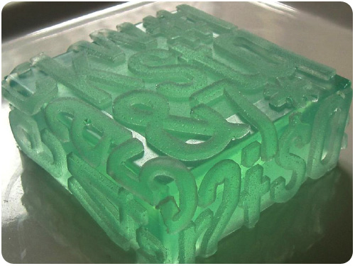
[image: how design blog]
thanks to the how design blog, i’m just happy to know this typography soap exists. i don’t think i could bring myself to use it if i bought it, though.
i’m a huge fan of hoefler & frere-jones knockout typeface, and i’m really enjoying the humor with which grip limited chose to use it, as shown on the h&fj blog.
help save the hamilton wood type museum! Dear friends of wood type: Hamilton has an unprecedented opportunity to qualify for a dollar-for-dollar matching grant from the “Save America’s Treasures” program which has a deadline of May 20th, 2010. This gives Hamilton 30 days to raise enough money to apply for a $25,000 matching grant from the National Endowment for the Humanities. We’re excited to have already raised over $5000 for this vital program that will help us archive, preserve and digitally document our collection of over 2000 vintage advertising plates and our 1.5 million-piece type collection. <a href="interested parties click here for 3 ways to help.
curiosities
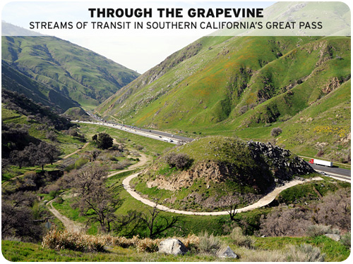
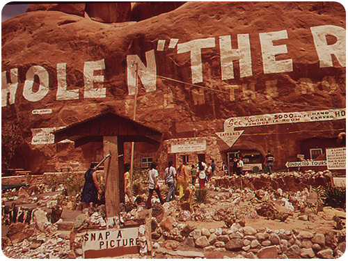
[image: clui.org]
the center for land use interpretation is at it again with a new exhibit through the grapevine currently on display. i have driven this road many times, but the center has a great way of showing us things we’ve never seen in our travels. from clui.org: The mountainous passage that separates the great population of Southern California from the rest of the state is a zone of transit, from one epic region to another. Located at the collision of the San Gabriel and Tehachapi Mountain Ranges, this steep and convoluted terrain lies between Castaic, the northern edge of the Los Angeles megalopolis, and the depopulated place known as Grapevine, at the southern end of the Central Valley. Layers of traffic, water, and energy move like a braided stream through the mountainous terrain, connecting here to there.
make your own 100 year pinhole camera, from good.is. it will take a long time, and you may not get to see the end result yourself, but you can construct your own pinhole camera using inkjet ink as the emulsion, allowing it to expose a photo-quality image from 100 years of sun exposure. curious, indeed!


