the art of the letter

the art of the letter doyald young
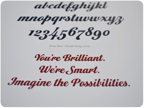
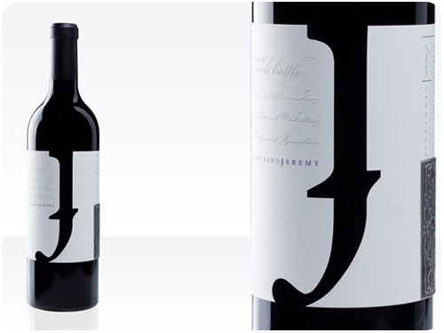
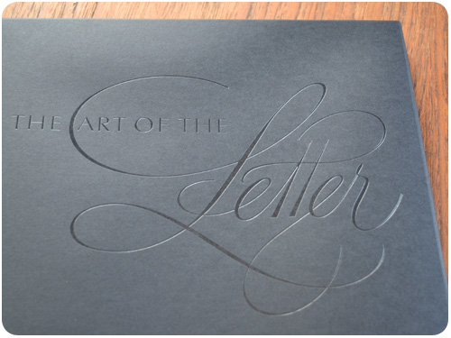
[the art of the letter, doyald young]

it’s been nearly a month since doyald young passed away. i’ve found myself thinking about him, about the amazing work he did, and what a nice guy he was. earlier this month, mohawk paper offered to ship a book they did with him awhile back, the art of the letter, for free, so for the cost of shipping i didn’t hesitate. you may still be able to order one following the link in this post.

hotel east 21 tokyo logo
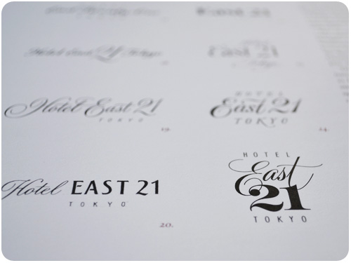
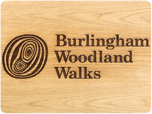
[hotel east 21 logo study]

i met doyald at my first design job, working in a service bureau on the studio city / hollywood border. i hadn’t started there with a design career in mind, but after a few years of seeing so much work from all over LA, i was compelled to make it my own. doyald was a regular customer, but i had no real concept of his legacy. he was just this really nice guy who always seemed to be tweaking the prudential stationery, ordering one sheet of paper or film with each visit, which seemed like a relatively small project compared to the 4-color ads and full book layouts that came through the shop. i remember thinking it was cool that he was still working past retirement age.

as i learned more and moved up, i landed a design position at a company with an employee education budget, so i joined AIGA and started going to events and conferences. at one of the early Y-design conferences with the san diego chapter, doyald gave a presentation of his hand-drawn logotypes and letterforms, and it utterly blew my mind. all those years i had known him as a nice, grandfatherly gentleman, but had no idea i was talking to one of the most amazing talents in graphic design. i bought all his books from the shop and asked him to sign them. i remember gushing somewhat apologetically that i hadn’t realized who he was. but this was bound to happen, after all, he was a modest guy and i was 19 & not formally educated in design just yet.

imagine the possibilities

creative inspiration

branding

burlingham woodland walks
[image: the click design consultants / identitydesigned.com]
as a person who frequents state and national parks, i really love it when branding for public spaces is done well, with reverence to the landscape. this makeover for burlingham woodland walks gives an elegant and instinctive feel to our connection to nature. see the whole package at identitydesigned.com.

infographic

beer infographic
[image: fastcodesign.com]
for a bit of fun, fastcodesign.com presents 14 surprising facts about beer in a super-cute poster-sized infographic. check their post for the full graphic.

design industry

if you’re looking for inspiration of the reading variety, fastcodesign.com profiled pentagram’s interactive site where you can click on your favorite designer and get their favorite reading suggestion.

mike montiero delivers his expert mix of humor with the straight truth in how to pick the right clients, my favorite quote from which is: Beware of clients that wait to call you until they have a perfect diagram of what they need. If they’re not coming to you for strategy and problem-solving, they’re not coming to you for design, they’re coming to you for production. And if you take on production work, you don’t get to call yourself a designer. (Yes, there’s a union. And we’re vicious.)

if you’re looking for ways to meet these clients and that same old elevator pitch doesn’t seem to be connecting with anyone, try rethinking what you’re saying with marcia hoeck’s ditch your elevator speech for parse blog.

finally, part 2 of my sustainability series for neenah paper is up on the against the grain blog: green with envy? put green ideas to action!

los angeles

some fun things floating around LA recently include this hike through the silver lake hills, a new electronics recycling center right here in echo park, and the oddly-comforting, instantly-beloved you are listening to los angeles.

food

nasturtium vinegar

some fun things going on food-wise include the fact that it’s springtime and flowers are everywhere. i’ve been foraging it up with dandelions, and finding all kinds of fun things to do with nasturtiums. before that, we celebrated the coming of spring with green garlic. get to picking and get down with your bad self!

creative inspiration

Moving Beyond the Automobile: Biking from Streetfilms on Vimeo.

LA streetsblog started this great series, moving beyond automobiles, the first of which was about transit oriented development, and this week’s installment is about biking, above.

branding

ifc rebrand
[image: underconsideration.com]
i’m loving this new simple & quirky rebrand for the ifc channel, going from a film sprocket detail to celebrating the offbeat art that is independent film. there are all kinds of details to appreciate over at underconsideration.com.

car design

mini rocketman
[image: miniforum.com]
i’ve had my mini long enough that i no longer look at the next iterations off the assembly line with them, but when someone posted this, i found it really cute. look at those doors! i really hope they use william shatner’s version of rocket man for the ads, ha! a slew of illustrations await at miniforums.com.

packaging design

wine stash packaging
[image: thedieline.com]
this packaging for wine stash has lots of elements i love in packaging: throwbacks to retro labeling systems, a stampy logo in the lower left corner, and a simple 2-color system with a palette that sings. see more at thedieline.com.

design industry

the case for the case study talks about rethinking how you present your work to clients, so instead of bombarding them with all your best looking stuff, you target one project that’s highly relevant to them, and go more in-depth about process.

listen to mule design’s mike montiero talk about running his firm and selling design ideas on the pipeline podcast.

i’ve been working to debunk the mysteries of transitioning from full-time, in-house work to self-employment with ilise benun of creative freelancer blog and alisa bonsignore of clarifying complex ideas:
freelance 101: how to begin getting clients
freelance 102: balancing two jobs
freelancing 103: when to make the leap to f/t freelancing
and finally, a podcast on my own experience for marketing mentor: interview with heather parlato on freelancing

freelance switch offers 110 ideas to get more freelance work and generate new client leads. hot dang, there’s got to be some new possibilities in there we haven’t thought of before.

los angeles

one of my favorite new clients, mohawk bend, talks to echo park online about the new restaurant they’re bringing to the neighborhood. can’t wait to unveil more of this brand, but for now, the main logo is up. check it out!

if you’re looking for new, hidden treasures around LA, los angeles magazine offers “hidden LA” with a great run-down of places to visit.

food

spicy avocado butter
we’re in the crossover from winter to spring in the LA area, so this week’s seasonal eats talks about the various avocado cultivars you can enjoy at different times of year. last week’s spotlight was on all the great things to do with cauliflower!

in my blog travels this week, i noticed emily ho’s suggestion to grill citrus for use in a vinaigrette dressing, what a fantastic idea!

creative inspiration

los angeles

http://service.twistage.com/plugins/player.swf?p=fastcodesign_episode&v=c8163eca83931&autoplay=false
first look: LA scores a bold new museum by diller scofidio renfro, from fastcodesign.com.

i love this story from greenlagirl.com about not having access to a green barrel or composting bin, rogue composting, and making a friend who will trade compostables for backyard fruit. this is community when it works: how i started composting and got free grapefruit too.

infographics

honey bee infographic
[image: fastcodesign.com]
in my travels this week, it seems like it’s an infographic time of year. design-wise, everything cool i found was a display of information, starting with this one above who cares if honey bees are dying, which is quite extensive and can only be excerpted here. another one worth every dead end [and a few green pastures] it leads to is jessica hische’s “should i work for free” flowchart, telling the all-too-true tales of why the answer is almost always NO. and then informationisbeautiful.com shares their own round-up this week 8 great infographics which includes a stunning radiant moon phase calendar.

design industry

favorite logos
[image: creativereview.co.uk]
creative review is asking you to vote on your favorite logos. i haven’t made my picks yet, but it’s all over the design blogosphere. weigh in on your favorites!

this freelancer workout is close to my heart, as i quit the gym last year, citing lovely LA weather and abhorrence of commuting for why i wouldn’t return again unless i return to a regular work-related commute.

since you haven’t heard enough about my retreat yet, i wrote about it for the creative freelancer blog: what a difference a retreat makes, and then i updated my own retreat recap with specifics about last year’s milestones and this year’s goals.

food

winter root vegetable haystack fritters
get the story on celeriac and a recipe for veggie haystack fritters in my weekly seasonal eats for LAist. then, if you’re really into this whole seasonal thing, but you’re not in LA and aren’t sure how to do it where you live, epicurious has an interactive seasonal map of winter seasonal foods just for you! and hey, if you’re more curious about how different food systems work and can affect you [especially the yous in the colder areas who rely on a delivery system] there’s this really interesting piece: mapping food access on the ecocentric blog. and with that, i’m out!

creative inspiration


doyald young talks about and demonstrates drawing type.

typography

dreams
[image: seb lester]
take an in-depth look at the creation of this amazing typographic limited-edition poster, and other works by seb lester. outstanding!

remember that design your own type contest by design sponge? it’s time to vote for your favorites! right now, today!

if you need a primer or reminder on how to combine type styles, check out smashing magazine’s: best practices for combining type

diy

handpainted
[image: imprint.com]

imprint takes a look at sign painters, a new documentary from faythe levine and sam macon on the timeless art of hand-painted signs. so much hand-lettered goodness in there!

speaking of diy projects, have you ever considered making your own wrapping paper? i often use plain brown paper anyway, but this design sponge post made me think i should dress it up a bit. diy project: handmade gift wrap.

design industry

the latest report on co-working talks about mixing things up by hitting the road: creative co-working: take it on the road!

how about a contest that breaks all the rules and awards the worst logo ever? i think this is hilarious: how low can your logo?

more on color by jude stewart: the wonderful color wheel, part 3

packaging

jeremy winery
[image: thedielinewine.com]
stunning packaging for jeremy wine co. by 6 west design. not only is it dually typographic, it’s a diecut wrap label that uses the negative space to create the letterform. excellent work!

beyond design

the coming of thanksgiving heralds the onslaught of how to posts on choosing the perfect wine. you know what it comes down to? you can drink anything you want. but if you want to sort some of this out, here are a grip of posts that will lead you down myriad trails, at least there’s wine at the end of each one: sparkling wine & champagne, chardonnay, gewurztraminer, zinfandel, pinot noir, a selection of reds that go well with thanksgiving fare. also, the huffington post has an opinion. and if you’re not into wine, there’s artisanal cider.

but there are other things you can do besides drink for the holidays [you can always have an apple]. you could participate in machine project’s pop up pie shop in which you may purchase a pie kit and know you’re not only getting a complete kit for baking your thanksgiving pie—you’re also funding the los angeles food bank. why? because machine is awesome!

but look, if you insist on drinking AND fundraising for good causes, and you feel i glossed over beer, take this: harvest beer festival at the echo & echoplex this weekend, benefiting 826LA. bam!

on the more foodie end of the spectrum, i am loving this salad of fall flavors from hot knives: hot rad winter salad.

if you’ve been hitting up the farmer’s market and creating original concoctions at home, write them up and submit them to epicurious’ farm-fresh recipe contest!

and it’s not that i want to end this post on a dark, gothy note or anything, but i found this feature from los angeles magazine totally fascinating: the end. death in LA can be an odd undertaking. trust me on that one.

article of the week

crowd-sourcing design: the last frontier by steven heller for print magazine

bring up crowd-sourcing in a design community, and you’re sure to get an uproar of protest against it. bring it up with fledgling small businesses, and it’s seen as a cost-effective alternative to professional design services by many, though i wouldn’t say there’s a majority opinion. i think it’s important to address this topic beyond the design arena, and i think heller took great care in pointing out the you-get-what-you-pay-for facts.

if you really believe you need a logo before a brand strategy, and you’re willing to sacrifice the process that might make it meaningful to your business, by all means, hire yourself as art director and crowd-source away. here’s a tip though: some very successful businesses out there got started with a small client base, getting recommendations on the merits of their work before they ever had logos. put your work first, use the materials you can afford at startup, and make identity design a savings goal. there’s no need to rush, gaining all the setbacks that rushed behavior brings in the process.

creative inspiration

identity

landfit logo
[image: designedbygoodpeople.com]
this logo for a gardening matchmaking service is really appealing to those of us who love gardening. and i love the concept, a service that pairs people who want to garden but have no land with those who have land & want a garden, but don’t want to do it. brilliant!

publications

ferocious quarterly
[image: ferocious quarterly]
announcements of a new publication, ferocious quarterly, have been posted in a few design communities. from their site: Ferocious is a curated, quarterly publication that collects illustrators, graphic artists, short fiction authors and written text. indeed! thanks how magazine for the link.

parse is a new blog project from how magazine, aiming to make sense of issues and information relevant to design practitioners. check it out!

this just in from the design review of books, a review of jost hochuli, detail in typography.

design industry

take a spin through the annals of design history: graphic design through the decades series: the 70s, from inspiredology.com

if you’re a creative professional in need of some marketing mentoring, ilise benun’s marketing groups are about to kick off for fall. join the track that’s right for you and get one-on-one help from a creative industry marketing pro: marketing mentor’s advanced marketing groups.

another great installment from design*sponge: biz ladies: using a blog to grow your business.

culture

some interesting looks at labor day, what it’s not currently, and what it could be. labor day is almost meaningless now. we can change that, by steve mccallion for fastcodesign.com: With an increasing belief that socioeconomic mobility is now less possible in the US than in other countries, Labor Day has the potential to reclaim some of its initial promise — a celebration of American labor and an inspiration to the American worker.

another look includes what ever happened to labor, by seth godin: In a world where labor does exactly what it’s told to do, it will be devalued. Obedience is easily replaced, and thus one worker is as good as another. And devalued labor will be replaced by machines or cheaper alternatives. We say we want insightful and brilliant teachers, but then we insist they do their labor precisely according to a manual invented by a committee…

creative inspiration

http://vimeo.com/moogaloop.swf?clip_id=4249739&server=vimeo.com&show_title=1&show_byline=1&show_portrait=1&color=&fullscreen=1&autoplay=0&loop=0

Hi-Fi from bante on Vimeo.

branding

secca animated logo
[image: pentagram]
this brand & identity for secca by pentagram is not only stunning, it moves! read up on it here: pentagram’s luke hayman on how multimedia is transforming branding, from fastcodesign.com.

print design

lan su visitor guide
[image: sockeye creative]
this lovely print specimen by sockeye creative for the lan su chinese garden in portland is rich in details that make the experience of interacting with it really rewarding. a custom die-cut window over a stylized illustration invites you in, then the unique binding of a gate fold over stepped pages detailing the vistas makes you want to flip through and study each one. fantastic work! see more here: lan su visitor guide, from underconsideration.com.

web design

a series i found on uxbooth.com included some useful articles i wanted to share for web designers. a complete beginner’s guide to design research, overcoming the obstacles of usability testing and the complete beginner’s guide to web analytics and measurement.

creativity

bottle rainbows by johnny miller
[image: johnny miller]
amazing rainbows and color gradients created with colored glass and light, by johnny miller. thanks, oh joy for the link!

since creativity is about how you think, here are 2 articles i found interesting from around the tubes this week. seth godin talks about how we analyze our inner monologue to help define intuitive marketing: monitoring your internal monologue, and succcess.org explores the einstein quote “imagination is more important than knowledge” here: be smart, know smarts ain’t the answer.

design industry

ravi sawhney talks about his new book predictable magic here:forget praying to the muse, create design magic on demand, from fastcodesign.com

tim lapetino of hexanine talks about how to get the most out of your kickoff meeting: the art of interviewing your client, from logodesignlove.com.

a post chock-full of inspiring resources: 25 useful videos and presentations for designers, from smashingmagazine.com.

small business owners & sole-proprietors, take note: biz ladies: free online resources for business owners, from designsponge.com

creative inspiration

brand development

brand building
[image: fastcodesign.com]
apparently, the idea that when a client asks for a logo, what they probably really need is a brand strategy is gaining ground. if this is you or someone you know, get familiar with what goes into brand development with six tips for designing a memorable brand from fastcodesign.com.

once you work out the brand strategy, you’ll want to create a style guide so you can keep everyone developing artifacts for your business on point. to get a good idea of what goes into a style guide, check out designing style guidelines for brands and web sites from smashingmagazine.com

logos

indian rupee symbol selected
[image: logodesignlove.com]
more than a logo, a currency denotation is an international symbol that comes to be synonymous with a country and its people’s well being. the indian rupee underwent a redesign [via, of all things, a design contest] and a final has been chosen. i like the shape of it, almost futura-istic. read more here: indian rupee symbol selected, from logodesignlove.com.

typography

interview with rudy vanderlans
[image: fastcodesign.com]
i have been an emigre fan for my entire design career. it was just yesterday that one of many awesome creations of rudy vanderlans [brothers typeface] rescued yet another in a line of countless layouts for me. join alissa walker in her interview with this amazing type design icon and his new showcase for his typefaces, historia: type master: an interview with emigre’s rudy vanderlans, from fastcodesign.com

design industry

recycled vintage couture by koi suwannagate
[image: greenlagirl.com]
i wasn’t able to make it to the pasadena museum of california arts biennial this past saturday, but you can take a spin through the greenest features here: discover green design at pasadena museum of california arts biennial, from greenlagirl.com.

we talked about it last week, we’ll talk about it this week: print cant be dead if people are still starting up new magazines, especially in these new niche markets for printed rag fetishists. steven heller profiles vintage magazine for print here: print ain’t dead yet, continued.

three for the marketing department. first of all, drop the “us vs. them” mentality, marketing and design do their best when they work together: the creative vs. the marketing team: yin and yang, oil and water, from smashingmagazine.com. then, take 2 marketing-smart tips from ilise benun: does your email say “open me?” and keywords made simple, both from marketingmixblog.com.