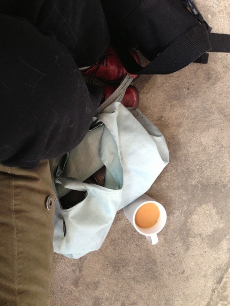
I’m at backdoor coffee club this morning, and testing out my WordPress phone app.
I’m at backdoor coffee club this morning, and testing out my WordPress phone app.
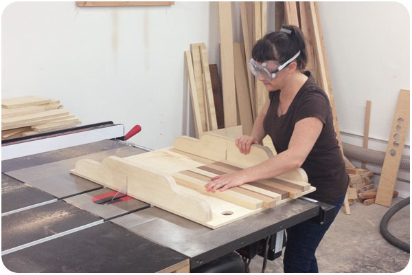
last month, i talked about community woodshop and the first half of our cutting board class. last week i completed the class and came away with 2 nice cutting boards. the first step in finishing up is to trim the uneven edges, which i am doing with a squaring template on the table saw above.
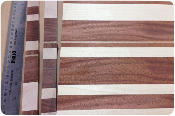
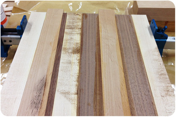
once i got my trimmed pieces, it was time to decide if i would do any cross cuts and flips. the wood grain itself will always look pretty on its own, but i used the trimmed edges to see where they flipped cuts would match up. i decided to cut the board into 5 pieces and flip symmetrically.
after these final design edits, when the glue is dry, we plane both surfaces and decide on any edge finishes. i decided on simple rounded edges for one, and only one round for the other. then it’s off to the sander to get all surfaces perfectly smooth.
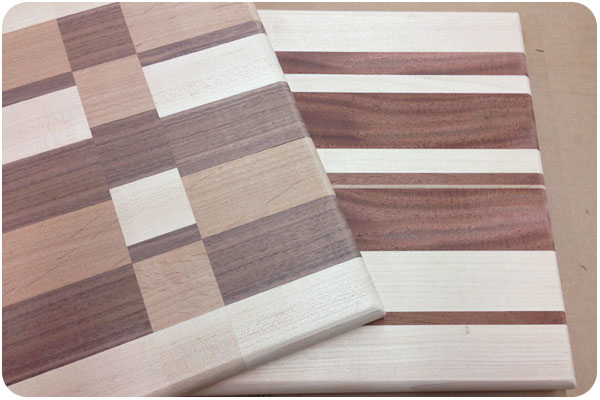
once they’re ready to go, we got out the beeswax. it’s more of a heavy grease that smells like fine bath products and soaks into both wood and your hands, giving both a nice finish. the color of the wood really came alive with this application. i think they look great, but now i’m a little hesitant to take a knife to them. next up, i’ve signed up for basic cabinetry. i can’t wait to see what manner of trouble i can get into there!

more efforts to help hamilton wood type museum relocate to their new digs are afoot—this time from neenah paper, asking designers and printers alike to submit their favorite samples and share their love of letterpress with the world.
moreover, neenah is offering a kickstarter-style fundraising effort of their own: you donate to them for beautifully affordable letterpress rewards, and they match your donation to hamilton! donate here!
thanks to my fantastic design network, i found out about community woodshop in the keystone arts spaces in glassell park just a few months after they opened. community woodshop is both a workspace and a learning space for people who want to learn about and work on various techniques in wood working, but maybe don’t own or have space for all the equipment. after taking the required safety class, you can join various levels of membership to work in the shop, or take classes. since i’m a beginner, i opted to start with the cutting board class.
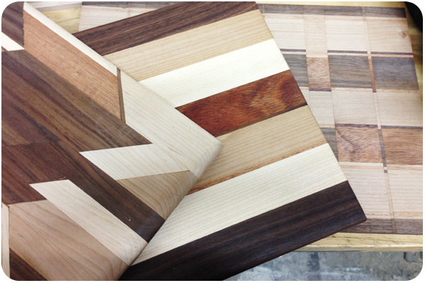
we were given all the samples in the above photos for inspiration of what we could create, though we were discouraged from cutting too many angles, since it would complicate the gluing process for those of us with less experience. we could do straight cuts, cross & flip, round corners, cut handles, or route a trench. cool!
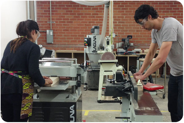
we were provided with maple, alder, walnut and mahogany pieces, squared on 2 sides. to get a feel for the process, we were told to smooth the other sides. here are 2 students using the planer and joiner to get perfectly-smooth starting pieces.

our teacher, bob, reminds us of all the safety precautions of the table saw. there are many. when cutting with wood grain, the wood goes through the blade effortlessly, but going against grain can be a much more tricky cut. we cut all our on-grain 1″ pieces, and bob cut all our against-grain requests for us. then we went to worktables to arrange our pieces and design our boards.

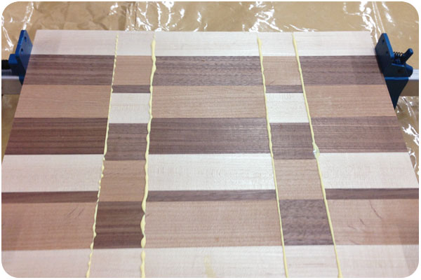
gluing is the fun part. you get big clamps and glue paper and turn all your pieces on their sides, run the glue down the center, and stick them one by one to their neighbor. then tighten the clamps and watch the glue squeeze out the seams.
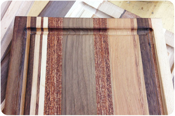
finally, we let the glue set and cleaned it from the surface. my board looks oddly plain here. the table saw burned the maple wood as it cut, which is normal since it is a very hard wood, but leaves it looking dirty. all of that will be sanded away though, it will oil up nicely and all the grain details will show through. i’ve heard we use some sort of beeswax to do this. we’ll find out in next week’s class when the beauty of our projects are revealed!
Husbands – “Dream” from Cauboyz on Vimeo.
this is a great type-only video, and i love the reveal at the end that it’s not just some digital animation. very cute.

i’ve been doing a lot of sewing lately and wanted to post a few things. not because the sewing is particularly great, but because fabric and pattern design has become so inspiring now that i’m looking at it all the time. recently i made a few sets of pillowcases, because so many fabrics remind me of the crazy sheets we had as kids in the 70s. that, and we don’t have even one complete set of sheets, everything is mismatched in our house, so i thought i’d compound that problem by adding to it. but i mean, look at these cute little geisha cats! and they’re all sleeping!

sewing pillowcases is really easy, and you get to buy fabrics that are way more crazy than you’d wear. wearing a print like this definitely makes me feel like a crazy cat lady. it’s the absolute furthest i’m willing to go in terms of wearing cat things. so all i did was make a kimono-style top out of it and solid black. that’s it! i’m making more clothes too, but i have to figure out how & where to photograph them.

i found this pattern for a kindle slipcase online and thought it was so nice with the contrasting fabric and divided pocket. turns out it’s really easy to make and requires very little fabric. i made my parents slipcases for each of their devices for the holidays, an ipad case and a nook case. my machine has a ton of embroidery stitches, so i tried out a contrasting thread and made a star pattern to close the hems. making things like this is really fun & rewarding. and with all the extra fabric from garment sewing, it’s starting to look like i’ll have to take up quilting. hmmmm!

i found some really nice, affordable typefaces in my research this week, and thought i’d share my favorites.
this typeface is certainly named accurately, a rounded & voluptuous take on a classic serif that remains highly readable. buy it here.

as the name would suggest, this is more of a renaissance serif, full of details and flourish. the letterforms manage to remain spacious at smaller sizes and thinner weights. check it out in more detail here.

this is a free font in 2 styles of caps: one with more angular crossbars and slants, the other a bit more straightened out. with all the vintage goodness popular in design today, this typeface could certainly add nice detail. download it here.

i like this, because i can’t quite do it. and because most handwritten fonts mimic a more conventional, casual hand, while this one is more illustrative and cursive. available here.


we recently went to portland for a wedding, and though i’ve only been there once before, i still couldn’t get over how cute it was. especially in the sunshine, which was the weather that graced our visit. we stayed downtown, so on our first night, we decided to finally have some deschutes from the source. our flight was outstanding, and look at their awesome logo!

i won’t lie, i’m really jealous of a city that has highly-visible bike lanes that take up half the one-way street. one of these was right outside our hotel lobby, so we could watch all the happy people biking by. happy because it was beautiful sunshiny weather, which i know i mentioned before, but it seemed like every person we overheard was remarking on it all weekend, which made us enjoy it so much more.

pretty wedding colors in creme and just-off tiffany blue. we joined the bride for champagne mani-pedis the night before, so i got to take this color home on my toes too. super cute!

we chose the ace hotel since we’ve enjoyed the palm springs location, and selected a back room on the quiet side of the hotel. it was quiet, indeed, and quite comfy. i liked their idea of using an encyclopedia as wallpaper with these cute paintings.

![]()
two stories about classic designers that came through the news this week caught my eye. one, the story of the NEXT logo by paul rand for steve jobs, including 2 interviews about the design, and a replication of what must be the most narrative logo presentation i’ve ever seen.
personal preferences, prejudices, and stereotypes often dictate what a logo looks like, but it is needs not wants, ideas, not type styles which determine what its form should be. to defamiliarize it, to make it look different, to let it evoke more than the mere adjective or adverb it happens to be is, it seems, the nub of the problem. —paul rand
read and view the full piece here: paul rand + steve jobs.
the other is a heartening tale of hiring one of the mad men-era illustrators to help capture the illustrative style of the time for the new season promotion posters. i love the show already, but thought it was a great pairing.
…they just looked up the person who had done all these drawings that I really loved, and they said: “Hey, we’ve got the guy who did them. And he’s still working. His name is Brian Sanders.” —matthew weiner
read the full story here: brian sanders creates made men poster for new season.
