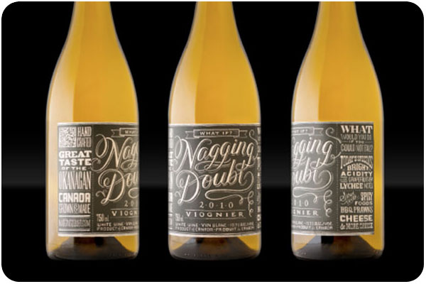
in my travels of design research, i’m always collecting inspiring work on pinterest. these 3 wine label design projects stood out to me as beautifully simplistic with the personal touch of illustration. on the heels of yesterday’s book about drawing your own type, how about that fantastic label for nagging doubt?! full post here.
image: thedieline.com
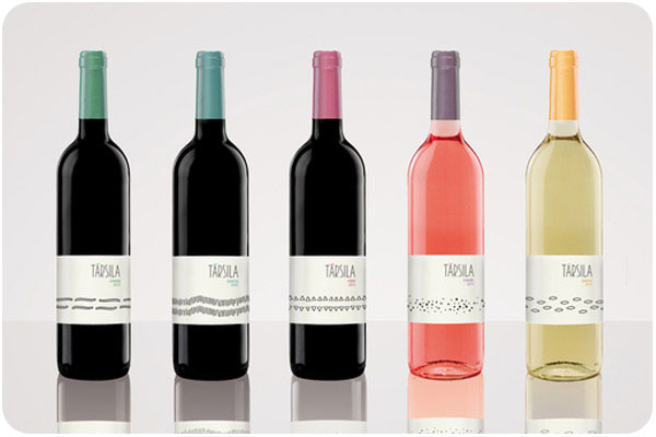
this collection for társila is such a breath of fresh air. i love the patterns for each wine, and the colors are a nice accent. i love this type of clean organization, it’s a very confident presentation. full post here.
image: thedieline.com
this “magic machine” that wraps the length of torello’s label is both funny and charming, a cluster of gears here, a bugle that funnels into a barrel there. a very nice touch of gold foil to match the color of the wine, too. full post here.
i’m excited to see so many great examples of sustainable food storytelling for the preponderance of naturally-raised and hand-crafted foods available today. see the whole brand package here.
today i’m taking the opportunity to share 3 wine packaging ideas that are all wonderful, but none of which exist in the commercial marketplace, either because they’re student work or personal projects. i’d love to see more of this on the shelves over the stayed embossed metallic serifs with only occasional illustrations of interest.
sangwine
sangwine by lydia nichols is a project based on a vineyard of her invention to showcase her lovely illustration work. why shouldn’t wine be set in a retro-fantastic national park or a polka-dotted california road trip? the colors and illustrative details are truly charming. read more on the dieline.com sangwine, image: thedieline.com
niagara chrysalis
niagara chrysalis by melissa deckert. i’ve seen a fair amount of diecut labels, but not many that use the distortion of the wine-filled bottle to add effects to back-side label printing. this is a great way to encourage interaction with the bottle, where a table wine can become a conversation piece. niagara chrysalis, image: thedieline.com
13 appelations
13 appelations by wei sun is a nice concept package on blend wines from multiple vineyards, tying together concepts of terroir into a patchwork of domaines and landscapes. beyond that, it’s covered in maps, another curiosity that gets people studying and enjoying the packaging. i don’t know a single person who doesn’t like maps. 13 appelations, image: thedieline.com
this week we’re looking at type-forward design, kicking it off with this bold branding for lucy’s fried chicken. i love how the outside of the menu shows the logo as an overprint on wood, while the inside is a nice, clean layout of fare. see the whole spread at underconsideration.com.
packaging
stoke bomber beer, image: thedieline.com
i’m loving this all-type packaging for stoke bomber beer. apparently this brand has always used some form of retro imagery, but this line is their foray into ww2-era nostalgia. peruse the write-up at thedieline.com.
typefaces
highway font, image: friendsoftype.com
i’m just looking for a good excuse to use highway by dan cassaro, with all its swashes, ligatures and alternates. and at 39 bucks it’s a damn good deal.
letter cutting
letters & stone, image: ilovetypography.com
the modern-day convenience of fonts usually only serves to make hand-setting letterpress a timely chore, but what about good old stone letter cutting from the age when serifs were more than a decoration? check out ilovetypography.com‘s interview with fergus wessel to learn more about a modern-day letter cutter.
super-cute explanation of the universe done in food! i especially like the polar caps in shredded mozzarella.
branding
rebranding teachers, image: hyperakt
a beautiful rebranding of teachers by hyperakt re-imagines the inspiration of education and applies it to just about every civic touchpoint conceivable. great work!
products
cuppow, image: cuppow.com
i saw this innovative item on 3 blogs in one week, and it first caught my eye for the retro-style packaging. however, i have several friends who have given up on the travel bottle craze and gone luddite, preferring to cart their beverages around in mason jars with canning lids. i think this is great, except for my desire to frequently sip. then i saw this cuppow thing and love that it makes a sippy cup out of jars. now the question is, can i get it in glass instead of any type of plastic [though i see it’s bpa-free and recyclable]. see the writeup and video at fastcodesign.com
how do you grab attention in a competitive job market? if you’re in one of the performing arts, compiling your best clips into a promotional reel as part of a mailing makes it easy for any prospects to see exactly what you do as soon as they receive it. as an addendum to his web site and youtube channel, conductor robert boardman contacted me to create a dvd in the same style as part of his intro kit mailing, for maximum exposure to music department decision makers. i was happy to help showcase his energy and personality to get him one step closer to connecting with his dream jobs.
i’d put up the before & after intro that under consideration usually posts, but it just doesn’t do this redesign justice. this highly versatile identity system is everything a great brand can grow from and use to communicate. take a closer look at all the fantastic details at underconsideration.com.
typography
image: anna garforth / howdesign.com
what a precise endeavor, not only to cut such thin type out of dough, but then to bake it without burning anything. thanks, howdesign.com
house industries has just launched photo lettering, where you can set type using their highly stylized & versatile fonts, and download a vector file for use. check it out!
packaging
image: fizz / thedieline.com
very cute & clever idea of pairing grape varietals with typefaces to give each even more personality. not to mention pretty amazing labels. see the whole preview at thedieline.com
HOW has 10 reasons you’ll love the creativity issue, and if you have it and read into reason #5, you can hear from myself and some greatly respected colleagues talk about transitioning to freelance, which is very fun indeed.
los angeles
after reading the profile of GOOD’s LA issue, i decided i’m going to have to go buy a hard copy to curl up with this weekend. but that’s not to say you can’t read it online. digging deeper, if you want to see how designers and writers who do amazing things all over town live, design sponge sneak peeks alissa walker & keith scharwath’s pad in silver lake.
with easter around the corner, you’re going to have a lot of hard boiled eggs. if you need help with them, check out happy spring: 5 deviled egg recipes. and then, really, think twice about eating too much easter candy, because sugar is really more problematic than most of us think, and that’s putting it mildly. sorry to end on that note, but i care about your health. and my chutney is sugar-free.
i love it when 2 worlds i adore collide. brand session assigned a different pantone chip to each varietal of wine and used it all over the packaging. see the whole profile on thedieline.com
diy
one part great sustainability idea, one part diy, why not cut the top flap of your greeting cards away from the personalized back flap and reuse them as postcards? thanks, greenlagirl!
if you find yourself in need of meditation but not sure where to start, get on this 30-minute method from utne reader.
design industry
a few tools circulating like wildfire around the web this week include what font, a droplet that will allow you to identify fonts on the web, and print magazine’s how to proofread like a pro, because everyone needs to do it, but nobody really thinks they can.
in other news, one day for design is an online open forum to discuss the future of design, and it’s happening all day TODAY!
food
this week from seasonal eats on LAist: asparagus scallion stir-fry!