branding

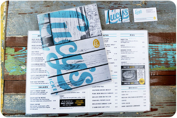
this week we’re looking at type-forward design, kicking it off with this bold branding for lucy’s fried chicken. i love how the outside of the menu shows the logo as an overprint on wood, while the inside is a nice, clean layout of fare. see the whole spread at underconsideration.com.
packaging

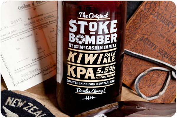
i’m loving this all-type packaging for stoke bomber beer. apparently this brand has always used some form of retro imagery, but this line is their foray into ww2-era nostalgia. peruse the write-up at thedieline.com.
typefaces

i’m just looking for a good excuse to use highway by dan cassaro, with all its swashes, ligatures and alternates. and at 39 bucks it’s a damn good deal.
letter cutting

the modern-day convenience of fonts usually only serves to make hand-setting letterpress a timely chore, but what about good old stone letter cutting from the age when serifs were more than a decoration? check out ilovetypography.com‘s interview with fergus wessel to learn more about a modern-day letter cutter.
