creative inspiration

branding

michelle obama garden branding
[image: fastcodesign.com]
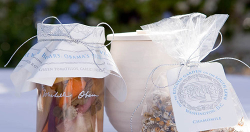
lovely packaging for specialty items from michelle obama’s vegetable garden, designed by cronan give home grown handmade items a classy look.

typography

hanging wall letters for home decor
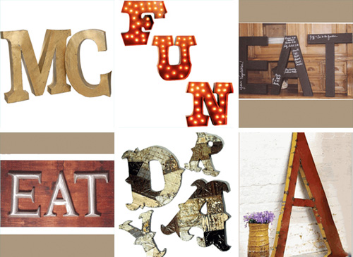
[image: iron accents]
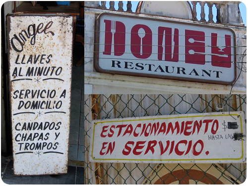
if you’ve been looking for more ways to bring the signage you see on the street into your home, re-nest.com has a great profile on a company that can bring them to you: hanging wall letters from iron accents. cute!
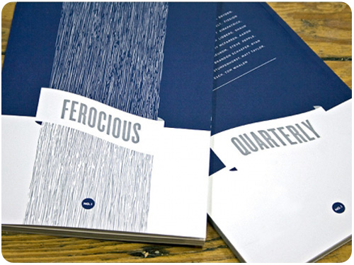
packaging

the tentacle wine packaging
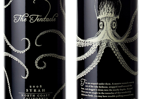
[image: thedielinewine.com]
here’s my favorite for wine packaging this week from thedielinewine.com, the tentacle designed by john schall.

design industry

check out part 2 of my creative co-working adventures on the creative freelancer blog!

a really informative piece from rochelle fainstein of sterling brands on how wine packaging can become more sustainable in both materials and manufacturing: message in the bottle: repackaging wine, from thedielinewine.com

beyond design

you’ve probably noticed i write about food and diy projects, and i put up a fair amount of preservation projects. an interesting piece on this growing movement is home canners wield pickles against food giants, from utne reader. my interest is first to buy fresh food with as little interference in the farmer’s profit margin as possible, and second to replace commodified convenience foods with my own preservations from scratch. i find the assertion by rachel lauden that preservation projects are “…making too many women slaves to their stovepots and canning jars…” completely absurd and sexist. it’s a lifestyle choice and an activity that is hugely rewarding. i love my stovepots and canning jars!

speaking of food, i got myself 2 bunches of dandelion greens from the market this week and went looking some delicious things you can do with them at epicurious.com. i typically stay away from salads with added sugar or bacon [though there are some good ones out there], so here are my picks: dandelion greens with hot olive oil dressing which is a way to wilt the greens without cooking them, greek country salad which you can do with any combination of the listed greens in the recipe, and the standout for me, wilted greens with garlic and anchovies. i love anchovies, this is just what i’m looking for!

creative inspiration

identity

landfit logo
[image: designedbygoodpeople.com]
this logo for a gardening matchmaking service is really appealing to those of us who love gardening. and i love the concept, a service that pairs people who want to garden but have no land with those who have land & want a garden, but don’t want to do it. brilliant!

publications

ferocious quarterly
[image: ferocious quarterly]
announcements of a new publication, ferocious quarterly, have been posted in a few design communities. from their site: Ferocious is a curated, quarterly publication that collects illustrators, graphic artists, short fiction authors and written text. indeed! thanks how magazine for the link.

parse is a new blog project from how magazine, aiming to make sense of issues and information relevant to design practitioners. check it out!

this just in from the design review of books, a review of jost hochuli, detail in typography.

design industry

take a spin through the annals of design history: graphic design through the decades series: the 70s, from inspiredology.com

if you’re a creative professional in need of some marketing mentoring, ilise benun’s marketing groups are about to kick off for fall. join the track that’s right for you and get one-on-one help from a creative industry marketing pro: marketing mentor’s advanced marketing groups.

another great installment from design*sponge: biz ladies: using a blog to grow your business.

culture

some interesting looks at labor day, what it’s not currently, and what it could be. labor day is almost meaningless now. we can change that, by steve mccallion for fastcodesign.com: With an increasing belief that socioeconomic mobility is now less possible in the US than in other countries, Labor Day has the potential to reclaim some of its initial promise — a celebration of American labor and an inspiration to the American worker.

another look includes what ever happened to labor, by seth godin: In a world where labor does exactly what it’s told to do, it will be devalued. Obedience is easily replaced, and thus one worker is as good as another. And devalued labor will be replaced by machines or cheaper alternatives. We say we want insightful and brilliant teachers, but then we insist they do their labor precisely according to a manual invented by a committee…

creative inspiration

books

maps everywhere
[image: from here to there on imprint.printmag.com]
i may have mentioned, even yesterday, that i love maps of all kinds. enter this gem maps, maps everywhere! from print magazine and now i not only know there’s a new book on hand-drawn maps, from here to there, i know there is a hand-drawn map association, which puts me over the moon! [don’t worry, i can map it for you.]

six novels in woodcuts
[image: how design blog]
a 2-volume set of six novels told in woodcuts doesn’t need much more explanation, but the idea that lind ward chose to create this body of work is pretty unbelievable: wordless novel, from how design blog.

typography

recherche script by laura worthington
[image: myfonts.com]
laura worthington creates beautiful original script fonts for myfonts.com, and this month she talks about design and hand-drawn type here: creative characters: laura worthington.

design industry

if there ever came a time to redesign american currency, there would be endless ideas abounding everywhere, it’s an interesting proposition. utne reader pointed me to this piece dowling duncan redesign: US bank notes in which a really cool set of US bills have been revised with a modern twist and more of a spin on our history of achievement rather than leaders.

following up from last week’s piece on buying design, mule is back with presenting design like you get paid for it outlines all the best points on how, why & when to present your work.

biz ladies: promoting your business tastefully online, another infinitely helpful how-to from designspongeonline.com.

little lies and small promises, from seth godin is a nice reminder about how your work ethic can be a slippery slope.

international freelancer’s day is coming up in september, with a free online conference especially for solopreneurs!

animation

lab still by don shank
[image: don shank]
print magazine’s imprint blog got it right when they said i may not know don shank by name, but i know his work. i’ve actually been a longtime fan of his animation for samurai jack and the powerpuff girls, so it’s not surprising that a spin through his prints and original work have already set off an imaginary wish list. i love this stuff!

event calendar, august 16 – 22, 2010

here’s what i’ll be doing

wednesday, august 18, 7-10pm type that moves (you) FREE with rsvp. put on by AIGA los angeles at typecon, we’ll be talking about the design of motion graphics and creating a typeface on the spot!

friday, august 21, 7-11pm house industries at reserve gallery opening FREE! Join us in West Hollywood for a House Industries show at Reserve Gallery featuring new wood serigraphs, custom Reserve/House products and plenty of House gear.

creative inspiration

brand development

brand building
[image: fastcodesign.com]
apparently, the idea that when a client asks for a logo, what they probably really need is a brand strategy is gaining ground. if this is you or someone you know, get familiar with what goes into brand development with six tips for designing a memorable brand from fastcodesign.com.

once you work out the brand strategy, you’ll want to create a style guide so you can keep everyone developing artifacts for your business on point. to get a good idea of what goes into a style guide, check out designing style guidelines for brands and web sites from smashingmagazine.com

logos

indian rupee symbol selected
[image: logodesignlove.com]
more than a logo, a currency denotation is an international symbol that comes to be synonymous with a country and its people’s well being. the indian rupee underwent a redesign [via, of all things, a design contest] and a final has been chosen. i like the shape of it, almost futura-istic. read more here: indian rupee symbol selected, from logodesignlove.com.

typography

interview with rudy vanderlans
[image: fastcodesign.com]
i have been an emigre fan for my entire design career. it was just yesterday that one of many awesome creations of rudy vanderlans [brothers typeface] rescued yet another in a line of countless layouts for me. join alissa walker in her interview with this amazing type design icon and his new showcase for his typefaces, historia: type master: an interview with emigre’s rudy vanderlans, from fastcodesign.com

design industry

recycled vintage couture by koi suwannagate
[image: greenlagirl.com]
i wasn’t able to make it to the pasadena museum of california arts biennial this past saturday, but you can take a spin through the greenest features here: discover green design at pasadena museum of california arts biennial, from greenlagirl.com.

we talked about it last week, we’ll talk about it this week: print cant be dead if people are still starting up new magazines, especially in these new niche markets for printed rag fetishists. steven heller profiles vintage magazine for print here: print ain’t dead yet, continued.

three for the marketing department. first of all, drop the “us vs. them” mentality, marketing and design do their best when they work together: the creative vs. the marketing team: yin and yang, oil and water, from smashingmagazine.com. then, take 2 marketing-smart tips from ilise benun: does your email say “open me?” and keywords made simple, both from marketingmixblog.com.

creative inspiration

illustration

lab partners for monocle magazine
[image: lab partners]
from the farmlands, through the cities, to the sea! this illustration by lab partners is an amazing perspective on landscapes. thanks designworklife.com for the link.

photography

david hiser for documerica
[image: david hiser]
an amazing find shared on the how design blog: images of the 70s. the documerica project, commissioned by the EPA, hired freelance photographers to capture images relating to environmental problems. quite an outstanding collection!

typography

alto font
[image: fontshop.com]
if you’re looking for some great sans serif typefaces that work well in a variety of layouts and styles, check out thefontshop.com’s fundamentals: workhorse sans serifs for a great list with examples in action.

posters

sleepers & coal by adam hill
[image: adam hill]
thanks to fudgegraphics.com for showcasing this outstanding work by adam hill in their for your inspiration monday feature. this selection of gig posters shown have some really awesome type treatments and uses, along with his uniquely stylized illustrations.

design industry

a couple from aiga, did you know they’re expanding the resource center to add useful things like the aiga center for practice management, aiming to support all aspects of the business side of graphic design? it’s true! all those questions you might have about rates, legal issues, financial planning, and project management can be found in this public resrouce for best practices. another fantastic aiga development just released is the living principles, helping designers move toward the creation of work that is environmentally, culturally & socially sustainable.. their mission statement: The Living Principles for Design aim to guide purposeful action, celebrating and popularizing the efforts of those who use design thinking to create positive cultural change.

creative inspiration

http://vimeo.com/moogaloop.swf?clip_id=11443824&server=vimeo.com&show_title=1&show_byline=1&show_portrait=0&color=&fullscreen=1

Oceans from Sol Linero on Vimeo [thanks to designworklife.com for the link].

sports

fifa world cup logos
[image: logoblog.org]
there are some great retrospectives on fifa world cup logos and posters online. fifa world cup logo evolution: 1934-2014, from logoblog.org has some great archives, as does an older post, fifa world cup logo designs, from logodesignlove.com. it’s so cool to see some of the early stuff from the 30s-50s!

typography

open type features
[image: martin plus for ilovetypography.com]
for the type designers out there, an introduction to opentype substitution features will show you how to make all those cool ligatures and custom-set type combos you might want to add to your typeface design.

if you’re in new york [or willing to travel] and want to learn typeface design, H&FJ’s sara soskolne will be teaching turning letters into type july 12-16: learning typeface design.

web design

applying interior design principles to the web from smashingmagazine.com talks about how the same principles of arranging physical objects relates to the placement and use of graphic objects, with a great breakdown of each.

creativity

jazz brain: functional magnetic resonance imaging is a quick report from utne.com about brain behavior during times of innovative creativity. Limb had jazz musicians play memorized music while being monitored by an fMRI machine. He then asked them to start improvising and noticed a shift in neurological activity. Their scans showed less activity in the areas that represent self-censoring and inhibition and more in the area that indicates self-expression. Limb interpreted this shift as a possible sign of “spontaneous creativity.”

typography of mazatlán

restaurant mamucas
restaurant mamucas, playa norte, mazatlán.

last week, i returned from my retreat in mazatlán, sinaloa, mexico. mazatlán is a very interesting city which grew from a small fishing village to mexico’s largest commercial port. downtown and viejo mazatlán show much of this older history with beautiful old buildings painted bright colors in various states of maintenance [some are abandoned, some have been restored, some have aged gracefully with continuous use]. in the 1950-1970s, the strip along olas altas beach, zona dorada, experienced a heyday, and as development headed north, a nuevo mazatlán appeared with more of the resorts and timeshares lining the shores.

i really enjoyed the viejo mazatlán area. it has so much color, and cute little homes piled atop hillsides not unlike echo park, where i live in los angeles. i especially enjoyed the typography, sign design, and hand-painted signs that seem to proliferate everywhere in a very different style than our own. i collected some of my favorites to archive in photos.

typography of mazatlan

typography of mazatlan
how awesome is that restaurant sign? indeed, it’s dinner!

fishing boats in mazatlán
a group of fishing boats on the shore in playa norte. i loved all their colorful names. walking along the beach here, we saw a guy with about 10 octopi on a hook, asking other fishermen if they’d like to buy some.

ulomac
i found this sign in the restaurant row portion of the old market downtown, i like how this union represents itself with a clear rendering of the old market building and the food they are known for selling.

bar las yardas
this is by far my favorite find. a highly stylized display face for a bar which may or may not still inhabit the building [the roll-up door was locked when we walked by]. it would be fun to recreate this as a full typeface using these sample letters as a guide.

creative inspiration

infographic mailer

travel & leisure food issue 2010
[photo: underconsideration.com]
this 2010 food issue mailer from travel & leisure, profiled on underconsideration.com combines a few areas of interests in an awesome piece! i love infographics, i love food, and i love knowing what regions specialize in different foods locally, so this map of the states by food really caught my eye. beyond that, 2-color printing is close to my heart, french paper is a drool-worthy paper source, and hand lettering gives a really fun personality to the piece. follow the link to read more!

snowboarding apparel

smith snow goggles by nubby twiglet
[photo: smith optics]
i’ve been snowboarding for 10 years now, and as much as i love it, i have to say that the fashion options for anyone over 17, especially women, are consistenly sorely lacking. this week, nubby twiglet posted examples of goggles and helmets she designed for smith optics which will be available next year. i have always wanted something classy and stylish to wear instead of opting for solid colors as the only alternative to a decidedly male adolescent fashion demographic. great work!

design industry

principles of minimalist web design with examples is a great showcase of sites that eliminate the clutter and allow visitors to focus on desired information. take a spin and let it help you re-imagine the possibilities for your own site.

ever wonder what goes on behind the scenes in type design? why did i start a type foundry is an interesting look at starting a foundry and getting fonts published and sold. cool!

something i’ve been writing about lately is what goes into a logo development, and it’s really outlined how you can’t really design a logo without a complete brand strategy in place. help your clients talk about their logo as part of a bigger plan with how to convince your clients they need a brand and not just a logo.

when applications crash and we get those report windows, sometimes we report bugs, sometimes we shut them in disgust. possibly, though, we’re missing some awesome opportunities for expressive prose!