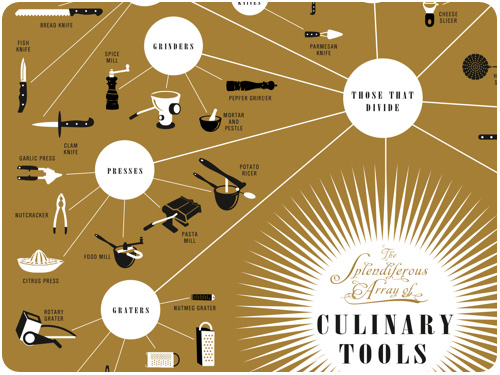
[image: pop chart lab]
this infographic of sorted & illustrated culinary tools is a virgo, graphic designer, diy kitchen person’s dream! see the whole profile at fastcodesign.com.
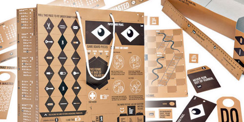
packaging
[image: thedieline.com]
i love this shopping bag commissioned by lee, intended to be cut down and reused as a board game, calendar, ruler, mask, door hanger, and so many more things. see the full post at the dieline.com.
something to get you rockin on the last week of the year.
packaging
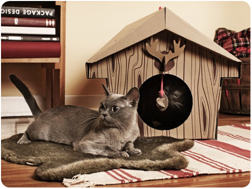
[image: loyal luxe]
if you have cats, then you know that as soon as a box is around, they’re inside it. these little cat houses & cabins are so cute, i think mine would have a ball playing in them.
something we don’t talk about enough in packaging, however, is waste, and i think marian bantjes’ piece for design observer explains my wrap rage really well: plastics: an apoplexy.
wine
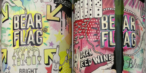
[image: thedieline.com]
sometime in september, i was up in san francisco, walking home from dinner on my cell phone, when i dropped into a liquor store to buy a bottle of wine. distracted by my call and less familiar with napa wine than most points south, i scanned the shelf forever and then decided that this fascinating label for bear flag wine had to be a sign. i bought it, i drank it, i planned to photograph it, but i didn’t, and then i took home the empty bottle, and it sat on a shelf for 2 weeks, when i finally decided i would just let it go. but then—here it is on the dieline, and it reminded me, it was an awesome piece of illustration & package planning. the bear flag site is pretty awesome as well, and i give them a pass on using flash, because they’re using it well.
typography
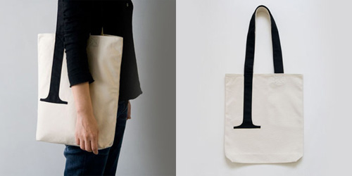
[image: thedieline.com]
you probably think you don’t need this serif bag, but face it, you probably do. profiled on thedieline.com.
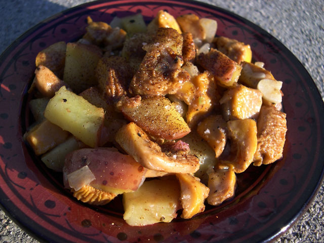
this week’s post for LAist doubly surprised me, for one because people seem to really like fennel more than i thought, and for another, i didn’t get ANY anchovy hate! seasonal eats: root-to-flower fun with fennel.
What promises are you (or your client) making that you know you’ll probably break? The best way to figure that out is to get to the heart of why, exactly, you’re even building this website in the first place. It seems like a simple question, doesn’t it? But you’d be amazed to know just how often web projects reach significant milestones only to fail to launch because it hasn’t been asked—or answered—by the people involved.
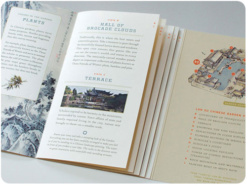
[image: sockeye creative]
this lovely print specimen by sockeye creative for the lan su chinese garden in portland is rich in details that make the experience of interacting with it really rewarding. a custom die-cut window over a stylized illustration invites you in, then the unique binding of a gate fold over stepped pages detailing the vistas makes you want to flip through and study each one. fantastic work! see more here: lan su visitor guide, from underconsideration.com.
[image: johnny miller]
amazing rainbows and color gradients created with colored glass and light, by johnny miller. thanks, oh joy for the link!
since creativity is about how you think, here are 2 articles i found interesting from around the tubes this week. seth godin talks about how we analyze our inner monologue to help define intuitive marketing: monitoring your internal monologue, and succcess.org explores the einstein quote “imagination is more important than knowledge” here: be smart, know smarts ain’t the answer.
if those made you want to put down your stylus and get your hands dirty, take a look at creative activities, from freelance switch and see how alternative forms of creative activities can keep your ideas fresh.
[image: jim godfrey design]
a poster designed around a compiled list of ways not to set type, by jim godfrey. take a look at the full piece at the showcase post on underconsideration.com
[image: sharpie]
permit me an office supply love minute here, but sharpie is releasing a liquid graphite pencil that goes permanent after a few days. i have a soft spot for pencils [espcially soft lead mechanicals], and while i realize this is not necessarily what the world needs, i am curious to try it. also, how cute is the sharpie blog header graphic?! thanks to how magazine for the link.
in our ongoing adventure to create great things, i think it’s important to remember that design is for everyone. ravi sawhney asserts designers continue to dedicate an overwhelming portion of their attention and energy toward designing for the top 10% in most developed nations. and he’s got a point. read more of what he has to say in designers are still blind to main street, from fastcodesign.com
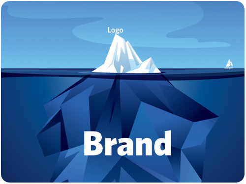
[image: fastcodesign.com]
apparently, the idea that when a client asks for a logo, what they probably really need is a brand strategy is gaining ground. if this is you or someone you know, get familiar with what goes into brand development with six tips for designing a memorable brand from fastcodesign.com.
[image: logodesignlove.com]
more than a logo, a currency denotation is an international symbol that comes to be synonymous with a country and its people’s well being. the indian rupee underwent a redesign [via, of all things, a design contest] and a final has been chosen. i like the shape of it, almost futura-istic. read more here: indian rupee symbol selected, from logodesignlove.com.
typography
[image: fastcodesign.com]
i have been an emigre fan for my entire design career. it was just yesterday that one of many awesome creations of rudy vanderlans [brothers typeface] rescued yet another in a line of countless layouts for me. join alissa walker in her interview with this amazing type design icon and his new showcase for his typefaces, historia: type master: an interview with emigre’s rudy vanderlans, from fastcodesign.com
we talked about it last week, we’ll talk about it this week: print cant be dead if people are still starting up new magazines, especially in these new niche markets for printed rag fetishists. steven heller profiles vintage magazine for print here: print ain’t dead yet, continued.
levi’s shares a video behind the scenes of letterpress, screen printing and block printing.
speaking of print design, how magazine reprinted part of a study by appleton coated on how print design is still a very valuable selling tool because clients and consumers love interacting with stunning print design pieces. but hey, you already knew that, right? the new ROI.
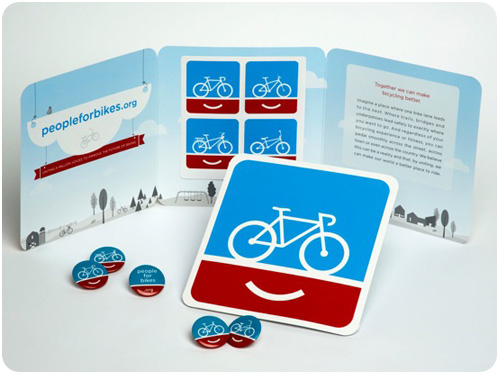
[image: fastcodesign.com finally, bike branding moves beyond hipster-ghetto takes a look at the people for bikes campaign by colle+mcvoy. simply put, it’s an organization to improve the future of biking through various actions on local & national levels. the branding for these efforts is friendly, accessible and engaging. check out some of the print ads, i love the one of the woman with a gear print on her leg.
posters
[image: fastcodesign.com]
if you’ve been looking for ways to use your design skills for positive propaganda, fastcodesign.com offers promoting social justice one poster at a time, showcasing the center for urban pedagogy. their mission statement has all kinds of inspiring language, and is worth reading in its entirety, but if you’re pressed for time, here’s a snip: Our work grows from a belief that the power of imagination is central to the practice of democracy, and that the work of governing must engage the dreams and visions of citizens. CUP believes in the legibility of the world around us.
design industry
brand new announces its first 1-day conference! if you’re a fan of underconsideration.com and you can swing by new york city at the beginning of november, they’ve got a jam-packed 11 hours for you. they’ve also got a bunch of different ways to attend, so if you’d rather watch a live webcast, you can!
what is the last thing you do before you launch a website? from smashing magazine is a really cute, informal quiz you can give yourself about your reactions to presenting final work and a brief analysis about what this says about your personality.
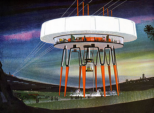
[image: US steel, grainedit.com]
i have to say, i liked the look of the future as imagined in the mid-60s. thanks to dave from grainedit.com for sharing spreads from power styling, which seems to be a collection of illustrations proposing re-imagined looks for the infrastructure of electric utility. be sure to look through all the pieces he scanned, they suggest a majesty that is glaringly absent in the power lines i see outside my window today.
logo evolution
[image: smashingmagazine.com]
we’ve come to know logos as modern signifiers in the marketplace, but the concept of a brand mark has existed a long time through history. smashing magazine offers the evolution of the logo that traces how graphic marks have been used to denote ownership, authorship and associations with different groups, only leading them to corporate identity as a result of evolution.
identity
[image: fastcodesign.com]
subtle, yet classic & modernized, check out the identity makeover on fastcodesign.com: a fresh identity for the girl scouts of america. i think these new profiles look more contemporary and youthful without losing any recognition of the brand and tradition. great work!
design industry
check out redesigning propublica by mule design. We love good journalism and hate unchecked abuses of power, so we were excited and honored to collaborate with ProPublica on their website redesign. hear, hear!
another from smashing magazine: add music to your workflow to improve results. i’ve always known i liked listening to music while i work, but i didn’t realize why it was helping me work better.
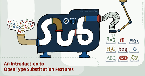
[image: martin plus for ilovetypography.com]
for the type designers out there, an introduction to opentype substitution features will show you how to make all those cool ligatures and custom-set type combos you might want to add to your typeface design.
if you’re in new york [or willing to travel] and want to learn typeface design, H&FJ’s sara soskolne will be teaching turning letters into type july 12-16: learning typeface design.
web design
applying interior design principles to the web from smashingmagazine.com talks about how the same principles of arranging physical objects relates to the placement and use of graphic objects, with a great breakdown of each.
creativity
jazz brain: functional magnetic resonance imaging is a quick report from utne.com about brain behavior during times of innovative creativity. Limb had jazz musicians play memorized music while being monitored by an fMRI machine. He then asked them to start improvising and noticed a shift in neurological activity. Their scans showed less activity in the areas that represent self-censoring and inhibition and more in the area that indicates self-expression. Limb interpreted this shift as a possible sign of “spontaneous creativity.”