City Lights from Colin Rich on Vimeo.
for the LA lover in anyone, this is a beautiful collection of time-lapses of los angeles after dark … or before the dawn!
City Lights from Colin Rich on Vimeo.
for the LA lover in anyone, this is a beautiful collection of time-lapses of los angeles after dark … or before the dawn!
okay, so it’s been awhile. i got in a rut and lost steam, had to prepare talks for 3 events in 3 weeks and started shopping for a home, and blogging fell off my to-do list. then the waffling came. the eternal waffle about how to come back. then i remembered that overthinking it would put it off indefinitely. so here i am!
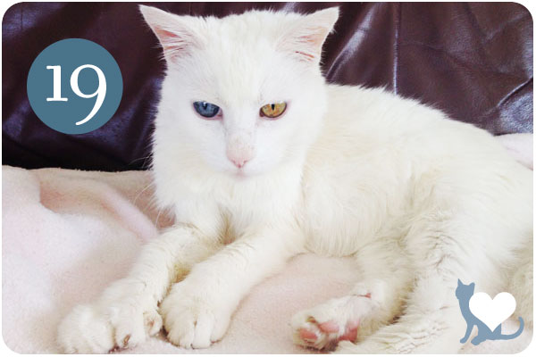
first thing’s first: motor turns 19 this month! my beloved little mascot has been with me a long time, and now is our last remaining cat. it feels a little weird to be a cat lady with only one cat, but the geriatric doting she requires allows me to still bring the cat mania with aplomb.
second thing is, we’re back with a new take on blogging. the round-ups of inspiration will still happen, but there will be more about business, management and brand strategy. as much as i love talking about aesthetics, the bigger picture is the story that got us there, which bridges you to your final design. so we’ll be doing more of that.
lastly, happy monday! let’s rock!
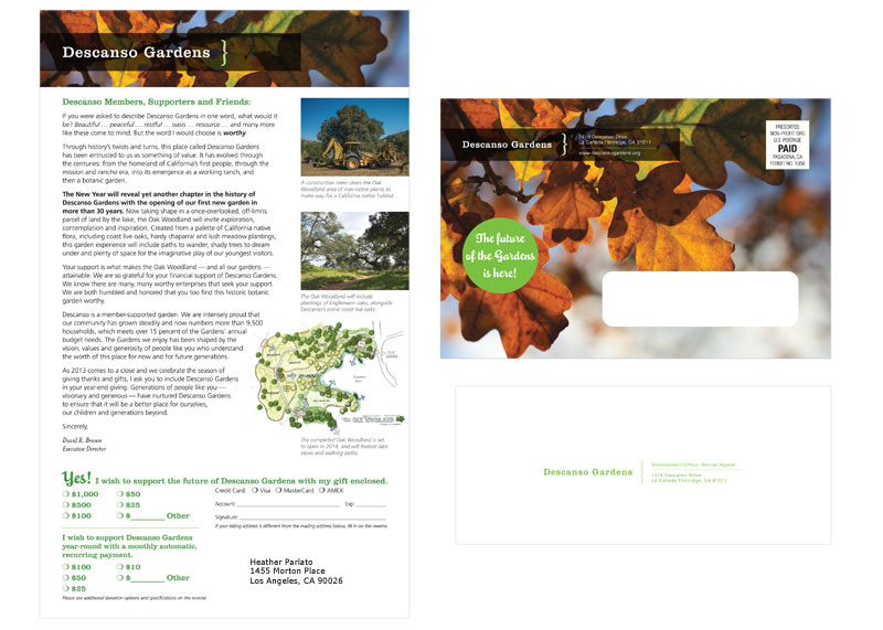
I’m pleased to be working with one of our fantastic oases in the city, Descanso Gardens! True to their tagline, Descanso is a member-supported garden, sending a fundraising appeal annually to continue their work in stewardship of the grounds and education to the public.
We created this showcase letter with a run-down of innovative projects completed with a forecast of what’s to come next year, all delivered in a very colorful mailing envelope themed by the oaks Descanso is known for. This piece got a lot done in a small space, and they reported an increase in returns from previous years.
this week we’re looking at 3 small specialty shops that have big brand ideas, leaving no touchpoint unturned. these suites bring taste and flavor to the forefront with striking packaging and multi-use labels and stickers, leaving no question as to where you picked up these fine food finds.
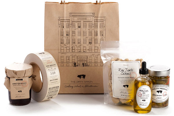
the dirty apron delicatessen uses a clever system of branded bags, hang tags and package closure tape with various versatile fill-in labels for an identity system that appears much bigger than it is. the branded items allow for multiple placements, and the labels allow for one collection of shapes to serve as fill-ins for every item in the store. see the whole collection at lovelypackage.com.
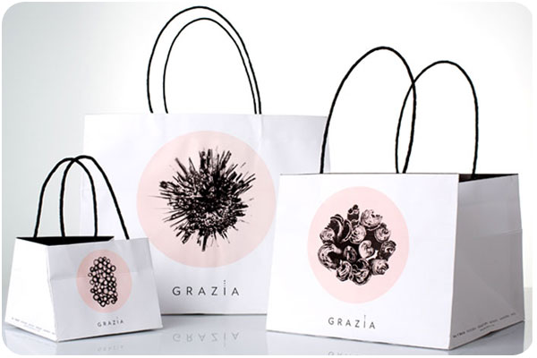
grazia, specializing in sweet and savory delicacies, uses a wonderful system of branded boxes, bags and stickers, all in their signature 2-color palette, featuring cross-sections of raw ingredients. i find this system to be stunning in versatility and simplicity. see more at thedieline.com.
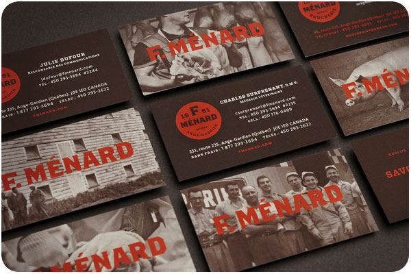
this family-owned butcher specializing in ethically-raised pork products has an identity system that pays special respect to the art of the craft. soft duotone photography is paired with a strong color palette and bold type, mostly using a label system for products in the store, and branded bags for your groceries. see more at lovelypackage.com.
there’s nothing like a strong typographic treatment over a simple color palette. this week we’re looking at 3 label series that make bold statements with type and color front and center.
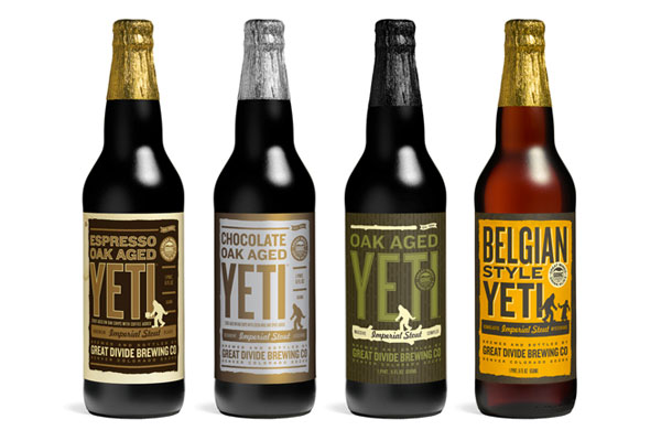
great divide’s yeti series uses a standardized-yet-versatile type treatment that allows them to include the minimal graphic elements that indicates the yeti line while making room for longer titles or alternate treatments for barrel aged brews. see the whole collection at thedieline.com
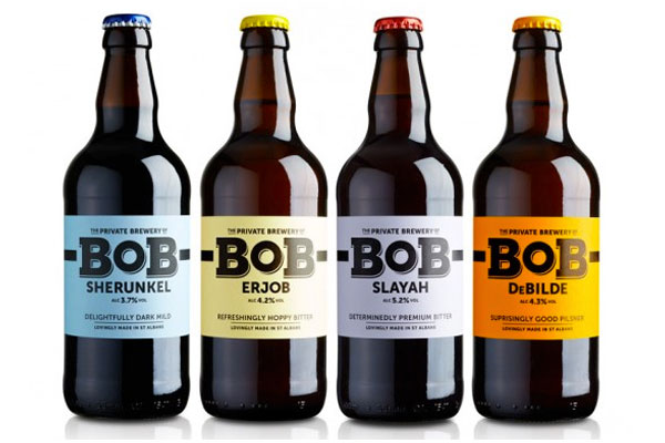
the bob [best of british] line from private brewery uses unconventional colors and unique brew names to draw interest and curiosity. each bottle is easily identifiable, with a nice 3-word descriptor. see more at lovelypackage.com
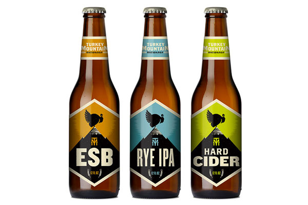
this collection from turkey mountain brewhaus uses a series of 2-color stamp-finish designs that allow for clear and prominent logo placement and brew name, relegating the brewery name to the neck label. nice, strong presentation. see more at ohbeautifulbeer.com
it seems like wine wraps are popping up everywhere—whether as packaging for a product, decorative wrap for personal gift-giving, or branded overlays for client gifts, wine is getting wrapped up everywhere!
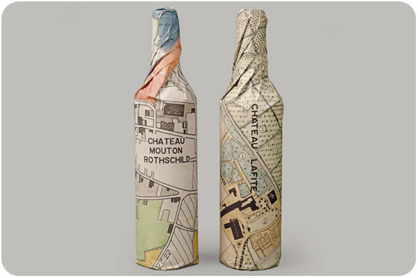
just one component of the rothschild’s wine distribution company, waddeson wine, these wraps manage to show a modern take on the map of the estate, blending historic and contemporary influences. see the whole brand package at designworklife.com.
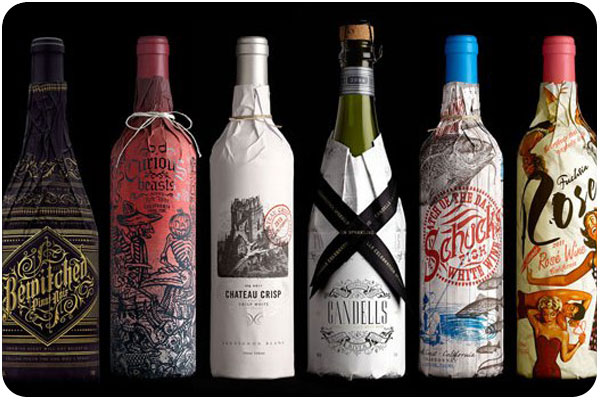
truett-hurst takes a different approach with these buyer-themed wraps, studying reasons and seasons when buyers buy, and designing wraps in the strongest themes. the wraps add an engaging and image-heavy narrative that allows the brand to communicate in a new way with potential shoppers. see more at psfk.com.
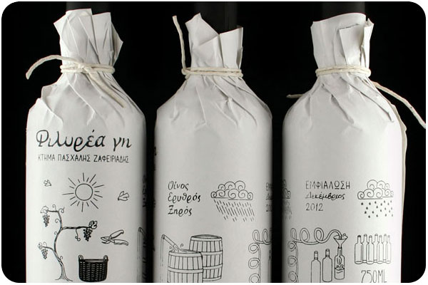
great for home brewers giving client gifts or short production runs, this 1-color wrap is budget-conscious while still adding a layer of interest. this piece illustrates the home winemaking process. see more at thedieline.com
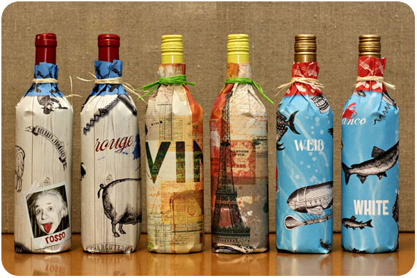
a very nice collection of wine wrapping papers from design am chiemsee, these wraps are reversible and offer decorative surprises for the recipient. see the collection at underconsideration.com.
in my never-ending design research, i saw a few pieces of thai-inspired design that caught my attention. i say thai-inspired because these 3 products and places are far from thailand, but each are borrowing their own elements from the design landscape and making them their own with great results.
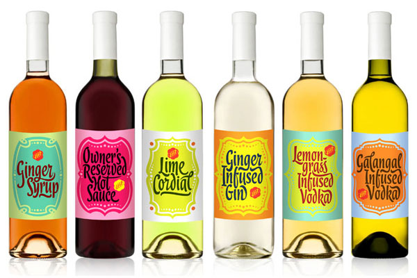
this series of brightly flavored and colored cordials are just one aspect of the branding for brazillian restaurant, my thai. the color palettes are outstanding, and a lovely contrast from the cordials inside. see more at thedieline.com.
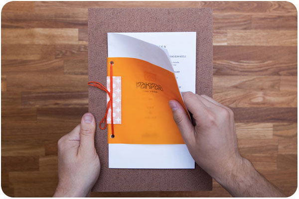
dallas-based pak pao has a lovely logo & wordmark with shapes that echo each other in a uniquely satisfying way. they have done a great job of mounting clean & simple menus to painted boards with lots of orange-over-orange reverberations. see more at underconsideration.com
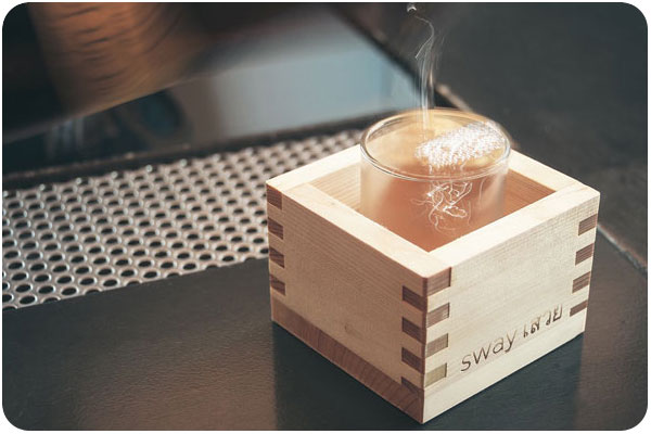
austin-based sway is a very extensive environment brand experience right down to the last detail. starting with the wordmark, the voice of sway is bilingual from the wayfinding to the menu. the stark and clean design of both print and environment is accented with bright color in coasters, placemats and matchbooks. see the whole profile at identitydesigned.com
small, specialized food stores don’t have to skip out on big, fun identity & brand systems. these three examples use tags, stickers, string and printed wraps for multiple placements that really get their brand noticed.
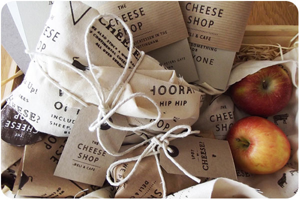
stamps, stickers, and printed wrappers—oh my! the cheese shop goes all out on letting onlookers know where you got your cheese! a very nice monochromatic use of type, simple design and copious touchpoints for a very complete suite. see more at thedieline.com.
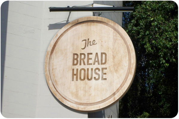
i really like the identity system of the bread house, using a simple mark that translates directly into packaging and versatile labels that allow for fresh products to be marked and dated. see more at thedieline.com
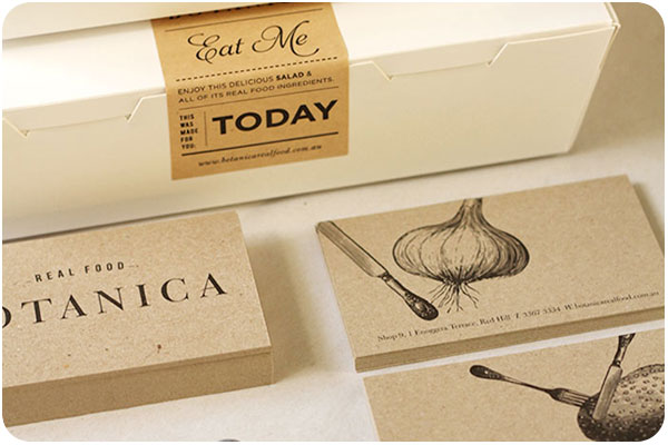
real food botanica is a deli with the concept of whole foods to go. a simple system of sustainable packaging and stickers for the type-forward brand placement, paired with craft paper identity materials. very sharp. see more at thedieline.com.
take a trip back in time to downtown LA in 1946! a special 10-minute silent treat for classic car lovers and vintage architecture fanatics, this ride-along is a wonderful look at places i walk all the time from a time when my parents were only a year old. so sweet!
