creative inspiration: fruit-forward spirits

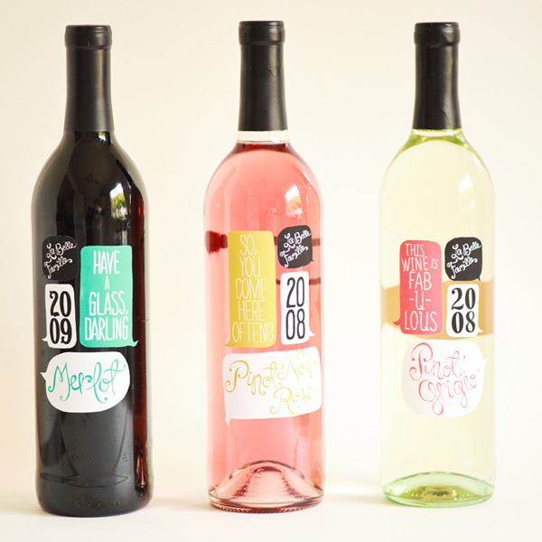
set your usual drinks aside and try out some artisan spirits. all of these are made with fresh fruits using traditional recipes.


slamsey’s fruit gins

image: lovelypackage.com

slamsey’s is both a distillery and a farm, specializing in small production of fruit gins. the branding, showing detailed drawings of natural specimens, is a nod to naturalist john ray, who also lived in the area. the bigger story of artisan production comes through in the simplicity of this packaging. see more at lovelypackage.com


gioia luisa

image: thedieline.com

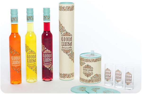
student work redesigning gioia luisa limoncellos in 3 flavors, this branding is inspired by italian countryside tile and landscape. a very vibrant palate indeed! see more at thedieline.com


art in the age

image: thedieline.com

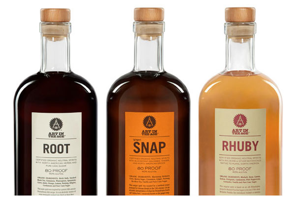
art in the age spirits revive historical recipes, celebrating the time when liquors were considered health elixirs, a mix of botanicals and spices. the branding is straightforward yet modern, with references to science and handicraft. see more at thedieline.com.

creative inspiration: summer’s bounty

it’s the end of summer, which means there are fresh fruits & veggies everywhere! let’s look at 3 brands making the most of the super-fresh.


ugly fruit

image: lovelypackage.com

maybe the ultimate in upcycling, ugly fruit saves the slightly distressed from the landfill: fruit that may not make the superficial cut for market shelves, but is still nutritious and delicious enough to juice, preserve and dry. the packaging showcases cute little animated fruits, each with a black eye—aww. great brand story and nice treatment of subject matter. see more at lovelypackage.com


thise

image: lovelypackage.com

a student assignment to redesign thise mejeri turns out more great student work in this modern, colorful twist on classic milk bottles. the logo is strong, and the series looks delicious! see more at lovelypackage.com


wellbar

image: thedieline.com

beautiful branding for wellbar combining 1-color show-through packaging with bright, fresh juice, and craft paper bags and boxes for dry goods. everything is clean, tight, and clearly labeled so you can see just what you’re getting. see more at thedieline.com

creative inspiration: product color palettes

this week, we’re looking at packaging that uses the product reveal to drive the color palette. these three pieces tantalize with natural flavors front-and-center!

¡cho! gazpacho

image: thedieline.com

it’s high-gazpacho season here in los angeles, and these vegetable & fruit blends look deliciously refreshing, using nothing but the bright colors of natural, organic produce. see more at the dieline.


d’oro extra virgin olive oil

image: thedieline.com

olive oil is already an amazing translucent green, but d’oro brings more of the spectrum of color into the picture with their mixed flavors. with infusions like tangerine, garlic, coffee and chili, they can keep their black-reversed logo reveals each unique color through the olive illustration. see more at the dieline.


milk talk

image: thedieline.com

these cute shower soaps could easily be mistaken for yogurt drinks–except that they come with flavor-themed sponge tops for use in the shower. the milk theme evokes the luxury of bathing in milk, along with a texture that is smooth and creamy. see more at the dieline.

friday fun: silk pavilion

SILK PAVILION from Mediated Matter Group on Vimeo.

i made a silk dress to wear to my sister’s wedding this month. hard to believe such a delicate yet durable fabric is woven by worms!

creative inspiration: colorful branding

angela & evan photography

image: designworklife.com

i love a vibrant brand that uses multiple color iterations, patterns and setups around one clear logo. this identity for angela & evan wedding photography centers around a striking hand-drawn logo, pairing it with fresh spring greens and yellows for wedding season, playing out into traditional photographic equipment in brand touchpoints. see the full post at designworklife.com.


wigwam cabins

image: the-design-ark.com

i’ve talked about this identity before, but how can you NOT when wigwams are involved? focusing heavily on the angular relationships of the W, A and M letterforms, they have created a thematic logo that references the shape of the cabins themselves, and then uses the extended color palette to carry the identity through, looking much like an indian woven blanket. fantastic & fun work! see more at the-design-ark.com


kröller müller

image: identitydesigned.com

the kröller müller museum offers this colorful, inviting and interactive brand, where the logo appears to be revealed through an open door in still applications, it is very literally opening in motion and environmental graphics. another identity with every color application in the rainbow, it is not only versatile in pairing several colors into every layout, but the theme of invitation and discovery of art and environment is very strong in this brand. explore further at identitydesigned.com.

redesign: inspire 2013

Inspire2013_banner

i’m hugely excited to announce that i’ll be speaking at the redesign: inspire conference this fall, october 21 – 22, 2013, at the smog shoppe in culver city!

described as equal parts conference, salon and retreat, redesign: inspire is shaping up to be a fantastic creative getaway [or staycation, if you’re local]. i’m already overwhelmed at the company i’m in honor of keeping at this event. as you’ll see the speaker lineup unfold through june and july, it’s a group of truly outstanding design thinkers and industry leaders. this year’s event symposiarch is lawrence azerrad, a fantastic designer i met at aiga’s blueprint: freelance panel discussion.

parlato_2013_150this year’s theme is cross-pollination, “drawing from sources beyond traditional design to enhance, strengthen and inspire our work.” i’ll be talking about my long and winding road in design, moving ever outward from the day-to-day bubble in order to give my work balance and clarity. i love the idea that this is a forum format, because while i have plenty to share from my own experience, i’m equally excited to hear from attendees as well. every speaker will be tackling this topic from a different angle. join us and get in on the conversation!

this conference has an early-bird registration deadline of june 30, 2013, for the best possible rate! register this week, and keep your eyes on the redesign: inspire site for new announcements.

get in on patio season

patioseason-june

in case you haven’t heard, i’m hosting a little something called patio season, which is an open invitation to sit & chat, network, or mutually brain-pick during either morning coffee or afternoon happy hour. take me up on it, and all this [snacks above] and more can be yours. ha.

recently, someone i’d never met before answered the call and came for a visit! she’s a lovely person, a writer, and a neighbor, ana ottman. we chatted about running our freelance practices, managing clients, how and where we might hire each other if the opportunity comes up, and life in los angeles. i’m so glad she took a chance on coming to meet a new person for a patio chat! turns out, we have a lot of friends in common and have just missed meeting somehow within the same circles, but no more—we just ran into each other at LA creative mornings last week, and she has given me the low-down on where to get earl grey pie downtown.

ottman-card

so, conquer your fears, people! there’s no better way to get some in-depth networking done than a one-on-one conversation over snacks & drinks. let’s hang!

here’s how it works. choose a morning coffee [10:30am] or evening happy hour [5:30pm] appointment, tuesday, wednesday or thursday. tell me when you’d like to meet and what you’d like to talk about. if it’s open, i’ll make the drinks & snacks, you come over and we chat. about design, about business, about ideas, about food stuff–whatever, up to 2 hours.

creative inspiration: summer-ready colorful wine packaging

la belle famille

image: ali-labelle.com

kickin around pinterest one day, i found these cute conversation-starters pinned to someone else’s packaging board. i love how ali labelle has used the wine as a background color for both rosé and white. see more at ali-labelle.com.


vin de mesies

image: thedieline.com

very clean execution of moon phases as mandalas in color palettes that compliment the flavors, each with a sparing use of gold. very nice! see more at the dieline


small talk vineyard

image: thedieline.com

another hat tip to hand-drawn type, evoking conversational style, giving voice to the background clamor you might hear at your next party. over wine, of course. see more at the dieline.